Related Research Articles

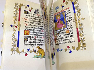
Arabic calligraphy is the artistic practice of handwriting and calligraphy based on the Arabic alphabet. It is known in Arabic as khatt, derived from the word 'line', 'design', or 'construction'. Kufic is the oldest form of the Arabic script.
Hermann Zapf was a German type designer and calligrapher who lived in Darmstadt, Germany. He was married to the calligrapher and typeface designer Gudrun Zapf-von Hesse. Typefaces he designed include Palatino, Optima, and Zapfino. He is considered one of the greatest type designers of all time.
Calligraphy is a visual art related to writing and is the design and execution of lettering with a pen, ink brush, or other writing instrument. Contemporary calligraphic practice can be defined as "the art of giving form to signs in an expressive, harmonious, and skillful manner".

In typography and lettering, a sans-serif, sans serif, gothic, or simply sans letterform is one that does not have extending features called "serifs" at the end of strokes. Sans-serif typefaces tend to have less stroke width variation than serif typefaces. They are often used to convey simplicity and modernity or minimalism.

Edward Johnston, CBE was a British craftsman who is regarded, with Rudolf Koch, as the father of modern calligraphy, in the particular form of the broad-edged pen as a writing tool.

Lettering is an umbrella term that covers the art of drawing letters, instead of simply writing them. Lettering is considered an art form, where each letter in a phrase or quote acts as an illustration. Each letter is created with attention to detail and has a unique role within a composition. Lettering is created as an image, with letters that are meant to be used in a unique configuration. Lettering words do not always translate into alphabets that can later be used in a typeface, since they are created with a specific word in mind.
In Latin script typography, roman is one of the three main kinds of historical type, alongside blackletter and italic. Sometimes called normal, it is distinct from these two for its upright style and its simplicity.

Kris Holmes is an American typeface designer, calligrapher, type design educator and animator. She, with Charles Bigelow, is the co-creator of the Lucida and Wingdings font families, among many other typeface designs. She is President of Bigelow & Holmes Inc., a typeface design studio.

Rudolf Koch was a German type designer, professor, and a master of lettering, calligraphy, typography and illustration. Commonly known for his typefaces created for the Klingspor Type Foundry, his most widely used typefaces include Neuland and Kabel.

Perpetua is a serif typeface that was designed by the English sculptor and stonemason Eric Gill for the British Monotype Corporation. Perpetua was commissioned at the request of Stanley Morison, an influential historian of printing and adviser to Monotype around 1925, when Gill's reputation as a leading artist-craftsman was high. Perpetua was intended as a crisp, contemporary design that did not follow any specific historic model, with a structure influenced by Gill's experience of carving lettering for monuments and memorials. Perpetua is commonly used for covers and headings and also sometimes for body text and has been particularly popular in fine book printing. Perpetua was released with characters for the Greek alphabet and a matching set of titling capitals for headings.
Sumner Stone is a typeface designer and graphic artist. He notably designed ITC Stone while working for Adobe. A specimen of ITC Stone is shown at his personal website.
Rick Cusick is an American lettering artist, calligrapher, type designer and book designer.
The Frederic W. Goudy Award & Lecture were established in 1969 by funds donated to Rochester Institute of Technology (RIT) by the Mary Flagler Cary Charitable Trust in memory of her late husband, Melbert B. Cary, Jr., a typographer, type importer, fine printer, book collector, and president of AIGA. The award was named after illustrious American type designer Frederic W. Goudy, a friend and business associate of Melbert Cary.
David Harban RBSA is a graphic artist specializing in printmaking. He exhibited his prints in one of the Royal Birmingham Society of Artists Gallery's ‘Open’ exhibitions, where he was supported by some of the other members of the Society. He then became a full Member of the Society in 2008. Harban is an elected member of the Easel Club and the Birmingham Art Circle.
David White RBSA is an artist trained at the Birmingham College of Art. Initially, he was a teacher although he retired early in 1996 to become a full-time artist. He has since exhibited his works throughout the Midlands in locations such as Birmingham, Lichfield and Stratford-upon-Avon.

A display typeface is a typeface that is intended for use in display type at large sizes for titles, headings, pull quotes, and other eye-catching elements, rather than for extended passages of body text.

Calligraffiti is an art form that combines calligraphy, typography, and graffiti. It can be classified as either abstract expressionism or abstract vandalism. It is defined as a visual art that integrates letters into compositions that attempt to communicate a broader message through writing that has been aesthetically altered to move beyond the literal meaning. Simply put, it is the conscious effort of making a word or group of words into a visual composition. As such it is meant to be both an aesthetic experience and provocative art—mixing tradition and precision with modern unbridled self-expression.
Patricia Lovett is a British scribe, calligrapher and illuminator from Kent. She is the author of several books and teaches calligraphy, illumination and manuscript skills in the UK and worldwide. She was chair of the Heritage Crafts Association between 2017 and 2022, having been vice-chair for several years previously and in 2013 was awarded an MBE for services to calligraphy and the protection of heritage crafts.

In typography, a fat face letterform is a serif typeface or piece of lettering in the Didone or modern style with an extremely bold design. Fat face typefaces appeared in London around 1805–1810 and became widely popular; John Lewis describes the fat face as "the first real display typeface."

Bryant Olcher Fedden was a self-taught letter-cutter, glass engraver and sculptor who developed his craft in a workshop environment with craftspeople whom he taught and supported. He was a member of the Gloucestershire Guild of Craftsmen for more than forty years. He was a founder member of the Letter Exchange, a professional organisation promoting lettering in all its forms. Bryant Fedden has work in the Victoria and Albert Museum Collections.
References
| | This article about an artist from the United Kingdom is a stub. You can help Wikipedia by expanding it. |