Example
This is perhaps most readily understood by means of an example. If an i.i.d. sample of six items is taken from a normally distributed population with expected value 0 and variance 1 (the standard normal distribution) and then sorted into increasing order, the expected values of the resulting order statistics are:
- −1.2672, −0.6418, −0.2016, 0.2016, 0.6418, 1.2672.
Suppose the numbers in a data set are
- 65, 75, 16, 22, 43, 40.
Then one may sort these and line them up with the corresponding rankits; in order they are
- 16, 22, 40, 43, 65, 75,
which yields the points:
| data point | rankit |
|---|
| 16 | −1.2672 |
| 22 | −0.6418 |
| 40 | −0.2016 |
| 43 | 0.2016 |
| 65 | 0.6418 |
| 75 | 1.2672 |
These points are then plotted as the vertical and horizontal coordinates of a scatter plot.
Alternative method
Alternatively, rather than sort the data points, one may rank them, and rearrange the rankits accordingly. This yields the same pairs of numbers, but in a different order.
For:
- 65, 75, 16, 22, 43, 40,
the corresponding ranks are:
- 5, 6, 1, 2, 4, 3,
i.e., the number appearing first is the 5th-smallest, the number appearing second is 6th-smallest, the number appearing third is smallest, the number appearing fourth is 2nd-smallest, etc. One rearranges the expected normal order statistics accordingly, getting the rankits of this data set:
| data point | rank | rankit |
|---|
| 65 | 5 | 0.6418 |
| 75 | 6 | 1.2672 |
| 16 | 1 | −1.2672 |
| 22 | 2 | −0.6418 |
| 43 | 4 | 0.2016 |
| 40 | 3 | −0.2016 |
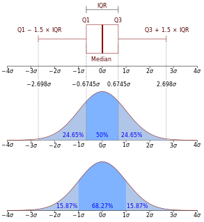
In descriptive statistics, the interquartile range (IQR), also called the midspread, middle 50%, or H‑spread, is a measure of statistical dispersion, being equal to the difference between 75th and 25th percentiles, or between upper and lower quartiles, IQR = Q3 − Q1. In other words, the IQR is the third quartile subtracted from the first quartile; these quartiles can be clearly seen on a box plot on the data. It is a trimmed estimator, defined as the 25% trimmed range, and is a commonly used robust measure of scale.
In statistics, a quartile is a type of quantile which divides the number of data points into four parts, or quarters, of more-or-less equal size. The data must be ordered from smallest to largest to compute quartiles; as such, quartiles are a form of order statistic. The three main quartiles are as follows:
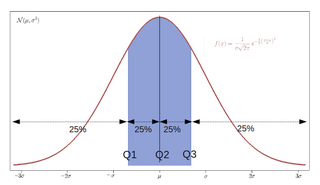
In statistics and probability, quantiles are cut points dividing the range of a probability distribution into continuous intervals with equal probabilities, or dividing the observations in a sample in the same way. There is one fewer quantile than the number of groups created. Common quantiles have special names, such as quartiles, deciles, and percentiles. The groups created are termed halves, thirds, quarters, etc., though sometimes the terms for the quantile are used for the groups created, rather than for the cut points.

In probability theory and statistics, skewness is a measure of the asymmetry of the probability distribution of a real-valued random variable about its mean. The skewness value can be positive, zero, negative, or undefined.

In descriptive statistics, a box plot or boxplot is a method for graphically depicting groups of numerical data through their quartiles. Box plots may also have lines extending from the boxes (whiskers) indicating variability outside the upper and lower quartiles, hence the terms box-and-whisker plot and box-and-whisker diagram. Outliers may be plotted as individual points. Box plots are non-parametric: they display variation in samples of a statistical population without making any assumptions of the underlying statistical distribution. The spacings between the different parts of the box indicate the degree of dispersion (spread) and skewness in the data, and show outliers. In addition to the points themselves, they allow one to visually estimate various L-estimators, notably the interquartile range, midhinge, range, mid-range, and trimean. Box plots can be drawn either horizontally or vertically. Box plots received their name from the box in the middle, and from the plot that they are.
In statistics, the kth order statistic of a statistical sample is equal to its kth-smallest value. Together with rank statistics, order statistics are among the most fundamental tools in non-parametric statistics and inference.

The normal probability plot is a graphical technique to identify substantive departures from normality. This includes identifying outliers, skewness, kurtosis, a need for transformations, and mixtures. Normal probability plots are made of raw data, residuals from model fits, and estimated parameters.

In probability theory and statistics, the probit function is the quantile function associated with the standard normal distribution. It has applications in data analysis and machine learning, in particular exploratory statistical graphics and specialized regression modeling of binary response variables.
The following is a glossary of terms used in the mathematical sciences statistics and probability.
The Shapiro–Wilk test is a test of normality in frequentist statistics. It was published in 1965 by Samuel Sanford Shapiro and Martin Wilk.
The term normal score is used with two different meanings in statistics. One of them relates to creating a single value which can be treated as if it had arisen from a standard normal distribution. The second one relates to assigning alternative values to data points within a dataset, with the broad intention of creating data values than can be interpreted as being approximations for values that might have been observed had the data arisen from a standard normal distribution.

In statistics, a Q–Q (quantile-quantile) plot is a probability plot, which is a graphical method for comparing two probability distributions by plotting their quantiles against each other. First, the set of intervals for the quantiles is chosen. A point (x, y) on the plot corresponds to one of the quantiles of the second distribution plotted against the same quantile of the first distribution. Thus the line is a parametric curve with the parameter which is the number of the interval for the quantile.
In statistics, normality tests are used to determine if a data set is well-modeled by a normal distribution and to compute how likely it is for a random variable underlying the data set to be normally distributed.
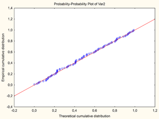
In statistics, a P–P plot is a probability plot for assessing how closely two data sets agree, which plots the two cumulative distribution functions against each other. P-P plots are vastly used to evaluate the skewness of a distribution.
In probability and statistics, the quantile function, associated with a probability distribution of a random variable, specifies the value of the random variable such that the probability of the variable being less than or equal to that value equals the given probability. It is also called the percent-point function or inverse cumulative distribution function.
Formalized by John Tukey, the Tukey lambda distribution is a continuous, symmetric probability distribution defined in terms of its quantile function. It is typically used to identify an appropriate distribution and not used in statistical models directly.

A plot is a graphical technique for representing a data set, usually as a graph showing the relationship between two or more variables. The plot can be drawn by hand or by a computer. In the past, sometimes mechanical or electronic plotters were used. Graphs are a visual representation of the relationship between variables, which are very useful for humans who can then quickly derive an understanding which may not have come from lists of values. Given a scale or ruler, graphs can also be used to read off the value of an unknown variable plotted as a function of a known one, but this can also be done with data presented in tabular form. Graphs of functions are used in mathematics, sciences, engineering, technology, finance, and other areas.
In statistics, the sample maximum and sample minimum, also called the largest observation and smallest observation, are the values of the greatest and least elements of a sample. They are basic summary statistics, used in descriptive statistics such as the five-number summary and Bowley's seven-figure summary and the associated box plot.
In statistical graphics and scientific visualization, the contour boxplot is an exploratory tool that has been proposed for visualizing ensembles of feature-sets determined by a threshold on some scalar function. Analogous to the classical boxplot and considered an expansion of the concepts defining functional boxplot, the descriptive statistics of a contour boxplot are: the envelope of the 50% central region, the median curve and the maximum non-outlying envelope.
The Shapiro–Francia test is a statistical test for the normality of a population, based on sample data. It was introduced by S. S. Shapiro and R. S. Francia in 1972 as a simplification of the Shapiro–Wilk test.
