Related Research Articles

Garamond is a group of many serif typefaces, named for sixteenth-century Parisian engraver Claude Garamond, generally spelled as Garamont in his lifetime. Garamond-style typefaces are popular and particularly often used for book printing and body text.

Frederic William Goudy was an American printer, artist and type designer whose typefaces include Copperplate Gothic, Goudy Old Style and Kennerley. He was one of the most prolific of American type designers and his self-named type continues to be one of the most popular in America.

Stanley Arthur Morison was a British typographer, printing executive and historian of printing. Largely self-educated, he promoted higher standards in printing and an awareness of the best printing and typefaces of the past.
Rudy VanderLans is a Dutch graphic designer, photographer, and the co-founder of Emigre Fonts with his wife Zuzana Licko. Emigre Fonts is an independent type foundry in Berkeley, CA. He was also the art director and editor of Emigre magazine, the legendary journal devoted to visual communications from 1984 to 2005. Since arriving in California in 1981, he has been photographing his adoptive Golden State as an ongoing side project. He has authored a total of 11 photo books on the topic, and staged two solo exhibits at Gallery 16 in San Francisco.

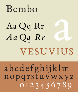
Bembo is a serif typeface created by the British branch of the Monotype Corporation in 1928–1929 and most commonly used for body text. It is a member of the "old-style" of serif fonts, with its regular or roman style based on a design cut around 1495 by Francesco Griffo for Venetian printer Aldus Manutius, sometimes generically called the "Aldine roman". Bembo is named for Manutius's first publication with it, a small 1496 book by the poet and cleric Pietro Bembo. The italic is based on work by Giovanni Antonio Tagliente, a calligrapher who worked as a printer in the 1520s, after the time of Manutius and Griffo.

Rudolf Koch was a German type designer, professor, and a master of lettering, calligraphy, typography and illustration. Commonly known for his typefaces created for the Klingspor Type Foundry, his most widely used typefaces include Neuland and Kabel.

Beatrice Lamberton Warde was a twentieth-century writer and scholar of typography. As a marketing manager for the British Monotype Corporation, she was influential in the development of printing tastes in Britain and elsewhere in the mid-twentieth century and was recognized at the time as "[o]ne of the few women typographers in the world". Her writing advocated higher standards in printing, and championed intelligent use of historic typefaces from the past, which Monotype specialised in reviving, and the work of contemporary typeface designers.
Frederic Warde was a book designer, editor, and typography designer. One of the great book designers of the twentieth century, Will Ransom described him as "a curious blend of romantic idealism and meticulous practicality." In describing his own work, Warde stated, "The innermost soul of any literary creation can never be seen in all its clarity and truth until one views it through the medium of the printed page, in which there must be absolutely nothing to divide the attention, interrupt the thought, or to offend one's sense of form."

Bruce Rogers was an American typographer and type designer, acclaimed by some as among the greatest book designers of the twentieth century. Rogers was known for his "allusive" typography, rejecting modernism, seldom using asymmetrical arrangements, rarely using sans serif type faces, often favoring faces such as Bell, Caslon, his own Montaigne, a Jensonian precursor to his masterpiece of type design Centaur. His books can fetch high sums at auction.

Allan Robb Fleming was a Canadian graphic designer best known for having created the Canadian National Railway logo, designing the best-selling 1967 Centennial book Canada: A Year of the Land/Canada, du temps qui passe, and for revolutionizing the look of scholarly publishing in Canada, particularly at University of Toronto Press.
The Fleuron was a British journal of typography and book arts published in seven volumes from 1923 to 1930. A fleuron is a floral ornament used by typographers.
William Edwin Rudge is the name of a grandfather, father and son, all of whom worked in the printing business. It's also the name of their business.

Linn Boyd Benton was an American typeface designer and inventor of technology for producing metal type.
Sol Hess was an American typeface designer. After a three-year scholarship course at Pennsylvania Museum School of Industrial Design, he began at Lanston Monotype in 1902, rising to typographic manager in 1922. He was a close friend and collaborator with Monotype art director Frederic Goudy, succeeding him in that position in 1940. Hess was particularly adept at expanding type faces into whole families, allowing him to complete 85 faces for Monotype, making him America's fourth most prolific type designer. While he was with Monotype, Hess worked on commissions for many prominent users of type, including, Crowell-Collier, Sears Roebuck, Montgomery Ward, Yale University Press, World Publishing Company, and Curtis Publishing for whom he re-designed the typography of their Saturday Evening Post.

University of California Old Style is a serif typeface designed by Frederic Goudy and created for the University of California Press from 1936–8. It is one of Goudy's most popular serif typefaces. It is also known as Berkeley Old Style and Californian.
Dennis Ichiyama is an artist focusing on woodblock prints and former professor of Visual Communications Design at Purdue University in West Lafayette, Indiana..

Jean Jannon was a French Protestant printer, type designer, punchcutter and typefounder active in Sedan in the seventeenth century. He was a reasonably prolific printer by contemporary standards, printing several hundred books.

Alan Kitching RDI AGI Hon FRCA is a practitioner of letterpress typographic design and printmaking. Kitching exhibits and lectures across the globe, and is known for his expressive use of wood and metal letterforms in commissions and limited-edition prints.

Henry Lewis Bullen was an American printer and typographic archivist.

George William Jones (1860-1942) was a British printer and type designer of the late nineteenth and twentieth century.