Related Research Articles

A typeface is a design of letters, numbers and other symbols, to be used in printing or for electronic display. Most typefaces include variations in size, weight, slope, width, and so on. Each of these variations of the typeface is a font.
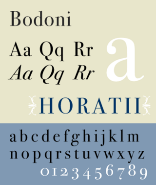
Bodoni is the name given to the serif typefaces first designed by Giambattista Bodoni (1740–1813) in the late eighteenth century and frequently revived since. Bodoni's typefaces are classified as Didone or modern. Bodoni followed the ideas of John Baskerville, as found in the printing type Baskerville—increased stroke contrast reflecting developing printing technology and a more vertical axis—but he took them to a more extreme conclusion. Bodoni had a long career and his designs changed and varied, ending with a typeface of a slightly condensed underlying structure with flat, unbracketed serifs, extreme contrast between thick and thin strokes, and an overall geometric construction.
In typography, italic type is a cursive font based on a stylised form of calligraphic handwriting. Along with blackletter and roman type, it served as one of the major typefaces in the history of Western typography.

Caslon is the name given to serif typefaces designed by William Caslon I (c. 1692–1766) in London, or inspired by his work.

Hoefler Text is an old-style serif font by Jonathan Hoefler released by Apple Computer Inc. in 1991 to showcase advanced type technologies. Intended as a versatile font that is suitable for body text, it takes cues from a range of classic fonts, such as designs by Miklós Kis and Jean Jannon.

Jonathan Hoefler is an American type designer. Hoefler founded the Hoefler Type Foundry in 1989, a type foundry in New York.
Oblique type is a form of type that slants slightly to the right, used for the same purposes as italic type. Unlike italic type, however, it does not use different glyph shapes; it uses the same glyphs as roman type, except slanted. Oblique and italic type are technical terms to distinguish between the two ways of creating slanted font styles; oblique designs may be labelled italic by companies selling fonts or by computer programs. Oblique designs may also be called slanted or sloped roman styles. Oblique fonts, as supplied by a font designer, may be simply slanted, but this is often not the case: many have slight corrections made to them to give curves more consistent widths, so they retain the proportions of counters and the thick-and-thin quality of strokes from the regular design.

Didone is a genre of serif typeface that emerged in the late 18th century and was the standard style of general-purpose printing during the 19th century. It is characterized by:

Tobias Frere-Jones is an American type designer who works in New York City. He operates the company Frere-Jones Type and teaches typeface design at the Yale School of Art MFA program.

In metal typesetting, a font or fount is a particular size, weight and style of a typeface. Each font is a matched set of type, with a piece for each glyph. A typeface consists of various fonts that share an overall design.
Hoefler&Co. (H&Co) is a digital type foundry in Woburn, Massachusetts, founded by type designer Jonathan Hoefler. H&Co designs typefaces for clients and for retail on its website.

Clarendon is the name of a slab serif typeface that was released in 1845 by Thorowgood and Co. of London, a letter foundry often known as the Fann Street Foundry. The original Clarendon design is credited to Robert Besley, a partner in the foundry, and was originally engraved by punchcutter Benjamin Fox, who may also have contributed to its design. Many copies, adaptations and revivals have been released, becoming almost an entire genre of type design.

A swash is a typographical flourish, such as an exaggerated serif, terminal, tail, entry stroke, etc., on a glyph. The use of swash characters dates back to at least the 16th century, as they can be seen in Ludovico Vicentino degli Arrighi's La Operina, which is dated 1522. As with italic type in general, they were inspired by the conventions of period handwriting. Arrighi's designs influenced designers in Italy and particularly in France.

Didot is a group of typefaces. The word/name Didot came from the famous French printing and type-producing Didot family. The classification is known as modern, or Didone.

Requiem is an old-style serif typeface designed by Jonathan Hoefler in 1992 for Travel + Leisure magazine and sold by his company, Hoefler & Co. The typeface takes inspiration from a set of inscriptional capitals found in Ludovico Vicentino degli Arrighi's 1523 writing manual, Il Modo de Temperare le Penne, and its italics are based on the chancery calligraphy, or cancelleresca corsiva of the period.

In typeface design, the overshoot of a round or pointed letter is the degree to which it extends higher or lower than a comparably sized "flat" letter, to achieve an optical effect of being the same size; it compensates for inaccuracies in human visual perception.

Typeface anatomy describes the graphic elements that make up letters in a typeface.
Typefaces are born from the struggle between rules and results. Squeezing a square about 1% helps it look more like a square; to appear the same height as a square, a circle must be measurably taller. The two strokes in an X aren't the same thickness, nor are their parallel edges actually parallel; the vertical stems of a lowercase alphabet are thinner than those of its capitals; the ascender on a d isn't the same length as the descender on a p, and so on. For the rational mind, type design can be a maddening game of drawing things differently in order to make them appear the same.
Memphis is a slab-serif typeface designed by Rudolf Wolf and released in 1929 by the Stempel Type Foundry.

In typography, a fat face letterform is a serif typeface or piece of lettering in the Didone or modern style with an extremely bold design. Fat face typefaces appeared in London around 1805–1810 and became widely popular; John Lewis describes the fat face as "the first real display typeface."
References
- ↑ Twemlow, Alice. "Forensic Types". Eye Magazine. Retrieved 6 October 2014.
- ↑ Fagone, Jason (2 June 2014). "A Type House Divided". New York . Retrieved 6 October 2014.
- ↑ McNaughton, Melanie (December 2010). "Martha Stewart's Graphic Design for Living". Bridgewater Review. Retrieved 7 October 2014.