
A geographic information system (GIS) consists of integrated computer hardware and software that store, manage, analyze, edit, output, and visualize geographic data. Much of this often happens within a spatial database; however, this is not essential to meet the definition of a GIS. In a broader sense, one may consider such a system also to include human users and support staff, procedures and workflows, the body of knowledge of relevant concepts and methods, and institutional organizations.
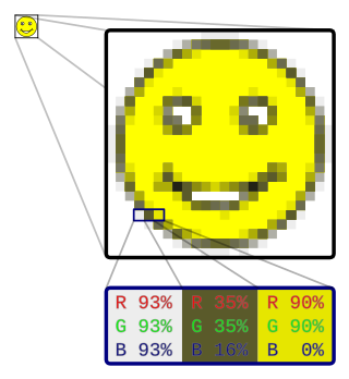
In computer graphics and digital photography, a raster graphic represents a two-dimensional picture as a rectangular matrix or grid of pixels, viewable via a computer display, paper, or other display medium. A raster image is technically characterized by the width and height of the image in pixels and by the number of bits per pixel. Raster images are stored in image files with varying dissemination, production, generation, and acquisition formats.
In telecommunications, an eye pattern, also known as an eye diagram, is an oscilloscope display in which a digital signal from a receiver is repetitively sampled and applied to the vertical input (y-axis), while the data rate is used to trigger the horizontal sweep (x-axis). It is so called because, for several types of coding, the pattern looks like a series of eyes between a pair of rails. It is a tool for the evaluation of the combined effects of channel noise, dispersion and intersymbol interference on the performance of a baseband pulse-transmission system. The technique was first used with the WWII SIGSALY secure speech transmission system.

Topography is the study of the forms and features of land surfaces. The topography of an area may refer to the land forms and features themselves, or a description or depiction in maps.

A chart is a graphical representation for data visualization, in which "the data is represented by symbols, such as bars in a bar chart, lines in a line chart, or slices in a pie chart". A chart can represent tabular numeric data, functions or some kinds of quality structure and provides different info.
In astronomy, an epoch or reference epoch is a moment in time used as a reference point for some time-varying astronomical quantity. It is useful for the celestial coordinates or orbital elements of a celestial body, as they are subject to perturbations and vary with time. These time-varying astronomical quantities might include, for example, the mean longitude or mean anomaly of a body, the node of its orbit relative to a reference plane, the direction of the apogee or aphelion of its orbit, or the size of the major axis of its orbit.

A bar chart or bar graph is a chart or graph that presents categorical data with rectangular bars with heights or lengths proportional to the values that they represent. The bars can be plotted vertically or horizontally. A vertical bar chart is sometimes called a column chart.

A scatter plot, also called a scatterplot, scatter graph, scatter chart, scattergram, or scatter diagram, is a type of plot or mathematical diagram using Cartesian coordinates to display values for typically two variables for a set of data. If the points are coded (color/shape/size), one additional variable can be displayed. The data are displayed as a collection of points, each having the value of one variable determining the position on the horizontal axis and the value of the other variable determining the position on the vertical axis.
In image processing and photography, a color histogram is a representation of the distribution of colors in an image. For digital images, a color histogram represents the number of pixels that have colors in each of a fixed list of color ranges, that span the image's color space, the set of all possible colors.

The cron command-line utility is a job scheduler on Unix-like operating systems. Users who set up and maintain software environments use cron to schedule jobs, also known as cron jobs, to run periodically at fixed times, dates, or intervals. It typically automates system maintenance or administration—though its general-purpose nature makes it useful for things like downloading files from the Internet and downloading email at regular intervals.

A contour line of a function of two variables is a curve along which the function has a constant value, so that the curve joins points of equal value. It is a plane section of the three-dimensional graph of the function parallel to the -plane. More generally, a contour line for a function of two variables is a curve connecting points where the function has the same particular value.

A timestamp is a sequence of characters or encoded information identifying when a certain event occurred, usually giving date and time of day, sometimes accurate to a small fraction of a second. Timestamps do not have to be based on some absolute notion of time, however. They can have any epoch, can be relative to any arbitrary time, such as the power-on time of a system, or to some arbitrary time in the past.

A hydrograph is a graph showing the rate of flow (discharge) versus time past a specific point in a river, channel, or conduit carrying flow. The rate of flow is typically expressed in units of cubic meters per second (m³/s) or cubic feet per second (cfs). Hydrographs often relate changes of precipitation to changes in discharge over time. The term can also refer to a graph showing the volume of water reaching a particular outfall, or location in a sewerage network. Graphs are commonly used in the design of sewerage, more specifically, the design of surface water sewerage systems and combined sewers.

Infographic are graphic visual representations of information, data, or knowledge intended to present information quickly and clearly. They can improve cognition by using graphics to enhance the human visual system's ability to see patterns and trends. Similar pursuits are information visualization, data visualization, statistical graphics, information design, or information architecture. Infographics have evolved in recent years to be for mass communication, and thus are designed with fewer assumptions about the readers' knowledge base than other types of visualizations. Isotypes are an early example of infographics conveying information quickly and easily to the masses.
A region of interest is a sample within a data set identified for a particular purpose. The concept of a ROI is commonly used in many application areas. Existing as a vicinity, or within one. For example, in medical imaging, the boundaries of a tumor may be defined on an image or in a volume, for the purpose of measuring its size. The endocardial border may be defined on an image, perhaps during different phases of the cardiac cycle, for example, end-systole and end-diastole, for the purpose of assessing cardiac function. In geographical information systems (GIS), a ROI can be taken literally as a polygonal selection from a 2D map. In computer vision and optical character recognition, the ROI defines the borders of an object under consideration. In many applications, symbolic (textual) labels are added to a ROI, to describe its content in a compact manner. Within a ROI may lie individual points of interest (POIs).
Neural coding is a neuroscience field concerned with characterising the hypothetical relationship between the stimulus and the neuronal responses, and the relationship among the electrical activities of the neurons in the ensemble. Based on the theory that sensory and other information is represented in the brain by networks of neurons, it is believed that neurons can encode both digital and analog information.

A carpet plot is any of a few different specific types of plot. The more common plot referred to as a carpet plot is one that illustrates the interaction between two or more independent variables and one or more dependent variables in a two-dimensional plot. Besides the ability to incorporate more variables, another feature that distinguishes a carpet plot from an equivalent contour plot or 3D surface plot is that a carpet plot can be used to more accurately interpolate data points. A conventional carpet plot can capture the interaction of up to three independent variables and three dependent variables and still be easily read and interpolated.

A plot is a graphical technique for representing a data set, usually as a graph showing the relationship between two or more variables. The plot can be drawn by hand or by a computer. In the past, sometimes mechanical or electronic plotters were used. Graphs are a visual representation of the relationship between variables, which are very useful for humans who can then quickly derive an understanding which may not have come from lists of values. Given a scale or ruler, graphs can also be used to read off the value of an unknown variable plotted as a function of a known one, but this can also be done with data presented in tabular form. Graphs of functions are used in mathematics, sciences, engineering, technology, finance, and other areas.
Seasonal subseries plots are a graphical tool to visualize and detect seasonality in a time series. Seasonal subseries plots involves the extraction of the seasons from a time series into a subseries. Based on a selected periodicity, it is an alternative plot that emphasizes the seasonal patterns are where the data for each season are collected together in separate mini time plots.

Image editing encompasses the processes of altering images, whether they are digital photographs, traditional photo-chemical photographs, or illustrations. Traditional analog image editing is known as photo retouching, using tools such as an airbrush to modify photographs or edit illustrations with any traditional art medium. Graphic software programs, which can be broadly grouped into vector graphics editors, raster graphics editors, and 3D modelers, are the primary tools with which a user may manipulate, enhance, and transform images. Many image editing programs are also used to render or create computer art from scratch. The term "image editing" usually refers only to the editing of 2D images, not 3D ones.
