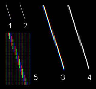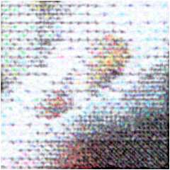
ClearType is Microsoft's implementation of subpixel rendering technology in rendering text in a font system. ClearType attempts to improve the appearance of text on certain types of computer display screens by sacrificing color fidelity for additional intensity variation. This trade-off is asserted to work well on LCD flat panel monitors.
Metafont is a description language used to define raster fonts. It is also the name of the interpreter that executes Metafont code, generating the bitmap fonts that can be embedded into e.g. PostScript. Metafont was devised by Donald Knuth as a companion to his TeX typesetting system.

A typeface is a design of letters, numbers and other symbols, to be used in printing or for electronic display. Most typefaces include variations in size, weight, slope, width, and so on. Each of these variations of the typeface is a font.

Arial is a sans-serif typeface in the neo-grotesque style. Fonts from the Arial family are included with all versions of Microsoft Windows after Windows 3.1, as well as in other Microsoft programs, Apple's macOS, and many PostScript 3 printers. In Office 2007, Arial was replaced by Calibri as the default typeface in PowerPoint, Excel, and Outlook.

Univers is a large sans-serif typeface family designed by Adrian Frutiger and released by his employer Deberny & Peignot in 1957. Classified as a neo-grotesque sans-serif, one based on the model of nineteenth-century German typefaces such as Akzidenz-Grotesk, it was notable for its availability from the moment of its launch in a comprehensive range of weights and widths. The original marketing for Univers deliberately referenced the periodic table to emphasise its scope.

Dots per inch is a measure of spatial printing, video or image scanner dot density, in particular the number of individual dots that can be placed in a line within the span of 1 inch (2.54 cm). Similarly, dots per centimetre refers to the number of individual dots that can be placed within a line of 1 centimetre (0.394 in).

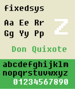
Fixedsys is a family of raster monospaced fonts. The name means fixed system, because its glyphs are monospace or fixed-width. It is the oldest font in Microsoft Windows, and was the system font in Windows 1.0 and 2.0, where it was simply named "System". For Windows 3.x, the system font was changed to a proportional sans-serif font named System, but Fixedsys remained the default font in Notepad.
An em is a unit in the field of typography, equal to the currently specified point size. For example, one em in a 16-point typeface is 16 points. Therefore, this unit is the same for all typefaces at a given point size.

In typography, the point is the smallest unit of measure. It is used for measuring font size, leading, and other items on a printed page. The size of the point has varied throughout printing's history. Since the 18th century, the size of a point has been between 0.18 and 0.4 millimeters. Following the advent of desktop publishing in the 1980s and 1990s, digital printing has largely supplanted the letterpress printing and has established the desktop publishing (DTP) point as the de facto standard. The DTP point is defined as 1⁄72 of an inch and, as with earlier American point sizes, is considered to be 1⁄12 of a pica.
A computer font is implemented as a digital data file containing a set of graphically related glyphs. A computer font is designed and created using a font editor. A computer font specifically designed for the computer screen, and not for printing, is a screen font.

Font rasterization is the process of converting text from a vector description to a raster or bitmap description. This often involves some anti-aliasing on screen text to make it smoother and easier to read. It may also involve hinting—information embedded in the font data that optimizes rendering details for particular character sizes.

Lucida Grande is a humanist sans-serif typeface. It is a member of the Lucida family of typefaces designed by Charles Bigelow and Kris Holmes. It is best known for its implementation throughout the macOS user interface from 1999 to 2014, as well as in other Apple software like Safari for Windows. As of OS X Yosemite, the system font was changed from Lucida Grande to Helvetica Neue. In OS X El Capitan the system font changed again, this time to San Francisco.
TeX font metric (TFM) is a font file format used by the TeX typesetting system. It is a font metric format, not an outline font format like TrueType, because it provides only the information necessary to typeset the font such as each character's width, height and depth. The actual glyphs are stored elsewhere. This is not unique to TeX; Adobe's AFM files and Windows' PFM files use the same technique.

misc-fixed is a collection of monospace bitmap fonts that is distributed with the X Window System. It is a set of independent bitmap fonts which—apart from all being sans-serif fonts—cannot be described as belonging to a single font family. The misc-fixed fonts were the first fonts available for the X Window System. Their individual origin is not attributed, but it is likely that many of them were created in the early or mid 1980s as part of MIT's Project Athena, or at its industrial partner, DEC. The misc-fixed fonts are in the public domain.
The Glyph Bitmap Distribution Format (BDF) by Adobe is a file format for storing bitmap fonts. The content takes the form of a text file intended to be human- and computer-readable. BDF is typically used in Unix X Window environments. It has largely been replaced by the PCF font format which is somewhat more efficient, and by scalable fonts such as OpenType and TrueType fonts.
Segoe is a typeface, or family of fonts, that is best known for its use by Microsoft. The company uses Segoe in its online and printed marketing materials, including recent logos for a number of products. Additionally, the Segoe UI font sub-family is used by numerous Microsoft applications, and may be installed by applications. It was adopted as Microsoft's default operating system font, and is also used on Outlook.com, Microsoft's web-based email service. On August 23, 2012, Microsoft unveiled its new corporate logo typeset in Segoe, replacing the logo it had used for the previous 25 years.

In metal typesetting, a font or fount is a particular size, weight and style of a typeface. Each font is a matched set of type, with a piece for each glyph. A typeface consists of various fonts that share an overall design.
Meiryo is a Japanese sans-serif gothic typeface. Microsoft bundled Meiryo with Office Mac 2008 as part of the standard install, and it replaces MS Gothic as the default system font on Japanese systems beginning with Windows Vista.
Resolution independence is where elements on a computer screen are rendered at sizes independent from the pixel grid, resulting in a graphical user interface that is displayed at a consistent physical size, regardless of the resolution of the screen.
PostScript fonts are font files encoded in outline font specifications developed by Adobe Systems for professional digital typesetting. This system uses PostScript file format to encode font information.

