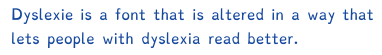
Dyslexie

Last updated
Dyslexie
Dyslexie sample font.tiff
Category Sans-serif
Designer(s) Christian Boer
Foundry Dyslexie font
Date created2008 [1]
License proprietary [2]
VariationsDyslexie regular, bold, italic, italic bold
Website www.dyslexiefont.com

Dyslexie is a typeface/font that was designed with the intention of mitigating some of the issues that dyslexics experience when reading. As many of the twenty-six letters of the basic Latin alphabet are visually very similar, the typeface emphasizes the parts of the letter that are different from each other. [3]

Contents

There is no evidence that the font aids reading, neither in those with, nor without, dyslexia. [4]

Creation

The typeface was designed by Dutch graphic designer Christian Boer in 2008 while he was majoring in graphic design at the University of Twente. He had himself struggled with dyslexia for much of his life. [1] [5]

In an interview, Boer stated that he came up with the typeface after a difficult final he was studying for. Its creation was an attempt to keep the characters from appearing to spin around, a symptom often reported in dyslexics. Boer related this to the way most people think in words: dyslexics cannot stop seeing letters differently just as non-dyslexic people cannot stop thinking in words. [6]

Font

Dyslexie uses a heavier line thickness to emphasize the bottom of most characters. This is to try to 'anchor' the letters since some people with dyslexia may see letters either moving or in three dimensions. [7] Since dyslexics tend to get b, d, p, and q mixed up, it also emphasizes a slight slant downwards on the curvature of the letters. Letters such as c or e may gape slightly more, or slump slightly in one direction. Also, in letters such as n or h, the font slightly elongates or diminishes the stem on the letters. So the letter h would have a longer line, and n would have a lower line. In addition, the font also thickens or bolds capital letters and punctuations, so that it is easier to identify when a sentence starts or ends. [8]

Research

Research does not suggest that the font is beneficial in aiding reading. [4] [9] Neither children with or without dyslexia read faster or more accurately with the font. It was also not the preferred font of the children tested. Data suggested that the font a child prefers is probably the most effective for them. [4]

No research to date has found a statistically significant beneficial effect on reading for dyslexics from any font specifically designed for dyslexia. [10] [11]

Related Research Articles

<span class="mw-page-title-main">Dyslexia</span> Specific learning disability characterized by troubles with reading

Dyslexia, previously known as word blindness, is a learning disability that affects either reading or writing. Different people are affected to different degrees. Problems may include difficulties in spelling words, reading quickly, writing words, "sounding out" words in the head, pronouncing words when reading aloud and understanding what one reads. Often these difficulties are first noticed at school. The difficulties are involuntary, and people with this disorder have a normal desire to learn. People with dyslexia have higher rates of attention deficit hyperactivity disorder (ADHD), developmental language disorders, and difficulties with numbers.

<span class="mw-page-title-main">Typography</span> Art of arranging type

Typography is the art and technique of arranging type to make written language legible, readable and appealing when displayed. The arrangement of type involves selecting typefaces, point sizes, line lengths, line spacing, letter spacing, and spaces between pairs of letters. The term typography is also applied to the style, arrangement, and appearance of the letters, numbers, and symbols created by the process. Type design is a closely related craft, sometimes considered part of typography; most typographers do not design typefaces, and some type designers do not consider themselves typographers. Typography also may be used as an ornamental and decorative device, unrelated to the communication of information.

In typography, a serif is a small line or stroke regularly attached to the end of a larger stroke in a letter or symbol within a particular font or family of fonts. A typeface or "font family" making use of serifs is called a serif typeface, and a typeface that does not include them is sans-serif. Some typography sources refer to sans-serif typefaces as "grotesque" or "Gothic", and serif typefaces as "roman".

<span class="mw-page-title-main">Typeface</span> Set of characters that share common design features

A typeface is a design of letters, numbers and other symbols, to be used in printing or for electronic display. Most typefaces include variations in size, weight, slope, width, and so on. Each of these variations of the typeface is a font.

<span class="mw-page-title-main">Bodoni</span> Serif typeface

Bodoni is the name given to the serif typefaces first designed by Giambattista Bodoni (1740–1813) in the late eighteenth century and frequently revived since. Bodoni's typefaces are classified as Didone or modern. Bodoni followed the ideas of John Baskerville, as found in the printing type Baskerville—increased stroke contrast reflecting developing printing technology and a more vertical axis—but he took them to a more extreme conclusion. Bodoni had a long career and his designs changed and varied, ending with a typeface of a slightly condensed underlying structure with flat, unbracketed serifs, extreme contrast between thick and thin strokes, and an overall geometric construction.

<span class="mw-page-title-main">Gill Sans</span> Humanist sans-serif typeface family developed by Monotype

Gill Sans is a humanist sans-serif typeface designed by Eric Gill and released by the British branch of Monotype from 1928 onwards.

<span class="mw-page-title-main">Comic Sans</span> Sans-serif typeface family by Microsoft Corporation

Comic Sans MS is a sans-serif typeface designed by Vincent Connare and released in 1994 by Microsoft Corporation. It is a non-connecting script inspired by comic book lettering, intended for use in cartoon speech bubbles, as well as in other casual environments, such as informal documents and children's materials.

x-height Measurement of letters in a typeface

In typography, the x-height, or corpus size, is the distance between the baseline and the mean line of lowercase letters in a typeface. Typically, this is the height of the letter x in the font, as well as the letters v, w, and z. One of the most important dimensions of a font, x-height defines how high lowercase letters without ascenders are compared to the cap height of uppercase letters.

<span class="mw-page-title-main">Myriad (typeface)</span> Sans-serif typeface family

Myriad is a humanist sans-serif typeface designed by Robert Slimbach and Carol Twombly for Adobe Systems. Myriad was intended as a neutral, general-purpose typeface that could fulfill a range of uses and have a form easily expandable by computer-aided design to a large range of weights and widths.

Letter spacing, character spacing or tracking is an optically consistent typographical adjustment to the space between letters to change the visual density of a line or block of text. Letter spacing is distinct from kerning, which adjusts the spacing of particular pairs of adjacent characters such as "7." which would appear to be badly spaced if left unadjusted, and leading, the spacing between lines.

<span class="mw-page-title-main">Font</span> Particular size, weight and style of a typeface

In metal typesetting, a font is a particular size, weight and style of a typeface. Each font is a matched set of type, with a piece for each glyph. A typeface consists of various fonts that share an overall design.

Legibility is the ease with which a reader can decode symbols. In addition to written language, it can also refer to behaviour or architecture, for example. From the perspective of communication research, it can be described as a measure of the permeability of a communication channel. A large number of known factors can affect legibility.

<span class="mw-page-title-main">Management of dyslexia</span>

Management of dyslexia depends on a multitude of variables; there is no one specific strategy or set of strategies that will work for all who have dyslexia.

The history of dyslexia research spans from the late 1800s to the present.

Dyslexia is a reading disorder wherein an individual experiences trouble with reading. Individuals with dyslexia have normal levels of intelligence but can exhibit difficulties with spelling, reading fluency, pronunciation, "sounding out" words, writing out words, and reading comprehension. The neurological nature and underlying causes of dyslexia are an active area of research. However, some experts believe that the distinction of dyslexia as a separate reading disorder and therefore recognized disability is a topic of some controversy.

Dyslexia is a complex, lifelong disorder involving difficulty in learning to read or interpret words, letters and other symbols. Dyslexia does not affect general intelligence, but is often co-diagnosed with ADHD. There are at least three sub-types of dyslexia that have been recognized by researchers: orthographic, or surface dyslexia, phonological dyslexia and mixed dyslexia where individuals exhibit symptoms of both orthographic and phonological dyslexia. Studies have shown that dyslexia is genetic and can be passed down through families, but it is important to note that, although a genetic disorder, there is no specific locus in the brain for reading and writing. The human brain does have language centers, but written language is a cultural artifact, and a very complex one requiring brain regions designed to recognize and interpret written symbols as representations of language in rapid synchronization. The complexity of the system and the lack of genetic predisposition for it is one possible explanation for the difficulty in acquiring and understanding written language.

<span class="mw-page-title-main">OpenDyslexic</span> Typeface designed to mitigate reading errors caused by dyslexia

OpenDyslexic is a free typeface/font designed to mitigate some of the common reading errors caused by dyslexia. The typeface was created by Abbie Gonzalez, who released it through an open-source license. The design is based on DejaVu Sans, also an open-source font.

EasyReading font is a typeface designed to support all of the Latin-alphabet-based languages existing in the world, including those ranging from Turkish and Indonesian, to Swedish. It was created by Federico Alfonsetti with a Design for All methodological approach to help dyslectics in reading with less difficulty and to increase reading speed, while also being a highly-readable font for typical readers.

Oswald Labs is a Dutch-Indian based accessibility technology company that builds products for individuals with disabilities. It specializes in enterprise web accessibility, offers smartphone apps, and also runs a startup accelerator. It was established in 2016 by Anand Chowdhary, Nishant Gadihoke and Mahendra Raghuwanshi after their product, Oswald Extension, won an event at the AngelHack hackathon in New Delhi.

<span class="mw-page-title-main">Fat face</span> Style of display typeface and lettering

In typography, a fat face letterform is a serif typeface or piece of lettering in the Didone or modern style with an extremely bold design. Fat face typefaces appeared in London around 1805–1810 and became widely popular; John Lewis describes the fat face as "the first real display typeface."

References

  1. 1 2 Nalewicki, Jennifer (October 26, 2011). "Bold Stroke: New Font Helps Dyslexics Read". Scientific American.
  2. "Order Dyslexie". Studiostudio.nl. Archived from the original on 2017-12-10. Retrieved December 15, 2012.
  3. Sawers, Paul (30 June 2011). "Dyslexie: A typeface for dyslexics". Thenextweb.com. Retrieved April 9, 2012.
  4. 1 2 3 Kuster, Sanne M.; van Weerdenburg, Marjolijn; Gompel, Marjolein; Bosman, Anna M. T. (April 2018). "Dyslexie font does not benefit reading in children with or without dyslexia". Annals of Dyslexia. 68 (1): 25–42. doi:10.1007/s11881-017-0154-6. ISSN   0736-9387. PMC   5934461 . PMID   29204931.
  5. Gann, Carrie. "Special Font Helps Dyslexics Mind Their Ps and Qs". Abcnews.go.com. Retrieved April 9, 2012.
  6. Allen, Rebekah. "Christian Boer". Dailybrink.com. Archived from the original on March 19, 2012. Retrieved April 9, 2012.
  7. Gonzalez, Robert (26 October 2011). "Check out "Dyslexie," a new font that helps dyslexics read with ease". Io9.com. Retrieved April 9, 2012.
  8. O'Connor, Mary. "Dyslexie font designed to help dyslexics read, write". Smartplanet.com. Retrieved April 9, 2012.
  9. Leeuw de, Renske (21 December 2010). "Special font for dyslexia?". Essay.utwente.nl. Retrieved April 9, 2013.
  10. "Which Font is Best For Dyslexic Users? The Science Reviewed". S-E-O.org. Retrieved 2018-09-20.
  11. "TYPOGRAPHY & DYSLEXIA (Bigelow & Holmes)". Bigelowandholmes.typepad.com. Retrieved 2017-02-27.

See also