Type design is the art and process of designing typefaces. This involves drawing each letterform using a consistent style. The basic concepts and design variables are described below.
A typeface differs from other modes of graphic production such as handwriting and drawing in that it is a fixed set of alphanumeric characters with specific characteristics to be used repetitively. Historically, these were physical elements, called sorts, placed in a wooden frame; modern typefaces are stored and used electronically. It is the art of a type designer to develop a pleasing and functional typeface. In contrast, it is the task of the typographer (or typesetter) to lay out a page using a typeface that is appropriate to the work to be printed or displayed.
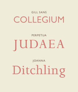
Type designers use the basic concepts of strokes, counter, body, and structural groups when designing typefaces. There are also variablesthat type designers take into account when creating typefaces. These design variables are style, weight, contrast, width, posture, and case.
History
The technology of printing text using movable type was invented in China,[1] but the vast number of Chinese characters, and the esteem in which calligraphy was held, meant that few distinctive, complete typefaces were created in China in the early centuries of printing.
Gutenberg's most important innovation in the mid 15th century development of his press was not printing itself, but the casting of Latinate types. Unlike Chinese characters, which are based on a uniform square area, European Latin characters vary in width, from the very wide "M" to the slender "l". Gutenberg developed an adjustable mold which could accommodate an infinite variety of widths. From then until at least 400 years later, type started with cutting punches, which would be struck into a brass "matrix". The matrix was inserted into the bottom of the adjustable mold and the negative space formed by the mold cavity plus the matrix acted as the master for each letter that was cast. The casting material was an alloy usually containing lead, which has a low melting point, cools readily, and can easily be filed and finished. In those early days, type design had to not only imitate the handwritten forms familiar to readers, but also account for the limitations of the printing process, such as rough papers of uneven thicknesses, the squeezing or splashing properties of the ink, and the eventual wear on the type itself.
Beginning in the 1890s, each character was drawn in a very large size for the American Type Founders Corporation and a few others using their technology—over a foot (30cm) high. The outline was then traced by a Benton pantograph-based engraving machine with a pointer at the hand-held vertex and a cutting tool at the opposite vertex down to a size usually less than a quarter-inch (6mm). The pantographic engraver was first used to cut punches, and later to directly create matrices.
In the late 1960s through the 1980s, typesetting moved from metal to photo composition. During this time, type design made a similar transition from physical matrices to hand-drawn letters on vellum or mylar and then the precise cutting of "rubyliths". Rubylith was a common material in the printing trade, in which a very soft, pliable transparent red film was bonded to a supporting clear acetate. Placing the ruby over the master drawing of the letter, the craftsman would gently and precisely cut through the upper film and peel the non-image portions away. The resulting letterform, now existing as the remaining red material still adhering to the clear substrate, would then be ready to be photographed using a reproduction camera.
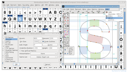
With the coming of computers, type design became a form of computer graphics. Initially, this transition occurred with a program called Ikarus around 1980, but widespread transition began with programs such as Aldus Freehand and Adobe Illustrator, and finally to dedicated type design programs called font editors, such as Fontographer and FontLab. This process occurred rapidly: by the mid-1990s, virtually all commercial type design had transitioned to digital vector drawing programs.
Each glyph design can be drawn or traced by a stylus on a digitizing board, or modified from a scanned drawing, or composed entirely within the program itself. Each glyph is then in a digital form, either in a bitmap (pixel-based) or vector (scalable outline) format. A given digitization of a typeface can easily be modified by another type designer; such a modified font is usually considered a derivative work, and is covered by the copyright of the original font software.
Type design could be copyrighted typeface by typeface in many countries, though not the United States. The United States offered and continues to offer design patents as an option for typeface design protection.[2]
The shape of designed letterforms and other characters are defined by strokes arranged in specific combinations. This shaping and construction has a basis in the gestural movements of handwriting. The visual qualities of a given stroke are derived from factors surrounding its formation: the kind of tool used, the angle at which the tool is dragged across a surface, and the degree of pressure applied from beginning to end. The stroke is the positive form that establishes a character's archetypal shape.[3]:49
Counter
The spaces created between and around strokes are called counters (also known as counterforms). These negative forms help to define the proportion, density, and rhythm of letterforms. The counter is an integral element in Western typography, however this concept may not apply universally to non-Western typographic traditions. More complex scripts, such as Chinese, which make use of compounding elements (radicals) within a single character may additionally require consideration of spacing not only between characters but also within characters.[4]
Body
The overall proportion of characters, or their body, considers proportions of width and height for all cases involved (which in Latin are uppercase and lowercase), and individually for each character. In the former case, a grid system is used to delineate vertical proportions and gridlines (such as the baseline, mean line/x-height, cap line, descent line, and ascent line). In the latter case, letterforms of a typeface may be designed with variable bodies, making the typeface proportional, or they may be designed to fit within a single body measure, making the typeface fixed width or monospaced.
Structural groups
When designing letterforms, characters with analogous structures can be grouped in consideration of their shared visual qualities. In Latin, for example, archetypal groups can be made on the basis of the dominant strokes of each letter: verticals and horizontals (E F H L T), diagonals (V W X), verticals and diagonals (K M N Y), horizontals and diagonals (A Z), circular strokes (C O Q S), circular strokes and verticals (B D G P R U), and verticals (I J).
Design variables
Type design takes into consideration a number of design variables which are delineated based on writing system and vary in consideration of functionality, aesthetic quality, cultural expectations, and historical context.[3]:48
Weight refers to the thickness or thinness of a typeface's strokes in a global sense. Typefaces usually have a default medium, or regular, weight which will produce the appearance of a uniform grey value when set in text. Categories of weight include hairline, thin, extra light, light, book, regular/medium, semibold, bold, black/heavy, and extra black/ultra.
Variable fonts are computer fonts that are able to store and make use of a continuous range of weight (and size) variants of a single typeface.
Contrast
Contrast refers to the variation in weight that may exist internally within each character, between thin strokes and thick strokes. More extreme contrasts will produce texts with more uneven typographic color. At a smaller scale, strokes within a character may individually also exhibit contrasts in weight, which is called modulation.
Each character within a typeface has its own overall width relative to its height. These proportions may be changed globally so that characters are narrowed or widened. Typefaces that are narrowed are called condensed typefaces, while those that are widened are called extended typefaces.
Letterform structures may be structured in a way that changes the angle between upright stem structures and the typeface's baseline, changing the overall posture of the typeface. In Latin script typefaces, a typeface is categorized as a Roman when this angle is perpendicular. A forward-leaning angle produces either an Italic, if the letterforms are designed with reanalyzed cursive forms, or an oblique, if the letterforms are slanted mechanically. A back-leaning angle produces a reverse oblique, or backslanted, posture.
Case
Ascenders (as in "h") and descenders (as in "p") make the height of lower-case letters vary.
A proportion of writing systems are bicameral, distinguishing between two parallel sets of letters that vary in use based on prescribed grammar or convention. These sets of letters are known as cases. The larger case is called uppercase or capitals (also known as majuscule) and the smaller case is called lowercase (also known as minuscule). Typefaces may also include a set of small capitals, which are uppercase forms designed in the same height and weight as lowercase forms. Other writing systems are unicameral, meaning only one case exists for letterforms. Bicameral writing systems may have typefaces with unicase designs, which mix uppercase and lowercase letterforms within a single case.
Principles
The design of a legible text-based typeface remains one of the most challenging assignments in graphic design. The even visual quality of the reading material being of paramount importance, each drawn character (called a glyph) must be even in appearance with every other glyph regardless of order or sequence. Also, if the typeface is to be versatile, it must appear the same whether it is small or large. Because of optical illusions that occur when we apprehend small or large objects, this entails that in the best fonts, a version is designed for small use and another version is drawn for large, display, applications. Also, large letterforms reveal their shape, whereas small letterforms in text settings reveal only their textures: this requires that any typeface that aspires to versatility in both text and display, needs to be evaluated in both of these visual domains. A beautifully shaped typeface may not have a particularly attractive or legible texture when seen in text settings.
Spacing is also an important part of type design. Each glyph consists not only of the shape of the character, but also the white space around it. The type designer must consider the relationship of the space within a letter form (the counter) and the letter spacing between them.
Designing type requires many accommodations for the quirks of human perception, "optical corrections" required to make shapes look right, in ways that diverge from what might seem mathematically right. For example, round shapes need to be slightly bigger than square ones to appear "the same" size ("overshoot"), and vertical lines need to be thicker than horizontal ones to appear the same thickness. For a character to be perceived as geometrically round, it must usually be slightly "squared" off (made slightly wider at the shoulders). As a result of all these subtleties, excellence in type design is highly respected in the design professions.
Type design is performed by a type designer. It is a craft, blending elements of art and science. In the pre-digital era it was primarily learned through apprenticeship and professional training within the industry. Since the mid-1990s it has become the subject of dedicated degree programs at a handful of universities, including the MA Typeface Design at the University of Reading (UK) and the Type Media program at the KABK (Royal Academy of Art in the Hague). At the same time, the transition to digital type and font editors which can be inexpensive (or even open source and free) has led to a great democratization of type design; the craft is accessible to anyone with the interest to pursue it, nevertheless, it may take a very long time for the serious artist to master.
Israeli typographer Henri Friedlaender examines Hadassah Hebrew typeface sketches. The sequence was shot in his study in Motza-Illit (near Jerusalem) in 1978.
References
↑Needham, Joseph (1994). The Shorter Science and Civilisation in China, Volume 4. Cambridge University Press. p.14. ISBN9780521329958. Bi Sheng... who first devised, about 1045, the art of printing with movable type
↑"Types of Patents". United States Patent and Trademark Office. Retrieved 6 March 2015.
12Samara, Timothy (2018). Letterforms: Typeface Design From Past to Future. Minneapolis: Rockport Publishers. ISBN978-1631594731.
↑Takagi, Mariko (2012). "Typography between Chinese complex characters and Latin Letters". ATypI 2012 Hong Kong: 11.
Further reading
Stiebner, Erhardt D. & Dieter Urban. Initials and Decorative Alphabets. Poole, England: Blandford Press, 1985. ISBN0-7137-1640-1
This page is based on this Wikipedia article Text is available under the CC BY-SA 4.0 license; additional terms may apply. Images, videos and audio are available under their respective licenses.