Diagram of font metrics showing where letters and symbols would be placed relative to each other. The letters would change size according to the font type, typographic unit and dimension used.
Typographic units are the units of measurement used in typography or typesetting. Traditional typometry units are different from familiar metric units because they were established in the early days of printing. Though most printing is digital now, the old terms and units have persisted.
Even though these units are all very small, across a line of print they add up quickly. Confusions such as resetting text originally in type of one unit in type of another will result in words moving from one line to the next, resulting in all sorts of typesetting errors (viz. rivers, widows and orphans, disrupted tables, and misplaced captions). Before the popularization of desktop publishing, type measurements were done with a tool called a typometer.[1]
Development
In Europe, the Didot point system was created by François-Ambroise Didot (1730–1804) in c. 1783. Didot's system was based on Pierre Simon Fournier's (1712–1768), but Didot modified Fournier's by adjusting the base unit precisely to a French Royal inch (pouce), as Fournier's unit was based on a less common foot.
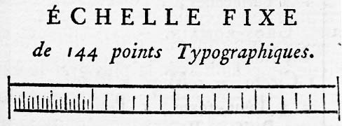
(Fournier's printed scale of his point system, from Manuel Typographique, Barbou, Paris 1764, enlarged)
However, the basic idea of the point system – to generate different type sizes by multiplying a single minimum unit calculated by dividing a base measurement unit such as one French Royal inch – was not Didot's invention, but Fournier's.[note 1] In Fournier's system, an approximate French Royal inch (pouce) is divided by 12 to calculate 1 ligne, which is then divided by 6 to get 1 point. Didot just made the base unit (one French Royal inch) identical to the standard value defined by the government.
In Didot's point system:
1 point = 1⁄6ligne = 1⁄72French Royal inch = 15625⁄41559mm ≤0.3759715104mm, however in practice mostly: 0.376mm (i.e. + 0.0076%).
Both in Didot's and Fournier's systems, some point sizes have traditional names such as Cicero (before introduction of point systems, type sizes were called by names such as Cicero, Pica, Ruby, Great Primer, etc.).
1 cicero = 12 Didot points = 1⁄6 French Royal inch = 62500⁄13853mm ≤4.5116581246mm, also in practice mostly: 4.512mm (i.e. + 0.0076%).
The Didot point system has been widely used in European countries. An abbreviation for it that these countries use is "dd", employing an old method for indicating plurals. Hence "12dd" means twelve didot points.
In Britain and the United States, many proposals for type size standardization had been made by the end of 19th century (such as Bruce Typefoundry's mathematical system that was based on a precise geometric progression). However, no nationwide standard was created until the American Point System was decided in 1886.
The American Point System was proposed by Nelson C. Hawks of Marder Luse & Company in Chicago in the 1870s, and his point system used the same method of size division as Fournier's; viz. dividing 1inch by 6 to get 1 pica, and dividing it again by 12 to get 1 point. However, the American Point System standardized finally in 1886 is different from Hawks' original idea in that 1 pica is not precisely equal to 1⁄6inch (neither the Imperial inch nor the US inch), as the United States Type Founders' Association defined the standard pica to be the Johnson Pica, which had been adopted and used by Mackellar, Smiths and Jordan type foundry (MS&J), Philadelphia. As MS&J was very influential in those days, many other type foundries were using the Johnson Pica.[note 2] Also, MS&J defined that 83 Picas are equal to 35 centimeters. The choice of the metric unit for the prototype was because at the time the Imperial and US inches differed in size slightly, and neither country could legally specify a unit of the other.
The Johnson Pica was named after Lawrence Johnson who had succeeded Binny & Ronaldson in 1833. Binny & Ronaldson was one of the oldest type foundries in the United States, established in Philadelphia in 1796. Binny & Ronaldson had bought the type founding equipment of Benjamin Franklin's (1706–1790) type foundry established in 1786 and run by his grandson Benjamin Franklin Bache (1769–1798). The equipment is thought to be that which Benjamin Franklin purchased from Pierre Simon Fournier when he visited France for diplomatic purposes (1776–85).
The official standard approved by the Fifteenth Meeting of the Type Founders Association of the United States in 1886 was this Johnson pica, equal to exactly 0.166inch.[citation needed] Therefore, the two other – very close – definitions, 1200/7227inch and 350/83mm, are both unofficial[citation needed].
Monotype wedges used in England and America were based on a pica = .1660inch. But on the European continent all available wedges were based on the "old-pica" 1 pica - .1667inch. These wedges were marked with an extra E behind the numbers of the wedge and the set. These differences can also be found in the tables of the manuals.
In the American point system:
1 Johnson pica = exactly 0.166inch (versus 0.166 = 1⁄6inch for the DTP-pica) = 4.2164mm.
1 point = 1⁄12 pica = exactly 0.01383 inch = 0.35136mm.
The American point system has been used in the US, Britain, Japan, and many other countries.
Today, digital printing and display devices and page layout software use a unit that is different from these traditional typographic units. On many digital printing systems (desktop publishing systems in particular), the following equations are applicable (with exceptions, most notably the popular TeX typesetting system and its derivatives[2]).
1 pica = 1⁄6inch (British/American inch of today) = 4.233mm.
1 point = 1⁄12 pica = 1⁄72 inch = 127⁄360mm = 0.3527mm.
Digital displays and printing led to the use an additional unit:
1 twip = 1⁄20 point = 1⁄1440 inch = 127⁄7200mm = 0.017638mm.
Fournier's original method of division is now restored in today's digital typography.[citation needed]
Comparing a piece of type in didots for Continental European countries – 12dd, for example – to a piece of type for an English-speaking country – 12pt – shows that the main body of a character is actually about the same size. The difference is that the languages of the former often need extra space atop the capital letters for accent marks (e.g. Ñ, Â, Ö, É), but English rarely needs this.
The traditional typographic units are based either on non-metric units, or on odd multiples (such as 35⁄83) of a metric unit. There are no specifically metric units for this particular purpose, although there is a DIN standard sometimes used in German publishing, which measures type sizes in multiples of 0.25mm, and proponents of the metrication of typography generally recommend the use of the millimetre for typographical measurements, rather than the development of new specifically typographical metric units. The Japanese already do this for their own characters (using the kyu, which is q in romanized Japanese and is also 0.25mm), and have metric-sized type for European languages as well. One advantage of the q is that it reintroduces the proportional integer division of 3mm (12q) by 6 & 4.
During the age of the French Revolution or Napoleonic Empire, the French established a typographic unit of 0.4mm, but except for the government's print shops, this did not catch on.
In 1973, the didot was restandardized in the EU as 0.375 (= 3⁄8)mm.[citation needed] Care must be taken because the name of the unit is often left unmodified. The Germans, however, use the terms Fournier-Punkt and Didot-Punkt for the earlier ones, and Typografischer Punkt for this metric one. The TeX typesetting system uses the abbreviation dd for the earlier definition, and nd for the metric new didot[2]
Notes
↑ Actually, Sebastien Truchet (1657–1729) had invented a similar type sizing system before Fournier implemented his point system. Truchet's system was applied to the types of the Imprimerie Royale, the romains du roi. It is thought that Fournier knew about Truchet's scheme that was based on the standard French Royal inch and a very fine unit of 1⁄204ligne. For further information on Truchet's system, refer to James Mosley's "The New Type Bodies of the Imprimerie Royale", pp. 400–408, Vol. 3, The Manuel Typographique of Pierre-Simon Fournier le jeune, Darmstadt 1995. and Jacques André's "Truchet & Types" .
↑ Regarding the background of the adoption of the Johnson Pica, Mr. Richard L. Hopkins, author of Origin of The American Point System says: "The major issue then was the expense involved in re-tooling literally hundreds of molds in each foundry to make them all conform to the new system. If they could avoid just a few sizes being altered, it would save hundreds of thousands of dollars. That is why the MS&J (Johnson) pica was adopted."
Select bibliography
Boag, Andrew. "Typographic measurement: a chronology", Typography papers, no. 1, 1996, The Department of Typography and Graphic Communication, The University of Reading, Reading 1996.
Bruce's Son & Company, Specimen of Printing Types, incl. Theo. L. DeVinne's "The Invention of Printing", New York 1878.
Carter, Harry. Fournier on Typefounding, The Soncino Press, London 1930.
Fournier, Pierre Simon, The Manuel Typographique of Pierre-Simon Fournier le jeune, Vols. I–III, Ed. by James Mosley, Darmstadt 1995.
Fournier, Pierre Simon. Modèles des Caractères de l'Imprimerie, including James Mosley's introduction, Eugrammia Press, London 1965.
Fournier, Pierre Simon. Manuel Typographique, Vols. I & II, Fournier & Barbou, Paris 1764–1766.
Hansard, T. C. Typographia, Baldwin, Cradock, and Joy, London 1825.
Hopkins, Richard L. Origin of The American Point System, Hill & Dale Private Press, Terra Alta 1976.
Hutt, Allen. Fournier, the complete typographer, Rowman and Littlefield, Totowa, NJ 1972.
Johnson, John. Typographia, Longman, Hurst, Rees, Orme, Brown & Green, London 1824.
Jones, Thomas Roy, Printing in America, The Newcomen Society of England, American Branch, New York 1948.
MacKellar Smiths & Jordan. One Hundred Years, Philadelphia 1896.
Mosley, James. "French Academicians and Modern Typography: Designing New Types in the 1690s", Typography papers, no. 2, 1997, The Department of Typography and Graphic Communication, The University of Reading, Reading 1997.
Moxon, Joseph. Mechanick Exercises On The Whole Art Of Printing, Oxford University Press, London 1958.
Ovink, G. Willem. "From Fournier to metric, and from lead to film", Quaerendo, Volume IX 2 & 4, Theatrum Orbis Terrarum Ltd., Amsterdam 1979.
Smith, John. The Printer's Grammar, L. Wayland, London 1787.
The inch is a unit of length in the British Imperial and the United States customary systems of measurement. It is equal to 1/36 yard or 1/12 of a foot. Derived from the Roman uncia ("twelfth"), the word inch is also sometimes used to translate similar units in other measurement systems, usually understood as deriving from the width of the human thumb.
Typography is the art and technique of arranging type to make written language legible, readable and appealing when displayed. The arrangement of type involves selecting typefaces, point sizes, line lengths, line spacing, letter spacing, and spaces between pairs of letters. The term typography is also applied to the style, arrangement, and appearance of the letters, numbers, and symbols created by the process. Type design is a closely related craft, sometimes considered part of typography; most typographers do not design typefaces, and some type designers do not consider themselves typographers. Typography also may be used as an ornamental and decorative device, unrelated to the communication of information.
A typeface is a design of letters, numbers and other symbols, to be used in printing or for electronic display. Most typefaces include variations in size, weight, slope, width, and so on. Each of these variations of the typeface is a font.
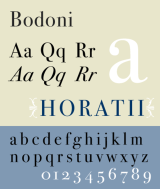
Bodoni is the name given to the serif typefaces first designed by Giambattista Bodoni (1740–1813) in the late eighteenth century and frequently revived since. Bodoni's typefaces are classified as Didone or modern. Bodoni followed the ideas of John Baskerville, as found in the printing type Baskerville—increased stroke contrast reflecting developing printing technology and a more vertical axis—but he took them to a more extreme conclusion. Bodoni had a long career and his designs changed and varied, ending with a typeface of a slightly condensed underlying structure with flat, unbracketed serifs, extreme contrast between thick and thin strokes, and an overall geometric construction.
Phototypesetting is a method of setting type which uses photography to make columns of type on a scroll of photographic paper. It has been made obsolete by the popularity of the personal computer and desktop publishing which gave rise to digital typesetting.
An em is a unit in the field of typography, equal to the currently specified point size. For example, one em in a 16-point typeface is 16 points. Therefore, this unit is the same for all typefaces at a given point size.
The pica is a typographic unit of measure corresponding to approximately 1⁄6 of an inch, or from 1⁄68 to 1⁄73 of a foot. One pica is further divided into 12 points.
In typography, the point is the smallest unit of measure. It is used for measuring font size, leading, and other items on a printed page. The size of the point has varied throughout printing's history. Since the 18th century, the size of a point has been between 0.18 and 0.4 millimeters. Following the advent of desktop publishing in the 1980s and 1990s, digital printing has largely supplanted the letterpress printing and has established the desktop publishing (DTP) point as the de facto standard. The DTP point is defined as 1⁄72 of an inch and, as with earlier American point sizes, is considered to be 1⁄12 of a pica.
Metric typographic units have been devised and proposed several times to overcome the various traditional point systems. After the French Revolution of 1789 one popular proponent of a switch to metric was Didot, who had been able to standardise the continental European typographic measurement a few decades earlier. The conversion did not happen, though. The Didot point was metrically redefined as 1⁄2660 m (≈ 0.376 mm) in 1879 by Berthold.
Didot is the name of a family of French printers, punch-cutters and publishers. Through its achievements and advancements in printing, publishing and typography, the family has lent its name to typographic measurements developed by François-Ambroise Didot and the Didot typeface developed by Firmin Didot. The Didot company of France was ultimately incorporated into the modern CPI printing group.
A cicero is a unit of measure used in typography in Italy, France and other continental European countries, first used by Pannartz and Sweynheim in 1468 for the edition of Cicero's Epistulae ad Familiares. The font size thus acquired the name cicero.
Pierre-Simon Fournier was a French mid-18th century punch-cutter, typefounder and typographic theoretician. He was both a collector and originator of types. Fournier's contributions to printing were his creation of initials and ornaments, his design of letters, and his standardization of type sizes. He worked in the rococo form, and designed typefaces including Fournier and Narcissus. He was known for incorporating ‘decorative typographic ornaments’ into his typefaces. Fournier's main accomplishment is that he ‘created a standardized measuring system that would revolutionize the typography industry forever’.
Didone is a genre of serif typeface that emerged in the late 18th century and was the standard style of general-purpose printing during the 19th century. It is characterized by:
Nelson Crocker Hawks (1840–1929) was born in Milwaukee, Wisconsin, USA on August 21, 1840. He is notable for creating the 12-points-per-inch pica typographical standard [1]. This system was first used by typographers to make the standard-sized letter-blocks used by printers, and now by font designers to make the digital fonts on computers. He held that there should be a standard measurement system for printing, and promoted the idea.
Modern typographers view typography as a craft with a very long history tracing its origins back to the first punches and dies used to make seals and coinage currency in ancient times. The basic elements of typography are at least as old as civilization and the earliest writing systems—a series of key developments that were eventually drawn together into one systematic craft. While woodblock printing and movable type had precedents in East Asia, typography in the Western world developed after the invention of the printing press by Johannes Gutenberg in the mid-15th century. The initial spread of printing throughout Germany and Italy led to the enduring legacy and continued use of blackletter, roman, and italic types.
Didot is a group of typefaces. The word/name Didot came from the famous French printing and type-producing Didot family. The classification is known as modern, or Didone.
Jean Truchet, known as Father Sébastian, was a French Dominican priest born in Lyon, who lived under the reign of Louis XIV. He was active in areas such as mathematics, hydraulics, graphics, and typography. He is also known for many inventions.
Binny & Ronaldson established the first permanent type foundry in the United States. Founded in Philadelphia in 1796 by the Scot Archibald Binny (1762/3–1838) and James Ronaldson (1769–1841).
Fonts originally consisted of a set of moveable type letterpunches purchased from a type foundry. As early as 1600, the sizes of these types—their "bodies"—acquired traditional names in English, French, German, and Dutch, usually from their principal early uses. These names were used relative to the others and their exact length would vary over time, from country to country, and from foundry to foundry. For example, "agate" and "ruby" used to be a single size "agate ruby" of about 5 points; metal type known as "agate" later ranged from 5 to 5.8 points. The sizes were gradually standardized as described above. Modern Chinese typography uses the following names in general preference to stating the number of points. In ambiguous contexts, the word hào is added to the end of the size name to clarify the meaning.
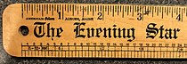
A typometer is a ruler which is usually divided in typographic points or ciceros on one of its sides and in centimeters or millimeters on the other, which was traditionally used in the graphic arts to inspect the measures of typographic materials. The most developed typometers could also measure the type size of a particular typeface, the leading of a text, the width of paragraph rules and other features of a printed text. This way, designers could study and reproduce the layout of a document.
References
↑ Radics, Vilmos; Ritter, Aladár (1984). Make-up and typography. International Organization of Journalists. p.13. ISBN9789630231367. Retrieved 25 November 2016. The typometer is an instrument for measuring typographical denominations: type sizes, column width and depth, slugs, type area, etc.
This page is based on this Wikipedia article Text is available under the CC BY-SA 4.0 license; additional terms may apply. Images, videos and audio are available under their respective licenses.