| Blackletter | |
|---|---|
 | |
| Script type | Alphabet |
Period | 12th–17th century (as late as 20th century in Germany) |
| Direction | Left-to-right |
| Languages | Western and Northern European languages |
| Related scripts | |
Parent systems | Latin script
|
Child systems | Fraktur (Fraktur and blackletter are sometimes used interchangeably) Kurrentschrift including Sütterlin |
| ISO 15924 | |
| ISO 15924 | Latf(217),Latin (Fraktur variant) |
| Unicode | |
1D504–1D537, with some exceptions (see below) | |
Blackletter ( also black letter or sometimes black-letter), also known as Gothic script, Gothic minuscule or Gothic type, is a family of scripts, originally handwriting scripts, then adapted into typefaces and still used in calligraphy.
Contents
- Etymology
- Forms
- Early Gothic
- Textura
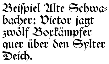
- Schwabacher
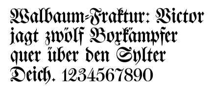
- Fraktur
- Cursiva
- Hybrida
- Donatus-Kalender
- Blackletter typesetting
- National forms
- England
- France
- Germany
- Italy
- The Netherlands
- Modern use
- Unicode
- See also
- References
- Further reading
- External links
Blackletter was used throughout Western Europe from approximately 1150 until the 17th century. [1] It continued to be commonly used for Danish, Norwegian, and Swedish until the 1870s, [2] Finnish until the turn of the 20th century, [3] Estonian and Latvian until the 1930s, [4] and for the German language until the 1940s, when Adolf Hitler officially banned it in 1941. [5] Fraktur is a notable script of this type, and sometimes the entire group of blackletter faces is referred to as Fraktur. Blackletter, although sometimes called Old English lettering, is not to be confused with the Old English language, which predates blackletter by many centuries and was written in the insular script or in Futhorc runes. Along with Italic type and Roman type, blackletter served as one of the major typefaces in the history of Western typography.
 Various German language blackletter typefaces
 Blackletter typefaces highlighting differences between select characters


 Modern interpretation of blackletter script in the form of the font "Old English" which includes several anachronistic glyphs, such as Arabic numerals, ampersand (instead of Tironian et) and several punctuation marks, but lacks letter alternatives like long ⟨s⟩ and ⟨r⟩ rotunda, scribal abbreviations and ligatures, and contains several relatively modern versions of letters such as ⟨x⟩, which is confusable with the letter ⟨r⟩.