Palaeography (UK) or paleography is the study and academic discipline of the analysis of historical writing systems, the historicity of manuscripts and texts, subsuming deciphering and dating of historical manuscripts, including the analysis of historic handwriting, signification and printed media. It is primarily concerned with the forms, processes and relationships of writing and printing systems as evident in a text, document or manuscript; and analysis of the substantive textual content of documents is a secondary function. Included in the discipline is the practice of deciphering, reading, and dating manuscripts, and the cultural context of writing, including the methods with which writing and printing of texts, manuscripts, books, codices and tomes, tracts and monographs, etcetera, were produced, and the history of scriptoria. This discipline is important for understanding, authenticating, and dating historic texts. However, it cannot be used as a discrete academic discipline to pinpoint dates with precision without interdisciplinary inquiry.
Calligraphy is a visual art related to writing. It is the design and execution of lettering with a pen, ink brush, or other writing instrument. Contemporary calligraphic practice can be defined as "the art of giving form to signs in an expressive, harmonious, and skillful manner".

In typography and lettering, a sans-serif, sans serif, gothic, or simply sans letterform is one that does not have extending features called "serifs" at the end of strokes. Sans-serif typefaces tend to have less stroke width variation than serif typefaces. They are often used to convey simplicity and modernity or minimalism. For the purposes of type classification, sans-serif designs are usually divided into these major groups: § Grotesque and § Neo-grotesque, § Geometric, § Humanist and § Other or mixed.
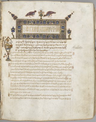
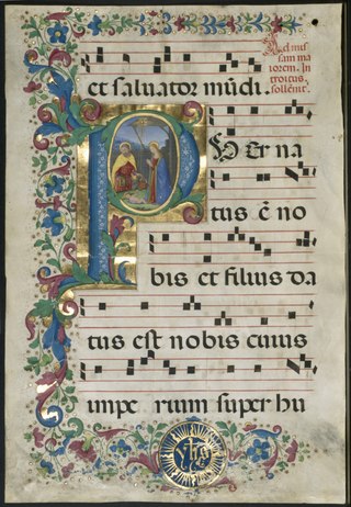
An illuminated manuscript is a formally prepared document where the text is decorated with flourishes such as borders and miniature illustrations. Often used in the Roman Catholic Church for prayers, liturgical services and psalms, the practice continued into secular texts from the 13th century onward and typically include proclamations, enrolled bills, laws, charters, inventories and deeds.
Uncial is a majuscule script commonly used from the 4th to 8th centuries AD by Latin and Greek scribes. Uncial letters were used to write Greek and Latin, as well as Gothic, and are the current style for Coptic and Nobiin.

The Early Cyrillic alphabet, also called classical Cyrillic or paleo-Cyrillic, is an alphabetic writing system that was developed in Medieval Bulgaria in the Preslav Literary School during the late 9th century. It is used to write the Church Slavonic language, and was historically used for its ancestor, Old Church Slavonic. It was also used for other languages, but between the 18th and 20th centuries was mostly replaced by the modern Cyrillic script, which is used for some Slavic languages, and for East European and Asian languages that have experienced a great amount of Russian cultural influence.

Frederic William Goudy was an American printer, artist and type designer whose typefaces include Copperplate Gothic, Goudy Old Style and Kennerley. He was one of the most prolific of American type designers and his self-named type continues to be one of the most popular in America.

William Addison Dwiggins, was an American type designer, calligrapher, and book designer. He attained prominence as an illustrator and commercial artist, and he brought to the designing of type and books some of the boldness that he displayed in his advertising work. His work can be described as ornamented and geometric, similar to the Art Moderne and Art Deco styles of the period, using Oriental influences and breaking from the more antiquarian styles of his colleagues and mentors Updike, Cleland and Goudy.

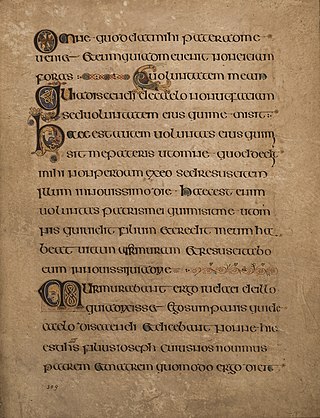
Insular script is a medieval script system originating from Ireland that spread to England and continental Europe under the influence of Irish Christianity. Irish missionaries took the script to continental Europe, where they founded monasteries such as Bobbio. The scripts were also used in monasteries like Fulda, which were influenced by English missionaries. They are associated with Insular art, of which most surviving examples are illuminated manuscripts. It greatly influenced modern Gaelic type and handwriting.

Copperplate Gothic is a typeface designed by Frederic W. Goudy and first produced by American Type Founders (ATF) beginning in 1901.

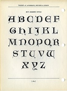
In a written or published work, an initial capital is a letter at the beginning of a word, a chapter, or a paragraph that is larger than the rest of the text. The word is derived from the Latin initialis, which means standing at the beginning. An initial is often several lines in height and in older books or manuscripts are known as "inhabited" initials. Certain important initials, such as the Beatus initial or "B" of Beatus vir... at the opening of Psalm 1 at the start of a vulgate Latin. These specific initials in an illuminated manuscript were also called initiums.

Trajan is a serif typeface designed in 1989 by Carol Twombly for Adobe.

Goudy Old Style is an old-style serif typeface originally created by Frederic W. Goudy for American Type Founders (ATF) in 1915.

Modern typographers view typography as a craft with a very long history tracing its origins back to the first punches and dies used to make seals and coinage currency in ancient times. The basic elements of typography are at least as old as civilization and the earliest writing systems—a series of key developments that were eventually drawn together into one systematic craft. While woodblock printing and movable type had precedents in East Asia, typography in the Western world developed after the invention of the printing press by Johannes Gutenberg in the mid-15th century. The initial spread of printing throughout Germany and Italy led to the enduring legacy and continued use of blackletter, roman, and italic types.
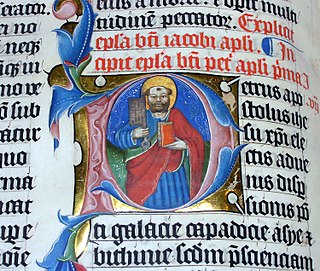
A historiated initial is an initial, an enlarged letter at the beginning of a paragraph or other section of text, that contains a picture. Strictly speaking, a historiated initial depicts an identifiable figure or a specific scene, while an inhabited initial contains figures that are decorative only, without forming a subject. Both sorts became very common and elaborate in luxury illuminated manuscripts. These illustrated initials were first seen in the Insular art of the early 8th century. The earliest known example is in the Saint Petersburg Bede, an Insular manuscript of 731–46, and the Vespasian Psalter has another.

An inhabited initial is an initial, an enlarged letter at the beginning of a paragraph or other section of text that contains an illustration of human or animal figures within the letter. It is similar to a historiated initial; however, the figures in historiated initials show an identifiable scene or story, while the figures in inhabited initials do not show a narrative. Figures in inhabited initials may be related to the contents of the text, but do not have to be. They may be purely decorative instead.
Sol Hess was an American typeface designer. After a three-year scholarship course at Pennsylvania Museum School of Industrial Design, he began at Lanston Monotype in 1902, rising to typographic manager in 1922. He was a close friend and collaborator with Monotype art director Frederic Goudy, succeeding him in that position in 1940. Hess was particularly adept at expanding type faces into whole families, allowing him to complete 85 faces for Monotype, making him America's fourth most prolific type designer. While he was with Monotype, Hess worked on commissions for many prominent users of type, including, Crowell-Collier, Sears Roebuck, Montgomery Ward, Yale University Press, World Publishing Company, and Curtis Publishing for whom he re-designed the typography of their Saturday Evening Post.

Deepdene is a serif typeface designed by Frederic Goudy from 1927–1933. It belongs to the "old-style" of serif font design, with low contrast between strokes and an oblique axis. However, Deepdene has crisp serifs and a nearly upright italic, with much less of a slant than is normal for this style.

Goudy Sans is a sans-serif typeface designed by Frederic Goudy around 1929–1931 and published by Lanston Monotype.