Related Research Articles
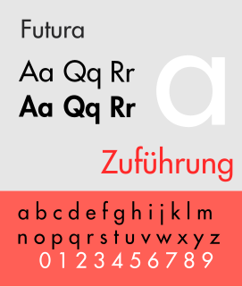
Futura is a geometric sans-serif typeface designed by Paul Renner and released in 1927. It was designed as a contribution on the New Frankfurt-project. It is based on geometric shapes, especially the circle, similar in spirit to the Bauhaus design style of the period. It was developed as a typeface by the Bauer Type Foundry, in competition with Ludwig & Mayer's seminal Erbar typeface of 1926.
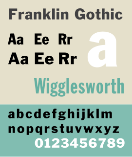
Franklin Gothic and its related faces are a large family of sans-serif typefaces in the industrial or grotesque style developed in the early years of the 20th century by the type foundry American Type Founders (ATF) and credited to its head designer Morris Fuller Benton. “Gothic” was a contemporary term meaning sans-serif.
In metal typesetting, a font was a particular size, weight and style of a typeface. Each font was a matched set of type, one piece for each glyph, and a typeface consisting of a range of fonts that shared an overall design.

Cheltenham is a typeface for display use designed in 1896 by architect Bertram Goodhue and Ingalls Kimball, director of the Cheltenham Press. The original drawings were known as Boston Old Style and were made about 14" high. These drawings were then turned over to Morris Fuller Benton at American Type Founders (ATF) who developed it into a final design. Trial cuttings were made as early as 1899 but the face was not complete until 1902. The face was patented by Kimball in 1904. Later the basic face was spun out into an extensive type family by Morris Fuller Benton.
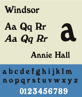
Windsor is a serif typeface created by Eleisha Pechey (1831-1902) and released by the Stephenson Blake type foundry. It is intended for use such as display and in headings rather than for body text.

Goudy Old Style is an old-style serif typeface originally created by Frederic W. Goudy for American Type Founders (ATF) in 1915.
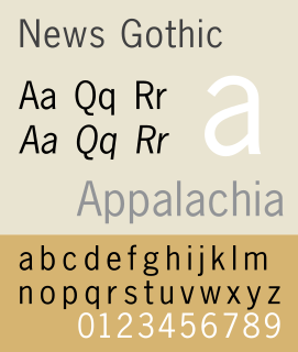
News Gothic is a sans-serif typeface in the grotesque or industrial style. It was designed by Morris Fuller Benton and released in 1908 by his employer American Type Founders (ATF). News Gothic is similar in proportion and structure to Franklin Gothic, also designed by Benton, but lighter.

Twentieth Century is a geometric sans-serif typeface designed by Sol Hess for Lanston Monotype in 1937. It was created as a competitor to the successful Futura typeface for Monotype's hot metal typesetting system. Like Futura it has a single-story 'ɑ' and a straight 'j' with no bend.
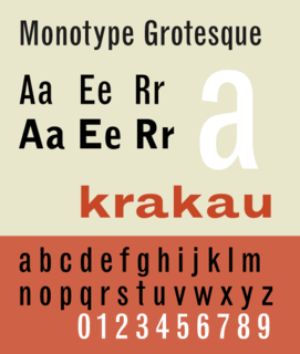
Monotype Grotesque is a family of sans-serif typefaces released by the Monotype Corporation for its hot metal typesetting system. It belongs to the grotesque or industrial genre of early sans-serif designs. Like many early sans-serifs, it forms a sprawling family designed at different times.
The Bauer Type Foundry was a German type foundry founded in 1837 by Johann Christian Bauer in Frankfurt am Main. Noted typeface designers, among them Lucian Bernhard, Konrad Friedrich Bauer, Walter Baum, Heinrich Jost, Imre Reiner, Friedrich Hermann Ernst Schneidler, Emil Rudolf Weiß, and Heinrich Wienyck, designed typefaces for the company.
Robert Wiebking (1870–1927) was a German-American engraver typeface designer who was known for cutting type matrices for Frederic Goudy from 1911 to 1926.
Sol Hess was an American typeface designer. After a three-year scholarship course at Pennsylvania Museum School of Industrial Design, he began at Lanston Monotype in 1902, rising to typographic manager in 1922. He was a close friend and collaborator with Monotype art director Frederic Goudy, succeeding him in that position in 1940. Hess was particularly adept at expanding type faces into whole families, allowing him to complete 85 faces for Monotype, making him America's fourth most prolific type designer. While he was with Monotype, Hess worked on commissions for many prominent users of type, including, Crowell-Collier, Sears Roebuck, Montgomery Ward, Yale University Press, World Publishing Company, and Curtis Publishing for whom he re-designed the typography of their Saturday Evening Post.

Century is a family of serif type faces particularly intended for body text. The family originates from a first design, Century Roman cut by American Type Founders designer Linn Boyd Benton in 1894 for master printer Theodore Low De Vinne, for use in The Century Magazine. ATF rapidly expanded it into a very large family, first by Linn Boyd and later by his son Morris.

The Intertype Corporation produced the Intertype, a typecasting machine closely resembling the Linotype, and using the same matrices as the Linotype. It was founded in New York in 1911 by Hermann Ridder, of Ridder Publications, as the International Typesetting Machine Company, but purchased by a syndicate for $1,650,000 in 1916 and reorganized as the Intertype Corporation.
The Type foundry Amsterdam was a Dutch type foundry that contributed a number of original type designs early in the 20th century. It eventually became a division of Tetterode. On October 1, 2000, Tetterode transferred the rights for all of its typefaces to Linotype.
The Inland Type Foundry was an American type foundry established in 1894 in Saint Louis, Missouri and later with branch offices in Chicago and New York City. Although it was founded to compete directly with the "type trust", and was consistently profitable, it was eventually sold to ATF.
There have been two, unrelated firms using the name Baltimore Type Foundry.
References
- 1 2 Edwin W. Shaar (retrieved April 17, 2020)
- ↑ "Edwin Willis Shaar Sr". Genlookup. Retrieved April 23, 2020.
- ↑ MacGrew, Mac, American Metal Typefaces of the Twentieth Century, Oak Knoll Books, New Castle Delaware, 1993, ISBN 0-938768-34-4.
- ↑ "THE MEDIA BUSINESS; A Face-Lift for The Times, Typographically, That Is". The New York Times. October 21, 2003. Retrieved August 7, 2018.
The Times's text typeface, for news and editorials, remains Imperial, designed in the 1950s by Edwin W. Shaar and adopted by the newspaper in 1967.