Stephenson Blake

Last updated

Stephenson Blake
Industry Type foundry
FoundedJuly 1818
FounderWilliam Garnett, John Stephenson, James Blake
Headquarters Sheffield, England

Stephenson Blake is an engineering company based in Sheffield, England. The company was active from the early 19th century as a type founder, remaining until the 1990s as the last active type foundry in Britain, since when it has diversified into specialist engineering.

Contents

The type foundry began operations in July 1818 by silversmith and mechanic William Garnett and toolmaker John Stephenson, financially supported by James Blake. That November, news came that the breakaway Caslon foundry (formed when William Caslon III left the original firm and acquired Joseph Jackson's foundry in 1792§ (Caslon foundry 1716; 1764; etc. §) was put up for sale by William Caslon IV. In 1819 the deal was concluded and Blake, Garnett & Co. were suddenly in charge of one of England's most prestigious typefoundries. In 1829 Garnett left to become a farmer. The company was renamed Blake & Stephenson in 1830, but Blake died soon after. It became Stephenson, Blake & Co. in 1841-1905. John Stephenson died in 1864, the year after he handed control to his son Henry. In 1905 the firm purchased Sir Charles Reed and Sons Ltd. It was then known as Stephenson, Blake & Co., and Sir Charles Reed and Sons between 1905-1914. In 1914, without any change in proprietorship, the business was converted into a private limited liability company. The early 1900s the foundry had ventured into steel making and tool production, which would prove to be the core business of the current firm Stephenson, Blake and Co., Ltd. from until 2004 when Tom Blake (5th Generation) retired. [1]

Mergers and acquisitions

The foundry also acquired some materials from Miller & Richard when it was wound up in 1952. [2]

Dissolution

While the foundry was still producing some type in zinc as late as 2001, the foundry had shut down by 2005 when the matrices and other typographic equipment, by then of little commercial value (but of great historical value), were passed to the Monotype Corporation, becoming a key part of the Type Museum, London. The Heritage Lottery Fund funded the work at the suggestion of Susan Shaw in 1996 so that the machinery and equipment of Stephenson Blake (and Robert DeLittle of York) could be loaded up and sent to South London. [3]

Typefaces

The foundry types produced by Stephenson Blake fall into three categories: those designed in-house, those designed by firms subsequently merged into Stephenson Blake, and those designs licensed from other foundries. [4]

Original designs

  • Algerian (1908)
  • Athenian (1889, William Kirkwood)
  • Antique Nos. 1 + 2 + 3 + 4 (1904, William Kirkwood)
  • Arabian (1904)
  • Britannic (1906), derived from Rothbury.
  • Chatsworth (1921)
  • Chisel (1935, Robert Harling), also sold by Enschedé as Bavo.
  • Consort (1956), a re-issue of the original Clarendon, with new weights added.
  • Coronation (1937), a knock-off of Corvinus.
  • Dominus (1925), also known as Clearface Open and Handtooled
  • Elongated Roman (1955), a revival of a nineteenth-century face.
  • Ganton (1927)
  • Granby (1930 onwards), a humanist sans-serif influenced by Gill Sans and Johnston
  • Grotesque series - a large family of sans-serifs sold by number
  • Impact by Geoffrey Lee (1965)
  • June (1927)
  • Latin Wide (1940), digitised and offered with Microsoft Office [5] [6]
  • Keyboard (1951, Robert Harling)
  • Kingston (1924)
  • Playbill (1938, Robert Harling), an updating of a nineteenth-century French Clarendon face.
  • Podium (1927), later digitized as Podium Sharp by Mateusz Machalski.
  • Revue (1968, Colin Brignall)
  • Windsor (1905, Elisha Pechey), punches by William Kirkwood.

Designs of predecessor corporations

  • Alexandra (SB 1911), from matrices acquired from the Reed Foundry.
  • Ancient Black (1582, SB 1904) from original matrices acquired by the Reed Foundry. Originally English No. 2 from the stock of Wolf, a London printer, passed to John James Foundry, then to Fry.
  • Baskerville (1795, SB 1906, Isaac Morre) from original matrices acquired by the Reed Foundry from the Fry Foundry.
  • Caslon Egyptian - the first commercial sans-serif typeface, created by the Caslon foundry. Inherited as a single-size font, later with increased popularity of the style other sizes cut. [7] Caps-only.
  • Clarendon (1845), cast by R. Besley & Co. (Fann Street Foundry), subsequently re-issued as Consort.
  • Doric 12 (1816, SB 1870), originally cast by the Caslon foundry .
  • Fry's Canon (1808, Fry Foundry), privately case for use by Kynoch Press and Curwen Press.
  • Fry's Ornamented (1796, SB 1907, Richard Austin), from matrices acquired by the Reed Foundry from the Fry Foundry.
  • Georgian (c. 1790, SB 1909), perhaps from matrices acquired from the Fry Foundry.

Licensed designs

Successor corporation

Stephenson & Blake is now a company which specializes in High Frequency Welding brass electrodes and CNC machining for all types of brass welding/cutting dies and has a huge collection of samples and products which are machined to order.

Their in-house machining/engineering department make tooling for any kind of plastic welding, and because of the CNC machining department, can make extraordinary dies which are impossible to make out of tooling rule.

In December 2007, Stephenson & Blake acquired Nu-Gauge engineering, who are a major manufacturer to the glass gauge industry in the United Kingdom. Nu-Gauge engineering has been merged to within Stephenson & Blake, and will make any type of gauge to order with extremely tight tolerances.

In December 2009, Stephenson & Blake acquired the steel rule tooling business from DR Tooling Ltd; They now design and manufacture steel cutting tools alongside their High Frequency Welding tools.

In 2010 Stephenson & Blake acquired the Brass Welding/High Frequency Welding rule business from Caslon. Stephenson & Blake now manufacture the whole of Caslon's High Frequency Welding Rule range alongside their own inventory.

Use within Sheffield

Until 2023, the University of Sheffield used two fonts "TUOS Stephenson" (serif, originally designed by S&B) and "TUOS Blake" (sans serif) as part of their corporate identity. [10]

Sheffield City Council uses a corporate font, Wayfarer, commissioned from designer Jeremy Tankard that is based on Stephenson Blake's sans-serif Granby and Grotesque No. 9 families. [11] [12] [13]

Related Research Articles

<span class="mw-page-title-main">Sans-serif</span> Typeface classification for letterforms without serifs

In typography and lettering, a sans-serif, sans serif, gothic, or simply sans letterform is one that does not have extending features called "serifs" at the end of strokes. Sans-serif typefaces tend to have less stroke width variation than serif typefaces. They are often used to convey simplicity and modernity or minimalism. For the purposes of type classification, sans-serif designs are usually divided into these major groups: § Grotesque and § Neo-grotesque, § Geometric, § Humanist and § Other or mixed.

<span class="mw-page-title-main">Gill Sans</span> Humanist sans-serif typeface family developed by Monotype

Gill Sans is a humanist sans-serif typeface designed by Eric Gill and released by the British branch of Monotype from 1928 onwards.

<span class="mw-page-title-main">Matrix (printing)</span> Mould used to cast letter blocks (sorts) used in printing

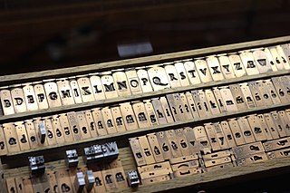
In the manufacture of metal type used in letterpress printing, a matrix is the mould used to cast a letter, known as a sort. Matrices for printing types were made of copper.

<span class="mw-page-title-main">Johnston (typeface)</span> Sans-serif typeface

Johnston is a sans-serif typeface designed by and named after Edward Johnston. The typeface was commissioned in 1913 by Frank Pick, commercial manager of the Underground Electric Railways Company of London, as part of his plan to strengthen the company's corporate identity. Johnston was originally created for printing, but it rapidly became used for the enamel station signs of the Underground system as well.

<span class="mw-page-title-main">Type foundry</span> Company that designs typefaces (fonts)

A type foundry is a company that designs or distributes typefaces. Before digital typography, type foundries manufactured and sold metal and wood typefaces for hand typesetting, and matrices for line-casting machines like the Linotype and Monotype, for letterpress printers. Today's digital type foundries accumulate and distribute typefaces created by type designers, who may either be freelancers operating their own independent foundry, or employed by a foundry. Type foundries may also provide custom type design services.

<span class="mw-page-title-main">Caslon</span> Typeface with serifs

Caslon is the name given to serif typefaces designed by William Caslon I (c. 1692–1766) in London, or inspired by his work.

<span class="mw-page-title-main">Slab serif</span> Type of serif typeface

In typography, a slab serif typeface is a type of serif typeface characterized by thick, block-like serifs. Serif terminals may be either blunt and angular (Rockwell), or rounded (Courier). Slab serifs were introduced in the early nineteenth century.

<span class="mw-page-title-main">Clarendon (typeface)</span> Slab-serif typeface

Clarendon is the name of a slab serif typeface that was released in 1845 by Thorowgood and Co. of London, a letter foundry often known as the Fann Street Foundry. The original Clarendon design is credited to Robert Besley, a partner in the foundry, and was originally engraved by punchcutter Benjamin Fox, who may also have contributed to its design. Many copies, adaptations and revivals have been released, becoming almost an entire genre of type design.

<span class="mw-page-title-main">Monotype Grotesque</span> Grotesque sans-serif typeface

Monotype Grotesque is a family of sans-serif typefaces released by the Monotype Corporation for its hot metal typesetting system. It belongs to the grotesque or industrial genre of early sans-serif designs. Like many early sans-serifs, it forms a sprawling family designed at different times.

Sol Hess was an American typeface designer. After a three-year scholarship course at Pennsylvania Museum School of Industrial Design, he began at Lanston Monotype in 1902, rising to typographic manager in 1922. He was a close friend and collaborator with Monotype art director Frederic Goudy, succeeding him in that position in 1940. Hess was particularly adept at expanding type faces into whole families, allowing him to complete 85 faces for Monotype, making him America's fourth most prolific type designer. While he was with Monotype, Hess worked on commissions for many prominent users of type, including, Crowell-Collier, Sears Roebuck, Montgomery Ward, Yale University Press, World Publishing Company, and Curtis Publishing for whom he re-designed the typography of their Saturday Evening Post.

<span class="mw-page-title-main">Erbar</span> Sans-serif typeface

In typography, Erbar or Erbar-Grotesk is a sans-serif typeface in the geometric style, one of the first designs of this kind released as type. Designer Jakob Erbar's aim was to design a printing type which would be free of all individual characteristics, possess thoroughly legible letter forms, and be a purely typographic creation. His conclusion was that this could only work if the type form was developed from a fundamental element, the circle. Erbar-Grotesk was developed in stages; Erbar wrote that he had originally sketched out the design in 1914 but had been prevented from working on it due to the war. The original version of Erbar was released in 1926, following Erbar's "Phosphor" titling capitals of 1922 which are very similar in design.

<span class="mw-page-title-main">Vincent Figgins</span> British typefounder

Vincent Figgins was a British typefounder based in London, who cast and sold metal type for printing. After an apprenticeship with typefounder Joseph Jackson, he established his own type foundry in 1792. His company was extremely successful and, with its range of modern serif faces and display typefaces, had a strong influence on the styles of British printing in the nineteenth century. A successor company continued to make type until the 1970s.

<span class="mw-page-title-main">Fann Street Foundry</span>

The Fann Street Foundry was a type foundry that was located on Fann Street, City of London.

<span class="mw-page-title-main">Reverse-contrast typefaces</span> Kind of typeface or custom lettering

A reverse-contrast or reverse-stress letterform is a design in which the stress is reversed from the norm: a typeface or custom lettering where the horizontal lines are the thickest. This is the reverse of the vertical lines being the same width or thicker than horizontals, which is normal in Latin-alphabet writing and especially printing. The result is a dramatic effect, in which the letters seem to have been printed the wrong way round. The style invented in the early nineteenth century as attention-grabbing novelty display designs. Modern font designer Peter Biľak, who has created a design in the genre, has described them as "a dirty trick to create freakish letterforms that stood out."

<span class="mw-page-title-main">Miller & Richard</span>

Miller & Richard was a type foundry based in Edinburgh that designed and manufactured metal type. It operated from 1809 to 1952.

<span class="mw-page-title-main">Granby (typeface)</span> Humanist sans-serif typeface

Granby is a sans-serif typeface designed and released by the Stephenson Blake type foundry of Sheffield from 1930.

<span class="mw-page-title-main">Grotesque (Stephenson Blake typefaces)</span> Family of sans-serif typefaces

The Stephenson Blake Grotesque fonts are a series of sans-serif typefaces created by the type foundry Stephenson Blake of Sheffield, England, mostly around the beginning of the twentieth century.

<span class="mw-page-title-main">Caslon Egyptian</span>

Egyptian is a typeface created by the Caslon foundry of Salisbury Square, London around or probably slightly before 1816, that is the first general-purpose sans-serif typeface in the Latin alphabet known to have been created.

<span class="mw-page-title-main">Caslon Type Foundry</span> English type foundry, founded c. 1720

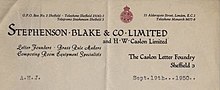
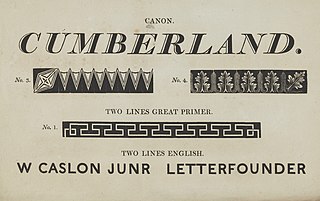
The Caslon type foundry was a type foundry in London which cast and sold metal type. It was founded by the punchcutter and typefounder William Caslon I, probably in 1720. For most of its history it was based at Chiswell Street, Islington, was the oldest type foundry in London, and the most prestigious.

References

  1. Book: Printing Types composing room equipment condensed edition Stephenson, Blake & Co, Ltd. 1927, The letter foundry Sheffield England
  2. Mosley, James (1984). British Type Specimens before 1831: a hand-list. Oxford Bibliographical Society, Bodleian Library in association with the Dept. of Typography & Graphic Communication, University of Reading. p. 68. ISBN   9780901420114. Miller & Richard was wound up in 1952. Matrices for a few types were acquired by Stephenson, Blake & Co. Ltd., Sheffield, but most of the materials appear to have been dispersed.
  3. "Susan Shaw obituary". the Guardian. 15 July 2020. Retrieved 5 December 2020.
  4. List based upon the following sources: • Jaspert, W. Pincus, W. Turner Berry and A.F. Johnson. The Encyclopedia of Type Faces. Blandford Press Lts.: 1953, 1983, ISBN   0-7137-1347-X. • Millingoton, Roy Stephenson Blake: The Last of the Old English Typefounders Oak Knoll Press, New Castle Delaware, 2002, ISBN   1-58456-086-X.
  5. Devroye, Luc. "Stephenson Blake". Type Design Information Page. Retrieved 5 September 2014.
  6. Also called Wide Latin, e.g. by Microsoft Typography: Wide Latin font family
  7. Mosley, James. "Comments on Typophile thread - "Unborn: sans serif lower case in the 19th century"". Typophile (archived). Archived from the original on 28 June 2014. Retrieved 15 October 2016.{{cite web}}: CS1 maint: bot: original URL status unknown (link)
  8. The Penrose Annual, Vol. 56 (1962), p19
  9. Possibly both Jaspert and Millingoton have this face confused with Bernhar's Bernhard Cursive which was also sold by SB as Madonna Ronde.
  10. University of Sheffield, https://www.sheffield.ac.uk/marketing/visual-identity/fonts/download-stephenson-blake
  11. Bramley, Ellie Violet (13 January 2015). "Subliminal power of city fonts". The Guardian . Retrieved 31 July 2016.
  12. Tankard, Jeremy. "Commissions: Connect Sheffield". Jeremy Tankard Typography. Retrieved 31 July 2016.
  13. Tankard, Jeremy. "Wayfarer". Jeremy Tankard Typography. Retrieved 31 July 2016. Application of the original Granby Condensed type was, however, difficult practically. It was not available in digital form, and felt to be just too condensed, with the proportion of ascender to x-height, too uncomfortable for use on the signing project. So there arose an opportunity to design a new typeface and at the same time tailor it to the specific needs of the Sheffield project. It was also an opportunity to widen the typographic references for the new font. I was keen to look at other early sans serif types, especially those from Stephenson, Blake and most notably their Grotesque series. These most idiosyncratic of designs are full of warmth, have an informal rhythm and a vitality to their shapes, all of which help create interesting word patterns. The rhythm of Wayfarer is similar to that of Granby, but it is combined with an approach to character detailing which echoes the informal variety found in the Grotesques.