Erik van Blokland

Last updated

van Blokland in 2013 Erik van Blokland at beyond tellerand 2013.jpg
van Blokland in 2013

Erik van Blokland (born 29 August 1967 in Gouda) [1] is a Dutch typeface designer, educator and computer programmer. He is the head of the Type Media Master of Design program in Typeface Design at the Royal Academy of Art, The Hague in the Netherlands. [2]

Contents

Letterror

Letterror is the name of the collaborative efforts of Erik van Blokland and Just van Rossum. While studying at Royal Academy of Art, The Hague, the two were introduced by the school's professor of Type Design, Gerrit Noordzij, who "knew they shared an enthusiasm for computers and programming". [3] Their collaboration started in earnest in Berlin in 1989 around the time the duo were working for Erik Spiekermann. First they published zine, which was named Letterror, which demonstrated their experiments with generative type. That name followed their collaboration through the years. [4]

LTR Beowolf

LTR Beowolf is a Serif-typeface which had novel programming features. Each time it was printed, code within the typeface files moved the outlines of the letters around slightly, giving it a spiky appearance. [5] The two designers, van Blokland and Just van Rossum, discovered that PostScript 1 format typeface files contained code that they could edit directly, adding randomization points to the line positioning points that usually make up such a file. [6]

It is thought to be the first dynamically generated typeface, [7] which modified letterforms on the fly. It used a randomizing algorithm [8] to generate different letter forms each time a letter was printed. The typeface "expanded the possibilities of typography", [9] introducing Generative design to type.

It was published under the name FF Beowolf, the first typeface in the FontFont library.

The specifications of printer drivers were updated in time to curtail "aberrations", so in the end FF Beowulf stopped working. [10] Later versions of the typeface do not include the random feature that made it famous, as current font technology does not support programming features within typefaces, for security reasons. Instead they use a feature called "contextual alternates" to swap out the basic set of letters with pre-randomized alternative letters, when certain letter combinations occur in context, from a pool of over 90.000 alternate letters. [11]

LTR Beowolf was one of 23 typefaces in the MoMA Architecture and Design Collection's first type acquisition in 2011. Each typeface in the group was selected as a "milestone in the history of typography". The typefaces were exhibited at the Standard Deviations exhibition in March of the same year. [12] [13] [14] [15]

Trixie, Instant Types and Grunge Type

Following Beowulf, the design duo discovered that they could create previously unseen typefaces that evoked the printed look of amateur letter tools like stamps, typewriters, name tag makers and other household items. By combining a scanner, and recently available computer programs, such as image vector tracing software, Photoshop, Illustrator and early type design program Fontographer, they could create much more complex typefaces by automating the process, using the aforementioned software. These "grunge" shapes had messy, complicated outlines, which would have been extremely difficult to produce using analogue methods. [3] Also called "distressed type", this mode of typeface creation became very popular, and a large number of "grunge" typefaces were created. Letterror's Justlefthand and Erikrighthand typefaces were the first digital "handwriting" fonts, [6] their introduction was described as evidence that "the computer brings more, not less human expression into [graphic design]"Forms in modernism : a visual set : the unity of typography, architecture & the design arts They were the first releases from this project. Erik's typeface Trixie was the second one, it came out in 1991, a year before RayGun magazine signaled the formal beginning of Grunge Design. [16] It was famously used in the iconic logo for The X-files TV series, and also on the covers of Rage Against The Machine's eponymous debut album and Alanis Morissette's Jagged Little Pill. [17] Just van Rossum's Instant Types set fonts came out a year later, adding five iconic typefaces to the new category.

Other typefaces of note include Eames Century Modern, a typeface based on the legacy of Charles and Ray Eames, designed with the co-operation of The Eames Office for House Industries and LTR Federal, a highly intricate interpretation of the typography of bank notes, based on a study of siderography - the steel engraving process used for currency and old fashioned stocks. [18] Later works include Action [19] Condensed, which the NBA used for a redesign of their logo and graphic identity. [20]

Programming

Erik has made several contributions to programming related to type design. He is the co-author of Unified Font Object (UFO), [21] the open, XML based file format for font data. He co-authored WOFF, the Web Open Font Format. [22] He developed the RoboFab [23] type design extensions for Python with Just van Rossum and Tal Leming. [24] He's the author of Superpolator, [25] the application for interpolating font styles.

Related Research Articles

<span class="mw-page-title-main">Matthew Carter</span> British type designer (born 1937)

Matthew Carter is a British type designer. A 2005 New Yorker profile described him as 'the most widely read man in the world' by considering the amount of text set in his commonly used typefaces.

<span class="mw-page-title-main">Emigre Fonts</span> American type foundry

Emigre, Inc., doing business as Emigre Fonts, is a digital type foundry based in Berkeley, California, that was founded in 1985 by husband-and-wife team Rudy VanderLans and Zuzana Licko. The type foundry grew out of Emigre magazine, a publication founded by VanderLans and two Dutch friends who met in San Francisco, CA in 1984. Note that unlike the word émigré, Emigre is officially spelled without accents.

<span class="mw-page-title-main">Erik Spiekermann</span> German typographer, designer and writer (born 1947)

Erik Spiekermann is a German typographer, designer and writer. He is an honorary professor at the University of the Arts Bremen and ArtCenter College of Design.

<span class="mw-page-title-main">Neville Brody</span> British graphic designer

Neville Brody, is an English graphic designer, typographer and art director. He is known for his work on The Face magazine (1981–1986), Arena magazine (1987–1990), and designing record covers for artists such as Clock DVA, Cabaret Voltaire, The Bongos, 23 Skidoo and Depeche Mode. He created the company Research Studios in 1994 and is a founding member of Fontworks. His work is included in the permanent collection of the Museum of Modern Art (MoMA). He was the Dean of the School of Communication at the Royal College of Art, London until September 2018. He is now Professor of Communication.

<span class="mw-page-title-main">Tobias Frere-Jones</span> American type designer (born 1970)

Tobias Frere-Jones is an American type designer who works in New York City. He operates the company Frere-Jones Type and teaches typeface design at the Yale School of Art MFA program.

<span class="mw-page-title-main">Rotis</span> Font superfamily; humanist sans-serif typeface

Rotis is a typeface developed in 1988 by Otl Aicher, a German graphic designer and typographer. In Rotis, Aicher explores an attempt at maximum legibility through a highly unified yet varied typeface family that ranges from full serif, glyphic, and sans-serif. The four basic Rotis variants are:

<span class="mw-page-title-main">DIN 1451</span> Sans-serif font, used on German traffic signs

DIN 1451 is a sans-serif typeface that is widely used for traffic, administrative and technical applications.

<span class="mw-page-title-main">FF Meta</span> Sans-serif typeface

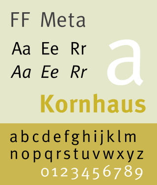
FF Meta is a humanist sans-serif typeface family designed by Erik Spiekermann and released in 1991 through his FontFont library.

<span class="mw-page-title-main">FF Scala</span> Serif typeface

FF Scala is an old-style serif typeface designed by Dutch typeface designer Martin Majoor in 1991 for the Muziekcentrum Vredenburg in Utrecht, the Netherlands. The FF Scala font family was named for the Teatro alla Scala (1776–78) in Milan, Italy. Like many contemporary Dutch serif faces, FF Scala is not an academic revival of a single historic typeface but shows influences of several historic models. Similarities can be seen with William Addison Dwiggins' 1935 design for the typeface Electra in its clarity of form, and rhythmic, highly calligraphic italics. Eric Gill's 1931 typeface Joanna, with its old style armature but nearly square serifs, is also similar in its nearly mono-weighted stroke width.

<span class="mw-page-title-main">FF Scala Sans</span> Sans-serif typeface

FF Scala Sans is a humanist sans-serif typeface designed by Dutch designer Martin Majoor in 1993 for the Vredenburg Music Center in Utrecht, the Netherlands. It was designed as a companion to Majoor's earlier serif old style typeface FF Scala, designed in 1990.

<span class="mw-page-title-main">FF DIN</span> Sans-serif typeface

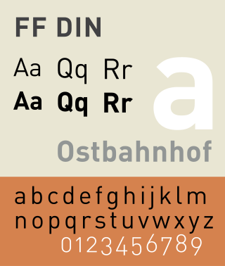
FF DIN is a sans-serif typeface in the industrial or "grotesque" style. It was designed in 1995 by Albert-Jan Pool, based on DIN-Mittelschrift and DIN-Engschrift, as defined in the German standard DIN 1451. DIN is an acronym for Deutsches Institut für Normung. It was published by FontShop in its FontFont library of typefaces.

<span class="mw-page-title-main">Christian Schwartz</span> American type designer (born 1977)

Christian Schwartz is an American type designer. He has been awarded the German Design Award and the Prix Charles Peignot.

<span class="mw-page-title-main">Martin Majoor</span> Dutch type designer and graphic designer (born 1960)

Martin Majoor is a Dutch type designer and graphic designer. As of 2006, he had worked since 1997 in both Arnhem, Netherlands, and Warsaw, Poland.

FontShop International was an international manufacturer of digital typefaces (fonts), based in Berlin. It was one of the largest digital type foundries.

The Gerrit Noordzij Prize is given to type designers and typographers for extraordinary contributions to the fields of type design, typography and type education. The prize, initiated by Anno Fekkes during the 1996 ATypI conference in The Hague, is awarded every three years by the Royal Academy of Art in The Hague together with the Museum Meermanno, under the auspices of the Dr. P.A. Tiele Trust. The prize is named after Gerrit Noordzij, who was a professor of typeface design at the Royal Academy of Art. For the continuity of the prize, the Gerrit Noordzij Fund was created.

<span class="mw-page-title-main">Jeremy Tankard</span> British type designer

Jeremy Tankard is a British type designer. Tankard has designed retail fonts independently and for FontShop and Adobe. Corbel was designed for Microsoft and has been included in Microsoft Office and Windows since 2006.

<span class="mw-page-title-main">Petr van Blokland</span>

Petr van Blokland is a Dutch graphic designer, software author and typeface designer who lives in Delft.

The Unified Font Object (UFO) is an XML-based source file format for digital fonts. It was created by Tal Leming, Just van Rossum and Erik van Blokland. Contributors to the format also include Ben Kiel and Frederik Berlaen. According to its creators, the UFO is a "future proof" open format that is designed to be "application independent", "human readable and human editable".

Just van Rossum is a Dutch typeface designer, software developer, and professor at the Royal Academy of Art in the Hague. He is the co-founder of design firm, LettError, along with Erik van Blokland. Just van Rossum is the younger brother of Guido van Rossum, creator of the Python programming language.

References

  1. Erik van Blokland at the Klingspor Museum website.
  2. "Typographics ➽ People ➽ Erik van Blokland". Archived from the original on 22 June 2015. Retrieved 22 June 2015.
  3. 1 2 Macmillan, Neil (2006). An A-Z of type designers. New Haven, Conn.: Yale University Press. ISBN   978-0-300-11151-4.
  4. Emotional digital : a sourcebook of contemporary typographics. London; New York: Thames & Hudson. 2001. ISBN   978-0-500-28310-3.
  5. "LettError | Frieze". Frieze (21). Retrieved 29 May 2021.
  6. 1 2 "LettError". Frieze (21).
  7. "FF Beowolf & BeoSans OT". Typographica. Retrieved 29 May 2021.
  8. "Erik van Blokland, Just van Rossum. FF Beowolf. 1990 | MoMA". MoMA. The Museum of Modern Art, New York. Retrieved 29 May 2021.
  9. Processing Handbook For Visual Designers.
  10. "Random Characters: The Past, Present and Future of Generative Typography". School of Visual Arts | SVA | New York City. Retrieved 29 May 2021.
  11. "FF Beowolf Font". FontShop. Retrieved 29 May 2021.
  12. "MoMA | Digital Fonts: 23 New Faces in MoMA's Collection". www.moma.org.
  13. An A-Z of Type Designers By Neil Macmillan Yale University Press, 2006
  14. Postscript : zur Form von Schrift heute : A/CH/D. Ostfildern: Hatje Cantz. 2004. ISBN   978-3-7757-1415-0.
  15. Heller, Steven (2000). Graphic design timeline : a century of design milestones. New York: Allworth Press. ISBN   978-1-58115-064-3.
  16. Spiekermann, Erik. "LettError[TM]". Wired.
  17. "The Story :: FF Trixie, Typewriter Font". trixiefont.com.
  18. "LettError Type and Typography". letterror.com.
  19. "LettError Type and Typography". letterror.com. Retrieved 30 May 2021.
  20. "NBA changes its logotype after 48 years". TYPE Magazine. Retrieved 30 May 2021.
  21. "Unified Font Object". unifiedfontobject.org.
  22. "Web Open Font Format backed by Mozilla, type foundries". Ars Technica. 2 November 2009.
  23. Twemlow, Alice (2006). What is graphic design for?. Mies, Switzerland; Hove, UK: RotoVision SA. ISBN   978-2-940361-07-6.
  24. Stephen Coles. "An Introduction to RoboFab". Typographica.
  25. "Interpolation Systems". superpolator.com.