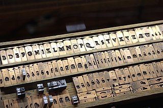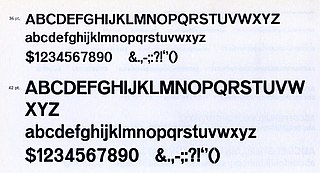
Typography is the art and technique of arranging type to make written language legible, readable and appealing when displayed. The arrangement of type involves selecting typefaces, point sizes, line lengths, line-spacing (leading), and letter-spacing (tracking), as well as adjusting the space between pairs of letters (kerning). The term typography is also applied to the style, arrangement, and appearance of the letters, numbers, and symbols created by the process. Type design is a closely related craft, sometimes considered part of typography; most typographers do not design typefaces, and some type designers do not consider themselves typographers. Typography also may be used as an ornamental and decorative device, unrelated to the communication of information.

A typeface is a design of letters, numbers and other symbols, to be used in printing or for electronic display. Most typefaces include variations in size, weight, slope, width, and so on. Each of these variations of the typeface is a font.

Futura is a geometric sans-serif typeface designed by Paul Renner and released in 1927. It was designed as a contribution on the New Frankfurt-project. It is based on geometric shapes, especially the circle, similar in spirit to the Bauhaus design style of the period. It was developed as a typeface by the Bauer Type Foundry, in competition with Ludwig & Mayer's seminal Erbar typeface of 1926.

Emigre, Inc., doing business as Emigre Fonts, is a digital type foundry based in Berkeley, California, that was founded in 1985 by husband-and-wife team Rudy VanderLans and Zuzana Licko. The type foundry grew out of Emigre magazine, a publication founded by VanderLans and two Dutch friends who met in San Francisco, CA in 1984. Note that unlike the word émigré, Emigre is officially spelled without accents.
FIGlet is a computer program that generates text banners, in a variety of typefaces, composed of letters made up of conglomerations of smaller ASCII characters. The name derives from "Frank, Ian and Glenn's letters".

Courier is a monospaced slab serif typeface. Courier was created by IBM in the mid-1950s, and was designed by Howard "Bud" Kettler (1919–1999). The Courier name and typeface concept are in the public domain. Courier has been adapted for use as a computer font, and versions of it are installed on most desktop computers.

In the manufacture of metal type used in letterpress printing, a matrix is the mould used to cast a letter, known as a sort. Matrices for printing types were made of copper.

Monotype Imaging Holdings Inc., founded as Lanston Monotype Machine Company in 1887 in Philadelphia by Tolbert Lanston, is an American company that specializes in digital typesetting and typeface design for use with consumer electronics devices. Incorporated in Delaware and headquartered in Woburn, Massachusetts, the company has been responsible for many developments in printing technology—in particular the Monotype machine, which was a fully mechanical hotmetal typesetter, that produced texts automatically, all single type. Monotype was involved in the design and production of many typefaces in the 20th century. Monotype developed many of the most widely used typeface designs, including Times New Roman, Gill Sans, Arial, Bembo and Albertus.
Hoefler&Co. (H&Co) is a digital type foundry in Woburn, Massachusetts, founded by type designer Jonathan Hoefler. H&Co designs typefaces for clients and for retail on its website.

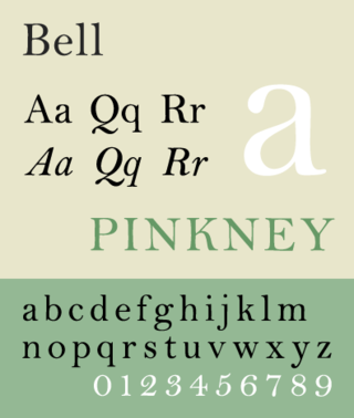
Bell is the name given to a serif typeface designed and cut in 1788 by the punchcutter Richard Austin for the British Letter Foundry, operated by publisher John Bell, and revived several times since.
Ascender Corporation was a digital typeface foundry and software development company located in the Chicago suburb of Elk Grove Village, Illinois in the United States. It was founded in 2004 by a team of software developers, typographers, and font-industry veterans who had previously been involved in developing fonts used widely in computers, inkjet printers, phones, and other digital technology devices. On December 8, 2010, Ascender Corp. was acquired by Monotype Imaging.

OCR-A is a font issued in 1966 and first implemented in 1968. A special font was needed in the early days of computer optical character recognition, when there was a need for a font that could be recognized not only by the computers of that day, but also by humans. OCR-A uses simple, thick strokes to form recognizable characters. The font is monospaced (fixed-width), with the printer required to place glyphs 0.254 cm apart, and the reader required to accept any spacing between 0.2286 cm and 0.4572 cm.

Trinité is a serif typeface designed by Dutch type designer Bram de Does. He worked on the design from 1979 to 1982. In 1991, he received the H.N. Werkman Prize for the design.

Klavika is a family of sans-serif fonts designed by Eric Olson and released by Process Type Foundry in 2004. It contains four weights: light, regular, medium, and bold and variations of numerals.

The Klim Type Foundry is a digital type foundry operated by Kris Sowersby, a New Zealand typeface designer. Klim was founded in 2005 and is currently based in Wellington. Klim produces retail typefaces, custom typefaces and custom lettering and logotypes. Sowersby has garnered many international awards for his typefaces.

URW Type Foundry GmbH is a type foundry based in Hamburg, Germany. The foundry has its own library with more than 500 font families. The company specializes in customized corporate typefaces and the development of non-Latin fonts. It has been owned by Monotype Imaging since May 2020.

Venus or Venus-Grotesk is a sans-serif typeface family released by the Bauer Type Foundry of Frankfurt am Main, Germany from 1907 onwards. Released in a large range of styles, including condensed and extended weights, it was very popular in the early-to-mid twentieth century. It was exported to other countries, notably the United States, where it was distributed by Bauer Alphabets Inc, the U.S. branch of the firm.

Seravek is a sans-serif typeface family designed by Eric Olson and released in 2007. Olson described Seravek as having a neutral design of "near silence". Seravek is a member of the humanist style of sans-serifs, with features such as a true italic inspired by handwriting.
East Asian typography is the application of typography to the writing systems of Chinese, Japanese, and Korean languages and Vietnamese languages. Scripts used in East Asian typography include Chinese characters, hiragana, katakana, hangul, and Chữ Nôm.


