News Gothic

Last updated
News Gothic
News Gothic specimen.svg
Category Sans-serif
Classification Grotesque
Designer(s) Morris Fuller Benton
Foundry American Type Founders
Date created1908

News Gothic is a sans-serif typeface designed by Morris Fuller Benton, and was released in 1908 by his employer American Type Founders (ATF). [1] The typeface is similar in proportion and structure to Franklin Gothic, also designed by Benton, but lighter.

Contents

News Gothic, like other Benton sans serif typefaces, follows the grotesque model, resembling serif text faces of the period, with a double-storey lower-case 'a' and 'g'. Also distinctive are the blunt terminus at the apex of the lowercase 't', and the location of the tail of the uppercase 'Q' completely outside the bowl. The letter forms are compact, and descenders are shallow. The typeface differs from other grotesque sans-serifs in its rather light weight and open letterforms, contributing to a less severe, humanist tone of voice.

For much of the twentieth century, News Gothic was used in newspaper and magazine publishing with copies available on Monotype and Intertype machines for hot metal typesetting. Both companies added additional weights to the family. [2] For use in headlines, it was designed with condensed and extra-condensed styles.

'Gothic' was an early twentieth century term for sans-serifs, found mostly in the United States and Canada. It was also used in the UK, along with 'grotesque'. In Germany the term 'Grotesk' was used.

Metal type release

A post-war guide (presumably c. 1958) explaining the names used by ATF for their many somewhat related 'gothic' types and highlighting their then-new News Gothic Bold. ATF Gothics.png
A post-war guide (presumably c. 1958) explaining the names used by ATF for their many somewhat related 'gothic' types and highlighting their then-new News Gothic Bold.

Benton's autobiographical notes list the following designs as his contributions to the family: [4]

ATF's 1923 specimen book also shows: [5]

As with Franklin Gothic, the foundry expanded the line sometime later, adding two more variants:

Both Monotype and Intertype released oblique versions; McGrew reports that while ATF's archives contained 1912 production drawings for an oblique "we have no record of its production". [2]

Cold type copies

Virtually all producers of cold type offered their own versions of News Gothic under different names: [7]

Digital releases

Several common News Gothic digitisations. News Gothic comparison.png
Several common News Gothic digitisations.

Because there is no active descendant of the American Type Founders Corporation making digital typefaces, News Gothic has been revived in digital form in many different versions from different sources.

Benton Sans is a greatly expanded font family based on News Gothic by Font Bureau, adding additional features such as wide styles and extra-bold weights. At 80 styles, it is one of the most comprehensive digital renditions of the News Gothic style. [8] Its users include Newsweek, Fortune magazine, the Boston Globe and Sotheby's. [9]

Digital releases actually named News Gothic have a variety of features, often adding in weights not present in the original design or removing some less popular ones. For example, Bitstream's release is rare in including the extra-condensed styles. [10] URW++'s (also sold by Fontsite) is only sold in one width but in a wide range of weights and with italics for every weight, while Linotype's lacks a light weight or any condensed styles. [11] [12] Monotype's revival, a subset of which is included with many Microsoft products, features the condensed style but not extra-condensed, and has wider spacing than several others. Adobe, Monotype, Linotype and Bitstream have their own versions. The Bitstream version of News Gothic was extended with Cyrillic glyphs in 2005 and Greek glyphs in 2009 by Dmitry Kirsanov for ParaType, and is sold by them separately. [13]

Hamburg Serial [14] is a lesser-known version of News Gothic by SoftMaker, with italics that have a one-story 'a' and 'g'.

News Gothic No. 2 is an enhanced version of News Gothic produced by the D. Stempel AG type foundry in 1984. It adds more weights to the News Gothic family than were available in other versions. [15]

Adobe Source Sans Pro is a single-width design based on News Gothic, but differs in having true italics and a larger x-height for use with onscreen display. It was released in 2012 as Adobe's first open-source family under the SIL Open Font License; Adobe's training material highlights it as having a more consistent colour on the page than the rather condensed News Gothic. [16] [17]

News Cycle is an open-source variant by Nathan Willis based on 1908 specimens of News Gothic typeface from ATF extended with full Latin, Greek, and Cyrillic glyphs. It is an open source typeface licensed under the SIL Open Font License. [18] [19]

Similar designs

Linotype called their similar design Trade Gothic while the Ludlow version was known as Record Gothic. Intertype copied the face under the same name and added a variant, News Gothic Bold (1955). [2] Baltimore Type's copy was called Balto Gothic, while their copy of Inland Type Foundry's Inland Gothic No. 6 was perversely sold under the name News Gothic.

In 1916, Sol Hess made alternate rounded characters for News Gothic Extra Condensed and the resulting face was sold by Lanston Monotype as Jefferson Gothic, which was also sold by Baltimore Type as Tourist Extra Condensed In 1935, M.F. Benton did much the same thing for A.T.F. and the face was called Phenix.

Ludlow's Record Gothic began as a mere knock-off but, between 1956 and 1961, their in-house designer, R. Hunter Middleton made many original additions to the family including: [20]

Record Gothic is, again, a very inconsistent family, and has never been fully digitised. [21]

Yu Gothic is a Japanese font bundled with some versions of Windows, but the Latin glyphs look similar to News Gothic. The fonts are otherwise unrelated.

Usages

A sample image for News Gothic Condensed, made by ATF in 1912. The design is a letterhead for an electrical equipment company, showing News Gothic's clean, modern image. News Gothic Condensed sample 1915.jpg
A sample image for News Gothic Condensed, made by ATF in 1912. The design is a letterhead for an electrical equipment company, showing News Gothic's clean, modern image.
The well-known logo of ABBA using bold variant of this font ABBA-Logo.svg
The well-known logo of ABBA using bold variant of this font

Bibliography

Related Research Articles

<span class="mw-page-title-main">Frutiger (typeface)</span> Typeface designed by Adrian Frutiger

Frutiger is a series of typefaces named after its Swiss designer, Adrian Frutiger. Frutiger is a humanist sans-serif typeface, intended to be clear and highly legible at a distance or at small text sizes. A popular design worldwide, type designer Steve Matteson described its structure as "the best choice for legibility in pretty much any situation" at small text sizes, while Erik Spiekermann named it as "the best general typeface ever".

<span class="mw-page-title-main">Arial</span> Neo-grotesque sans-serif typeface

Arial is a sans-serif typeface and set of computer fonts in the neo-grotesque style. Fonts from the Arial family are included with all versions of Microsoft Windows after Windows 3.1, as well as in other Microsoft programs, Apple's macOS, and many PostScript 3 printers.

<span class="mw-page-title-main">Univers</span> Sans-serif typeface family

Univers is a large sans-serif typeface family designed by Adrian Frutiger and released by his employer Deberny & Peignot in 1957. Classified as a neo-grotesque sans-serif, one based on the model of nineteenth-century German typefaces such as Akzidenz-Grotesk, it was notable for its availability from the moment of its launch in a comprehensive range of weights and widths. The original marketing for Univers deliberately referenced the periodic table to emphasise its scope.

<span class="mw-page-title-main">Franklin Gothic</span> Family of sans-serif fonts

Franklin Gothic and its related faces are a large family of sans-serif typefaces in the industrial or grotesque style developed in the early years of the 20th century by the type foundry American Type Founders (ATF) and credited to its head designer Morris Fuller Benton. “Gothic” was a contemporary term meaning sans-serif.

<span class="mw-page-title-main">Font</span> Particular size, weight and style of a typeface

In metal typesetting, a font is a particular size, weight and style of a typeface. Each font is a matched set of type, with a piece for each glyph. A typeface consists of various fonts that share an overall design.

<span class="mw-page-title-main">Cheltenham (typeface)</span> 1896 display typeface

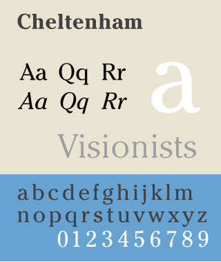
Cheltenham is a typeface for display use designed in 1896 by architect Bertram Goodhue and Ingalls Kimball, director of the Cheltenham Press. The original drawings were known as Boston Old Style and were made about 14" high. These drawings were then turned over to Morris Fuller Benton at American Type Founders (ATF) who developed it into a final design. Trial cuttings were made as early as 1899 but the face was not complete until 1902. The face was patented by Kimball in 1904. Later the basic face was spun out into an extensive type family by Morris Fuller Benton.

<span class="mw-page-title-main">Goudy Old Style</span> Typeface

Goudy Old Style is an old-style serif typeface originally created by Frederic W. Goudy for American Type Founders (ATF) in 1915.

<span class="mw-page-title-main">Syntax (typeface)</span> Typeface

Syntax comprises a family of fonts designed by Swiss typeface designer Hans Eduard Meier. Originally just a sans-serif font, it was extended with additional serif designs.

<span class="mw-page-title-main">Bank Gothic</span> Typeface

Bank Gothic is a rectilinear geometric sans-serif typeface designed by Morris Fuller Benton for American Type Founders and released in 1930. The design has become popular from the late twentieth century to suggest a science-fiction, military, corporate, or sports aesthetic.

<span class="mw-page-title-main">Monotype Grotesque</span> Grotesque sans-serif typeface

Monotype Grotesque is a family of sans-serif typefaces released by the Monotype Corporation for its hot metal typesetting system. It belongs to the grotesque or industrial genre of early sans-serif designs. Like many early sans-serifs, it forms a sprawling family designed at different times.

<span class="mw-page-title-main">Trade Gothic</span> Grotesque sans-serif typeface

Trade Gothic is a sans-serif typeface designed in 1948 by Jackson Burke (1908–1975), who continued to work on further style-weight combinations, eventually 14 in all, until 1960, while he was director of type development for Linotype in the US. The family includes three weights and three widths.

<span class="mw-page-title-main">Clearface</span> Typeface

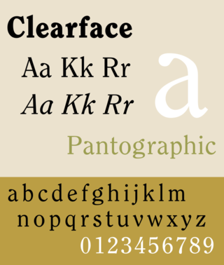
Clearface is a serif typeface designed by Morris Fuller Benton with the collaboration of his father Linn Boyd Benton, produced at American Type Founders in 1907.

Sol Hess was an American typeface designer. After a three-year scholarship course at Pennsylvania Museum School of Industrial Design, he began at Lanston Monotype in 1902, rising to typographic manager in 1922. He was a close friend and collaborator with Monotype art director Frederic Goudy, succeeding him in that position in 1940. Hess was particularly adept at expanding type faces into whole families, allowing him to complete 85 faces for Monotype, making him America's fourth most prolific type designer. While he was with Monotype, Hess worked on commissions for many prominent users of type, including, Crowell-Collier, Sears Roebuck, Montgomery Ward, Yale University Press, World Publishing Company, and Curtis Publishing for whom he re-designed the typography of their Saturday Evening Post.

<span class="mw-page-title-main">Century type family</span> Typeface

Century is a family of serif type faces particularly intended for body text. The family originates from a first design, Century Roman, cut by American Type Founders designer Linn Boyd Benton in 1894 for master printer Theodore Low De Vinne, for use in The Century Magazine. ATF rapidly expanded it into a very large family, first by Linn Boyd, and later by his son Morris.

<span class="mw-page-title-main">Souvenir (typeface)</span> Typeface

Souvenir is a serif typeface designed in 1914 by Morris Fuller Benton for American Type Founders. It was loosely based on Schelter-Antiqua and Schelter-Kursiv, a 1905 Art Nouveau type issued by the J.G. Schelter & Giesecke foundry in Leipzig. It has a much softer appearance than other old style faces, with a generally light look, rounded serifs, and very little contrast between thick and thin strokes. Like Cheltenham, it shows the influence of the Arts and Crafts Movement without belonging to a specific historical style. A 1970s redesign by Ed Benguiat, adding extra styles and an italic, became far more popular than the initial release, and is the source of most versions sold today.

<span class="mw-page-title-main">Cloister (typeface)</span> Typeface

Cloister is a serif typeface that was designed by Morris Fuller Benton and published by American Type Founders from around 1913. It is loosely based on the printing of Nicolas Jenson in Venice in the 1470s, in what is now called the "old style" of serif fonts. American Type Founders presented it as an attractive but highly usable serif typeface, suitable both for body text and display use.

<span class="mw-page-title-main">Source Sans</span> Sans-serif typeface family

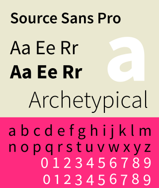
Source Sans is a sans-serif typeface created by Paul D. Hunt, released by Adobe in 2012. It is the first open-source font family from Adobe, distributed under the SIL Open Font License.

<span class="mw-page-title-main">Metro (typeface)</span> Typeface

Metro is a sans-serif typeface family created by William Addison Dwiggins and released by the American Mergenthaler Linotype Company from 1929 onwards.

References

  1. Rollins, Carl Purington (1947). American Type Designers and their Work. p.  7 . Retrieved 9 July 2017.
  2. 1 2 3 McGrew, Mac (1993). American Metal Typefaces of the Twentieth Century (Seconde édition révisée. ed.). New Castle: Oak Knoll Press. pp. 230–1. ISBN   0-938768-39-5.
  3. MacMillan, David. "Unidentified ATF Catalog (Fragments)". Circuitous Root. Retrieved 9 July 2017.
  4. Cost, Patricia (28 March 2015). "A Reply to Rick von Holdt". Morris Benton website. Retrieved 2 January 2017.
  5. Specimen Book & Catalogue. American Type Founders. 1923. pp.  472–7. Retrieved 30 August 2015.
  6. Devroye, Luc. "News Gothic". Type Design Information. Retrieved 9 July 2017.
  7. Lawson, Provan, and Romano, "Primer Metal Typeface Identification," pp. 34 - 35.
  8. "Benton Sans". Font Bureau. Retrieved 29 August 2015.
  9. "Benton Gothic". Fonts in Use. Retrieved 29 August 2015.
  10. "News Gothic BT". MyFonts. Bitstream. Retrieved 28 July 2018.
  11. "URW++ News Gothic". MyFonts. URW++ . Retrieved 29 August 2015.
  12. "Linotype News Gothic". MyFonts. Linotype. Retrieved 29 August 2015.
  13. "News Gothic Font". Paratype. Retrieved 30 September 2014.
  14. "Hamburg Serial™ - Webfont & Desktop font « MyFonts". www.myfonts.com. Retrieved 2018-10-13.
  15. "News Gothic No. 2". MyFonts. Linotype. Retrieved 28 July 2018.
  16. "Source Sans Pro: Adobe's first open source type family". TypeKit. Retrieved 30 September 2014.
  17. Brown, Tim. "Selecting Typefaces for Body Text". Typekit Practice. Adobe Systems. Retrieved 28 July 2018. Source Sans has an obviousness and toughness similar to News Gothic, but with a much more even color. Its letterforms are wider and more widely spaced, more modest than monumental, which makes sense in a body text setting....News Gothic is not a good choice of body text typeface. Certain letter combinations are very dense, and the overall color is not even.
  18. Willis, Nathan (25 August 2010). "News Cycle font family". Launchpad. Retrieved 30 September 2014.
  19. "News Cycle". Open Font Library. Retrieved 9 December 2014.
  20. MacGrew, "American Metal Typefaces of the Twentieth Century," pp. 264 - 267.
  21. Coles, Stephen (22 July 2015). "Record Gothic: fictional samples". Fonts in Use. Retrieved 29 August 2015.
  22. hem.bredband.net/b138451/logo/
  23. www.amazon-noir.com/BOOKS/6_%20The_Fluxus_Reader_Ken_Friedman.pdf
  24. ubu.clc.wvu.edu/historical/gb/index.html
  25. "Signaltron ST-15 split-flap displays". 3 August 2020.
  26. "Official Scrabble Letter Fonts: What Fans Need to Know". 2 April 2020.
  27. Devroye, Luc. "Heidelberg Gothic and Antiqua". Luc Devroye. Retrieved 30 September 2014.
  28. "JCP News Gothic". Terminal Design. Retrieved 30 September 2014.
  29. "Font used for State Farm agent name and info?". Signs101.com: Largest Forum for Signmaking Professionals. 2 June 2018. Retrieved 2020-01-16.