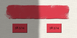
Perceived hue shift when white light is added to a monochromatic light source
An illustration of the Abney effect. The RGB primaries on a typical display are not monochromatic, making the effect weaker than in the usual experimental setup. However, it is usually still possible to see the effect in the blue example, with the middle shades appearing to be purple.
The addition of white light will cause a desaturation of the monochromatic source, as perceived by the human observer. However, a less intuitive effect of the perceived white light addition is the change in the apparent hue. This hue shift is physiological rather than physical in nature.
This variance of hue as a result of the addition of white light was first described by the English chemist and physicist Sir William de Wiveleslie Abney in 1909, although the date is commonly reported as 1910. A white light source can be created by the combination of red, blue, and green light. Abney demonstrated that the cause of the apparent change in hue was the red and green light that comprised this light source, and that the blue light component had no contribution to the Abney effect.[3]
Chromaticity diagrams
Purity-on-hue (Abney) effect in CIE 1931 chromaticity diagram, showing five experimental datasets. Inset table shows approximate nulls, i.e. wavelengths where the effect doesn't seem to appear. Confusingly, the data don't seem to agree except for nulls in violet and yellow ranges.
Chromaticity diagrams are two-dimensional diagrams that plot the projection of the International Commission on Illumination (CIE) XYZ color space onto the (x, y) plane. The X, Y, Z values (or tristimulus values) are simply used as weightings to create new colors from the primary colors, much in the same way that RGB is used for creating colors from primaries in televisions or photographs. The x and y values used to create the chromaticity diagram are created from the XYZ values by dividing X and Y by the sum of X, Y, Z. The chromaticity values that can then be plotted are dependent upon two values: dominant wavelength and saturation. Since luminous energy is not included, colors that differ only in its lightness are not distinguished on the diagram. For instance, brown, which is just a low-luminance mixture of orange and red, will not appear as such.[4]
The Abney effect can be illustrated on chromaticity diagrams as well. If one adds white light to a monochromatic light, one will obtain a straight line on the chromaticity diagram. We might imagine that the colors along such a line are all perceived as having the same hue. In reality, this does not hold true, and a hue shift is perceived. Correspondingly, if we plot colors that are perceived as having the same hue (and only differing in purity) we will obtain a curved line.[which?]
In chromaticity diagrams, a line that has constant perceived hue must be curved, so that the Abney effect is accounted for.[5] The chromaticity diagrams that have been corrected for the Abney effect are therefore excellent illustrations of the non-linear[clarification needed] nature of the visual system.[6] Also, the Abney effect does not disallow any and all straight lines on chromaticity diagrams. One may mix two monochromatic lights[which?] and not see a shift in hue, thereby suggesting a straight-line plot for the different levels of mixture would be appropriate on a chromaticity diagram.[7]
Physiology
The opponent process model of the visual system is composed of two chromatic neural channels and one achromatic neural channel.[8] The chromatic channels consist of a red-green channel and a yellow-blue channel and transmit color information. The achromatic channel is responsible for luminance, or white-black discrimination. Hue and saturation are perceived due to varying amounts of activity in these neural channels consisting of axon pathways from retinal ganglion cells.[8] These three channels are tied closely to reaction time in response to colors. The achromatic neural channel has a faster response time than the chromatic neural channels under most conditions. The functions of these channels are task-dependent. Some activities are dependent on one channel or the other, as well as both channels. When a colored stimulus is summed with a white stimulus, both the chromatic and achromatic channels are activated. The achromatic channel will have a slightly slowed response time, since it must adjust to the different luminance; however, despite this delayed response, the speed of the achromatic channel will still be faster than that of the chromatic channel.[5] In these conditions of summed stimuli, the magnitude of the signal emitted by the achromatic channel will be stronger than of the chromatic channel. The coupling of a faster response with a higher amplitude from the achromatic channel means that reaction time will most likely depend on the luminance and saturation levels of the stimuli.[5]
The customary explanations for color vision explain the difference in hue perception as elemental sensations that are inherent to the physiology of the observer. However, no specific physiological constraints or theories have been able to explain the response to each unique hue. To this end, both the observer’s spectral sensitivity and relative number of cone types have proven to not play any significant role in perceiving different hues.[9] Perhaps the environment plays a larger role in the perception of unique hues than the different physiological features across individuals. This is supported by the fact that color judgments can vary depending on differences in the color environment across long periods of time, but these same chromatic and achromatic judgments are held constant if the color environment is the same, despite aging and other individual physiological factors affecting the retina.[10]
Like the Bezold–Brücke effect, the Abney effect suggests a non-linearity between the cone responses (LMS) to the stage of hue perception.[11]
Colorimetric purity
The saturation, or degree of paleness of a color, is related to colorimetric purity. The equation for colorimetric purity is: P = L/(Lw + L).[12] In this equation, L equals the luminance of the colored light stimulus, Lw is the luminance of the white light stimulus to be mixed with the colored light. The above equation is a way of quantifying the amount of white light that is mixed with the colored light. In the case of pure spectral color, with no white light added, L equals one and Lw equals zero. This means colorimetric purity would equal one, and for any case involving the addition of white light, the colorimetric purity, or the value of P, would be less than one. The purity of a spectral color stimulus can be altered by adding white, black, or gray stimulus. However, the Abney effect describes the change in colorimetric purity by the addition of white light. In order to determine the effect that changing the purity has on the perceived hue, it is important that purity be the only variable in the experiment; luminance must be kept constant.
Hue discrimination
The term hue discrimination is used to describe the change in wavelength that must be obtained in order for the eye to detect a shift in hue. An expressionλ + Δλ defines the required wavelength adjustment that must take place.[12] A small (< 2 nm) change in wavelength causes most spectral colors to appear to take on a different hue. However, for blue light and red light, a much larger wavelength shift must occur in order for a person to be able to identify a difference in hue.
History
The original article describing the Abney effect was published by Sir William de Wiveleslie Abney in Proceedings of the Royal Society of London, Series A in December 1909.[3] He decided to do quantitative research following the discovery that the visual observations of color did not match the dominant colors obtained photographically when using models of fluorescence.
A color-measuring apparatus commonly used in experiments in the 1900s was used in conjunction with partially silvered mirrors to split one beam of light into two beams.[13] This resulted in two beams of light parallel to one another having the same intensity and color. The beams of light were projected onto a white background, creating patches of light that were 1.25-inch (32mm) squares. The white light was added to one of the patches of colored light, the patch on the right. A rod was inserted in the path of the two beams so that there would be no space in between the colored surfaces. An additional rod was used to create a shadow where the white light scattered onto the patch that was not to receive addition of white light (the patch on the left side). The amount of white light added was determined as one half of the luminosity of the colored light. The red light source, for example, had more white light added than the yellow light source. He began using two patches of red light, and in fact, the addition of white light to the light patch on the right caused a more yellow tone than the pure red light source. The same results happened when the experimental light source was orange. When the light source was green, the addition of white light caused the appearance of the patch to become yellow-green. Subsequently, when white light was added to yellow-green light, the patch of light appeared primarily yellow. In a mixture of blue-green light (with a slightly higher percentage of blue) with white light, the blue appeared to take on a reddish hue. In the case of a violet light source, the addition of white light caused the violet light to take on a blue tint.[3]
Abney hypothesized that the resulting change in hue that occurred was due to the red light and green light that were components of the white light being added. He also thought that the blue light that also comprises the white light beam was a negligible factor that had no effect on the apparent hue shift. Abney was able to prove his hypothesis experimentally by matching his experimental values of percentage composition and luminosities of red, green, and blue sensations to the calculated values almost exactly. He examined the percentage composition and luminosity found in the different spectral colors as well as the white light source that was added.[3]
Similar effect of bandwidth
While the nonlinearity of neural color-coding, as evidenced by the classical understanding of the Abney effect and its use of white light to particular wavelengths of light, has been thoroughly studied in the past, a new method was undertaken by researchers at the University of Nevada.[10] Rather than adding white light to monochromatic light, the bandwidth of the spectrum was varied. This variation of bandwidth directly targeted the three classes of cone receptors as a means of identifying any hue shifts as perceived by the human eye.[14] The overall goal of the research was to determine whether the appearance of color was affected by the filtering effects of the spectral sensitivity of the eye. Experiments showed that the cone ratios signaled a hue was adjusted so as to produce a constant hue that matched the central wavelength of the light source. Also, the experiments conducted essentially showed that the Abney effect does not hold for all changes in light purity, but is limited very much to certain means of purity degradation, namely the addition of white light. Since the experiments undertaken varied the bandwidth of the light, a similar albeit different means of altering the purity and therefore hue of the monochromatic light, the nonlinearity of the results displayed differently from what had traditionally been seen. Ultimately, the researchers came to the conclusion that variations in spectral bandwidth cause postreceptoral mechanisms to compensate for the filtering effects imposed by cone sensitivities and preretinal absorption and that the Abney effect occurs because the eye has, in a sense, been tricked into seeing a color that would not naturally occur and must therefore approximate the color. This approximation to compensate for the Abney effect is a direct function of the cone excitations experienced with a broadband spectrum.[10]
Miscellaneous facts
A patent for a color printer that claims to compensate for the Abney effect was published in 1995.[15]
The Abney effect must be taken into account when designing the cockpit for modern fighter planes. The colors viewed on the screen become desaturated when white light strikes the screen, so special considerations are made to counteract the Abney effect.[5]
A wide array of spectral colors exist that can be made to exactly match a pure color by adding various levels of white light.[16]
It remains unknown whether the Abney effect is a resulting phenomenon that occurs by chance during color perception or the effect plays a deliberate function in the way the eye codes for color.
Modeling
This section is missing information about what special constructs allow the two CAMs to predict the effect. Please expand the section to include this information. Further details may exist on the talk page.(February 2021)
The Abney effect is rarely described by known color appearance models. Of the many models Fairchild reviewed in Color Appearance Models (3 ed.), only the Hunt and ATD models predict the Abney effect.[17]
Color or colour is the visual perception based on the electromagnetic spectrum. Though color is not an inherent property of matter, color perception is related to an object's light absorption, reflection, emission spectra and interference. For most humans, color are perceived in the visible light spectrum with three types of cone cells (trichromacy). Other animals may have a different number of cone cell types or have eyes sensitive to different wavelength, such as bees that can distinguish ultraviolet, and thus has a different color sensitivity range. Animal perception of color originates from different light wavelength or spectral sensitivity in cone cell types, which is then processed by the brain.
A set of primary colors or primary colours consists of colorants or colored lights that can be mixed in varying amounts to produce a gamut of colors. This is the essential method used to create the perception of a broad range of colors in, e.g., electronic displays, color printing, and paintings. Perceptions associated with a given combination of primary colors can be predicted by an appropriate mixing model that reflects the physics of how light interacts with physical media, and ultimately the retina.
In color theory, hue is one of the main properties of a color, defined technically in the CIECAM02 model as "the degree to which a stimulus can be described as similar to or different from stimuli that are described as red, orange, yellow, green, blue, violet," within certain theories of color vision.
Color vision, a feature of visual perception, is an ability to perceive differences between light composed of different frequencies independently of light intensity. Color perception is a part of the larger visual system and is mediated by a complex process between neurons that begins with differential stimulation of different types of photoreceptors by light entering the eye. Those photoreceptors then emit outputs that are propagated through many layers of neurons and then ultimately to the brain. Color vision is found in many animals and is mediated by similar underlying mechanisms with common types of biological molecules and a complex history of evolution in different animal taxa. In primates, color vision may have evolved under selective pressure for a variety of visual tasks including the foraging for nutritious young leaves, ripe fruit, and flowers, as well as detecting predator camouflage and emotional states in other primates.
An afterimage is an image that continues to appear in the eyes after a period of exposure to the original image. An afterimage may be a normal phenomenon or may be pathological (palinopsia). Illusory palinopsia may be a pathological exaggeration of physiological afterimages. Afterimages occur because photochemical activity in the retina continues even when the eyes are no longer experiencing the original stimulus.
In color science, the dominant wavelength is a method of characterizing a color's hue. Along with purity, it makes up one half of the Helmholtz coordinates. A color's dominant wavelength is the wavelength of monochromatic spectral light that evokes an identical perception of hue.
Colorfulness, chroma and saturation are attributes of perceived color relating to chromatic intensity. As defined formally by the International Commission on Illumination (CIE) they respectively describe three different aspects of chromatic intensity, but the terms are often used loosely and interchangeably in contexts where these aspects are not clearly distinguished. The precise meanings of the terms vary by what other functions they are dependent on.
A spectral color is a color that is evoked by monochromatic light, i.e. either a single wavelength of light in the visible spectrum, or a relatively narrow band of wavelengths. Every wavelength of visible light is perceived as a spectral color; when viewed as a continuous spectrum, these colors are seen as the familiar rainbow.
The opponent process is a color theory that states that the human visual system interprets information about color by processing signals from photoreceptor cells in an antagonistic manner. The opponent-process theory suggests that there are three opponent channels, each comprising an opposing color pair: red versus green, blue versus yellow, and black versus white (luminance). The theory was first proposed in 1892 by the German physiologist Ewald Hering.
The CIE 1931 color spaces are the first defined quantitative links between distributions of wavelengths in the electromagnetic visible spectrum, and physiologically perceived colors in human color vision. The mathematical relationships that define these color spaces are essential tools for color management, important when dealing with color inks, illuminated displays, and recording devices such as digital cameras. The system was designed in 1931 by the "Commission Internationale de l'éclairage", known in English as the International Commission on Illumination.
The Bezold–Brücke shift or luminance-on-hue effect is a change in hue perception as light intensity changes. As intensity increases, spectral colors shift more towards blue or yellow. At lower intensities, the red/green axis dominates. This means that reds become more yellow with increasing brightness. Light may change in the perceived hue as its brightness changes, despite the fact that it retains a constant spectral composition. It was discovered by Wilhelm von Bezold and M.E. Brücke.
Lightness is a visual perception of the luminance of an object. It is often judged relative to a similarly lit object. In colorimetry and color appearance models, lightness is a prediction of how an illuminated color will appear to a standard observer. While luminance is a linear measurement of light, lightness is a linear prediction of the human perception of that light.
In colorimetry, CIECAM02 is the color appearance model published in 2002 by the International Commission on Illumination (CIE) Technical Committee 8-01 and the successor of CIECAM97s.
The Coloroid Color System is a color space developed between 1962 and 1980 by Prof. Antal Nemcsics at the Budapest University of Technology and Economics for use by "architects and visual constructors". Since August 2000, the Coloroid has been registered as Hungarian Standard MSZ 7300.
Chromostereopsis is a visual illusion whereby the impression of depth is conveyed in two-dimensional color images, usually of red–blue or red–green colors, but can also be perceived with red–grey or blue–grey images. Such illusions have been reported for over a century and have generally been attributed to some form of chromatic aberration.
The Helmholtz–Kohlrausch effect is a perceptual phenomenon wherein the intense saturation of spectral hue is perceived as part of the color's luminance. This brightness increase by saturation, which grows stronger as saturation increases, might better be called chromatic luminance, since "white" or achromatic luminance is the standard of comparison. It appears in both self-luminous and surface colors, although it is most pronounced in spectral lights.
Impossible colors are colors that do not appear in ordinary visual functioning. Different color theories suggest different hypothetical colors that humans are incapable of perceiving for one reason or another, and fictional colors are routinely created in popular culture. While some such colors have no basis in reality, phenomena such as cone cell fatigue enable colors to be perceived in certain circumstances that would not be otherwise.
Unique hue is a term used in certain theories of color vision, which implies that human perception distinguishes between "unique" and composite (mixed) hues. A unique hue is defined as a color which an observer perceives as a pure, without any admixture of the other colors. Ewald Hering first defined the unique hues as red, green, yellow, and blue, and based them on the concept that these colors could not be simultaneously perceived. For example, a color cannot appear both red and green; the color would cancel out to yellow.
A color appearance model (CAM) is a mathematical model that seeks to describe the perceptual aspects of human color vision, i.e. viewing conditions under which the appearance of a color does not tally with the corresponding physical measurement of the stimulus source.
The Hunt effect or Luminance-on-colorfulness effect comprises an increase in colorfulness of a color with increasing luminance. The effect was first described by RWG Hunt in 1952.
References
↑ Pridmore, R. “Effect of purity on hue (Abney effect) in various conditions.” Color Research and Application. 32.1 (2007): 25–39.
1 2 3 4 W. de W. Abney. “On the Change in Hue of Spectrum Colours by Dilution with White Light.” Proceedings of the Royal Society of London. Series A, Containing Papers of a Mathematical and Physical Character. 83.560 (1909): 120–127.
1 2 3 4 Widdel H., Lucien D. Color in Electronic Displays. Springer (1992): 21–23.
↑ K. Mantere, J. Parkkinen, and T. Jaaskelainen. “Simulation of white-light adaptation characteristics with use of nonlinear neural principal component analysis”. Journal of the Optical Society of America. A 14 (1997): 2049–2056.
↑ Fairchild, M. Color Appearance Models. Wiley Interscience (2005): 117–119.
1 2 Kulp, T., Fuld, K. “The Prediction of Hue and Saturation for Non-spectral Lights.” Vision Res. 35.21 (1995): 2967–2983.
↑ Shevell, S. K. “Relating cone signals to color appearance: Failure of monotonicity in yellow/blue.” Visual Neuroscience. 18.6 (2001): 901–906.
1 2 3 Mizokami Y., Werner J., Crognale M., Webster M., “Nonlinearities in color coding: Compensating color appearance for the eye’s spectral sensitivity”. Journal of Vision. 6 (2006): 996–1007.
↑ Fairchild, M. Color Appearance Models. Wiley Interscience (2013): 121-122.
↑ W. de W. Abney. “Measurement of Colour Produced by Contrast”. Proceedings of the Royal Society of London. 56.0 (1894): 221–228.
↑ Webster, M., Mizokami, Y., Werner, J., & Crognale, M. A. “Hue constancy across changes in spectral purity and a functional theory of the Abney Effect”. Journal of Vision. 5.12 (2005):36, 36a.
↑ Pridmore, R. “Bezold–Brücke effect exists in related and unrelated colors and resembles the Abney effect.” Color Research and Application. 29.3 (2004): 241–246
↑ Fairchild, M. Color Appearance Models. Wiley Interscience (2013): 241, 263.
This page is based on this Wikipedia article Text is available under the CC BY-SA 4.0 license; additional terms may apply. Images, videos and audio are available under their respective licenses.