Carmine (color)

Last updated

Carmine
 
Carmine.png
Powdered carmine pigment
Gtk-dialog-info.svg    Color coordinates
Hex triplet #960018
sRGB B (r, g, b)(150, 0, 24)
HSV (h, s, v)(350°, 100%, 59%)
CIELChuv (L, C, h)(31, 99, 10°)
Source Pourpre.com
ISCC–NBS descriptor Vivid red
B: Normalized to [0–255] (byte)

Carmine color is the general term for some deep red colors that are very slightly purplish but are generally slightly closer to red than the color crimson is. Some rubies are colored the color shown below as rich carmine. The deep dark red color shown at right as carmine is the color of the raw unprocessed pigment, but lighter, richer, or brighter colors are produced when the raw pigment is processed, some of which are shown below.

Contents

The first recorded use of carmine as a color name in English was in 1523. [1]

Variations of carmine

Wild watermelon

Wild Watermelon
 
Gtk-dialog-info.svg    Color coordinates
Hex triplet #FC6C85
sRGB B (r, g, b)(252, 108, 133)
HSV (h, s, v)(350°, 57%, 99%)
CIELChuv (L, C, h)(64, 101, 4°)
Source Crayola
ISCC–NBS descriptor Deep pink
B: Normalized to [0–255] (byte)

The color wild watermelon is displayed at right.

Ultra red is a color formulated by Crayola in 1972. In 1990, the name of the color was changed to wild watermelon.

With a hue code of 350, this color is within the range of carmine colors.

This color is supposed to be fluorescent, but there is no mechanism for displaying fluorescence on a computer screen.

Radical red

Radical Red
 
Gtk-dialog-info.svg    Color coordinates
Hex triplet #FF355E
sRGB B (r, g, b)(255, 53, 94)
HSV (h, s, v)(348°, 79%, 100%)
CIELChuv (L, C, h)(57, 145, 6°)
Source Crayola
ISCC–NBS descriptor Vivid red
B: Normalized to [0–255] (byte)

The Crayola crayon color radical red is displayed at right.

The color radical red was formulated by Crayola in 1990.

With a hue code of 348, this color is within the range of carmine colors.

This color is supposed to be fluorescent, but there is no mechanism for displaying fluorescence on a computer screen.

Paradise pink

Paradise Pink
 
Gtk-dialog-info.svg    Color coordinates
Hex triplet #E63E62
sRGB B (r, g, b)(230, 62, 98)
HSV (h, s, v)(347°, 73%, 90%)
CIELChuv (L, C, h)(53, 119, 5°)
Source Pantone TPX [2]
ISCC–NBS descriptor Vivid red
B: Normalized to [0–255] (byte)

Displayed at right is the color paradise pink.

The source of this color is the "Pantone Textile Paper eXtended (TPX)" color list, color #17-1755 TPX—Paradise Pink. [3]

Since it has a hue code of 347, the color paradise pink is within the range of carmine colors.

Rich carmine

Rich Carmine
 
Gtk-dialog-info.svg    Color coordinates
Hex triplet #D70040
sRGB B (r, g, b)(215, 0, 64)
HSV (h, s, v)(342°, 100%, 84%)
CIELChuv (L, C, h)(45, 137, 6°)
SourceMaerz and Paul [4]
ISCC–NBS descriptor Vivid red
B: Normalized to [0–255] (byte)

The rich carmine color tone displayed at right matches the color shown as carmine in the 1930 book A Dictionary of Color (cited below). This color is also called Chinese carmine. This is the color usually referred to as carmine in fashion and interior design.

Spanish carmine

Spanish Carmine
 
Gtk-dialog-info.svg    Color coordinates
Hex triplet #D10047
sRGB B (r, g, b)(209, 0, 71)
HSV (h, s, v)(340°, 100%, 82%)
CIELChuv (L, C, h)(44, 130, 5°)
SourceGallego and Sanz [5]
ISCC–NBS descriptor Vivid red
B: Normalized to [0–255] (byte)

Spanish carmine is the color that is called Carmin (the Spanish word for "carmine") in the Guía de coloraciones (Guide to colorations) by Rosa Gallego and Juan Carlos Sanz, a color dictionary published in 2005 that is widely popular in the Hispanophone realm.

Pictorial carmine

Pictorial Carmine
 
Gtk-dialog-info.svg    Color coordinates
Hex triplet #C30B4E
sRGB B (r, g, b)(195, 11, 78)
HSV (h, s, v)(338°, 94%, 76%)
CIELChuv (L, C, h)(42, 115, 2°)
SourceGallego and Sanz [6]
ISCC–NBS descriptor Vivid red
B: Normalized to [0–255] (byte)

Pictorial carmine is the color that is called Carmín pictórico (Spanish for "pictorial carmine") in the Guía de coloraciones (Guide to colorations) by Rosa Gallego and Juan Carlos Sanz, a color dictionary published in 2005 that is widely popular in the Hispanophone realm.

This is a typical tone of carmine pigment used in painting.

Japanese carmine

Japanese Carmine
 
Gtk-dialog-info.svg    Color coordinates
Hex triplet #9D2933
sRGB B (r, g, b)(157, 41, 51)
HSV (h, s, v)(355°, 74%, 62%)
CIELChuv (L, C, h)(36, 85, 10°)
Source JTC
ISCC–NBS descriptor Deep red
B: Normalized to [0–255] (byte)

The color Japanese carmine is shown at right.

The name of this shade of carmine in Japanese is enji-iro (臙脂色), literally "cochineal/rouge color", as enji ( 臙脂 ) means rouge, the cosmetics. The insect is called enji-mushi (臙脂虫). The term enji is named after Yan, an ancient Chinese state during the Zhou dynasty, as it was considered that the use of rouge in China was originated from there, this was later adopted in Japanese.

Carmine in human culture

Crime scene investigation

Music

Sports

Television

Film

National flags

See also

Related Research Articles

<span class="mw-page-title-main">Indigo</span> Shade of blue

Indigo is a term used for a number of hues in the region of blue. The word comes from the ancient dye of the same name. The term "indigo" can refer to the color of the dye, various colors of fabric dyed with indigo dye, a spectral color, one of the seven colors of the rainbow, or a region on the color wheel, and can include various shades of blue, ultramarine, and green-blue. Since the web era, the term has also been used for various purple and violet hues identified as "indigo", based on use of the term "indigo" in HTML web page specifications.

<span class="mw-page-title-main">Navy blue</span> Blueish shade of the color black which almost appears as black

Navy blue is a dark shade of the color blue.

<span class="mw-page-title-main">Bistre</span> Dark brown color

Bistre is a pigment made from soot. Historically, beechwood was burned to produce the soot, which was boiled and diluted with water. Many Old Masters used bistre as the ink for their wash paintings. Bistre's appearance is generally of a dark grayish brown, with a yellowish cast.

<span class="mw-page-title-main">Fuchsia (color)</span> Color

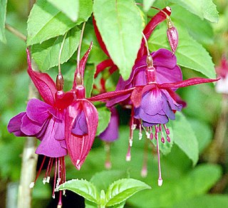
Fuchsia is a vivid pinkish-purplish-red color, named after the color of the flower of the fuchsia plant, which was named by a French botanist, Charles Plumier, after the 16th-century German botanist Leonhart Fuchs.

<span class="mw-page-title-main">Lavender (color)</span> Light shade of purple derived from the lavender plant

Lavender is a light shade of purple or violet. It applies particularly to the color of the flower of the same name. The web color called lavender is displayed adjacent—it matches the color of the palest part of the lavender flower; however, the more saturated color shown as floral lavender more closely matches the average color of the lavender flower as shown in the picture and is the tone of lavender historically and traditionally considered lavender by the average person as opposed to those who are website designers. The color lavender might be described as a medium purple or a light pinkish-purple. The term lavender may be used in general to apply to a wide range of pale, light, or grayish-purples, but only on the blue side; lilac is pale purple on the pink side. In paints, the color lavender is made by mixing purple and white paint.

<span class="mw-page-title-main">Lemon (color)</span> Shade of yellow

Lemon or lemon-color is a vivid yellow color characteristic of the lemon fruit. Shades of "lemon" may vary significantly from the fruit's actual color, including fluorescent tones and creamy hues reflective of lemon pies and confections.

<span class="mw-page-title-main">Orchid (color)</span>

Orchid is a bright rich purple color that resembles the color which various orchids often exhibit.

<span class="mw-page-title-main">Viridian</span> Shade of bluish green

Viridian is a blue-green pigment, a hydrated chromium(III) oxide, of medium saturation and relatively dark in value. It is composed of a majority of green, followed by blue. The first recorded use of viridian as a color name in English was in the 1860s. Viridian takes its name from the Latin viridis, meaning "green". The pigment was first prepared in mid-19th-century Paris and remains available from several US manufacturers as prepared artists' colors in all media.

<span class="mw-page-title-main">Red-violet</span> Overview of color term

Red-violet refers to a rich color of high medium saturation about 3/4 of the way between red and magenta, closer to magenta than to red. In American English, this color term is sometimes used in color theory as one of the purple colors—a non-spectral color between red and violet that is a deep version of a color on the line of purples on the CIE chromaticity diagram.

<span class="mw-page-title-main">Spring green</span> Color

Spring green is a color that was traditionally considered to be on the yellow side of green, but in modern computer systems based on the RGB color model is halfway between cyan and green on the color wheel.

<span class="mw-page-title-main">Shades of orange</span> Varieties of the color orange

In optics, orange has a wavelength between approximately 585 and 620 nm and a hue of 30° in HSV color space. In the RGB color space it is a secondary color numerically halfway between gamma-compressed red and yellow, as can be seen in the RGB color wheel. The complementary color of orange is azure. Orange pigments are largely in the ochre or cadmium families, and absorb mostly blue light.

<span class="mw-page-title-main">Shades of green</span> Varieties of the color green

Varieties of the color green may differ in hue, chroma or lightness, or in two or three of these qualities. Variations in value are also called tints and shades, a tint being a green or other hue mixed with white, a shade being mixed with black. A large selection of these various colors is shown below.

<span class="mw-page-title-main">Shades of red</span> Varieties of the color red

Varieties of the color red may differ in hue, chroma or lightness, or in two or three of these qualities. Variations in value are also called tints and shades, a tint being a red or other hue mixed with white, a shade being mixed with black. A large selection of these various colors are shown below.

<span class="mw-page-title-main">Shades of pink</span> Varieties of the color pink

Pink colors are usually light or desaturated shades of reds, roses, and magentas which are created on computer and television screens using the RGB color model and in printing with the CMYK color model. As such, it is an arbitrary classification of color.

<span class="mw-page-title-main">Shades of magenta</span> Varieties of the color magenta

The color magenta has notable tints and shades. These various colors are shown below.

<span class="mw-page-title-main">Shades of blue</span> Variety of the color blue

Varieties of the color blue may differ in hue, chroma, or lightness, or in two or three of these qualities. Variations in value are also called tints and shades, a tint being a blue or other hue mixed with white, a shade being mixed with black. A large selection of these colors are shown below.

<span class="mw-page-title-main">Shades of gray</span> Variations of the color gray

Variations of gray or grey include achromatic grayscale shades, which lie exactly between white and black, and nearby colors with low colorfulness. A selection of a number of these various colors is shown below.

<span class="mw-page-title-main">Shades of violet</span> Varieties of the color violet

Violet is a color term derived from the flower of the same name. There are numerous variations of the color violet, a sampling of which are shown below.

<span class="mw-page-title-main">Sky blue</span> Color

Sky blue refers to a collection of shades comparable to that of a clear daytime sky. Typically it is a shade of cyan or light teal, though some iterations are closer to light blue. The term is attested from 1681. A 1585 translation of Nicolas de Nicolay's 1576 Les navigations, peregrinations et voyages faicts en la Turquie includes "the tulbant [turban] of the merchant must be skie coloured".

<span class="mw-page-title-main">Shades of rose</span> Varieties of the color rose

Rose is the color halfway between red and magenta on the HSV color wheel, also known as the RGB color wheel.

References

  1. The color displayed in the color box above matches the color called Rich Carmine in the 1930 book A Dictionary of Color by Maerz and Paul. New York, McGraw-Hill, p. 29, Plate 3, Color Sample K5.
  2. Type the words "Paradise Pink" into the indicated window on the Pantone Color Finder and the color will appear.
  3. Pantone TPX Pantone Color Finder--Type the words "Paradise Pink" into the indicated window on the Pantone Color Finder and the color will appear:
  4. The color displayed in the color box above matches the color called carmine in the 1930 book A Dictionary of Color by Maerz and Paul. New York, McGraw-Hill, p. 29, Plate 3, Color Sample K5.
  5. Gallego, Rosa; Sanz, Juan Carlos (2005). Guía de coloraciones (Gallego, Rosa; Sanz, Juan Carlos (2005). Guide to Colorations) Madrid: H. Blume. ISBN   84-89840-31-8
  6. Gallego, Rosa; Sanz, Juan Carlos (2005). Guía de coloraciones (Gallego, Rosa; Sanz, Juan Carlos (2005). Guide to Colorations) Madrid: H. Blume. ISBN   84-89840-31-8