Homoglyph

Last updated
The homoglyphs

.mw-parser-output .monospaced{font-family:monospace,monospace}
U+0061 a LATIN SMALL LETTER A and

U+0430 a CYRILLIC SMALL LETTER A overlaid. In the image, both characters are set in Helvetica LT Std Roman. Homoglyph a.svg
The homoglyphs
U+0061aLATIN SMALL LETTER A and
U+0430аCYRILLIC SMALL LETTER A overlaid. In the image, both characters are set in Helvetica LT Std Roman.

In orthography and typography, a homoglyph is one of two or more graphemes, characters, or glyphs with shapes that appear identical or very similar but may have differing meaning. The designation is also applied to sequences of characters sharing these properties.

Contents

In 2008, the Unicode Consortium published its Technical Report #36 [1] on a range of issues deriving from the visual similarity of characters both in single scripts, and similarities between characters in different scripts.

Examples of homoglyphic symbols are (a) the diaeresis and umlaut (both a pair of dots, but with different meaning, although encoded with the same code points); and (b) the hyphen and minus sign (both a short horizontal stroke, but with different meaning, although often encoded with the same code point). Among digits and letters, digit 1 and lowercase l are always encoded separately but in many typefaces are given very similar glyphs, and digit 0 and capital O are always encoded separately but in many typefaces are given very similar glyphs. Virtually every example of a homoglyphic pair of characters can potentially be differentiated graphically with clearly distinguishable glyphs and separate code points, but this is not always done. Typefaces that do not emphatically distinguish the one/el and zero/oh homoglyphs are considered unsuitable for writing formulas, URLs, source code, IDs and other text where characters cannot always be differentiated without context. Fonts which distinguish glyphs by means of a slashed zero, for example, are preferred for those uses.

The term homograph is sometimes misused synonymously with homoglyph, but in the usual linguistic sense, homographs are words that are spelled the same but have different meanings, a property of words, not characters.

Allographs are typeface design variants that look different but mean the same thing  for example g and g, or a dollar sign with one or two strokes. The term synoglyph has a similar but a little more abstract meaning  for example the symbol £ and the letter L (in Lsd) both mean the pound sterling, [2] but only in that context. Allographs and synoglyphs are also known informally as display variants.

Umlaut and diaresis

In the days of early mechanical typewriters these were typed with the same key (using the "backspace and over-type" technique), which was also used for a double inverted comma. However the umlaut originated specifically as a pair of short vertical lines (not two dots) (see Sutterlin). Incidentally the two dots above the letter E in Albanian are described as a diaresis but do not fulfil the function of a diaresis. [3]

0 and O; 1, l and I

Two common and important sets of homoglyphs in use today are the digit zero and the capital letter O (i.e. 0 and O); and the digit one, the lowercase letter L and the uppercase i (i.e. 1, l and I). In the early days of mechanical typewriters there was very little or no visual difference between these glyphs, and typists treated them interchangeably as keyboarding shortcuts. In fact, most keyboards did not even have a key for the digit "1", requiring users to type the letter "l" instead, and some also omitted 0. As these same typists transitioned in the 1970s and 1980s to being computer keyboard operators, their old keyboarding habits continued with them, and was an occasional source of confusion.

Most current type designs carefully distinguish between these homoglyphs, usually by drawing the digit zero narrower and drawing the digit one with prominent serifs. Early computer print-outs went even further and marked the zero with a slash or dot, which led to a new conflict involving the Scandinavian letter "Ø" and the Greek letter Φ (phi). The redesigning of character types to differentiate these characters has meant less confusion. The degree to which two different characters appear the same to a given observer is called the "visual similarity". [4]

Some type designs conform to the DIN 1450 legibility standard by carefully designing such characters to be easy to distinguish: slashed zero to distinguish it from capital O; lowercase l with a tail and uppercase I with serifs to distinguish it from the digit 1; distinguishing the numeral 5 from the capital S; etc. [5]

An example of confusion due to near-homoglyphs arose from the use of a y to represent a þ (thorn). Early English typesetters imported Dutch typesets that did not contain the latter character, so used the letter y instead because (in Blackletter typeface) they look sufficiently similar. [6] It has led in modern times to such phenomena as Ye olde shoppe, implying incorrectly that the word the was formerly written ye /j/ rather than þe. The spelling of the name Menzies (pronounced Mengis and originally spelled Menʒies) arose for the same reason: the letter z was substituted for ʒ (yogh).

Multi-letter homoglyphs

Letters m and r+n in typefaces Arial, Calibri, Times New Roman, Cambria, Walbaum-Fraktur, and Comic Sans Letters m and r+n in fonts Arial, Calibri, Times New Roman, Cambria, Walbaum Fraktur, Comic Sans.svg
Letters m and r+n in typefaces Arial, Calibri, Times New Roman, Cambria, Walbaum-Fraktur, and Comic Sans
Stefan Szczotkowski looks like Aeffan Szczotkowski on the gravestone. Stefan Szczotkowski (1767-1836).jpg
Stefan Szczotkowski looks like Aeffan Szczotkowski on the gravestone.

Some other combinations of letters look similar, for instance rn looks similar to m, cl looks similar to d, and vv looks similar to w.

In certain narrow-spaced fonts (such as Tahoma), placing the letter c next to a letter such as j, l or i will create a homoglyph, such as cj cl ci (g d a).

When some characters are placed next to each other, seen together at a glance they give the visual impression of another, unrelated character. A more precise way of saying this is that some typographic ligatures can look similar to standalone glyphs. For example, the ligature (fi) can look similar to A in some typefaces or fonts. This potential for confusion is sometimes an argument made against the use of ligatures.[ citation needed ]

Unicode homoglyphs

The three most prominent European alphabets (Greek, Cyrillic and Latin) share many letter forms that are encoded in Unicode under separate code points. Venn diagram gr la ru.svg
The three most prominent European alphabets (Greek, Cyrillic and Latin) share many letter forms that are encoded in Unicode under separate code points.

Unicode has code points for many strongly homoglyphic characters, known as "confusables". [1] These present security risks in a variety of situations (addressed in UTR#36) [7] and were called to particular attention in regard to internationalized domain names. In theory at least, one might deliberately spoof a domain name by replacing one character with its homoglyph, thus creating a second domain name, not readily distinguishable from the first, that can be exploited in phishing (see main article IDN homograph attack ). In many typefaces, the Greek letter 'Α', the Cyrillic letter 'А' and the Latin letter 'A' are visually identical, as are the Latin letter 'a' and the Cyrillic letter 'а' (the same can be applied to the Latin letters "aBceHKopTxy" and the Cyrillic letters "аВсеНКорТху"). A domain name can be spoofed simply by substituting one of these forms for another in a separately registered name. There are also many examples of near-homoglyphs within the same script such as 'í' (with an acute accent) and 'i', É (E-acute) and Ė (E dot above) and È (E-grave), Í (with an acute accent) and ĺ (Lowercase L with acute). When discussing this specific security issue, any two sequences of similar characters may be assessed in terms of its potential to be taken as a 'homoglyph pair', or if the sequences clearly appear to be words, as 'pseudo-homographs' (noting again that these terms may themselves cause confusion in other contexts). In the Chinese language, many simplified Chinese characters are homoglyphs of the corresponding traditional Chinese characters.

Efforts by TLD registries and Web browser designers aim to minimize the risks of homoglyphic confusion. Commonly, this is achieved by prohibiting names which mix character sets from multiple languages (toys-Я-us.org, using the Cyrillic letter Я, would be invalid, but wíkipedia.org and wikipedia.org still exist as different websites); Canada's .ca registry goes one step further by requiring names which differ only in diacritics to have the same owner and same registrar. [8] The handling of Chinese characters varies: in .org and .info registration of one variant renders the other unavailable to anyone, while in .biz the traditional and simplified versions of the same name are delivered as a two-domain bundle which both point to the same domain name server.

Relevant documentation will be found both on the developers' Web sites, and on an IDN Forum [9] provided by ICANN.


ES1845 keyboard.jpg

In Cyrillic, Cyrillic С not only looks like Latin C, but also occupy the same button in JCUKEN-QWERTY hybrid layout keyboards. This design nuance can be seen on the C/С button represented in Keyboard Monument in Yekaterinburg.

Canonicalization

Homoglyphs of all kinds can be detected through a process called 'dual canonicalization'. [4] The first step in this process is to identify homoglyph sets, namely characters appearing the same to a given observer. From here, a single token is specified to represent the homoglyph set. This token is called a canon. The next step is to convert each character in the text to the corresponding canon in a process called canonicalization. If the canons of two runs of text are the same but the original text is different, then a homoglyph exists in the text.

Homoglyph prevention

Homoglyph attacks can be mitigated through a combination of user awareness and proactive measures. It is crucial to educate users about the risks associated with homoglyph attacks, urging them to meticulously inspect URLs before clicking. [10] Employing advanced security solutions, particularly those capable of scanning for homoglyph variations in domain names, can automate the detection and prevention of potential threats. Additionally, implementing stringent domain name monitoring and registration policies can help identify and neutralize homoglyph-related risks promptly. By fostering a culture of cyber vigilance and leveraging cutting-edge technologies, organizations can fortify their defenses against homoglyph attacks, ensuring a more secure online environment.

See also


Related Research Articles

<span class="mw-page-title-main">Grapheme</span> Smallest functional written unit

In linguistics, a grapheme is the smallest functional unit of a writing system. The word grapheme is derived from Ancient Greek γράφω (gráphō) 'write' and the suffix -eme by analogy with phoneme and other names of emic units. The study of graphemes is called graphemics. The concept of graphemes is abstract and similar to the notion in computing of a character. By comparison, a specific shape that represents any particular grapheme in a given typeface is called a glyph.

The Coptic script is the script used for writing the Coptic language, the latest stage of Egyptian. The repertoire of glyphs is based on the uncial Greek alphabet, augmented by letters borrowed from the Egyptian Demotic. It was the first alphabetic script used for the Egyptian language. There are several Coptic alphabets, as the script varies greatly among the various dialects and eras of the Coptic language.

<span class="mw-page-title-main">Phi</span> Twenty-first letter in the Greek alphabet

Phi is the twenty-first letter of the Greek alphabet.

Ø is a letter used in the Danish, Norwegian, Faroese, and Southern Sámi languages. It is mostly used as to represent the mid front rounded vowels, such as and, except for Southern Sámi where it is used as an diphthong.

<span class="mw-page-title-main">Internationalized domain name</span> Type of Internet domain name

An internationalized domain name (IDN) is an Internet domain name that contains at least one label displayed in software applications, in whole or in part, in non-Latin script or alphabet or in the Latin alphabet-based characters with diacritics or ligatures. These writing systems are encoded by computers in multibyte Unicode. Internationalized domain names are stored in the Domain Name System (DNS) as ASCII strings using Punycode transcription.

<span class="mw-page-title-main">Palochka</span> Cyrillic letter

The palochka or palotchka is a letter in the Cyrillic script. The letter is usually caseless. It was introduced in the late 1930s as the Hindu-Arabic digit '1', and on Cyrillic keyboards, it is usually typeset as the Roman numeral 'I'. Unicode currently supports both caseless/capital palochka at U+04C0 and a rarer lower-case palochka at U+04CF.

<span class="mw-page-title-main">Letter case</span> Uppercase or lowercase

Letter case is the distinction between the letters that are in larger uppercase or capitals and smaller lowercase in the written representation of certain languages. The writing systems that distinguish between the upper- and lowercase have two parallel sets of letters: each in the majuscule set has a counterpart in the minuscule set. Some counterpart letters have the same shape, and differ only in size, but for others the shapes are different. The two case variants are alternative representations of the same letter: they have the same name and pronunciation and are typically treated identically when sorting in alphabetical order.

<span class="mw-page-title-main">Allograph</span> Letters with alternative shapes

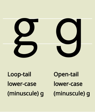
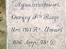
In graphemics and typography, the term allograph is used of a glyph that is a design variant of a letter or other grapheme, such as a letter, a number, an ideograph, a punctuation mark or other typographic symbol. In graphemics, an obvious example in English is the distinction between uppercase and lowercase letters. Allographs can vary greatly, without affecting the underlying identity of the grapheme. Even if the word "cat" is rendered as "cAt", it remains recognizable as the sequence of the three graphemes ⟨c⟩, ⟨a⟩, ⟨t⟩.

<span class="mw-page-title-main">Text figures</span> Numerals typeset with varying heights

Text figures are numerals designed with varying heights in a fashion that resembles a typical line of running text, hence the name. They are contrasted with lining figures, which are the same height as upper-case letters. Georgia is an example of a popular typeface that employs text figures by default.

Nameprep is the process of case-folding a string to lowercase and removal of some generally invisible code points before it is suitable to represent a domain name, or other such canonical name. It is used by the Internationalizing Domain Names in Applications (IDNA) standard, using the Unicode standard for NFKC normalization.

<span class="mw-page-title-main">Slashed zero</span> Glyph variant of numeral 0 (zero) with slash

The dotted or slashed zero 0̷ is a representation of the Arabic digit "0" (zero) with a slash through it. The slashed zero glyph is often used to distinguish the digit "zero" ("0") from the Latin script letter "O" anywhere that the distinction needs emphasis, particularly in encoding systems, scientific and engineering applications, computer programming, and telecommunications. It thus helps to differentiate characters that would otherwise be homoglyphs. It was commonly used during the punch card era, when programs were typically written out by hand, to avoid ambiguity when the character was later typed on a card punch.

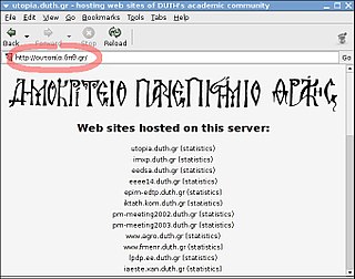
The internationalized domain name (IDN) homograph attack is a way a malicious party may deceive computer users about what remote system they are communicating with, by exploiting the fact that many different characters look alike

Unicode has a certain amount of duplication of characters. These are pairs of single Unicode code points that are canonically equivalent. The reason for this are compatibility issues with legacy systems.

L, or l, is the twelfth letter in the Latin alphabet, used in the modern English alphabet, the alphabets of other western European languages and others worldwide. Its name in English is el, plural els.

Unicode equivalence is the specification by the Unicode character encoding standard that some sequences of code points represent essentially the same character. This feature was introduced in the standard to allow compatibility with preexisting standard character sets, which often included similar or identical characters.

<span class="mw-page-title-main">Universal Character Set characters</span> Complete list of the characters available on most computers

The Unicode Consortium and the ISO/IEC JTC 1/SC 2/WG 2 jointly collaborate on the list of the characters in the Universal Coded Character Set. The Universal Coded Character Set, most commonly called the Universal Character Set, is an international standard to map characters, discrete symbols used in natural language, mathematics, music, and other domains, to unique machine-readable data values. By creating this mapping, the UCS enables computer software vendors to interoperate, and transmit—interchange—UCS-encoded text strings from one to another. Because it is a universal map, it can be used to represent multiple languages at the same time. This avoids the confusion of using multiple legacy character encodings, which can result in the same sequence of codes having multiple interpretations depending on the character encoding in use, resulting in mojibake if the wrong one is chosen.

A numeral is a character that denotes a number. The decimal number digits 0–9 are used widely in various writing systems throughout the world, however the graphemes representing the decimal digits differ widely. Therefore Unicode includes 22 different sets of graphemes for the decimal digits, and also various decimal points, thousands separators, negative signs, etc. Unicode also includes several non-decimal numerals such as Aegean numerals, Roman numerals, counting rod numerals, Mayan numerals, Cuneiform numerals and ancient Greek numerals. There is also a large number of typographical variations of the Western Arabic numerals provided for specialized mathematical use and for compatibility with earlier character sets, such as ² or ②, and composite characters such as ½.

<span class="mw-page-title-main">Subscript and superscript</span> A character set slightly below and above the normal line of type, respectively

A subscript or superscript is a character that is set slightly below or above the normal line of type, respectively. It is usually smaller than the rest of the text. Subscripts appear at or below the baseline, while superscripts are above. Subscripts and superscripts are perhaps most often used in formulas, mathematical expressions, and specifications of chemical compounds and isotopes, but have many other uses as well.

The Unicode Standard assigns various properties to each Unicode character and code point.

A typographic approximation is a replacement of an element of the writing system with another glyph or glyphs. The replacement may be a nearly homographic character, a digraph, or a character string. An approximation is different from a typographical error in that an approximation is intentional and aims to preserve the visual appearance of the original. The concept of approximation also applies to the World Wide Web and other forms of textual information available via digital media, though usually at the level of characters, not glyphs.

References

  1. 1 2 "UTR #36: Unicode Security Considerations". www.unicode.org.
  2. Walton, Chas (October 7, 2020). "A writer's guide to diacritics and special characters". Text Wizard.
  3. Describing these as homoglyphs is questionable as there are probably no languages in which the glyph can fulfil both these roles. It would be just as valid to describe, say, a grave accent as a homoglyph because it fulfils different roles in different languages.
  4. 1 2 Helfrich, James; Neff, Rick (2012). "Dual canonicalization: An answer to the homograph attack". 2012 e Crime Researchers Summit. eCrime Researchers Summit (eCrime), 2012. pp. 1–10. doi:10.1109/eCrime.2012.6489517. ISBN   978-1-4673-2543-1.
  5. Nigel Tao, Chuck Bigelow, and Rob Pike. Go fonts: DIN Legibility Standard". 2016.
  6. Hill, Will (30 June 2020). "Chapter 25: Typography and the printed English text" (PDF). The Routledge Handbook of the English Writing System. p. 6. ISBN   9780367581565. The types used by Caxton and his contemporaries originated in Holland and Belgium, and did not provide for the continuing use of elements of the Old English alphabet such as thorn <þ>, eth <ð>, and yogh <ʒ>. The substitution of visually similar typographic forms has led to some anomalies which persist to this day in the reprinting of archaic texts and the spelling of regional words. The widely misunderstood 'ye' occurs through a habit of printer's usage that originates in Caxton's time, when printers would substitute the <y> (often accompanied by a superscript <e>) in place of the thorn <þ> or the eth <ð>, both of which were used to denote both the voiced and non-voiced sounds, /ð/ and /θ/ (Anderson, D. (1969) The Art of Written Forms. New York: Holt, Rinehart and Winston, p 169)
  7. "UTR #36: Unicode Security Considerations". unicode.org.
  8. "Register a .CA in French!". Archived from the original on 2013-03-28. Retrieved 2013-03-29.
  9. "ICANN Email Archives: [idn-guidelines]". forum.icann.org.
  10. https://governance.dev/phishing-domain-check, accessed on February 12, 2024