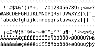
ISO/IEC 8859-1:1998, Information technology — 8-bit single-byte coded graphic character sets — Part 1: Latin alphabet No. 1, is part of the ISO/IEC 8859 series of ASCII-based standard character encodings, first edition published in 1987. ISO/IEC 8859-1 encodes what it refers to as "Latin alphabet no. 1", consisting of 191 characters from the Latin script. This character-encoding scheme is used throughout the Americas, Western Europe, Oceania, and much of Africa. It is the basis for some popular 8-bit character sets and the first two blocks of characters in Unicode.
The ampersand, also known as the and sign, is the logogram &, representing the conjunction "and". It originated as a ligature of the letters et—Latin for "and".

Daisy wheel printing is an impact printing technology invented in 1970 by Andrew Gabor at Diablo Data Systems. It uses interchangeable pre-formed type elements, each with typically 96 glyphs, to generate high-quality output comparable to premium typewriters such as the IBM Selectric, but two to three times faster. Daisy wheel printing was used in electronic typewriters, word processors and computers from 1972. The daisy wheel is so named because of its resemblance to the daisy flower.

Helvetica, also known by its original name Neue Haas Grotesk, is a widely used sans-serif typeface developed in 1957 by Swiss typeface designer Max Miedinger and Eduard Hoffmann.

Arial is a sans-serif typeface and set of computer fonts in the neo-grotesque style. Fonts from the Arial family are included with all versions of Microsoft Windows from Windows 3.1 on, some other Microsoft software applications, Apple's macOS and many PostScript 3 computer printers. The typeface was designed in 1982, by Robin Nicholas and Patricia Saunders, for Monotype Typography. Each of its characters has the same width as that character in the popular typeface Helvetica; the purpose of this design is to allow a document designed in Helvetica to be displayed and printed with the intended line-breaks and page-breaks without a Helvetica license. Because of their almost identical appearances, both Arial and Helvetica have commonly been mistaken for each other.

Courier is a monospaced slab serif typeface. The typeface was designed by Howard "Bud" Kettler (1919–1999). Initially created for IBM's typewriters, it has been adapted for use as a computer font, and versions of it are installed on most desktop computers.
The Hong Kong Supplementary Character Set is a set of Chinese characters – 4,702 in total in the initial release—used in Cantonese, as well as when writing the names of some places in Hong Kong. It evolved from the preceding Government Chinese Character Set (政府通用字庫) or GCCS. GCCS is a set of supplementary Chinese characters coded in the user-defined areas of the Big5 character set. It was originally used within the Hong Kong Government and later used by the public. It later evolved into Hong Kong Supplementary Character Set when the characters in the set were submitted to ISO-10646 for coding.

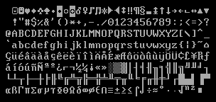
Code page 437 is the character set of the original IBM PC. It is also known as CP437, OEM-US, OEM 437, PC-8, or DOS Latin US. The set includes all printable ASCII characters as well as some accented letters (diacritics), Greek letters, icons, and line-drawing symbols. It is sometimes referred to as the "OEM font" or "high ASCII", or as "extended ASCII".
Windows-1256 is a code page used under Microsoft Windows to write Arabic and other languages that use Arabic script, such as Persian and Urdu.

Andalé Mono is a monospaced sans-serif typeface designed by Steve Matteson for terminal emulation and software development environments, originally for the Taligent project by Apple Inc. and IBM. Andalé Mono has a sibling called Andalé Sans.
Segoe is a typeface, or family of fonts, that is best known for its use by Microsoft. The company uses Segoe in its online and printed marketing materials, including recent logos for a number of products. Additionally, the Segoe UI font sub-family is used by numerous Microsoft applications, and may be installed by applications. It was adopted as Microsoft's default operating system font beginning with Windows Vista, and is also used on outlook.com, Microsoft's web-based email service. In August 2012, Microsoft unveiled its new corporate logo typeset in Segoe, replacing the logo it had used for the previous 25 years.

Century Gothic is a digital sans-serif typeface in the geometric style, released by Monotype Imaging in 1991. It is a redrawn version of Monotype's own Twentieth Century, a copy of Bauer's Futura, to match the widths of ITC Avant Garde Gothic. It is an exclusively digital typeface that has never been manufactured as metal type.
Terminal is a family of monospaced raster typefaces. It is relatively small compared with Courier. It uses crossed zeros, and is designed to approximate the font normally used in MS-DOS or other text-based consoles such as on Linux. In Microsoft Windows, it is used as the default font in the Command Prompt in Windows 7 and earlier.

News Gothic is a sans-serif typeface designed by Morris Fuller Benton, and was released in 1908 by his employer American Type Founders (ATF). The typeface is similar in proportion and structure to Franklin Gothic, also designed by Benton, but lighter.
Kochi (東風フォント) was a font development project to build free replacements of proprietary fonts such as MS Gothic or MS Mincho, developed by Yasuyuki Furukawa. The project consisted of the Kochi Gothic and Kochi Mincho fonts. It was released in the public domain.

The IBM Selectric typewriter was a highly successful line of electric typewriters introduced by IBM on 31 July 1961.
The programming language APL uses a number of symbols, rather than words from natural language, to identify operations, similarly to mathematical symbols. Prior to the wide adoption of Unicode, a number of special-purpose EBCDIC and non-EBCDIC code pages were used to represent the symbols required for writing APL.

Inconsolata is an open-source font created by Raph Levien and released under the SIL Open Font License. It is a humanist monospaced font designed for source code listing, terminal emulators, and similar uses. It was influenced by the proprietary Consolas monospaced font, designed by Lucas de Groot, the proportional Avenir and IBM's classic monospaced Letter Gothic.

IBM Plex is an open source typeface superfamily conceptually designed and developed by Mike Abbink at IBM in collaboration with Bold Monday to reflect the design principles of IBM and to be used for all brand material across the company internationally. Plex replaces Helvetica as the IBM corporate typeface after more than fifty years, freeing the company from extensive license payments in the process.


