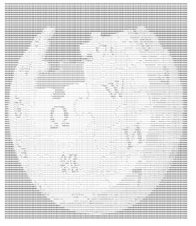
ASCII art is a graphic design technique that uses computers for presentation and consists of pictures pieced together from the 95 printable characters defined by the ASCII Standard from 1963 and ASCII compliant character sets with proprietary extended characters. The term is also loosely used to refer to text based visual art in general. ASCII art can be created with any text editor, and is often used with free-form languages. Most examples of ASCII art require a fixed-width font such as Courier for presentation.
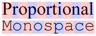
A monospaced font, also called a fixed-pitch, fixed-width, or non-proportional font, is a font whose letters and characters each occupy the same amount of horizontal space. This contrasts with variable-width fonts, where the letters and spacings have different widths.
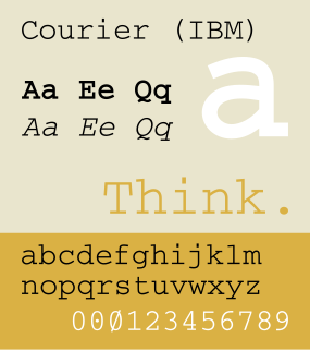
Courier is a monospaced slab serif typeface. The typeface was designed by Howard "Bud" Kettler (1919–1999). Initially created for IBM's typewriters, it has been adapted to use as a computer font and versions of it are installed on most desktop computers.
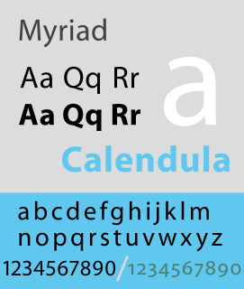
Myriad is a humanist sans-serif typeface designed by Robert Slimbach and Carol Twombly for Adobe Systems. Myriad was intended as a neutral, general-purpose typeface that could fulfill a range of uses and have a form easily expandable by computer-aided design to a large range of weights and widths.

In typography, a counter is the area of a letter that is entirely or partially enclosed by a letter form or a symbol. The stroke that creates such a space is known as a "bowl". Letters containing closed counters include A, B, D, O, P, Q, R, a, b, d, e, g, o, p, and q. Letters containing open counters include c, f, h, i, s etc. The digits 0, 4, 6, 8, and 9 also possess a counter. An aperture is the opening between an open counter and the outside of the letter.
Robert Joseph Slimbach is Principal Type Designer at Adobe, Inc., where he has worked since 1987. He has won many awards for his digital typeface designs, including the rarely awarded Prix Charles Peignot from the Association Typographique Internationale, the SoTA Typography Award, and repeated TDC2 awards from the Type Directors Club. His typefaces are among those most commonly used in books.
During the Killian documents controversy in 2004, the authenticity of the documents themselves was disputed by a variety of individuals and groups. Proof of authenticity is not possible without original documents, and since CBS used only faxed and photocopied duplicates, authentication to professional standards would be impossible regardless of the provenance of the originals. However, proving documents inauthentic does not depend on the availability of originals, and the validity of these photocopied documents has been challenged on a number of grounds, ranging from alleged anachronisms in their typography to issues pertaining to their content.
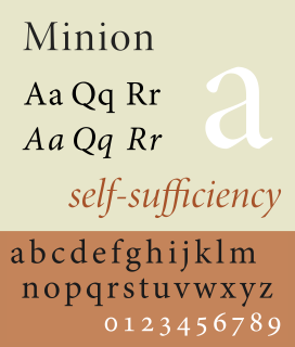
Minion is a serif typeface released in 1990 by Adobe Systems. Designed by Robert Slimbach, it is inspired by late Renaissance-era type and intended for body text and extended reading. Minion's name comes from the traditional naming system for type sizes, in which minion is between nonpareil and brevier, with the type body 7pt in height. As the historically rooted name indicates, Minion was designed for body text in a classic style, although slightly condensed and with large apertures to increase legibility. Slimbach described the design as having "a simplified structure and moderate proportions." The design is slightly condensed, although Slimbach has said that this was intended not for commercial reasons so much as to achieve a good balance of the size of letters relative to the ascenders and descenders.

Bitstream Charter is a serif typeface designed by Matthew Carter in 1987 for Bitstream Inc. Charter is based on Pierre-Simon Fournier’s characters, originating from the 18th century. Classified by Bitstream as a transitional-serif typeface, it also has features of a slab-serif typeface and is often classified as such.

The Adobe Originals program is a series of digital typefaces created by Adobe Systems from 1989 for professional use, intended to be of extremely high design quality while offering a large feature set across many languages. Many are strongly influenced by research into classic designs from the past and calligraphy. Adobe Originals fonts are sold separately or with Adobe products such as InDesign.

The IBM Selectric typewriter was a highly successful line of electric typewriters introduced by IBM on 31 July 1961.

Adobe Fonts is an online service which offers a subscription library of high-quality fonts. The fonts may be used directly on websites or synced via Adobe Creative Cloud to applications on the subscriber's computers.
The Web Open Font Format (WOFF) is a font format for use in web pages. WOFF files are OpenType or TrueType fonts, with format-specific compression applied and additional XML metadata added. The two primary goals are to first distinguish font files intended for use as web fonts from fonts files intended for use in desktop applications via local installation, and second to reduce web font latency when fonts are transferred from a server to a client over a network connection.
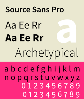
Source Sans Pro is a sans serif typeface created by Paul D. Hunt for Adobe Systems. It is the first open-source font family from Adobe, distributed under the SIL Open Font License.
Adobe Edge is a suite of web development tools developed by Adobe Systems that enhances the capabilities of their other applications, such as Dreamweaver. The first application in the suite was released in August 2011 as a multimedia authoring tool designed to succeed the Flash platform. In September 2012, Adobe renamed the application Edge Animate, and announced Edge Reflow, Edge Code, and Edge Inspect. Also packaged with the suite are Edge Web Fonts, the PhoneGap application, and access to Adobe's Typekit service.

Google Fonts is a library of 991 free licensed font families, an interactive web directory for browsing the library, and APIs for conveniently using the fonts via CSS and Android.
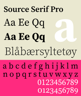
Source Serif Pro is a serif typeface created by Frank Grießhammer for Adobe Systems. It is the third open-source font family from Adobe, distributed under the SIL Open Font License.
OpenType variable fonts are an extension to the OpenType specification, introduced in OpenType 1.8. On 14 September 2016, Adobe, Apple, Google, and Microsoft announced the technology, which allows a single font file to store a continuous range of design variants.
A word processor (WP) is a device or computer program that provides for input, editing, formatting and output of text, often with some additional features.

