
A typeface is a design of letters, numbers and other symbols, to be used in printing or for electronic display. Most typefaces include variations in size, weight, slope, width, and so on. Each of these variations of the typeface is a font.

Helvetica, also known by its original name Neue Haas Grotesk, is a widely used sans-serif typeface developed in 1957 by Swiss typeface designer Max Miedinger and Eduard Hoffmann.

Matthew Carter is a British type designer. A 2005 New Yorker profile described him as 'the most widely read man in the world' by considering the amount of text set in his commonly used typefaces.

Futura is a geometric sans-serif typeface designed by Paul Renner and released in 1927. It was designed as a contribution on the New Frankfurt-project. It is based on geometric shapes, especially the circle, similar in spirit to the Bauhaus design style of the period. It was developed as a typeface by the Bauer Type Foundry, in competition with Ludwig & Mayer's seminal Erbar typeface of 1926.

Antiqua is a style of typeface used to mimic styles of handwriting or calligraphy common during the 15th and 16th centuries. Letters are designed to flow, and strokes connect together in a continuous fashion; in this way it is often contrasted with Fraktur-style typefaces where the individual strokes are broken apart. The two typefaces were used alongside each other in the germanophone world, with the Antiqua–Fraktur dispute often dividing along ideological or political lines. After the mid-20th century, Fraktur fell out of favor and Antiqua-based typefaces became the official standard in Germany.

Apple Inc. uses a large variety of typefaces in its marketing, operating systems, and industrial design with each product cycle. These change throughout the years with Apple's change of style in their products. This is evident in the design and marketing of the company. The current logo is a white apple with a bite out of it, which was first utilized in 2013.

Ephram Edward Benguiat was an American type designer and lettering artist. He designed over 600 typefaces, including Tiffany, Bookman, Panache, Souvenir, Edwardian Script, and the eponymous Benguiat and Benguiat Gothic.

Microgramma is a sans serif font which was designed by Aldo Novarese and Alessandro Butti for the Nebiolo Type Foundry in 1952. It became popular for use with technical illustrations in the 1960s and was a favourite of graphic designers by the early seventies, its uses ranging from publicity and publication design to packaging, largely because of its availability as a Letraset typeface. Early typesetters also incorporated it.

Caslon is the name given to serif typefaces designed by William Caslon I (c. 1692–1766) in London, or inspired by his work.

Bookman, or Bookman Old Style, is a serif typeface. A wide, legible design that is slightly bolder than most body text faces, Bookman has been used for both display typography, for trade printing such as advertising, and less commonly for body text. In advertising use it is particularly associated with the graphic design of the 1960s and 1970s, when revivals of it were very popular. It is also used as the official font of Indonesian laws since 2011.

Clarendon is the name of a slab serif typeface that was released in 1845 by Thorowgood and Co. of London, a letter foundry often known as the Fann Street Foundry. The original Clarendon design is credited to Robert Besley, a partner in the foundry, and was originally engraved by punchcutter Benjamin Fox, who may also have contributed to its design. Many copies, adaptations and revivals have been released, becoming almost an entire genre of type design.
Caslon usually refers to William Caslon (I) of United Kingdom (1692–1766), who was an English gunsmith and designer of typographic fonts.

Windsor is a serif typeface created by Eleisha Pechey (1831-1902) and released by the Stephenson Blake type foundry. It is intended for use such as display and in headings rather than for body text.

Didot is a group of typefaces. The word/name Didot came from the famous French printing and type producing Didot family. The classification is known as modern, or Didone.

News Gothic is a sans-serif typeface designed by Morris Fuller Benton, and was released in 1908 by his employer American Type Founders (ATF). The typeface is similar in proportion and structure to Franklin Gothic, also designed by Benton, but lighter.
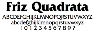
Friz Quadrata is a glyphic serif typeface designed by Ernst Friz and Victor Caruso for Visual Graphics Corporation in 1965. VGC worked with the International Typeface Corporation to create an additional, bold weight. It is currently available from the ITC and Linotype foundries. Because of its level of detail and graphic weight, it is often used as a display font, for short texts and headlines.
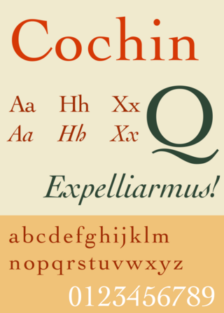
Cochin is a serif typeface. It was originally produced in 1912 by Georges Peignot for the Paris foundry G. Peignot et Fils and was based on the copperplate engravings of 18th century French artist Charles-Nicolas Cochin, from which the typeface also takes its name. The font has a small x-height with long ascenders. Georges Peignot also created the design 'Nicolas-Cochin' as a looser variation in the same style.

A reverse-contrast or reverse-stress letterform is a design in which the stress is reversed from the norm: a typeface or custom lettering where the horizontal lines are the thickest. This is the reverse of the vertical lines being the same width or thicker than horizontals, which is normal in Latin-alphabet writing and especially printing. The result is a dramatic effect, in which the letters seem to have been printed the wrong way round. The style invented in the early nineteenth century as attention-grabbing novelty display designs. Modern font designer Peter Biľak, who has created a design in the genre, has described them as "a dirty trick to create freakish letterforms that stood out."

Old Style or Modernised Old Style was the name given to a series of serif typefaces cut from the mid-nineteenth century and sold by the type foundry Miller & Richard, of Edinburgh in Scotland. It was a standard typeface in Britain for literary and prestigious printing in the second half of the nineteenth century and the early twentieth century, with many derivatives and copies released.

