
Data mining is a process of extracting and discovering patterns in large data sets involving methods at the intersection of machine learning, statistics, and database systems. Data mining is an interdisciplinary subfield of computer science and statistics with an overall goal to extract information from a data set and transform the information into a comprehensible structure for further use. Data mining is the analysis step of the "knowledge discovery in databases" process, or KDD. Aside from the raw analysis step, it also involves database and data management aspects, data pre-processing, model and inference considerations, interestingness metrics, complexity considerations, post-processing of discovered structures, visualization, and online updating.

Information visualization is the study of visual representations of abstract data to reinforce human cognition. The abstract data include both numerical and non-numerical data, such as text and geographic information. It is related to data visualization, infographics, and scientific visualization. One definition is that it's information visualization when the spatial representation is chosen, whereas it's scientific visualization when the spatial representation is given.
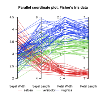
Parallel coordinates are a common way of visualizing and analyzing high-dimensional datasets.

Orange is an open-source data visualization, machine learning and data mining toolkit. It features a visual programming front-end for explorative rapid qualitative data analysis and interactive data visualization.
Software visualization or software visualisation refers to the visualization of information of and related to software systems—either the architecture of its source code or metrics of their runtime behavior—and their development process by means of static, interactive or animated 2-D or 3-D visual representations of their structure, execution, behavior, and evolution.
Neural network software is used to simulate, research, develop, and apply artificial neural networks, software concepts adapted from biological neural networks, and in some cases, a wider array of adaptive systems such as artificial intelligence and machine learning.
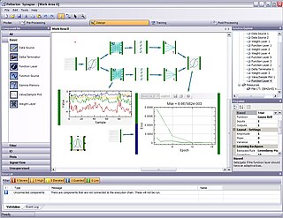
Synapse is a component-based development environment for neural networks and adaptive systems. Created by Peltarion, Synapse allows data mining, statistical analysis, visualization, preprocessing, design and training of neural networks and adaptive systems and the deployment of them. It utilizes a plug-in based architecture making it a general platform for signal processing. The first version of the product was released in May 2006.

A heat map is a data visualization technique that shows magnitude of a phenomenon as color in two dimensions. The variation in color may be by hue or intensity, giving obvious visual cues to the reader about how the phenomenon is clustered or varies over space. There are two fundamentally different categories of heat maps: the cluster heat map and the spatial heat map. In a cluster heat map, magnitudes are laid out into a matrix of fixed cell size whose rows and columns are discrete phenomena and categories, and the sorting of rows and columns is intentional and somewhat arbitrary, with the goal of suggesting clusters or portraying them as discovered via statistical analysis. The size of the cell is arbitrary but large enough to be clearly visible. By contrast, the position of a magnitude in a spatial heat map is forced by the location of the magnitude in that space, and there is no notion of cells; the phenomenon is considered to vary continuously.
Business intelligence software is a type of application software designed to retrieve, analyze, transform and report data for business intelligence. The applications generally read data that has been previously stored, often - though not necessarily - in a data warehouse or data mart.

Visual analytics is an outgrowth of the fields of information visualization and scientific visualization that focuses on analytical reasoning facilitated by interactive visual interfaces.
Cultural analytics refers to the use of computational, visualization, and big data methods for the exploration of contemporary and historical cultures. While digital humanities research has focused on text data, cultural analytics has a particular focus on massive cultural data sets of visual material – both digitized visual artifacts and contemporary visual and interactive media. Taking on the challenge of how to best explore large collections of rich cultural content, cultural analytics researchers developed new methods and intuitive visual techniques that rely on high-resolution visualization and digital image processing. These methods are used to address both the existing research questions in humanities, to explore new questions, and to develop new theoretical concepts that fit the mega-scale of digital culture in the early 21st century.
Biology data visualization is a branch of bioinformatics concerned with the application of computer graphics, scientific visualization, and information visualization to different areas of the life sciences. This includes visualization of sequences, genomes, alignments, phylogenies, macromolecular structures, systems biology, microscopy, and magnetic resonance imaging data. Software tools used for visualizing biological data range from simple, standalone programs to complex, integrated systems.
InfoZoom software is a data analysis, business intelligence and data visualization software product created using in-memory analytics. The software is created and supported by humanIT and the Fraunhofer Institute FIT, the same organization that created MP3 compression technology. The software has over 100,000 licensed users and over 1000 customers worldwide.

ELKI is a data mining software framework developed for use in research and teaching. It was originally at the database systems research unit of Professor Hans-Peter Kriegel at the Ludwig Maximilian University of Munich, Germany, and now continued at the Technical University of Dortmund, Germany. It aims at allowing the development and evaluation of advanced data mining algorithms and their interaction with database index structures.
Patent visualisation is an application of information visualisation. The number of patents has been increasing steadily, thus forcing companies to consider intellectual property as a part of their strategy. Patent visualisation, like patent mapping, is used to quickly view a patent portfolio.
In network theory, link analysis is a data-analysis technique used to evaluate relationships (connections) between nodes. Relationships may be identified among various types of nodes (objects), including organizations, people and transactions. Link analysis has been used for investigation of criminal activity, computer security analysis, search engine optimization, market research, medical research, and art.
NodeXL is a network analysis and visualization software package for Microsoft Excel 2007/2010/2013/2016. It is a popular package similar to other network visualization tools such as Pajek, UCINet, and Gephi. It is widely applied in ring, mapping of vertex and edge, and customizable visual attributes and tags. It enables researchers to undertake social network analysis work’s metrics such as centrality, degree, and clustering. It allows us to see the relational data and describe the overall relational network structure. When we applied it in Twitter data analysis, it can show the huge network of all users participating in public discussion and its internal structure through big data mining. It permits social Network analysis (SNA) emphasizes the relationships rather than isolated individuals or organizations, so this method allows us to investigate the ‘two-way dialogue between the organization and the public. SNA also provides researchers with a flexible measurement system and parameter selection to confirm the influential nodes in the network, such as in-degree and out-degree centrality. The free version contains network visualization and social network analysis features. The commercial version includes access to social media network data importers, advanced network metrics, and automation.
Tanagra is a free suite of machine learning software for research and academic purposes developed by Ricco Rakotomalala at the Lumière University Lyon 2, France. Tanagra supports several standard data mining tasks such as: Visualization, Descriptive statistics, Instance selection, feature selection, feature construction, regression, factor analysis, clustering, classification and association rule learning.
A software map represents static, dynamic, and evolutionary information of software systems and their software development processes by means of 2D or 3D map-oriented information visualization. It constitutes a fundamental concept and tool in software visualization, software analytics, and software diagnosis. Its primary applications include risk analysis for and monitoring of code quality, team activity, or software development progress and, generally, improving effectiveness of software engineering with respect to all related artifacts, processes, and stakeholders throughout the software engineering process and software maintenance.

Security visualisation is a subject that broadly covers aspects of big data, visualisation, human perception and security. Each day, we are collecting more and more data in the form of log files and it is often meaningless if the data is not analyzed thoroughly. Big data mining techniques like Map Reduce help narrow down the search for meaning in vast data. Data visualisation is a data analytics technique, which is used to engage the human brain into finding patterns in data.