
Johannes Gensfleisch zur Laden zum Gutenberg was a German inventor and craftsman who introduced letterpress printing to Europe with his movable-type printing press. Though movable type was already in use in East Asia, Gutenberg invented the printing press, which later spread across the world. His work led to an information revolution and the unprecedented mass-spread of literature throughout Europe. It also had a direct impact on the development of the Renaissance, Reformation, and humanist movements, as all of them have been described as "unthinkable" without Gutenberg's invention.

Typography is the art and technique of arranging type to make written language legible, readable and appealing when displayed. The arrangement of type involves selecting typefaces, point sizes, line lengths, line-spacing (leading), and letter-spacing (tracking), as well as adjusting the space between pairs of letters (kerning). The term typography is also applied to the style, arrangement, and appearance of the letters, numbers, and symbols created by the process. Type design is a closely related craft, sometimes considered part of typography; most typographers do not design typefaces, and some type designers do not consider themselves typographers. Typography also may be used as an ornamental and decorative device, unrelated to the communication of information.

Movable type is the system and technology of printing and typography that uses movable components to reproduce the elements of a document usually on the medium of paper.
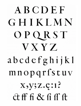
In typography, a serif is a small line or stroke regularly attached to the end of a larger stroke in a letter or symbol within a particular font or family of fonts. A typeface or "font family" making use of serifs is called a serif typeface, and a typeface that does not include them is sans-serif. Some typography sources refer to sans-serif typefaces as "grotesque" or "Gothic", and serif typefaces as "roman".
Ikarus is a type design and production software developed by URW and Brendel Informatik foundries, for converting existing typefaces and logos into digital format for use on computer driven printing, plotting and sign cutting devices.

Caslon is the name given to serif typefaces designed by William Caslon I (c. 1692–1766) in London, or inspired by his work.

Janson is the name given to a set of old-style serif typefaces from the Dutch Baroque period, and modern revivals from the twentieth century. Janson is a crisp, relatively high-contrast serif design, most popular for body text.

Modern typographers view typography as a craft with a very long history tracing its origins back to the first punches and dies used to make seals and coinage currency in ancient times. The basic elements of typography are at least as old as civilization and the earliest writing systems—a series of key developments that were eventually drawn together into one systematic craft. While woodblock printing and movable type had precedents in East Asia, typography in the Western world developed after the invention of the printing press by Johannes Gutenberg in the mid-15th century. The initial spread of printing throughout Germany and Italy led to the enduring legacy and continued use of blackletter, roman, and italic types.

Sabon is an old-style serif typeface designed by the German-born typographer and designer Jan Tschichold (1902–1974) in the period 1964–1967. It was released jointly by the Linotype, Monotype, and Stempel type foundries in 1967. The design of the roman is based on types by Claude Garamond, particularly a specimen printed by the Frankfurt printer Konrad Berner. Berner had married the widow of a fellow printer Jacques Sabon, the source of the face's name, who had bought some of Garamond's type after his death. The italics are based on types designed by a contemporary of Garamond's, Robert Granjon. It is effectively a Garamond revival, though a different name was chosen as many other modern typefaces already carry this name.

Centaur is a serif typeface by book and typeface designer Bruce Rogers, based on the Renaissance-period printing of Nicolas Jenson around 1470. He used it for his design of the Oxford Lectern Bible. It was given widespread release by the British branch of Monotype, paired with an italic designed by calligrapher Frederic Warde and based on the slightly later work of calligrapher and printer Ludovico Vicentino degli Arrighi. The italic has sometimes been named separately as the "Arrighi" italic.
Jan van Krimpen was a Dutch typographer, book designer and type designer. He worked for the printing house Koninklijke Joh. Enschedé. He also worked with Monotype in England, who issued or reissued many of his designs outside the Netherlands.

Albert-Jan Pool is a Dutch type designer and educator.
Martin Majoor is a Dutch type designer and graphic designer. As of 2006, he had worked since 1997 in both Arnhem, Netherlands, and Warsaw, Poland.

Fred Smeijers is a Dutch type designer, researcher and writer. He was educated at the ArtEZ Hogeschool voor de Kunsten in Arnhem in the early 1980s.
FontShop International was an international manufacturer of digital typefaces (fonts), based in Berlin. It was one of the largest digital type foundries.

Joan Michaël Fleischman, was an 18th-century German-Dutch typographer and punchcutter.
Petr van Blokland is a Dutch graphic designer, software author and typeface designer who lives in Delft.

In typography, a fat face letterform is a serif typeface or piece of lettering in the Didone or modern style with an extremely bold design. Fat face typefaces appeared in London around 1805–1810 and became widely popular; John Lewis describes the fat face as "the first real display typeface."
Hendrik van den Keere was a punchcutter, or cutter of punches to make metal type, who lived in Ghent in modern Belgium.
Just van Rossum is a Dutch typeface designer, software developer, and professor at the Royal Academy of Art in the Hague. He is the co-founder of design firm, LettError, along with Erik van Blokland. Just van Rossum is the younger brother of Guido van Rossum, creator of the Python programming language.
