Font may refer to:
Font may refer to:

Typography is the art and technique of arranging type to make written language legible, readable and appealing when displayed. The arrangement of type involves selecting typefaces, point sizes, line lengths, line spacing, letter spacing, and spaces between pairs of letters. The term typography is also applied to the style, arrangement, and appearance of the letters, numbers, and symbols created by the process. Type design is a closely related craft, sometimes considered part of typography; most typographers do not design typefaces, and some type designers do not consider themselves typographers. Typography also may be used as an ornamental and decorative device, unrelated to the communication of information.

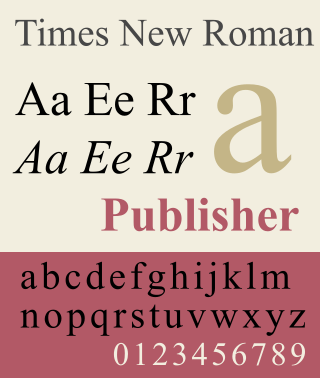
Times New Roman is a serif typeface. It was commissioned by the British newspaper The Times in 1931 and conceived by Stanley Morison, the artistic adviser to the British branch of the printing equipment company Monotype, in collaboration with Victor Lardent, a lettering artist in The Times's advertising department. It has become one of the most popular typefaces of all time and is installed on most personal computers.

Type design is the art and process of designing typefaces. This involves drawing each letterform using a consistent style. The basic concepts and design variables are described below.
In typography, a serif is a small line or stroke regularly attached to the end of a larger stroke in a letter or symbol within a particular font or family of fonts. A typeface or "font family" making use of serifs is called a serif typeface, and a typeface that does not include them is sans-serif. Some typography sources refer to sans-serif typefaces as "grotesque" or "Gothic" and serif typefaces as "roman".

A typeface is a design of letters, numbers and other symbols, to be used in printing or for electronic display. Most typefaces include variations in size, weight, slope, width, and so on. Each of these variations of the typeface is a font.

A kerosene lamp is a type of lighting device that uses kerosene as a fuel. Kerosene lamps have a wick or mantle as light source, protected by a glass chimney or globe; lamps may be used on a table, or hand-held lanterns may be used for portable lighting. Like oil lamps, they are useful for lighting without electricity, such as in regions without rural electrification, in electrified areas during power outages, at campsites, and on boats. There are three types of kerosene lamp: flat-wick, central-draft, and mantle lamp. Kerosene lanterns meant for portable use have a flat wick and are made in dead-flame, hot-blast, and cold-blast variants.

Garamond is a group of many serif typefaces, named for sixteenth-century Parisian engraver Claude Garamond, generally spelled as Garamont in his lifetime. Garamond-style typefaces are popular and particularly often used for book printing and body text.

Arial is a sans-serif typeface in the neo-grotesque style. Fonts from the Arial family are included with all versions of Microsoft Windows after Windows 3.1, as well as in other Microsoft programs, Apple's macOS, and many PostScript 3 printers. In Office 2007, Arial was replaced by Calibri as the default typeface in PowerPoint, Excel, and Outlook.

Futura is a geometric sans-serif typeface designed by Paul Renner and released in 1927. It was designed as a contribution on the New Frankfurt-project. It is based on geometric shapes, especially the circle, similar in spirit to the Bauhaus design style of the period. It was developed as a typeface by the Bauer Type Foundry, in competition with Ludwig & Mayer's seminal Erbar typeface of 1926.

Univers is a large sans-serif typeface family designed by Adrian Frutiger and released by his employer Deberny & Peignot in 1957. Classified as a neo-grotesque sans-serif, one based on the model of nineteenth-century German typefaces such as Akzidenz-Grotesk, it was notable for its availability from the moment of its launch in a comprehensive range of weights and widths. The original marketing for Univers deliberately referenced the periodic table to emphasise its scope.

Adrian Johann Frutiger was a Swiss typeface designer who influenced the direction of type design in the second half of the 20th century. His career spanned the hot metal, phototypesetting and digital typesetting eras. Until his death, he lived in Bremgarten bei Bern.

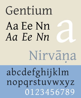
Gentium is a Unicode serif typeface designed by Victor Gaultney. Gentium fonts are free and open source software, and are released under the SIL Open Font License (OFL), which permits modification and redistribution. Gentium has wide support for languages using the Latin, Greek, and Cyrillic alphabets, and the International Phonetic Alphabet (IPA). Gentium Plus variants released since November 2010 now include over 5,500 glyphs and advanced typographic features through OpenType and formerly Graphite.

Johnston is a sans-serif typeface designed by and named after Edward Johnston. The typeface was commissioned in 1913 by Frank Pick, commercial manager of the Underground Electric Railways Company of London, as part of his plan to strengthen the company's corporate identity. Johnston was originally created for printing, but it rapidly became used for the enamel station signs of the Underground system as well.

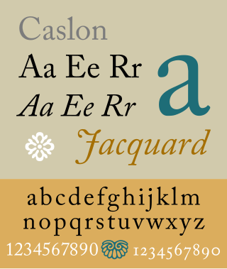
Caslon is the name given to serif typefaces designed by William Caslon I in London, or inspired by his work.
Oblique type is a form of type that slants slightly to the right, used for the same purposes as italic type. Unlike italic type, however, it does not use different glyph shapes; it uses the same glyphs as roman type, except slanted. Oblique and italic type are technical terms to distinguish between the two ways of creating slanted font styles; oblique designs may be labelled italic by companies selling fonts or by computer programs. Oblique designs may also be called slanted or sloped roman styles. Oblique fonts, as supplied by a font designer, may be simply slanted, but this is often not the case: many have slight corrections made to them to give curves more consistent widths, so they retain the proportions of counters and the thick-and-thin quality of strokes from the regular design.

Century Gothic is a digital sans-serif typeface in the geometric style, released by Monotype Imaging in 1990. It is a redrawn version of Monotype's own Twentieth Century, a copy of Bauer's Futura, to match the widths of ITC Avant Garde Gothic. It is an exclusively digital typeface that has never been manufactured as metal type.

In metal typesetting, a font or fount is a particular size, weight and style of a typeface, defined as the set of fonts that share an overall design. For instance, the typeface Bauer Bodoni includes fonts "Roman", "bold" and "italic"; each of these exists in a variety of sizes.

Minion is a serif typeface released in 1990 by Adobe Systems. Designed by Robert Slimbach, it is inspired by late Renaissance-era type and intended for body text and extended reading. Minion's name comes from the traditional naming system for type sizes, in which minion is between nonpareil and brevier, with the type body 7pt in height. As the historically rooted name indicates, Minion was designed for body text in a classic style, although slightly condensed and with large apertures to increase legibility. Slimbach described the design as having "a simplified structure and moderate proportions." The design is slightly condensed, although Slimbach has said that this was intended not for commercial reasons so much as to achieve a good balance of the size of letters relative to the ascenders and descenders.

A reverse-contrast or reverse-stress letterform is a typeface or custom lettering where the stress is reversed from the norm, meaning that the horizontal lines are the thickest. This is the reverse of the vertical lines being the same width or thicker than horizontals, which is normal in Latin-alphabet writing and especially printing. The result is a dramatic effect, in which the letters seem to have been printed the wrong way round. The style was invented in the early nineteenth century as an attention-grabbing novelty for display typefaces. Modern font designer Peter Biľak, who has created a design in the genre, has described them as "a dirty trick to create freakish letterforms that stood out."

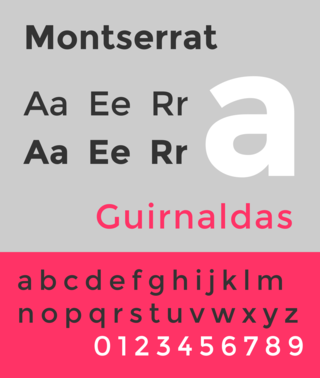
Montserrat is a geometric sans-serif typeface designed by Argentine graphic designer Julieta Ulanovsky and released in 2011. It was inspired by posters, signs and painted windows from the first half of the twentieth century, seen in the historic Montserrat neighbourhood of Buenos Aires.