Kreft's dichromaticity index

Last updated
Presentation of the changing color of pumpkin oil (in the CIELab color space) as its thickness or concentration changes Pumpkin oil - CIELab.png
Presentation of the changing color of pumpkin oil (in the CIELab color space) as its thickness or concentration changes

Kreft's dichromaticity index (DI) is a measure for quantification of dichromatism. It is defined as the difference in hue angle (Δhab) between the color of the sample at the dilution, where the chroma (color saturation) is maximal, and the color of four times more diluted (or thinner) and four times more concentrated (or thicker) sample. The two hue angle differences are called the dichromaticity index towards lighter (Kreft's DIL) and dichromaticity index towards darker (Kreft's DID) respectively. [1] Kreft's dichromaticity indexes DIL and DID for pumpkin seed oil, which is one of the most dichromatic substances, are −9 and −44, respectively. This means, that pumpkin seed oil changes its color from green-yellow to orange-red (for 44 degrees in Lab color space) when the thickness of the observed layer is increased from cca 0.5 mm to 2 mm; and it changes slightly towards green (for 9 degrees) if its thickness is reduced for four-fold.

Measurement Process of assigning numbers to objects or events

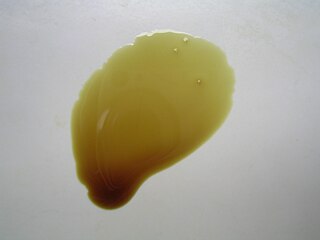
Measurement is the assignment of a number to a characteristic of an object or event, which can be compared with other objects or events. The scope and application of measurement are dependent on the context and discipline. In the natural sciences and engineering, measurements do not apply to nominal properties of objects or events, which is consistent with the guidelines of the International vocabulary of metrology published by the International Bureau of Weights and Measures. However, in other fields such as statistics as well as the social and behavioral sciences, measurements can have multiple levels, which would include nominal, ordinal, interval and ratio scales.

Dichromatism

Dichromatism is a phenomenon where a material or solution's hue is dependent on both the concentration of the absorbing substance and the depth or thickness of the medium traversed. In most substances which are not dichromatic, only the brightness and saturation of the colour depend on their concentration and layer thickness.

Hue Property of a color indicating balance of color perceived by the normal human eye

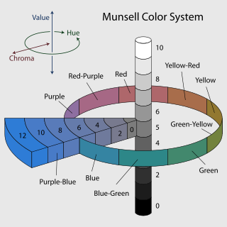
Hue is one of the main properties of a color, defined technically, as "the degree to which a stimulus can be described as similar to or different from stimuli that are described as red, green, blue, and yellow",. Hue can typically be represented quantitatively by a single number, often corresponding to an angular position around a central or neutral point or axis on a colorspace coordinate diagram or color wheel, or by its dominant wavelength or that of its complementary color. The other color appearance parameters are colorfulness, saturation, lightness, and brightness.

The color of pumpkin oil at increasing thickness or concentration presented in CIELAB colorspace diagram. Straight lines are vectors showing hue (angle) and chroma (length) of the color at maximal chroma (toward the square mark), and the colors of four-fold less or more diluted or thick pumpkin oil (DIL and DID). Note that DID is −44.1 degrees and DIL corresponds to −8.97 degrees.

Dichromaticity (DIL and DID) of selected substances, calculated from their VIS absorption spectra by the computer algorithm “Dichromaticity index calculator”:

Substance DIL DID Maximal chroma Angle at maximal chroma
1,1-diethyl-2,2-cyanine iodide 4.3-1.1107.144.6
acridine orange -10.1-17.9118.488.3
acridine yellow -2.1-1.7123.198.6
auramine O -3.40.4130.194.7
beta carotene -5.7-7.0131.891.5
bilirubin -4.7-6.0136.590.3
bromophenol blue at pH 3.0-12.4-31.1107.686.6
bromophenol blue at pH 3.2-14.6-42.492.986.5
bromophenol blue at pH 3.4-48.9-14.174.537.8
bromophenol blue at pH 3.6-51.4-16.470.637.4
bromophenol blue at pH 3.8-49.8-18.365.534.3
bromophenol blue at pH 4.0-26.5-10.868.931.4
bromophenol blue in water-13.0-34.7104.786.4
C3 indocyanine 8.217.389.3348.0
chlorophyll a in ether29.260.750.4201.4
chlorophyll b 11.227.344.5143.2
coumarin 6 -2.0-0.3131.296.5
coumarin 343 -1.90.0120.999.6
cryptocyanine 37.91.984.3301.3
crystal violet in glycerol9.73.3141.3318.3
crystal violet in water9.33.7142.0319.1
fluorescein dibase -1.6-6.9120.475.4
hemoglobin - oxy-1.2-5.6108.442.6
hemoglobin-2.3-5.962.319.0
malachite green 7.324.461.2223.2
nile blue in methanol34.97.878.3288.9
nile red 18.5-9.5103.245.9
proflavin at pH 7-6.1-10.6101.698.5
pumpkin seed oil -9.0-44.159.8102.2
resazurin 33.240.636.2331.3
rhodamine 6G21.9-0.8110.554.4
vitamin B12 34.8-6.2102.039.8

Maximal chroma: chroma at concentration (thickness) where the color of the substance has maximal chroma (saturation). Angle at maximal chroma: the hue, which is represented by the angle of the vector to the color with maximal chroma in the CIELAB colorspace diagram.

Related Research Articles

Color Characteristic of human visual perception

Color, or colour, is the characteristic of human visual perception described through color categories, with names such as red, orange, yellow, green, blue, or purple. This perception of color derives from the stimulation of cone cells in the human eye by electromagnetic radiation in the visible spectrum. Color categories and physical specifications of color are associated with objects through the wavelength of the light that is reflected from them. This reflection is governed by the object's physical properties such as light absorption, emission spectra, etc.

Munsell color system

In colorimetry, the Munsell color system is a color space that specifies colors based on three properties of color: hue, value (lightness), and chroma. It was created by Professor Albert H. Munsell in the first decade of the 20th century and adopted by the United States Department of Agriculture (USDA) as the official color system for soil research in the 1930s.

HSL and HSV are alternative representations of the RGB color model, designed in the 1970s by computer graphics researchers to more closely align with the way human vision perceives color-making attributes. In these models, colors of each hue are arranged in a radial slice, around a central axis of neutral colors which ranges from black at the bottom to white at the top. The HSV representation models the way paints of different colors mix together, with the saturation dimension resembling various shades of brightly colored paint, and the value dimension resembling the mixture of those paints with varying amounts of black or white paint. The HSL model attempts to resemble more perceptual color models such as the Natural Color System (NCS) or Munsell color system, placing fully saturated colors around a circle at a lightness value of ​12, where a lightness value of 0 or 1 is fully black or white, respectively.

CIELAB color space color-opponent space

The CIELAB color space is a color space defined by the International Commission on Illumination (CIE) in 1976. It expresses color as three numerical values, L* for the lightness and a* and b* for the green–red and blue–yellow color components. CIELAB was designed to be perceptually uniform with respect to human color vision, meaning that the same amount of numerical change in these values corresponds to about the same amount of visually perceived change.

RAL colour standard

RAL is a colour matching system used in Europe that is created and administrated by the German RAL gGmbH, which is a subsidiary of the German RAL Institute. In colloquial speech RAL refers to the RAL Classic system, mainly used for varnish and powder coating but nowadays there are reference panels for plastics as well. Approved RAL products are provided with a hologram as of early 2013 to make unauthorised versions difficult to produce. Imitations may show different hue and colour when observed under various light sources.

In the visual arts, color theory or colour theory is a body of practical guidance to color mixing and the visual effects of a specific color combination. There are also definitions of colors based on the color wheel: primary color, secondary color, and tertiary color. Although color theory principles first appeared in the writings of Leone Battista Alberti and the notebooks of Leonardo da Vinci, a tradition of "colory theory" began in the 18th century, initially within a partisan controversy over Isaac Newton's theory of color and the nature of primary colors. From there it developed as an independent artistic tradition with only superficial reference to colorimetry and vision science.

Colorfulness perceived intensity of a specific color

Colorfulness, chroma and saturation are attributes of perceived color relating to chromatic intensity. As defined formally by the International Commission on Illumination (CIE) they respectively describe three different aspects of chromatic intensity, but the terms are often used loosely and interchangeably in contexts where these aspects are not clearly distinguished.

Bromophenol blue chemical compound

Bromophenol blue is used as a pH indicator, a color marker, and a dye. It can be prepared by slowly adding excess bromine to a hot solution of phenolsulfonphthalein in glacial acetic acid.

Pumpkin seed oil oil from the seeds of pumpkins

Pumpkin seed oil is used in cooking, especially in central Europe.

Albert Henry Munsell American painter

Albert Henry Munsell was an American painter, teacher of art, and the inventor of the Munsell color system.

A color model is an abstract mathematical model describing the way colors can be represented as tuples of numbers, typically as three or four values or color components. When this model is associated with a precise description of how the components are to be interpreted, the resulting set of colors is called "color space." This section describes ways in which human color vision can be modeled.

In colorimetry, the CIE 1976L*, u*, v*color space, commonly known by its abbreviation CIELUV, is a color space adopted by the International Commission on Illumination (CIE) in 1976, as a simple-to-compute transformation of the 1931 CIE XYZ color space, but which attempted perceptual uniformity. It is extensively used for applications such as computer graphics which deal with colored lights. Although additive mixtures of different colored lights will fall on a line in CIELUV's uniform chromaticity diagram, such additive mixtures will not, contrary to popular belief, fall along a line in the CIELUV color space unless the mixtures are constant in lightness.

CIECAM02 Model that tries to describe Colours

In colorimetry, CIECAM02 is the color appearance model published in 2002 by the International Commission on Illumination (CIE) Technical Committee 8-01 and the successor of CIECAM97s.

Historic paint analysis is the scientific analysis of architectural finishes, including not only paints but also metallic finishes and clear and translucent finishes used on historic buildings. The primary purpose of such analysis is to determine the color of the finish used at a particular time in the building's history, usually the original construction, but not always. Secondary purposes include determination of ingredients such as media and pigments. Paint analysis is also used at times as a dating technique for various building elements.

The difference or distance between two colors is a metric of interest in color science. It allows quantified examination of a notion that formerly could only be described with adjectives. Quantification of these properties is of great importance to those whose work is color critical. Common definitions make use of the Euclidean distance in a device independent color space.

Resazurin chemical compound

Resazurin is a blue dye, itself weakly fluorescent until it is irreversibly reduced to the pink colored and highly red fluorescent resorufin. It is used as an oxidation-reduction indicator in cell viability assays for both aerobic and anaerobic respiration. Usually it is available commercially as the sodium salt.

HCL (Hue-Chroma-Luminance) is a color space model designed to accord with human perception of color. HCL has been adopted by information visualization practitioners to present data without the bias implicit in using varying saturation.

References

  1. Kreft S, Kreft M. (2009). "Quantification of dichromatism: a characteristic of color in transparent materials". Journal of the Optical Society of America A. 26 (7): 1576–1581. Bibcode:2009JOSAA..26.1576K. doi:10.1364/JOSAA.26.001576. PMID   19568292.