The ellipsis..., a.k.a. suspension point, suspension, points of ellipsis, periods of ellipsis, or colloquially dot-dot-dot, is a punctuation mark consisting of a series of three dots. An ellipsis can be used many ways including for intentional omission of text or to imply a concept without using words.

A glyph is any kind of purposeful mark. In typography, a glyph is "the specific shape, design, or representation of a character". It is a particular graphical representation, in a particular typeface, of an element of written language. A grapheme, or part of a grapheme, or sometimes several graphemes in combination can be represented by a glyph.
The colon, :, is a punctuation mark consisting of two equally sized dots aligned vertically. A colon often precedes an explanation, a list, or a quoted sentence. It is also used between hours and minutes in time, between certain elements in medical journal citations, between chapter and verse in Bible citations, and, in the US, for salutations in business letters and other formal letter writing.
In typography, a bullet or bullet point, •, is a typographical symbol or glyph used to introduce items in a list. For example:
• Item 1
• Item 2
• Item 3
A dagger, obelisk, or obelus† is a typographical mark that usually indicates a footnote if an asterisk has already been used. The symbol is also used to indicate death or extinction. It is one of the modern descendants of the obelus, a mark used historically by scholars as a critical or highlighting indicator in manuscripts. In older texts, it is called an obelisk.
The hyphen‐ is a punctuation mark used to join words and to separate syllables of a single word. The use of hyphens is called hyphenation. Son-in-law is an example of a hyphenated word.

The pilcrow, ¶, is a handwritten or typographical character used to identify a paragraph. It is also called the paragraph mark, paraph, or blind P.
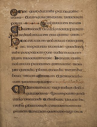
Uncial is a majuscule script commonly used from the 4th to 8th centuries AD by Latin and Greek scribes. Uncial letters were used to write Greek and Latin, as well as Gothic, and are the current style for Coptic and Nobiin.
An interpunct⟨·⟩, also known as an interpoint, middle dot, middot, centered dot or centred dot, is a punctuation mark consisting of a vertically centered dot used for interword separation in Classical Latin. It appears in a variety of uses in some modern languages and is present in Unicode as U+00B7·MIDDLE DOT.
In writing, a space is a blank area that separates words, sentences, syllables and other written or printed glyphs (characters). Conventions for spacing vary among languages, and in some languages the spacing rules are complex. Inter-word spaces ease the reader's task of identifying words, and avoid outright ambiguities such as "now here" vs. "nowhere". They also provide convenient guides for where a human or program may start new lines.
An underscore or underline is a line drawn under a segment of text. In proofreading, underscoring is a convention that says "set this text in italic type", traditionally used on manuscript or typescript as an instruction to the printer. Its use to add emphasis in modern finished documents is generally avoided.

Code page 437 is the character set of the original IBM PC. It is also known as CP437, OEM-US, OEM 437, PC-8, or DOS Latin US. The set includes all printable ASCII characters as well as some accented letters (diacritics), Greek letters, icons, and line-drawing symbols. It is sometimes referred to as the "OEM font" or "high ASCII", or as "extended ASCII".
The hyphen-minus symbol - is the form of hyphen most commonly used in digital documents. On most keyboards, it is the only character that resembles a minus sign or a dash so it is also used for these. The name hyphen-minus derives from the original ASCII standard, where it was called hyphen–(minus). The character is referred to as a hyphen, a minus sign, or a dash according to the context where it is being used.
A whitespace character is a character data element that represents white space when text is rendered for display by a computer.
Bopomofo, also called zhuyin or occasionally zhuyin fuhao, is a transliteration system for Standard Chinese and other Sinitic languages. It is commonly used in Taiwan. It consists of 37 characters and five tone marks, which together can transcribe all possible sounds in Mandarin Chinese.
Writing systems that use Chinese characters also include various punctuation marks, derived from both Chinese and Western sources. Historically, jùdú annotations were often used to indicate the boundaries of sentences and clauses in text. The use of punctuation in written Chinese only became mandatory during the 20th century, due to Western influence. Unlike modern punctuation, judu marks were added by scholars for pedagogical purposes and were not viewed as integral to the text. Texts were therefore generally transmitted without judu. In most cases, this practice did not interfere with the interpretation of a text, although it occasionally resulted in ambiguity.
The dash is a punctuation mark consisting of a long horizontal line. It is similar in appearance to the hyphen but is longer and sometimes higher from the baseline. The most common versions are the en dash–, generally longer than the hyphen but shorter than the minus sign; the em dash—, longer than either the en dash or the minus sign; and the horizontal bar―, whose length varies across typefaces but tends to be between those of the en and em dashes.
The full stop, period, or full point. is a punctuation mark used for several purposes, most often to mark the end of a declarative sentence.

In typography, a dinkus is a typographic symbol which often consists of three spaced asterisks in a horizontal row, i.e. ∗ ∗ ∗ . The symbol has a variety of uses, and it usually denotes an intentional omission or a logical "break" of varying degree in a written work. This latter use is similar to a subsection, and it indicates to the reader that the subsequent text should be re-contextualized. When used this way, the dinkus typically appears centrally aligned on a line of its own with vertical spacing before and after the symbol. The dinkus has been in use in various forms since c. 1850. Historically, the dinkus was often represented as an asterism, ⁂, though this use has fallen out of favor and is now nearly obsolete.
