Green is the color between cyan and yellow on the visible spectrum. It is evoked by light which has a dominant wavelength of roughly 495–570 nm. In subtractive color systems, used in painting and color printing, it is created by a combination of yellow and cyan; in the RGB color model, used on television and computer screens, it is one of the additive primary colors, along with red and blue, which are mixed in different combinations to create all other colors. By far the largest contributor to green in nature is chlorophyll, the chemical by which plants photosynthesize and convert sunlight into chemical energy. Many creatures have adapted to their green environments by taking on a green hue themselves as camouflage. Several minerals have a green color, including the emerald, which is colored green by its chromium content.

Brown is a color. It can be considered a composite color, but it is mainly a darker shade of orange. In the CMYK color model used in printing and painting, brown is usually made by combining the colors orange and black.

Magenta is a purplish-red color. On color wheels of the RGB (additive) and CMY (subtractive) color models, it is located precisely midway between blue and red. It is one of the four colors of ink used in color printing by an inkjet printer, along with yellow, cyan, and black to make all the other colors. The tone of magenta used in printing, printer's magenta, is redder than the magenta of the RGB (additive) model, the former being closer to rose.

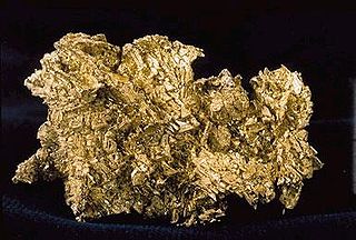
Gold, also called golden, is a color tone resembling the gold chemical element.

Complementary colors are pairs of colors which, when combined or mixed, cancel each other out by producing a grayscale color like white or black. When placed next to each other, they create the strongest contrast for those two colors. Complementary colors may also be called "opposite colors".

A color term is a word or phrase that refers to a specific color. The color term may refer to human perception of that color which is usually defined according to the Munsell color system, or to an underlying physical property. There are also numerical systems of color specification, referred to as color spaces.

Grey or gray is an intermediate color between black and white. It is a neutral or achromatic color, meaning that it has no chroma and therefore no hue. It is the color of a cloud-covered sky, of ash, and of lead.

Olive is a dark yellowish-green color, like that of unripe or green olives.

Lavender is a light shade of purple or violet. It applies particularly to the color of the flower of the same name. The web color called lavender is displayed adjacent—it matches the color of the palest part of the flower; however, the more saturated color shown as floral lavender more closely matches the average color of the lavender flower as shown in the picture and is the tone of lavender historically and traditionally considered lavender by average people as opposed to website designers. The color lavender might be described as a medium purple, a pale bluish purple, or a light pinkish-purple. The term lavender may be used in general to apply to a wide range of pale, light, or grayish-purples, but only on the blue side; lilac is pale purple on the pink side. In paints, the color lavender is made by mixing purple and white paint.
Maroon is a brownish crimson color that takes its name from the French word marron, or chestnut. "Marron" is also one of the French translations for "brown".
In many languages, the colors described in English as "blue" and "green" are colexified, i.e., expressed using a single umbrella term. To render this ambiguous notion in English, linguists use the blend word grue, from green and blue, a term coined by the philosopher Nelson Goodman—with an unrelated meaning—in his 1955 Fact, Fiction, and Forecast to illustrate his "new riddle of induction".

Horses exhibit a diverse array of coat colors and distinctive markings. A specialized vocabulary has evolved to describe them.

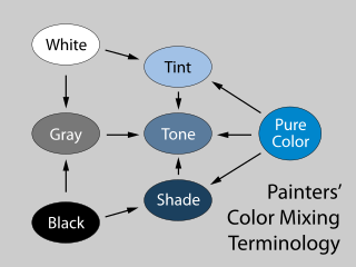
In color theory, a tint is a mixture of a color with white, which increases lightness, while a shade is a mixture with black, which increases darkness. Both processes affect the resulting color mixture's relative saturation. A tone is produced either by mixing a color with gray, or by both tinting and shading. Mixing a color with any neutral color reduces the chroma, or colorfulness, while the hue remains unchanged.

Varieties of the color green may differ in hue, chroma or lightness, or in two or three of these qualities. Variations in value are also called tints and shades, a tint being a green or other hue mixed with white, a shade being mixed with black. A large selection of these various colors is shown below.

White is the lightest color and is achromatic. It is the color of objects such as snow, chalk, and milk, and is the opposite of black. White objects fully reflect and scatter all the visible wavelengths of light. White on television and computer screens is created by a mixture of red, blue, and green light. The color white can be given with white pigments, especially titanium dioxide.

Ship camouflage is a form of military deception in which a ship is painted in one or more colors in order to obscure or confuse an enemy's visual observation. Several types of marine camouflage have been used or prototyped: blending or crypsis, in which a paint scheme attempts to hide a ship from view; deception, in which a ship is made to look smaller or, as with the Q-ships, to mimic merchantmen; and dazzle, a chaotic paint scheme which tries to confuse any estimate of distance, direction, or heading. Counterillumination, to hide a darkened ship against the slightly brighter night sky, was trialled by the Royal Canadian Navy in diffused lighting camouflage.

Varieties of the color blue may differ in hue, chroma, or lightness, or in two or three of these qualities. Variations in value are also called tints and shades, a tint being a blue or other hue mixed with white, a shade being mixed with black. A large selection of these colors is shown below.

Variations of gray or grey include achromatic grayscale shades, which lie exactly between white and black, and nearby colors with low colorfulness. A selection of a number of these various colors is shown below.

Shades of brown can be produced by combining red, yellow, and black pigments, or by a combination of orange and black—illustrated in the color box. The RGB color model, that generates all colors on computer and television screens, makes brown by combining red and green light at different intensities. Brown color names are often imprecise, and some shades, such as beige, can refer to lighter rather than darker shades of yellow and red. Such colors are less saturated than colors perceived to be orange. Browns are usually described as light or dark, reddish, yellowish, or gray-brown. There are no standardized names for shades of brown; the same shade may have different names on different color lists, and sometimes one name can refer to several very different colors. The X11 color list of web colors has seventeen different shades of brown, but the complete list of browns is much longer.

Shades of black, or off-black colors, are colors that differ only slightly from pure black. These colors have a low lightness. From a photometric point of view, a color which differs slightly from black always has low relative luminance. Colors often considered "shades of black" include onyx, black olive, charcoal, and jet.

