
Typography is the art and technique of arranging type to make written language legible, readable and appealing when displayed. The arrangement of type involves selecting typefaces, point sizes, line lengths, line spacing, letter spacing, and spaces between pairs of letters. The term typography is also applied to the style, arrangement, and appearance of the letters, numbers, and symbols created by the process. Type design is a closely related craft, sometimes considered part of typography; most typographers do not design typefaces, and some type designers do not consider themselves typographers. Typography also may be used as an ornamental and decorative device, unrelated to the communication of information.
Desktop publishing (DTP) is the creation of documents using dedicated software on a personal ("desktop") computer. It was first used almost exclusively for print publications, but now it also assists in the creation of various forms of online content. Desktop publishing software can generate page layouts and produce text and image content comparable to the simpler forms of traditional typography and printing. This technology allows individuals, businesses, and other organizations to self-publish a wide variety of content, from menus to magazines to books, without the expense of commercial printing.

In typography and lettering, a sans-serif, sans serif, gothic, or simply sans letterform is one that does not have extending features called "serifs" at the end of strokes. Sans-serif typefaces tend to have less stroke width variation than serif typefaces. They are often used to convey simplicity and modernity or minimalism. For the purposes of type classification, sans-serif designs are usually divided into these major groups: § Grotesque, § Neo-grotesque, § Geometric, § Humanist, and § Other or mixed.
In typography, a serif is a small line or stroke regularly attached to the end of a larger stroke in a letter or symbol within a particular font or family of fonts. A typeface or "font family" making use of serifs is called a serif typeface, and a typeface that does not include them is sans-serif. Some typography sources refer to sans-serif typefaces as "grotesque" or "Gothic" and serif typefaces as "roman".

A typeface is a design of letters, numbers and other symbols, to be used in printing or for electronic display. Most typefaces include variations in size, weight, slope, width, and so on. Each of these variations of the typeface is a font.

Adobe InDesign is a desktop publishing and page layout designing software application produced by Adobe and first released in 1999. It can be used to create works such as posters, flyers, brochures, magazines, newspapers, presentations, books and ebooks. InDesign can also publish content suitable for tablet devices in conjunction with Adobe Digital Publishing Suite. Graphic designers and production artists are the principal users.
In typography, italic type is a cursive font based on a stylised form of calligraphic handwriting. Along with blackletter and roman type, it served as one of the major typefaces in the history of Western typography.
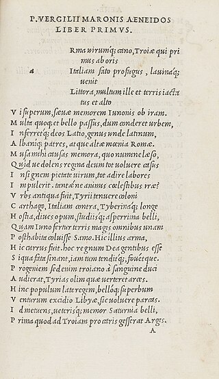
In typography, leading is the space between adjacent lines of type; the exact definition varies.

Lucida is an extended family of related typefaces designed by Charles Bigelow and Kris Holmes and released from 1984 onwards. The family is intended to be extremely legible when printed at small size or displayed on a low-resolution display – hence the name, from 'lucid'.
The font family selection in (X)HTML, CSS, and derived systems specifies a list of prioritized fonts and generic family names; in conjunction with correlating font properties, this list determines the particular font face used to render characters. The family selection is available in two forms: in the deprecated (X)HTML <font>...</font> element with its face attribute, and in the CSS font-family property.

Myriad is a humanist sans-serif typeface designed by Robert Slimbach and Carol Twombly for Adobe Systems. Myriad was intended as a neutral, general-purpose typeface that could fulfill a range of uses and have a form easily expandable by computer-aided design to a large range of weights and widths.

Lucida Grande is a humanist sans-serif typeface. It is a member of the Lucida family of typefaces designed by Charles Bigelow and Kris Holmes. It is best known for its implementation throughout the macOS user interface from 1999 to 2014, as well as in other Apple software like Safari for Windows. As of OS X Yosemite, the system font was changed from Lucida Grande to Helvetica Neue. In OS X El Capitan the system font changed again, this time to San Francisco.

In typography, a counter is the area of a letter that is entirely or partially enclosed by a letter form or a symbol. The stroke that creates such a space is known as a "bowl". Latin letters containing closed counters include A, B, D, O, P, Q, R, a, b, d, e, g, o, p, and q. Latin letters containing open counters include c, f, h, s etc. The digits 0, 4, 6, 8, and 9 also have counters. An aperture is the opening between an open counter and the outside of the letter.

In metal typesetting, a font or fount is a particular size, weight and style of a typeface, defined as the set of fonts that share an overall design. For instance, the typeface Bauer Bodoni includes fonts "Roman", "bold" and "italic"; each of these exists in a variety of sizes.

Multiple master fonts are an extension to Adobe Systems' Type 1 PostScript fonts, now superseded by the advent of OpenType and, in particular, the introduction of OpenType Font Variations in OpenType 1.8, also called variable fonts.

DIN 1451 is a sans-serif typeface that is widely used for traffic, administrative and technical applications.
Apple's Macintosh computer supports a wide variety of fonts. This support was one of the features that initially distinguished it from other systems.

Web typography, like typography generally, is the design of pages – their layout and typeface choices. Unlike traditional print-based typography, pages intended for display on the World Wide Web have additional technical challenges and – given its ability to change the presentation dynamically – additional opportunities. Early web page designs were very simple due to technology limitations; modern designs use Cascading Style Sheets (CSS), JavaScript and other techniques to deliver the typographer's and the client's vision.

Open Sans is an open source humanist sans-serif typeface that was designed by Steve Matteson under commission from Google. It was released in 2011 and is based on his earlier design called Droid Sans, which was specifically created for Android mobile devices but with slight modifications to its width.

Thai typography concerns the representation of the Thai script in print and on displays, and dates to the earliest printed Thai text in 1819. The printing press was introduced by Western missionaries during the mid-nineteenth century, and the printed word became an increasingly popular medium, spreading modern knowledge and aiding reform as the country modernized. The printing of textbooks for a new education system and newspapers and magazines for a burgeoning press in the early twentieth century spurred innovation in typography and type design, and various styles of Thai typefaces were developed through the ages as metal type gave way to newer technologies. Modern media is now served by digital typography, and despite early obstacles including lack of copyright protection, the market now sees contributions by several type designers and digital type foundries.