
Type design is the art and process of designing typefaces. This involves drawing each letterform using a consistent style. The basic concepts and design variables are described below.
In typography, a serif is a small line or stroke regularly attached to the end of a larger stroke in a letter or symbol within a particular font or family of fonts. A typeface or "font family" making use of serifs is called a serif typeface, and a typeface that does not include them is sans-serif. Some typography sources refer to sans-serif typefaces as "grotesque" or "Gothic", and serif typefaces as "roman".

A typeface is the design of lettering that can include variations in size, weight, slope, width, and so on. Each of these variations of the typeface is a font.
Alexandria is a city in Egypt.

Helvetica is a widely used sans-serif typeface developed in 1957 by Swiss typeface designer Max Miedinger and Eduard Hoffmann.

Frutiger is a series of typefaces named after its Swiss designer, Adrian Frutiger. Frutiger is a humanist sans-serif typeface, intended to be clear and highly legible at a distance or at small text sizes. A very popular design worldwide, type designer Steve Matteson described its structure as "the best choice for legibility in pretty much any situation" at small text sizes, while Erik Spiekermann named it as "the best general typeface ever".

Futura is a geometric sans-serif typeface designed by Paul Renner and released in 1927. It was designed as a contribution on the New Frankfurt-project. It is based on geometric shapes, especially the circle, similar in spirit to the Bauhaus design style of the period. It was developed as a typeface by the Bauer Type Foundry, in competition with Ludwig & Mayer's seminal Erbar typeface of 1926.

Courier is a monospaced slab serif typeface. The typeface was designed by Howard "Bud" Kettler (1919–1999). Initially created for IBM's typewriters, it has been adapted for use as a computer font, and versions of it are installed on most desktop computers.

Comic Sans MS is a sans-serif typeface designed by Vincent Connare and released in 1994 by Microsoft Corporation. It is a non-connecting script inspired by comic book lettering, intended for use in cartoon speech bubbles, as well as in other casual environments, like informal documents and children's materials.
Erik Spiekermann is a German typographer, designer and writer. He is an honorary professor at the University of the Arts Bremen and ArtCenter College of Design.

Apple Inc. uses a large variety of typefaces in its marketing, operating systems, and industrial design with each product cycle. These change throughout the years with Apple's change of style in their products. This is evident in the design and marketing of the company.

Roboto is a neo-grotesque sans-serif typeface family developed by Google as the system font for its mobile operating system Android, and released in 2011 for Android 4.0 "Ice Cream Sandwich".

In metal typesetting, a font is a particular size, weight and style of a typeface. Each font is a matched set of type, with a piece for each glyph. A typeface consists various fonts that share an overall design.

DIN 1451 is a sans-serif typeface that is widely used for traffic, administrative and technical applications.

Script typefaces are based upon the varied and often fluid stroke created by handwriting. They are generally used for display or trade printing, rather than for extended body text in the Latin alphabet. Some Greek alphabet typefaces, especially historically, have been a closer simulation of handwriting.
Athens was one of the original bitmap typefaces for the Apple Macintosh computer. It was designed by Susan Kare. An official TrueType version was never made, and Athens was rendered obsolete with the arrival of System 7.
Typefaces, fonts, and their glyphs raise intellectual property considerations in copyright, trademark, design patent, and related laws. The copyright status of a typeface—and any font file that describes it digitally—varies between jurisdictions. In the United States, the shapes of typefaces are not eligible for copyright, though the shapes may be protected by design patent. Typefaces can be protected in other countries, including the UK, Germany, and France, by industrial design protections that are similar to copyright or design patent in that they protect the abstract shapes. Additionally, in the US and in some other countries, computer fonts—the digital instantiation of the shapes as vector outlines—may be protected by copyright on the computer code that produces them. The name of a typeface may also be protected as a trademark.
A font catalog or font catalogue is a collection of specimen of typefaces offering sample use of the fonts for the included typefaces, originally in the form of a printed book. The definition has also been applied to websites offering a specimens collection similar to what a printed catalog provides.
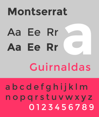
Montserrat is a geometric sans-serif typeface designed by Argentine graphic designer Julieta Ulanovsky and released in 2011. It was inspired by posters, signs and painted windows from the first half of the twentieth century, seen in the historic Montserrat neighbourhood of Buenos Aires.
