Optima is a humanist sans-serif typeface designed by Hermann Zapf and released by the D. Stempel AG foundry, Frankfurt, West Germany in 1958.
Bitstream Inc. was a type foundry that produced digital typefaces. It was founded in 1981 by Matthew Carter and Mike Parker among others. It was located in Marlborough, Massachusetts. The font business, including MyFonts, was acquired by Monotype Imaging in March 2012. The remainder of the business, responsible for Pageflex and Bolt Browser, was spun off to a new entity named Marlborough Software Development Holdings Inc. It was later renamed Pageflex, Inc following a successful management buyout in December 2013.
In typography, a serif is a small line or stroke regularly attached to the end of a larger stroke in a letter or symbol within a particular font or family of fonts. A typeface or "font family" making use of serifs is called a serif typeface, and a typeface that does not include them is sans-serif. Some typography sources refer to sans-serif typefaces as "grotesque" or "Gothic", and serif typefaces as "roman".

A typeface is a design of letters, numbers and other symbols, to be used in printing or for electronic display. Most typefaces include variations in size, weight, slope, width, and so on. Each of these variations of the typeface is a font.

Helvetica, also known by its original name Neue Haas Grotesk, is a widely used sans-serif typeface developed in 1957 by Swiss typeface designer Max Miedinger and Eduard Hoffmann.

Matthew Carter is a British type designer. A 2005 New Yorker profile described him as 'the most widely read man in the world' by considering the amount of text set in his commonly used fonts.

Comic Sans MS is a sans-serif typeface designed by Vincent Connare and released in 1994 by Microsoft Corporation. It is a non-connecting script inspired by comic book lettering, intended for use in cartoon speech bubbles, as well as in other casual environments, such as informal documents and children's materials.

Corel Photo-Paint is a raster graphics editor developed and marketed by Corel since 1992. Corel markets the software for Windows and Mac OS operating systems, previously having marketed versions for Linux. Its primary market competitor is Adobe Photoshop.

Georgia is a serif typeface designed in 1993 by Matthew Carter and hinted by Tom Rickner for Microsoft. It was intended as a serif typeface that would appear elegant but legible when printed small or on low-resolution screens. The typeface is inspired by Scotch Roman designs of the 19th century and was based on designs for a print typeface on which Carter was working when contacted by Microsoft; this would be released under the name Miller the following year. The typeface's name referred to a tabloid headline, "Alien heads found in Georgia."

In metal typesetting, a font is a particular size, weight and style of a typeface. Each font is a matched set of type, with a piece for each glyph. A typeface consists of various fonts that share an overall design.
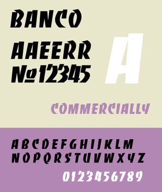
Banco is an inclined titling typeface. It was designed by Roger Excoffon for the Fonderie Olive foundry in 1951.

Arnold Böcklin is a typeface for display use that was designed in 1904 by Schriftgiesserei Otto Weisert foundry. It was named in memory of Arnold Böcklin, a Swiss symbolist painter who died in 1901.
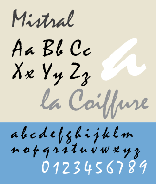
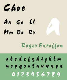
Mistral is a casual script typeface designed by Roger Excoffon for the Fonderie Olive type foundry, and released in 1953. The Amsterdam Type foundry released a version in 1955.

Gotham is a geometric sans-serif typeface family designed by American type designer Tobias Frere-Jones with Jesse Ragan and released through the Hoefler & Frere-Jones foundry from 2000. Gotham's letterforms were inspired by examples of architectural signs of the mid-twentieth century. Gotham has a relatively broad design with a reasonably high x-height and wide apertures.
Roger Excoffon was a French typeface designer and graphic designer.
CorelDRAW is a vector graphics editor developed and marketed by Alludo. It is also the name of the Corel graphics suite, which includes the bitmap-image editor Corel Photo-Paint as well as other graphics-related programs. It can serve as a digital painting platform, desktop publishing suite, and is commonly used for production art in signmaking, vinyl and laser cutting and engraving, print-on-demand and other industry processes. Reduced-feature Standard and Essentials versions are also offered.
Evert Bloemsma was a Dutch photographer, graphic designer, type designer, and art school educator.

The Amsterdam Type Foundry was a type foundry based in Amsterdam, Netherlands.

A reverse-contrast or reverse-stress letterform is a design in which the stress is reversed from the norm: a typeface or custom lettering where the horizontal lines are the thickest. This is the reverse of the vertical lines being the same width or thicker than horizontals, which is normal in Latin-alphabet writing and especially printing. The result is a dramatic effect, in which the letters seem to have been printed the wrong way round. The style invented in the early nineteenth century as attention-grabbing novelty display designs. Modern font designer Peter Biľak, who has created a design in the genre, has described them as "a dirty trick to create freakish letterforms that stood out."