Palatino is the name of an old-style serif typeface designed by Hermann Zapf, initially released in 1949 by the Stempel foundry and later by other companies, most notably the Mergenthaler Linotype Company.

Matthew Carter is a British type designer. A 2005 New Yorker profile described him as 'the most widely read man in the world' by considering the amount of text set in his commonly used typefaces.

Rockwell is a slab serif typeface designed by the Monotype Corporation and released in 1934. The project was supervised by Monotype's engineering manager Frank Hinman Pierpont. This typeface is distinguished by a serif at the apex of the uppercase A, while the lowercase a has two storeys. Because of its monoweighted stroke, Rockwell is used primarily for display or at small sizes rather than as a body text. Rockwell is based on an earlier, more condensed slab serif design cast by the Inland Type Foundry called Litho Antique.

Futura is a geometric sans-serif typeface designed by Paul Renner and released in 1927. It was designed as a contribution on the New Frankfurt-project. It is based on geometric shapes, especially the circle, similar in spirit to the Bauhaus design style of the period. It was developed as a typeface by the Bauer Type Foundry, in competition with Ludwig & Mayer's seminal Erbar typeface of 1926.

Univers is a large sans-serif typeface family designed by Adrian Frutiger and released by his employer Deberny & Peignot in 1957. Classified as a neo-grotesque sans-serif, one based on the model of nineteenth-century German typefaces such as Akzidenz-Grotesk, it was notable for its availability from the moment of its launch in a comprehensive range of weights and widths. The original marketing for Univers deliberately referenced the periodic table to emphasise its scope.
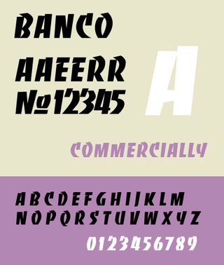
Banco is an inclined titling typeface. It was designed by Roger Excoffon for the Fonderie Olive foundry in 1951.
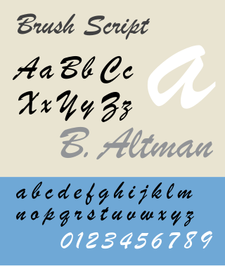
Brush Script is a casual connecting script typeface designed in 1942 by Robert E. Smith for the American Type Founders (ATF). The face exhibits an exuberant graphic stroke emulating the look of handwritten written letters with an ink brush. Lowercase letters are deliberately irregular to further effect the look of handwritten text. The typeface was introduced in 1942 and saw near immediate success with advertisers, retailers, and in posters. Its popularity continued through the 1950s, and waned as influence of the International Typographic Style grew in the 1960s. The typeface has regained considerable popularity for its nostalgic association with the post WW2 era.

Peignot is a sans-serif display typeface, designed by the poster artist A. M. Cassandre in 1937. It was commissioned by the French type foundry Deberny & Peignot.

DIN 1451 is a sans-serif typeface that is widely used for traffic, administrative and technical applications.

Windsor is a serif typeface created by Eleisha Pechey (1831-1902) and released by the Stephenson Blake type foundry. It is intended for use such as display and in headings rather than for body text.

Syntax comprises a family of fonts designed by Swiss typeface designer Hans Eduard Meier. Originally just a sans-serif font, it was extended with additional serif designs.

News Gothic is a sans-serif typeface designed by Morris Fuller Benton, and was released in 1908 by his employer American Type Founders (ATF). The typeface is similar in proportion and structure to Franklin Gothic, also designed by Benton, but lighter.

Bank Gothic is a rectilinear geometric sans-serif typeface designed by Morris Fuller Benton for American Type Founders and released in 1930. The design has become popular from the late twentieth century to suggest a science-fiction, military, corporate, or sports aesthetic.

Bulmer is the name given to a serif typeface originally designed by punchcutter William Martin around 1790 for the Shakespeare Press, run by William Bulmer (1757–1830). The types were used for printing the Boydell Shakespeare folio edition.

Caledonia is a serif typeface designed by William Addison Dwiggins in 1938 for the Mergenthaler Linotype Company and commonly used in book design. As a transitional serif design, one inspired by the Scotch Roman typefaces of the early nineteenth century, Caledonia has a contrasting design of alternating thick and thin strokes, a design that stresses the vertical axis and sharp, regular serifs on ascenders and descenders.
Roger Excoffon was a French typeface designer and graphic designer.
The Fonderie Olive, in English, Olive Foundry, was a small but high-profile type foundry located in Marseille, France. It is best known for the work of the typeface designer Roger Excoffon. In 1978 the foundry was acquired by the Mergenthaler Linotype Company which transferred photocomposition rights for all faces to Haas.

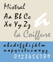
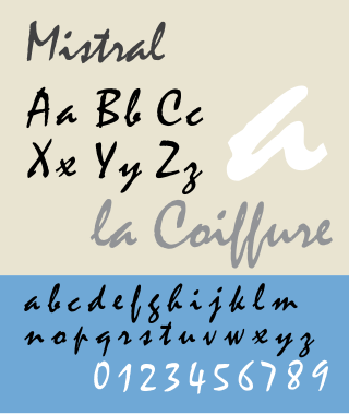
Script typefaces are based on the varied and often fluid stroke created by handwriting. They are generally used for display or trade printing, rather than for extended body text in the Latin alphabet. Some Greek alphabet typefaces, especially historically, have been a closer simulation of handwriting.

In typography, Erbar or Erbar-Grotesk is a sans-serif typeface in the geometric style, one of the first designs of this kind released as type. Designer Jakob Erbar's aim was to design a printing type which would be free of all individual characteristics, possess thoroughly legible letter forms, and be a purely typographic creation. His conclusion was that this could only work if the type form was developed from a fundamental element, the circle. Erbar-Grotesk was developed in stages; Erbar wrote that he had originally sketched out the design in 1914 but had been prevented from working on it due to the war. The original version of Erbar was released in 1926, following Erbar's "Phosphor" titling capitals of 1922 which are very similar in design.

The Amsterdam Type Foundry was a type foundry based in Amsterdam, Netherlands.