
Palatino is the name of an old-style serif typeface designed by Hermann Zapf, initially released in 1949 by the Stempel foundry and later by other companies, most notably the Mergenthaler Linotype Company.
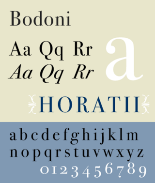
Bodoni is the name given to the serif typefaces first designed by Giambattista Bodoni (1740–1813) in the late eighteenth century and frequently revived since. Bodoni's typefaces are classified as Didone or modern. Bodoni followed the ideas of John Baskerville, as found in the printing type Baskerville—increased stroke contrast reflecting developing printing technology and a more vertical axis—but he took them to a more extreme conclusion. Bodoni had a long career and his designs changed and varied, ending with a typeface of a slightly condensed underlying structure with flat, unbracketed serifs, extreme contrast between thick and thin strokes, and an overall geometric construction.

Arial is a sans-serif typeface and set of computer fonts in the neo-grotesque style. Fonts from the Arial family are included with all versions of Microsoft Windows from Windows 3.1 on, some other Microsoft software applications, Apple's macOS and many PostScript 3 computer printers. The typeface was designed in 1982, by Robin Nicholas and Patricia Saunders, for Monotype Typography. Each of its characters has the same width as that character in the popular typeface Helvetica; the purpose of this design is to allow a document designed in Helvetica to be displayed and printed with the intended line-breaks and page-breaks without a Helvetica license. Because of their almost identical appearances, both Arial and Helvetica have commonly been mistaken for each other.

Franklin Gothic and its related faces are a large family of sans-serif typefaces in the industrial or grotesque style developed in the early years of the 20th century by the type foundry American Type Founders (ATF) and credited to its head designer Morris Fuller Benton. “Gothic” was a contemporary term meaning sans-serif.

Century Gothic is a digital sans-serif typeface in the geometric style, released by Monotype Imaging in 1991. It is a redrawn version of Monotype's own Twentieth Century, a copy of Bauer's Futura, to match the widths of ITC Avant Garde Gothic. It is an exclusively digital typeface that has never been manufactured as metal type.

Bookman, or Bookman Old Style, is a serif typeface. A wide, legible design that is slightly bolder than most body text faces, Bookman has been used for both display typography, for trade printing such as advertising, and less commonly for body text. In advertising use it is particularly associated with the graphic design of the 1960s and 1970s, when revivals of it were very popular. It is also used as the official font of Indonesian laws since 2011.

Bernhard Gothic is a family of geometric sans serif typeface designed by Lucian Bernhard in 1929 for the American Type Founders (ATF). Five variations by Bernhard were introduced over two years:

Cheltenham is a typeface for display use designed in 1896 by architect Bertram Goodhue and Ingalls Kimball, director of the Cheltenham Press. The original drawings were known as Boston Old Style and were made about 14" high. These drawings were then turned over to Morris Fuller Benton at American Type Founders (ATF) who developed it into a final design. Trial cuttings were made as early as 1899 but the face was not complete until 1902. The face was patented by Kimball in 1904. Later the basic face was spun out into an extensive type family by Morris Fuller Benton.

Goudy Old Style is an old-style serif typeface originally created by Frederic W. Goudy for American Type Founders (ATF) in 1915.

News Gothic is a sans-serif typeface designed by Morris Fuller Benton, and was released in 1908 by his employer American Type Founders (ATF). The typeface is similar in proportion and structure to Franklin Gothic, also designed by Benton, but lighter.

Bank Gothic is a rectilinear geometric sans-serif typeface designed by Morris Fuller Benton for American Type Founders and released in 1930. The design has become popular from the late twentieth century to suggest a science-fiction, military, corporate, or sports aesthetic.

Twentieth Century is a geometric sans-serif typeface designed by Sol Hess for Lanston Monotype in 1937. It was created as a competitor to the successful Futura typeface for Monotype's hot metal typesetting system. Like Futura it has a single-story 'ɑ' and a straight 'j' with no bend.

Caledonia is a serif typeface designed by William Addison Dwiggins in 1938 for the Mergenthaler Linotype Company and commonly used in book design. As a transitional serif design, one inspired by the Scotch Roman typefaces of the early nineteenth century, Caledonia has a contrasting design of alternating thick and thin strokes, a design that stresses the vertical axis and sharp, regular serifs on ascenders and descenders.

Handel Gothic is a geometric sans-serif typeface designed in 1965 by Donald J. Handel (1936–2002), who worked for the graphic designer Saul Bass.

Broadway is a decorative typeface, perhaps the archetypal Art Deco typeface. The original face was designed by Morris Fuller Benton in 1927 for ATF as a capitals-only display face. It had a long initial run of popularity, before being discontinued by ATF in 1954. It was re-discovered in the Cold Type Era and has ever since been used to evoke the feeling of the twenties and thirties. The font has been used in the TV shows Rhoda and My Life as a Teenage Robot. Several variants were made:

Century is a family of serif type faces particularly intended for body text. The family originates from a first design, Century Roman, cut by American Type Founders designer Linn Boyd Benton in 1894 for master printer Theodore Low De Vinne, for use in The Century Magazine. ATF rapidly expanded it into a very large family, first by Linn Boyd, and later by his son Morris.

Souvenir is a serif typeface designed in 1914 by Morris Fuller Benton for American Type Founders. It was loosely based on Schelter-Antiqua and Schelter-Kursiv, a 1905 Art Nouveau type issued by the J.G. Schelter & Giesecke foundry in Leipzig. It has a much softer appearance than other old style faces, with a generally light look, rounded serifs, and very little contrast between thick and thin strokes. Like Cheltenham, it shows the influence of the Arts and Crafts Movement without belonging to a specific historical style. A 1970s redesign by Ed Benguiat, adding extra styles and an italic, became far more popular than the initial release, and is the source of most versions sold today.

Cloister is a serif typeface that was designed by Morris Fuller Benton and published by American Type Founders from around 1913. It is loosely based on the printing of Nicolas Jenson in Venice in the 1470s, in what is now called the "old style" of serif fonts. American Type Founders presented it as an attractive but highly usable serif typeface, suitable both for body text and display use.
