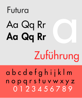
Futura is a geometric sans-serif typeface designed by Paul Renner and released in 1927. It was designed as a contribution on the New Frankfurt-project. It is based on geometric shapes, especially the circle, similar in spirit to the Bauhaus design style of the period. It was developed as a typeface by the Bauer Type Foundry, in competition with Ludwig & Mayer's seminal Erbar typeface of 1926.

Frederic William Goudy was an American printer, artist and type designer whose typefaces include Copperplate Gothic, Goudy Old Style and Kennerley.
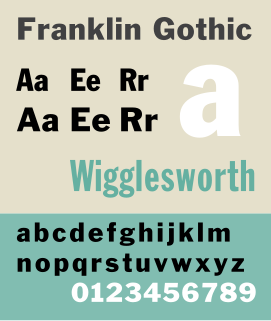
Franklin Gothic and its related faces are a large family of realist sans-serif typefaces developed in the early years of the 20th century by the type foundry American Type Founders (ATF) and credited to its head designer Morris Fuller Benton. “Gothic” was a contemporary term meaning sans-serif.
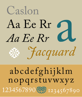
Caslon is the name given to serif typefaces designed by William Caslon I in London, or inspired by his work.

Cooper Black is an ultra-bold serif typeface intended for display use that was designed by Oswald Bruce Cooper and released by the Barnhart Brothers & Spindler type foundry in 1922. The typeface was drawn as an extra-bold weight of Cooper's "Cooper Old Style" family. It rapidly became a standard typeface and was licensed by American Type Founders and also copied by many other manufacturers of printing systems.
Oblique type is a form of type that slants slightly to the right, used for the same purposes as italic type. Unlike italic type, however, it does not use different glyph shapes; it uses the same glyphs as roman type, except slanted. Oblique and italic type are technical terms to distinguish between the two ways of creating slanted font styles; oblique designs may be labelled italic by companies selling fonts or by computer programs. Oblique designs may also be called slanted or sloped roman styles. Oblique fonts, as supplied by a font designer, may be simply slanted, but this is often not the case: many have slight corrections made to them to give curves more consistent widths, so they retain the proportions of counters and the thick-and-thin quality of strokes from the regular design.

Copperplate Gothic is a typeface designed by Frederic W. Goudy and released by American Type Founders (ATF) in 1901.

Bookman or Bookman Old Style, is a serif typeface. A wide, legible design that is slightly bolder than most body text faces, Bookman has been used for both display typography and for printing at small sizes such as in trade printing, and less commonly for body text. In advertising use it is particularly associated with the graphic design of the 1960s and 1970s, when revivals of it were very popular.

Goudy Old Style is an old-style serif typeface originally created by Frederic W. Goudy for American Type Founders (ATF) in 1915.

News Gothic is a realist sans-serif typeface dated to 1908 designed by Morris Fuller Benton, and released by his employer American Type Founders (ATF). News Gothic is similar in proportion and structure to Franklin Gothic, also designed by Benton, but lighter.

Twentieth Century is a geometric sans-serif typeface designed by Sol Hess for Lanston Monotype in 1937. It was created as a competitor to the successful Futura typeface for Monotype's hot metal typesetting system. Like Futura it has a single-story 'ɑ' and a straight 'j' with no bend.

Centaur is a serif typeface by book and typeface designer Bruce Rogers, based on the Renaissance-period printing of Nicolas Jenson around 1470. He used it for his design of the Oxford Lectern Bible. It was given widespread release by the British branch of Monotype, paired with an italic designed by calligrapher Frederic Warde and based on the slightly later work of calligrapher and printer Ludovico Vicentino degli Arrighi. The italic has sometimes been named separately as the "Arrighi" italic.
Sol Hess was an American typeface designer. After a three-year scholarship course at Pennsylvania Museum School of Industrial Design, he began at Lanston Monotype in 1902, rising to typographic manager in 1922. He was a close friend and collaborator with Monotype art director Frederic Goudy, succeeding him in that position in 1940. Hess was particularly adept at expanding type faces into whole families, allowing him to complete 85 faces for Monotype, making him America's fourth most prolific type designer. While he was with Monotype, Hess worked on commissions for many prominent users of type, including, Crowell-Collier, Sears Roebuck, Montgomery Ward, Yale University Press, World Publishing Company, and Curtis Publishing for whom he re-designed the typography of their Saturday Evening Post.

Century is a family of serif type faces particularly intended for body text. The family originates from a first design, Century Roman cut by American Type Founders designer Linn Boyd Benton in 1894 for master printer Theodore Low De Vinne, for use in The Century Magazine. ATF rapidly expanded it into a very large family, first by Linn Boyd and later by his son Morris.

Kennerley Old Style is a serif typeface designed by Frederic Goudy. Kennerley is an "old-style" serif design, loosely influenced by Italian and Dutch printing traditions of the Renaissance and early modern period. It was named for New York publisher Mitchell Kennerley, who advanced Goudy money to complete the design. While Goudy had already designed 18 other typefaces, it was one of Goudy's most successful early designs in his own style. The regular or roman style was designed in 1911, the italic in 1918; bold styles followed in 1924.

Deepdene is a serif typeface designed by Frederic Goudy from 1927–1933. It belongs to the "old-style" of serif font design, with low contrast between strokes and an oblique axis. However, Deepdene has crisp serifs and a nearly upright italic, with much less of a slant than is normal for this style.
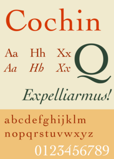
Cochin is a serif typeface. It was originally produced in 1912 by Georges Peignot for the Paris foundry G. Peignot et Fils and was based on the copperplate engravings of 18th century French artist Charles-Nicolas Cochin, from which the typeface also takes its name. The font has a small x-height with long ascenders. Georges Peignot also created the design 'Nicolas-Cochin' as a looser variation in the same style.

