Galliard (typeface)

Last updated
ITC Galliard
ITC Galliard.png
Category Serif
Classification Old-style
Designer(s) Robert Granjon
Matthew Carter
Foundry Linotype
International Typeface Corporation
Date released1978

ITC Galliard is the name of a serif typeface designed by Matthew Carter and issued in 1978 by the Mergenthaler Linotype Company. [1]

Contents

Galliard is based on the sixteenth-century type of Robert Granjon. [2] According to Alexander Lawson, "The name Galliard stems from Granjon's own term for an 8-point font he cut about 1570. It undoubtedly refers to the style of the face, for the galliard was a lively dance of the period." [3] Explaining what drew him to Granjon's work, Carter wrote on some of his more characteristic letterforms: "looking at them, adjectives like 'spirited, 'tense' and 'vigorous' come to mind...it is easy to admire Granjon's work." [1]

Mike Parker, Director of Typographic Development at Mergenthaler Linotype, had been inspired by seeing the types of Granjon at the Plantin-Moretus Museum in Antwerp. [4] [3] Matthew Carter, who joined Mergenthaler Linotype as a typeface designer in 1965, was also an admirer. His father, Harry Carter, had worked to itemise the museum's extensive collection of sixteenth-century punches and matrices in the 1950s, with his son occasionally helping. [5] [6] [7] [8] Work continued on the typeface, sporadically, through the 1960s and 1970s. The typeface was released in 1978. With a glittering, crisp design, Galliard has been used both for body text and for headings. Galliard is notable for its 'pelican-beak' letter 'g', based on Granjon's Double Pica italic of 1570. [2]

ITC Galliard (1978, 1982)

Granjon's punches for the italic Galliard is based on. The second row shows both forms of the 'g'. Robert Granjon italic punches.jpg
Granjon's punches for the italic Galliard is based on. The second row shows both forms of the 'g'.

It is a version re-issued by International Typeface Corporation after Mike Parker had given ITC exclusive rights to Galliard. Matthew Carter drew the four roman weights and complementary italic designs while at Mergenthaler Linotype, and a suite of small caps for the Roman and Bold weights. ITC Galliard was introduced by Mergenthaler Linotype Company in 1978, with public availability for ITC subscribers beginning on January 15, 1982 (as announced in December 1981 (volume 8-4) issue of U&lc magazine). [9]

The family includes 8 fonts in 4 weights and 1 width, with complementary italics. OpenType features include fractions, ligatures, ordinals, superscript.

ITC Galliard Pro (2010)

It is a version of ITC Galliard with characters that support Central European languages.

OpenType features include case sensitive forms, numerators/denominators, fractions, ligatures, lining/old style/proportional/tabular figures, localized forms, ordinals, scientific inferiors, superscript, small caps, diphthongs, stylistic alternates (set 1).

ITC Galliard eText (2013)

It is a version of ITC Galliard optimised for on-screen use, designed by Carl Crossgrove. Changes include increased lowercase heights, increased inter-character spacing, more open counters, adjusted thicks to thins ratio. [10]

The family includes 4 fonts in 2 weights (regular, bold) and 1 width, with complementary italics. Character set support include. OpenType features include case sensitive forms, fractions, ligatures, lining/old style figures, localized forms, ordinals, small caps. Character set supports include Adobe Western 2.

Reception

Robert Granjon's Ascendonica italic, the model for Galliard's, shown in a 1611 book. The 'pelican' 'g' is used in the second line and a conventional two-storey 'g' in other parts of the text. Granjon Ascendonica italic 1611 Caroli Clvsii Atrebatis Cvrae posteriores.jpg
Robert Granjon's Ascendonica italic, the model for Galliard's, shown in a 1611 book. The 'pelican' 'g' is used in the second line and a conventional two-storey 'g' in other parts of the text.

Galliard has robust strokes, but also sharp details and incisive contrast between thick and thin strokes. According to Lawson, "While the designers of the regenerated Garamonds were attempting to bring fidelity in their copies, Carter preferred simply to bring to Galliard his interpretation of the spirit of a Granjon original...Galliard thus possesses the authentic sparkle that is lacking in the current Garamonds." [3]

Usages

Galliard was a typeface used in the graphic identity and standards of Yale University until it was replaced in 2007 by Matthew Carter's Yale typeface which was itself inspired in part by Galliard.

Galliard was one of twenty-three typefaces acquired by the Museum of Modern Art in 2011 and subsequently exhibited in Standard Deviations.

Galliard is the house typeface of The New Criterion and of the Library of America series.

Galliard is the font found on the official logo of Baylor College of Medicine.

See also

Related Research Articles

<span class="mw-page-title-main">Optima</span> 1958 typeface by Hermann Zapf

Optima is a humanist sans-serif typeface designed by Hermann Zapf and released by the D. Stempel AG foundry, Frankfurt, West Germany in 1958.
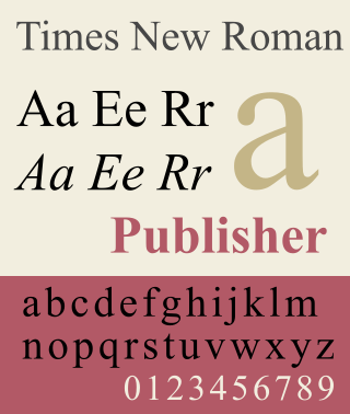
<span class="mw-page-title-main">Times New Roman</span> Serif typeface

Times New Roman is a serif typeface. It was commissioned by the British newspaper The Times in 1931 and conceived by Stanley Morison, the artistic adviser to the British branch of the printing equipment company Monotype, in collaboration with Victor Lardent, a lettering artist in The Times's advertising department. It has become one of the most popular typefaces of all time and is installed on most personal computers.

<span class="mw-page-title-main">Garamond</span> Typeface family

Garamond is a group of many serif typefaces, named for sixteenth-century Parisian engraver Claude Garamond, generally spelled as Garamont in his lifetime. Garamond-style typefaces are popular and particularly often used for book printing and body text.

<span class="mw-page-title-main">Matthew Carter</span> British type designer (born 1937)

Matthew Carter is a British type designer. A 2005 New Yorker profile described him as 'the most widely read man in the world' by considering the amount of text set in his commonly used typefaces.

<span class="mw-page-title-main">Frutiger (typeface)</span> Typeface designed by Adrian Frutiger

Frutiger is a series of typefaces named after its Swiss designer, Adrian Frutiger. Frutiger is a humanist sans-serif typeface, intended to be clear and highly legible at a distance or at small text sizes. A popular design worldwide, type designer Steve Matteson described its structure as "the best choice for legibility in pretty much any situation" at small text sizes, while Erik Spiekermann named it as "the best general typeface ever".

<span class="mw-page-title-main">Bodoni</span> Serif typeface

Bodoni is the name given to the serif typefaces first designed by Giambattista Bodoni (1740–1813) in the late eighteenth century and frequently revived since. Bodoni's typefaces are classified as Didone or modern. Bodoni followed the ideas of John Baskerville, as found in the printing type Baskerville—increased stroke contrast reflecting developing printing technology and a more vertical axis—but he took them to a more extreme conclusion. Bodoni had a long career and his designs changed and varied, ending with a typeface of a slightly condensed underlying structure with flat, unbracketed serifs, extreme contrast between thick and thin strokes, and an overall geometric construction.

<span class="mw-page-title-main">Caslon</span> Typeface with serifs

Caslon is the name given to serif typefaces designed by William Caslon I (c. 1692–1766) in London, or inspired by his work.

<span class="mw-page-title-main">Claude Garamond</span> French publisher and type designer

Claude Garamont, known commonly as Claude Garamond, was a French type designer, publisher and punch-cutter based in Paris. Garamond worked as an engraver of punches, the masters used to stamp matrices, the moulds used to cast metal type. He worked in the tradition now called old-style serif design, which produced letters with a relatively organic structure resembling handwriting with a pen but with a slightly more structured and upright design. Considered one of the leading type designers of all time, he is recognised to this day for the elegance of his typefaces. Many old-style serif typefaces are collectively known as Garamond, named after the designer.

<span class="mw-page-title-main">Plantin–Moretus Museum</span> Printing museum in Antwerp, Belgium

The Plantin–Moretus Museum is a printing museum in Antwerp, Belgium which focuses on the work of the 16th-century printers Christophe Plantin and Jan Moretus. It is located in their former residence and printing establishment, the Plantin Press, at the Vrijdagmarkt in Antwerp, and has been a UNESCO World Heritage Site since 2005.

<span class="mw-page-title-main">Parisine</span> Typeface

Parisine is a typeface that was created by Jean-François Porchez and is distributed by Typofonderie.

<span class="mw-page-title-main">Swash (typography)</span> Typographical flourish found on some letterforms, particularly in italics

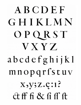
A swash is a typographical flourish, such as an exaggerated serif, terminal, tail, entry stroke, etc., on a glyph. The use of swash characters dates back to at least the 16th century, as they can be seen in Ludovico Vicentino degli Arrighi's La Operina, which is dated 1522. As with italic type in general, they were inspired by the conventions of period handwriting. Arrighi's designs influenced designers in Italy and particularly in France.

<span class="mw-page-title-main">Sabon</span> Serif typeface

Sabon is an old-style serif typeface designed by the German-born typographer and designer Jan Tschichold (1902–1974) in the period 1964–1967. It was released jointly by the Linotype, Monotype, and Stempel type foundries in 1967. The design of the roman is based on types by Claude Garamond, particularly a specimen printed by the Frankfurt printer Konrad Berner. Berner had married the widow of a fellow printer Jacques Sabon, the source of the face's name, who had bought some of Garamond's type after his death. The italics are based on types designed by a contemporary of Garamond's, Robert Granjon. It is effectively a Garamond revival, though a different name was chosen as many other modern typefaces already carry this name.

<span class="mw-page-title-main">Granjon</span> Serif typeface

Granjon is an old-style serif typeface designed by George W. Jones around 1924 for the British branch of the Linotype company, and based on the Garamond typeface that was used in a book printed by the Parisian Jean Poupy in 1592. The roman design was from Claude Garamond and the italic version was from Robert Granjon. Because several other Garamonds were on the market in the 1920s, Jones decided to name his type Granjon. Jones, a master printer based in London, had been engaged by Linotype to improve the quality of their typeface range through the development of revivals of notable type designs of the past.

<span class="mw-page-title-main">Plantin (typeface)</span> Typeface

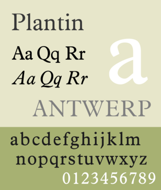
Plantin is an old-style serif typeface. It was created in 1913 by the British Monotype Corporation for their hot metal typesetting system and is named after the sixteenth-century printer Christophe Plantin. It is loosely based on a Gros Cicero roman type cut in the 16th century by Robert Granjon held in the collection of the Plantin–Moretus Museum, Antwerp.

<span class="mw-page-title-main">Robert Granjon</span> French type designer and printer

Robert Granjon was a French punchcutter, a designer and creator of metal type, and printer. He worked in Paris, Lyon, Antwerp, and Rome. He is best known for having introduced the typeface style Civilité, for his many italic types and his fleuron designs, although he worked across all genres of typeface and alphabet across his long career.

<span class="mw-page-title-main">Century type family</span> Typeface

Century is a family of serif type faces particularly intended for body text. The family originates from a first design, Century Roman, cut by American Type Founders designer Linn Boyd Benton in 1894 for master printer Theodore Low De Vinne, for use in The Century Magazine. ATF rapidly expanded it into a very large family, first by Linn Boyd, and later by his son Morris.

Mike Russell Parker was a British-born American typographer and type designer.

<i>Grecs du roi</i> Greek typeface by Claude Garamond

Les Grecs du roi are a celebrated and influential Greek alphabet typeface in the Greek minuscule style which was cut by the French punchcutter Claude Garamond between 1541 and 1550. Arthur Tilley calls the books printed from them "among the most finished specimens of typography that exist".

<span class="mw-page-title-main">Hendrik van den Keere</span> 16th-century punchcutter

Hendrik van den Keere was a punchcutter, or cutter of punches to make metal type, who lived in Ghent in modern Belgium.

References

  1. 1 2 Carter, Matthew (1985). "Galliard: A Revival of Types of Robert Granjon". Visible Language. 19 (1): 77–98. Archived from the original on 30 December 2017. Retrieved 19 May 2017.
  2. 1 2 Vervliet, Hendrik D.L. (2008). The Palaeotypography of the French Renaissance: Selected papers on sixteenth-century typefaces. 2 vols . Leiden: Koninklijke Brill NV. pp.  215–230, 321–2, 356. ISBN   9789004169821.
  3. 1 2 3 Lawson, Alexander, Anatomy of a Typeface , Godine, 1990.
  4. Bigelow, Charles, Galliard in Fine Print on Type, Charles Bigelow, editor, 1989.
  5. "ITC Classics: ITC Galliard - ITCFonts.com". Archived from the original on 2012-06-20. Retrieved 2012-06-20.
  6. Carter, Harry (2002). Mosley, James (ed.). A View of Early Typography up to about 1600. London: Hyphen Press. In 1954 Carter was persuaded...to take up the appointment of Archivist at the Oxford University Press...a part of Carter's brief was therefore to look into [the Plantin-Moretus Museum's] collections...it had gradually become known that Plantin's stock of punches and matrices had also survived intact...Carter became a member of the small team of researchers who performed the task of sorting and cataloguing the materials...his experience at Antwerp involved handling punches...and original matrices, from which he cast sample types, using the traditional hand mould.
  7. Hoefler, Jonathan. "Reconstructing Harry". Hoefler & Co. Retrieved 14 October 2017.
  8. Mosley, James (2003). "Reviving the Classics: Matthew Carter and the Interpretation of Historical Models". In Re, Margaret (ed.). Typographically Speaking: The Art of Matthew Carter (2. ed.). New York: Princeton Architectural. pp. 31–6. ISBN   9781568984278.
  9. U&lc. VOLUME EIGHT, NUMBER FOUR, DEC. 1981, pages 28-33
  10. eText Typefaces: Typefaces for High-Quality e-Reading Experiences
  11. Clusius, Carolus (1611). Atrebatis cvrae posteriores, seu, Plurimarum non antè cognitarum, aut descriptarum stirpium, peregrinorumq́ue aliquot animalium. Antwerp: Officina Plantiniana. Retrieved 5 March 2019.
  12. Blokland, Frank E. (31 October 2018). "An Italic for Uccello [Comments on TypeDrawers thread]". TypeDrawers. Retrieved 5 March 2019.