Times New Roman is a serif typeface. It was commissioned by the British newspaper The Times in 1931 and conceived by Stanley Morison, the artistic adviser to the British branch of the printing equipment company Monotype, in collaboration with Victor Lardent, a lettering artist in The Times's advertising department. It has become one of the most popular typefaces of all time and is installed on most desktop computers.

In typography and lettering, a sans-serif, sans serif, gothic, or simply sans letterform is one that does not have extending features called "serifs" at the end of strokes. Sans-serif fonts tend to have less stroke width variation than serif fonts. They are often used to convey simplicity and modernity or minimalism.

Matthew Carter is a British type designer. A 2005 New Yorker profile described him as 'the most widely read man in the world' by considering the amount of text set in his commonly used fonts.

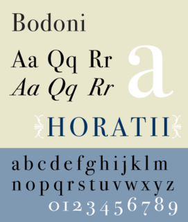
Bodoni is the name given to the serif typefaces first designed by Giambattista Bodoni (1740–1813) in the late eighteenth century and frequently revived since. Bodoni's typefaces are classified as Didone or modern. Bodoni followed the ideas of John Baskerville, as found in the printing type Baskerville—increased stroke contrast reflecting developing printing technology and a more vertical axis—but he took them to a more extreme conclusion. Bodoni had a long career and his designs changed and varied, ending with a typeface of a slightly condensed underlying structure with flat, unbracketed serifs, extreme contrast between thick and thin strokes, and an overall geometric construction.

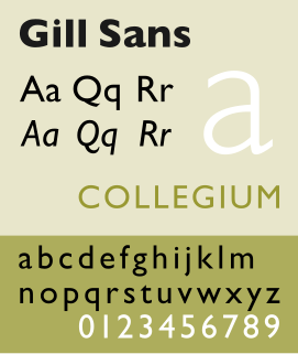
Gill Sans is a humanist sans-serif typeface designed by Eric Gill and released by the British branch of Monotype from 1928 onwards.

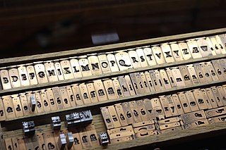
In the manufacture of metal type used in letterpress printing, a matrix is the mould used to cast a letter, known as a sort. Matrices for printing types were made of copper.

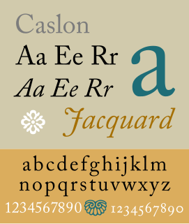
Caslon is the name given to serif typefaces designed by William Caslon I in London, or inspired by his work.

Didone is a genre of serif typeface that emerged in the late 18th century and was the standard style of general-purpose printing during the nineteenth. It is characterized by:

Bookman or Bookman Old Style, is a serif typeface. A wide, legible design that is slightly bolder than most body text faces, Bookman has been used for both display typography and for printing at small sizes such as in trade printing, and less commonly for body text. In advertising use it is particularly associated with the graphic design of the 1960s and 1970s, when revivals of it were very popular.

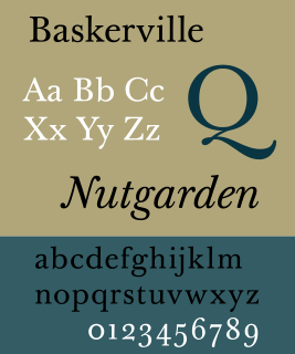
Baskerville is a serif typeface designed in the 1750s by John Baskerville (1706–1775) in Birmingham, England, and cut into metal by punchcutter John Handy. Baskerville is classified as a transitional typeface, intended as a refinement of what are now called old-style typefaces of the period, especially those of his most eminent contemporary, William Caslon.

Perpetua is a serif typeface that was designed by English sculptor and stonemason Eric Gill for the British Monotype Corporation. Perpetua was commissioned at the request of Stanley Morison, an influential historian of printing and adviser to Monotype around 1925, at a time when Gill's reputation as a leading artist-craftsman was high. Perpetua was intended as a crisp, contemporary design not following any specific historic model, with a structure influenced by Gill's experience of carving lettering for monuments and memorials. Perpetua is commonly used for covers and headings and also sometimes for body text; it has been particularly popular in fine book printing. Perpetua was released with characters for the Greek alphabet and a matching set of titling capitals for headings.

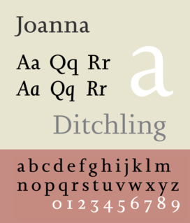
Joanna is a serif typeface designed by Eric Gill (1882–1940) in the period 1930–31, and named for one of his daughters. Gill chose Joanna for setting An Essay on Typography, a book by Gill on his thoughts on typography, typesetting, and page design. He described it as "a book face free from all fancy business."

Plantin is an old-style serif typeface named after the sixteenth-century printer Christophe Plantin. It was created in 1913 by the British Monotype Corporation for their hot metal typesetting system, and is loosely based on a Gros Cicero face cut in the 16th century by Robert Granjon and held in the collection of the Plantin-Moretus Museum of Antwerp.

Kennerley Old Style is a serif typeface designed by Frederic Goudy. Kennerley is an "old-style" serif design, loosely influenced by Italian and Dutch printing traditions of the Renaissance and early modern period. It was named for New York publisher Mitchell Kennerley, who advanced Goudy money to complete the design. While Goudy had already designed 18 other typefaces, it was one of Goudy's most successful early designs in his own style. The regular or roman style was designed in 1911, the italic in 1918; bold styles followed in 1924.

A reverse-contrast letterform is a typeface or custom lettering in which the stress is reversed from the norm: instead of the vertical lines being the same width or thicker than horizontals, which is normal in Latin-alphabet writing and especially printing, the horizontal lines are the thickest. The result is a dramatic effect, in which the letters seem to have been printed the wrong way round. Originally invented in the early nineteenth century as attention-grabbing novelty display designs, modern font designer Peter Biľak, who has created a design in the genre, has described them as "a dirty trick to create freakish letterforms that stood out."

A display typeface is a typeface that is intended for use at large sizes for headings, rather than for extended passages of body text.

Solus is a serif typeface that was designed by English sculptor and stonemason Eric Gill for the British Monotype Corporation and released in 1929.

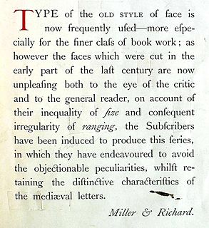
Old Style or Modernised Old Style was the name given to a series of serif typefaces cut from the mid-nineteenth century and sold by the type foundry Miller & Richard, of Edinburgh in Scotland, as well as many derivatives and copies. The exact date of Old Style's release is apparently uncertain as Miller & Richard published specimens erratically, but according to James Mosley and Morris it first appears in an 1860 specimen.

In typography, a fat face letterform is a serif typeface or piece of lettering in the Didone or modern style with an extremely bold design. Fat face typefaces appeared in London around 1805-10 and became widely popular; John Lewis describes the fat face as "the first real display typeface." While decorated typefaces and lettering styles existed in the past, for instance inline and shadowed forms, the fat faces' extreme design and their issue in very large poster sizes had an immediate impact on display typography in the early nineteenth century. Historian James Mosley describes a fat face as "designed like a naval broadside to sock its commercial message by poster to the unconsenting reader at a distance of ten or twenty yards by sheer aggressive weight of heavy metal."


