Contents
- Serif
- Proportional
- Sans-serif
- Proportional 2
- Monospaced
- Script and handwritten
- Miscellaneous
- See also
- References
This article needs additional citations for verification .(April 2010) |

This is a list of typefaces made by/for Apple Inc.
This article needs additional citations for verification .(April 2010) |
This is a list of typefaces made by/for Apple Inc.


A typeface is a design of letters, numbers and other symbols, to be used in printing or for electronic display. Most typefaces include variations in size, weight, slope, width, and so on. Each of these variations of the typeface is a font.

Arial is a sans-serif typeface in the neo-grotesque style. Fonts from the Arial family are included with all versions of Microsoft Windows after Windows 3.1, as well as in other Microsoft programs, Apple's macOS, and many PostScript 3 printers. In Office 2007, Arial was replaced by Calibri as the default typeface in PowerPoint, Excel, and Outlook.

Tahoma is a humanist sans-serif typeface that Matthew Carter designed for Microsoft Corporation. Microsoft first distributed it, along with Carter's Verdana, as a computer font with Office 97.
Lucida Sans Unicode is an OpenType typeface from the design studio of Bigelow & Holmes, designed to support the most commonly used characters defined in version 1.0 of the Unicode standard. It is a sans-serif variant of the Lucida font family and supports Latin, Greek, Cyrillic and Hebrew scripts, as well as all the characters used in the International Phonetic Alphabet.
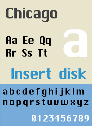
Chicago is a sans-serif typeface designed by Susan Kare for Apple Computer. It was used in the Macintosh operating system user interface between 1984 and 1997 and was an important part of Apple’s brand identity. It is also used in early versions of the iPod user interface. Chicago was initially a bitmap font; as the Apple OS’s capabilities improved, Apple commissioned the type foundry Bigelow & Holmes to create a vector-based TrueType version. The typeface is named after the U.S. city of Chicago, following the theme of original Macintosh fonts being named after major world cities.
Apple Inc. uses a large variety of typefaces in its marketing, operating systems, and industrial design with each product cycle. These change throughout the years with Apple's change of style in their products. This is evident in the design and marketing of the company. The current logo is a white apple with a bite out of it, which was first utilized in 2013.

Myriad is a humanist sans-serif typeface designed by Robert Slimbach and Carol Twombly for Adobe Systems. Myriad was intended as a neutral, general-purpose typeface that could fulfill a range of uses and have a form easily expandable by computer-aided design to a large range of weights and widths.

Lucida Grande is a humanist sans-serif typeface. It is a member of the Lucida family of typefaces designed by Charles Bigelow and Kris Holmes. It is best known for its implementation throughout the macOS user interface from 1999 to 2014, as well as in other Apple software like Safari for Windows. As of OS X Yosemite, the system font was changed from Lucida Grande to Helvetica Neue. In OS X El Capitan the system font changed again, this time to San Francisco.
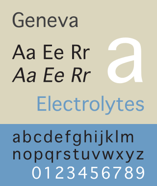
Geneva is a neo-grotesque or "industrial" sans-serif typeface designed by Susan Kare for Apple Computer. It is one of the oldest fonts shipped with Macintosh operating systems. The original version was a bitmap font, but later versions were converted to TrueType when that technology became available on the Macintosh platform. Because this Macintosh font is not commonly available on other platforms, many users find Verdana, Microsoft Sans Serif or Arial to be an acceptable substitute.
Oblique type is a form of type that slants slightly to the right, used for the same purposes as italic type. Unlike italic type, however, it does not use different glyph shapes; it uses the same glyphs as roman type, except slanted. Oblique and italic type are technical terms to distinguish between the two ways of creating slanted font styles; oblique designs may be labelled italic by companies selling fonts or by computer programs. Oblique designs may also be called slanted or sloped roman styles. Oblique fonts, as supplied by a font designer, may be simply slanted, but this is often not the case: many have slight corrections made to them to give curves more consistent widths, so they retain the proportions of counters and the thick-and-thin quality of strokes from the regular design.

Monaco is a monospaced sans-serif typeface designed by Susan Kare and Kris Holmes. It ships with macOS and was already present with all previous versions of the Mac operating system. Characters are distinct, and it is difficult to confuse 0 and O, or 1, |, I and l. A unique feature of the font is the high curvature of its parentheses as well as the width of its square brackets, the result of these being that an empty pair of parentheses or square brackets will strongly resemble a circle or square, respectively.

New York is a transitional serif typeface designed in 1983 for the Macintosh computer by Susan Kare and reworked in 1988 by Charles Bigelow and Kris Holmes. The typeface was the standard bitmap serif font for the early Macintosh operating systems. Originally titled “Ardmore”, it was renamed to New York before its initial release as part of the "World Class Cities" naming scheme by Apple Computer cofounder Steve Jobs.
Espy Sans is a bitmap font designed by Garrett Boge and Damon Clark of LetterPerfect Fonts for the Apple Computer user interface group in 1992. The Espy family consists of Sans & Serif typefaces, each with Regular & Bold styles in discrete bitmap sizes of 8, 9, 10, 12 & 14 pt. Espy Sans bears similarities to Frutiger and Myriad.
Apple's Macintosh computer supports a wide variety of fonts. This support was one of the features that initially distinguished it from other systems.

Microsoft Sans Serif is a sans-serif typeface introduced with early Microsoft Windows versions. It is the successor of MS Sans Serif, formerly Helv, a proportional bitmap font introduced in Windows 1.0. Both typefaces are very similar in design to Arial and Helvetica. The typeface was designed to match the MS Sans bitmap included in the early releases of Microsoft Windows.
PostScript fonts are font files encoded in outline font specifications developed by Adobe Systems for professional digital typesetting. This system uses PostScript file format to encode font information.

Web typography, like typography generally, is the design of pages – their layout and typeface choices. Unlike traditional print-based typography, pages intended for display on the World Wide Web have additional technical challenges and – given its ability to change the presentation dynamically – additional opportunities. Early web page designs were very simple due to technology limitations; modern designs use Cascading Style Sheets (CSS), JavaScript and other techniques to deliver the typographer's and the client's vision.
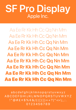
San Francisco is a neo-grotesque typeface made by Apple Inc. It was first released to developers on November 18, 2014. It is the first new typeface designed at Apple in nearly twenty years and has been inspired by Helvetica and DIN.
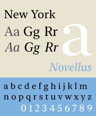
New York is a transitional American serif typeface created by Apple Inc. It was released to developers in June 2019. It is released by Apple freely but solely for use in developing or creating mock-ups of software on Apple platforms.