Rail Alphabet

Last updated

Rail Alphabet
Railalphabet.png
Category Sans-serif
Classification Neo-grotesque
Designer(s) Jock Kinneir
Margaret Calvert
Foundry Department for Transport
BRB (Residuary) Limited
British Railways Board
Date released1965
Design based on Helvetica
Rail Alphabet in use at Castle Cary railway station Castle Cary services.jpg
Rail Alphabet in use at Castle Cary railway station

Rail Alphabet is a neo-grotesque sans-serif typeface designed by Jock Kinneir and Margaret Calvert for signage on the British Rail network. First used at Liverpool Street station, it was then adopted by the Design Research Unit (DRU) as part of their comprehensive 1965 rebranding of the company. [1] It was later used by other public bodies in the United Kingdom.

Contents

A redesigned version, Rail Alphabet 2, is planned to be used across the Great British Railways network, [2] whilst the double arrow logo will also be restored as the primary brand identifier for the network.

Rail Alphabet is similar to a bold weight of Helvetica, but with some differences in character shapes, [3] stroke width and x-height to aid legibility. The typeface also has some similarities to Akzidenz-Grotesk, which had earlier provided the same designers the broad inspiration for the Transport typeface used for road signs in the United Kingdom.

The typeface was designed specifically for signage and the designers included features to support this such as a bespoke letter-spacing system and two slightly different weights to provide optimum visibility on both light and dark backgrounds. [3]

British Rail

In 1949, the Railway Executive decided on standard types of signs to be used at all stations. Lettering was to use redrawn versions of Gill Sans lettering on a background of the regional colour. [4] [5] This style persisted for nearly 15 years.

In the early 1960s, British Railways (which rebranded as British Rail in 1965) trialled new signs at Coventry station that made use of Kinneir and Calvert's recently launched Transport typeface. While Transport has since been an enduring success on road signs, it was designed around the specific needs of road users – such as visibility at speed and in all weathers. The subsequent creation of Rail Alphabet was intended to provide a style of lettering more specifically suited to stations where it would primarily be viewed indoors by pedestrians. [6]

The Design Research Unit's 1965 rebranding of British Railways included a new logo (the double arrow), a shortened name British Rail, and the total adoption of Rail Alphabet for all lettering other than printed matter [7] including station signage, trackside signs, fixed notices, signs inside trains and train liveries.

Key elements of the rebranding were still being used during much of the 1980s and Rail Alphabet was also used as part of the livery of Sealink ships until that company's privatisation in the late 1980s. However, by the end of the 1980s, British Rail's various business units were developing their own individual brands and identities with use of Rail Alphabet declining as a consequence. [8] The typeface remained in near-universal use for signs at railway stations but began to be replaced with alternatives in other areas, such as in InterCity's 1989 Mark 4 passenger carriages which made use of Frutiger for much of their interior signage.

After British Rail

The privatisation of British Rail from 1994 accelerated the decline in use of the typeface on the railway network with most of the privatised train operating companies who now manage individual stations choosing to use the typefaces associated with their own corporate identities for station signs and publicity. More recently, the custom Brunel typeface introduced by Railtrack for signs at major stations and adapted by Network Rail as NR Brunel was recommended as a new national standard for station signs by a 2009 report commissioned by the Secretary of State for Transport, [9] and was used extensively by South West Trains and East Midlands Trains. Meanwhile, Helvetica Medium has replaced Rail Alphabet as the industry's preferred typeface for safety notices within passenger trains due to the ready availability of the former and for consistency with British Standards on general safety signs. [10]

Some train operators continued use of Rail Alphabet long into the privatisation era. Arriva Trains Wales [11] used the typeface until the end of the franchise in 2018, with First Great Western also making extensive use of Rail Alphabet for signage until the firm's rebranding to Great Western Railway in 2015. Merseyrail [12] continues to use the typeface for station signage.

The use of the typeface is also still prescribed by standards for trackside warning signs and safety/operating notices. [13]

Other uses

Rail Alphabet used on signage at Frederiksberg Station in Denmark, 1978. Dsb-s-bahnlinie-f-bahnhof-klampenborg-699386.jpg
Rail Alphabet used on signage at Frederiksberg Station in Denmark, 1978.

Rail Alphabet was used by certain other state-owned corporations and organisations in the UK. The National Health Service in England, Scotland and Wales adopted Rail Alphabet for its signs. It is still the dominant typeface used on signs in older hospitals. It ceased to be used in new builds in the late 1990s. NHS England now uses Frutiger, [14] while NHS Scotland uses Stone Sans. [15]

Rail Alphabet was widely used on signs by the British Airports Authority and by Danish railway company DSB. [16] It was also used on signage for the National Coal Board.

Road signs in Iran used Rail Alphabet typeface for English texts.[ citation needed ]

Digitisation and updates

New Rail Alphabet

In 2009, a newly digitised version of the typeface was publicly released. Created by Henrik Kubel of A2/SW/HK in close collaboration with Margaret Calvert, New Rail Alphabet features six weights: off white, white, light, medium, bold and black, with non-aligning numerals, corresponding italics and a set of Eastern European characters. [17]

Rail Alphabet 2

Rail Alphabet 2
RA2 Specimen.svg
Category Sans-serif
Classification Neo-grotesque
Mixed
Humanist
Designer(s) Margaret Calvert
Henrik Kubel
Foundry A2-TYPE
Date released2020
Design based onRail Alphabet
New Rail Alphabet

In 2020, Network Rail announced that it had commissioned an updated version of the typeface. Designed by Margaret Calvert and Henrik Kubel, Rail Alphabet 2 includes lighter versions of the lettering as well as italics for signage along with accompanying versions for use in printed matter and online. [18] The redesign also includes new pictograms to depict services and facilities which did not exist in the 1960s when the original typeface was conceived – such as gender neutral toilets and vaping areas. In October 2020, Network Rail announced that starting with London Paddington, [19] the updated Rail Alphabet 2 typeface will replace Brunel for all signage on all Network Rail managed major stations on the network. [20] Network Rail will also begin using the typeface for corporate communications.

In May 2021, as part of the Williams Rail Review, it was announced that the new government body Great British Railways (GBR) will introduce Rail Alphabet 2 on the rail network, replacing the many different typefaces used on railway signage since privatisation. [2]

See also

Related Research Articles

British Railways (BR), which from 1965 traded as British Rail, was a state-owned company that operated most rail transport in Great Britain from 1948 to 1997. Originally a trading brand of the Railway Executive of the British Transport Commission, it became an independent statutory corporation in January 1963, when it was formally renamed the British Railways Board.

National Rail (NR) is the trading name licensed for use by the Rail Delivery Group, an unincorporated association whose membership consists of the passenger train operating companies (TOCs) of England, Scotland, and Wales. The TOCs run the passenger services previously provided by the British Railways Board, from 1965 using the brand name British Rail. Northern Ireland, which is bordered by the Republic of Ireland, has a different system. National Rail services share a ticketing structure and inter-availability that generally do not extend to services which were not part of British Rail.

<span class="mw-page-title-main">Frutiger (typeface)</span> Typeface designed by Adrian Frutiger

Frutiger is a series of typefaces named after its Swiss designer, Adrian Frutiger. Frutiger is a humanist sans-serif typeface, intended to be clear and highly legible at a distance or at small text sizes. A popular design worldwide, type designer Steve Matteson described its structure as "the best choice for legibility in pretty much any situation" at small text sizes, while Erik Spiekermann named it as "the best general typeface ever".

<span class="mw-page-title-main">Gill Sans</span> Humanist sans-serif typeface family developed by Monotype

Gill Sans is a humanist sans-serif typeface designed by Eric Gill and released by the British branch of Monotype from 1928 onwards.

<span class="mw-page-title-main">Tyne and Wear Metro</span> Rapid-transit rail network in north-east England

The Tyne and Wear Metro is an overground and underground light rail rapid transit system serving Newcastle upon Tyne, Gateshead, North Tyneside, South Tyneside, and the City of Sunderland. It has been described as the "first modern light rail system in the United Kingdom". The system is currently both owned and operated by the Tyne and Wear Passenger Transport Executive (Nexus), thus is fully under public ownership and operation.

<span class="mw-page-title-main">Gender symbol</span> Symbols of gender, sex, or sexuality

A gender symbol is a pictogram or glyph used to represent sex and gender, for example in biology and medicine, in genealogy, or in the sociological fields of gender politics, LGBT subculture and identity politics.

<span class="mw-page-title-main">Johnston (typeface)</span> Sans-serif typeface

Johnston is a sans-serif typeface designed by and named after Edward Johnston. The typeface was commissioned in 1913 by Frank Pick, commercial manager of the Underground Electric Railways Company of London, as part of his plan to strengthen the company's corporate identity. Johnston was originally created for printing, but it rapidly became used for the enamel station signs of the Underground system as well.

<span class="mw-page-title-main">British Rail brand names</span>

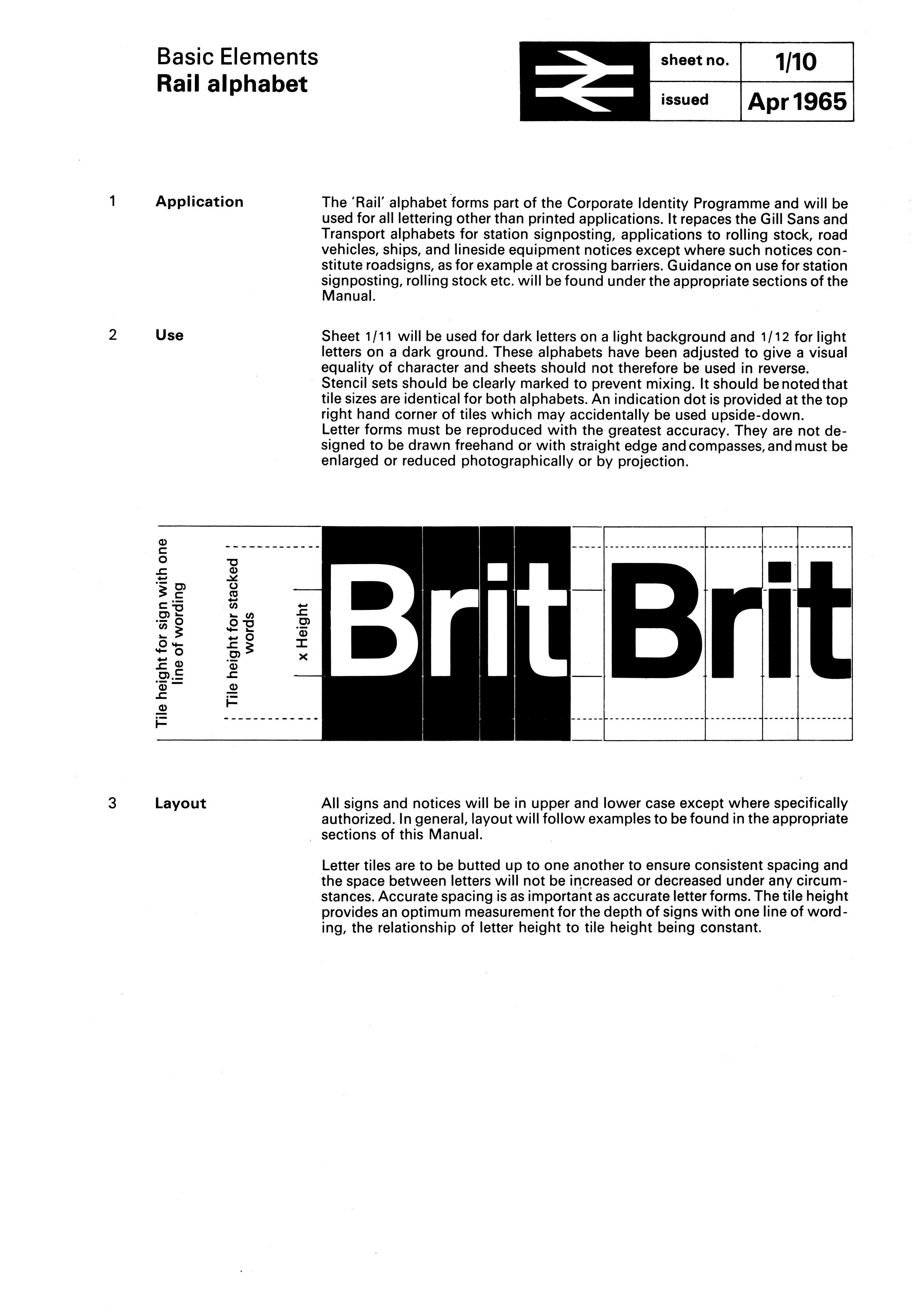
British Rail was the brand image of the nationalised railway owner and operator in Great Britain, the British Railways Board, used from 1965 until its breakup and sell-off from 1993 onwards.

Margaret Vivienne Calvert is a British typographer and graphic designer who, with colleague Jock Kinneir, designed many of the road signs used throughout the United Kingdom, Crown Dependencies, and British Overseas Territories, as well as the Transport font used on road signs, the Rail Alphabet font used on the British railway system, and an early version of the signs used in airports. The typeface developed by Kinneir and Calvert was further developed into New Transport and used for the single domain GOV.UK website in the United Kingdom.

<span class="mw-page-title-main">Rotis</span> Font superfamily; humanist sans-serif typeface

Rotis is a typeface developed in 1988 by Otl Aicher, a German graphic designer and typographer. In Rotis, Aicher explores an attempt at maximum legibility through a highly unified yet varied typeface family that ranges from full serif, glyphic, and sans-serif. The four basic Rotis variants are:

<span class="mw-page-title-main">Transport (typeface)</span> Road sign typeface used in the United Kingdom

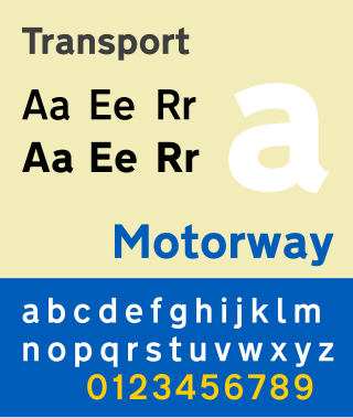
Transport is a sans serif typeface first designed for road signs in the United Kingdom. It was created between 1957 and 1963 by Jock Kinneir and Margaret Calvert as part of their work as designers for the Department of Transport's Anderson and Worboys committees.

<span class="mw-page-title-main">DIN 1451</span> Sans-serif font, used on German traffic signs

DIN 1451 is a sans-serif typeface that is widely used for traffic, administrative and technical applications.

<span class="mw-page-title-main">Traffic Signs Regulations and General Directions</span> United Kingdom legislation

The Traffic Signs Regulations and General Directions is the law that sets out the design and conditions of use of official traffic signs that can be lawfully placed on or near roads in Great Britain and the Isle of Man. The regulations, originally introduced in 1965, were the result of the review of British road signage carried out by the Worboys Committee.

Richard "Jock" Kinneir was a British typographer and graphic designer who, with his colleague Margaret Calvert, designed many of the road signs used throughout the United Kingdom, Crown Dependencies, and British overseas territories. Their system has become a model for modern road signage.

<span class="mw-page-title-main">Motorway (typeface)</span> Sans-serif typeface

Motorway is a sans-serif typeface designed by Jock Kinneir and Margaret Calvert for use on the motorway network of the United Kingdom. Motorway was first used on the M6 Preston bypass in 1958 and has been in use on the UK's motorways ever since. The typeface is also used in some other countries, most notably Ireland and Portugal.

<span class="mw-page-title-main">Design Research Unit</span> British design consultant firm

The Design Research Unit (DRU) was one of the first generation of British design consultancies combining expertise in architecture, graphics and industrial design. It was founded by the managing director of Stuart Advertising Agency, Marcus Brumwell with Misha Black and Milner Gray in 1943. It became well known for its work in relation to the Festival of Britain in 1951 and its influential corporate identity project for British Rail in 1965. In 2004, DRU merged with Scott Brownrigg architects.

<span class="mw-page-title-main">British Rail Corporate Identity Manual</span> Corporate identity guide

The British Rail Corporate Identity Manual is a corporate identity guide created in 1965 by British Rail. It was conceived in 1964, and finished in July 1965 by British Rail's Design Research Unit, and introduced British Rail's enduring double arrow logo, created by Gerald Barney and still in use today as the logo for National Rail. The manual spanned four volumes, and was created as part of a comprehensive redesign of British Rail following the Beeching Cuts as part of a plan to attract more passengers. It is noted as a piece of British design history.

<span class="mw-page-title-main">NR Brunel</span> Typeface

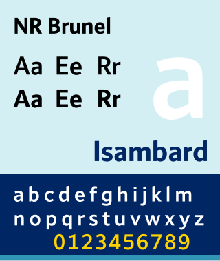
The NR Brunel typeface is the Network Rail standard for signing at Network Rail managed stations.

<span class="mw-page-title-main">British Rail Double Arrow</span> Logo used by British Rail and successor organisations

The British Rail Double Arrow is a logo that was created for British Rail (BR), the then state-owned operator of Britain's railway network, in 1965. It has remained in use as part of the National Rail brand used for Britain's passenger rail services after the disbanding of British Rail, having been officially renamed as the National Rail Double Arrow and more recently being updated and reworked for continued use under the name Rail Symbol 2.

References

  1. "Jock Kinneir and Margaret Calvert". Design Museum . Retrieved 1 July 2010.
  2. 1 2 "Great British Railways: The Williams-Shapps Plan for Rail" (PDF). Government of the United Kingdom.
  3. 1 2 "British Rail Corporate Identity" . Retrieved 4 August 2020.
  4. "Railway Station Signs. Standard Lettering" . Warminster & Westbury journal, and Wilts County Advertiser. England. 20 May 1949. Retrieved 13 February 2017 via British Newspaper Archive.
  5. "Standard Stations Signs". The Railway Magazine . No. 582. July 1949. p. 271.
  6. "On Line Typeface (Rail Alphabet typeface, Margaret Calvert/Jock Kinneir, UK)". The Beauty of Transport. 13 May 2015. Archived from the original on 9 July 2018.
  7. "Basic Elements: Rail alphabet". The British Rail Corporate Identity Manual. British Rail. April 1985 via Doublearrow.co.uk.
  8. Forsythe, Robert (13 December 2000). "Is collecting railway ephemera an archaeological task?". Institute of Railway Studies, University of York . Archived from the original on 25 January 2006.
  9. "Better trail stations" (PDF). Department for Transport. November 2009. Archived from the original (PDF) on 22 November 2009. Retrieved 31 October 2010.
  10. "Research Programme" (PDF). Rail Safety & Standards Board . April 2003. Archived from the original (PDF) on 17 July 2011. Retrieved 31 October 2010.
  11. "Making Rail Accessible". Arriva Trains Wales. Retrieved 14 January 2012.
  12. "Liverpool South Parkway". Flickr.
  13. "Lineside Operational Safety Signs" (PDF). Rail Safety & Standards Board. October 2009. Archived from the original (PDF) on 17 July 2011. Retrieved 19 December 2009.
  14. "NHS CFH visual identity guidelines, section 4" (PDF).
  15. "Corporate Identity". NHS Scotland. Archived from the original on 1 May 2009. Retrieved 27 April 2009.
  16. Walters, John L. (20 April 2009). "Rue Britanica". Eye Magazine. Retrieved 15 May 2024.
  17. "New Rail Alphabet". Newrailalphabet.co.uk. Retrieved 15 May 2024.
  18. Lawrence, David (2 May 2020). "HUB Making places for people and trains" . Retrieved 15 May 2024 via Issuu.
  19. "Rail Alphabet 2 launches at exhibition celebrating 1960s design icon". Network Rail . 26 October 2020. Retrieved 15 May 2024.
  20. Holden, Alan (29 October 2020). "Margaret Calvert exhibition and Rail Alphabet 2". Rail Advent. Retrieved 27 May 2021.