
Verdana is a humanist sans-serif typeface designed by Matthew Carter for Microsoft Corporation, with hand-hinting done by Thomas Rickner, then at Monotype. Demand for such a typeface was recognized by Virginia Howlett of Microsoft's typography group and commissioned by Steve Ballmer. The name "Verdana" is derived from "verdant" (green) and "Ana".

A typeface is a design of letters, numbers and other symbols, to be used in printing or for electronic display. Most typefaces include variations in size, weight, slope, width, and so on. Each of these variations of the typeface is a font.

Helvetica, also known by its original name Neue Haas Grotesk, is a widely used sans-serif typeface developed in 1957 by Swiss typeface designer Max Miedinger and Eduard Hoffmann.

Arial is a sans-serif typeface and set of computer fonts in the neo-grotesque style. Fonts from the Arial family are included with all versions of Microsoft Windows after Windows 3.1, as well as in other Microsoft programs, Apple's macOS, and many PostScript 3 printers.

Gill Sans is a humanist sans-serif typeface designed by Eric Gill and released by the British branch of Monotype from 1928 onwards.
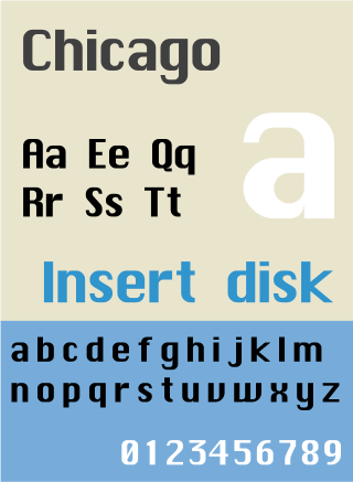
Chicago is a sans-serif typeface designed by Susan Kare for Apple Computer. It was used in the Macintosh operating system user interface between 1984 and 1997 and was an important part of Apple’s brand identity. It is also used in early versions of the iPod user interface. Chicago was initially a bitmap font; as the Apple OS’s capabilities improved, Apple commissioned the type foundry Bigelow & Holmes to create a vector-based TrueType version. The typeface is named after the U.S. city of Chicago, following the theme of original Macintosh fonts being named after major world cities.

Apple Inc. uses a large variety of typefaces in its marketing, operating systems, and industrial design with each product cycle. These change throughout the years with Apple's change of style in their products. This is evident in the design and marketing of the company.

Johnston is a sans-serif typeface designed by and named after Edward Johnston. The typeface was commissioned in 1913 by Frank Pick, commercial manager of the Underground Electric Railways Company of London, as part of his plan to strengthen the company's corporate identity. Johnston was originally created for printing, but it rapidly became used for the enamel station signs of the Underground system as well.

Myriad is a humanist sans-serif typeface designed by Robert Slimbach and Carol Twombly for Adobe Systems. Myriad was intended as a neutral, general-purpose typeface that could fulfill a range of uses and have a form easily expandable by computer-aided design to a large range of weights and widths.

Lucida Grande is a humanist sans-serif typeface. It is a member of the Lucida family of typefaces designed by Charles Bigelow and Kris Holmes. It is best known for its implementation throughout the macOS user interface from 1999 to 2014, as well as in other Apple software like Safari for Windows. As of OS X Yosemite, the system font was changed from Lucida Grande to Helvetica Neue. In OS X El Capitan the system font changed again, this time to San Francisco.

Roboto is a neo-grotesque sans-serif typeface family developed by Google as the system font for its mobile operating system Android, and released in 2011 for Android 4.0 "Ice Cream Sandwich".
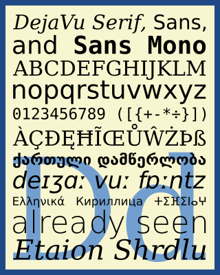
The DejaVu fonts are a superfamily of fonts designed for broad coverage of the Unicode Universal Character Set. The fonts are derived from Bitstream Vera (sans-serif) and Bitstream Charter (serif), two fonts released by Bitstream under a free license that allowed derivative works based upon them; the Vera and Charter families were limited mainly to the characters in the Basic Latin and Latin-1 Supplement portions of Unicode, roughly equivalent to ISO/IEC 8859-15, and Bitstream's licensing terms allowed the fonts to be expanded upon without explicit authorization. The DejaVu fonts project was started with the aim to "provide a wider range of characters ... while maintaining the original look and feel through the process of collaborative development". The development of the fonts is done by many contributors and is organized through a wiki and a mailing list.

Clarendon is the name of a slab serif typeface that was released in 1845 by Thorowgood and Co. of London, a letter foundry often known as the Fann Street Foundry. The original Clarendon design is credited to Robert Besley, a partner in the foundry, and was originally engraved by punchcutter Benjamin Fox, who may also have contributed to its design. Many copies, adaptations and revivals have been released, becoming almost an entire genre of type design.

Microsoft Sans Serif is a sans-serif typeface introduced with early Microsoft Windows versions. It is the successor of MS Sans Serif, formerly Helv, a proportional bitmap font introduced in Windows 1.0. Both typefaces are very similar in design to Arial and Helvetica. The typeface was designed to match the MS Sans bitmap included in the early releases of Microsoft Windows.

Web typography, like typography generally, is the design of pages – their layout and typeface choices. Unlike traditional print-based typography, pages intended for display on the World Wide Web have additional technical challenges and – given its ability to change the presentation dynamically – additional opportunities. Early web page designs were very simple due to technology limitations; modern designs use Cascading Style Sheets (CSS), JavaScript and other techniques to deliver the typographer's and the client's vision.
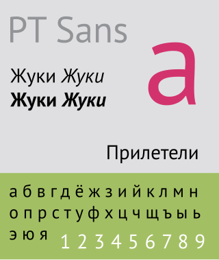
The Public Type or PT Fonts are a family of free/libre fonts released from 2009 onwards, comprising PT Sans, PT Serif and PT Mono. They were commissioned from the design agency ParaType by Rospechat, a department of the Russian Ministry of Communications, to celebrate the 300th anniversary of Peter the Great's orthography reform and to create a font family that supported all the different variations of Cyrillic script used by the minority languages of Russia, as well as the Latin alphabet.

Klavika is a family of sans-serif fonts designed by Eric Olson and released by Process Type Foundry in 2004. It contains four weights: light, regular, medium, and bold and variations of numerals.
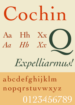
Cochin is a serif typeface. It was originally produced in 1912 by Georges Peignot for the Paris foundry G. Peignot et Fils and was based on the copperplate engravings of 18th century French artist Charles-Nicolas Cochin, from which the typeface also takes its name. The font has a small x-height with long ascenders. Georges Peignot also created the design 'Nicolas-Cochin' as a looser variation in the same style.

Athelas is a serif typeface designed by Veronika Burian and Jose Scaglione and intended for use in body text. Released by their company TypeTogether in 2008, Burian and Scaglione described Athelas as inspired by British fine book printing.
