Verdana

Last updated
Verdana
VerdanaSpecimen.svg
Category Sans-serif
Classification Modern Humanist
Designer(s) Matthew Carter
Foundry Microsoft, Font Bureau (Verdana Pro)
Date released1996
Design based on Tahoma
Variations Meiryo
MS Reference Sans Serif
Nina
Verdana Pro
Verdana Ref
Metrically compatible with Bitstream Vera Sans
DejaVu Sans

Verdana is a humanist sans-serif typeface designed by Matthew Carter for Microsoft Corporation, with hand-hinting done by Thomas Rickner, then at Monotype. Demand for such a typeface was recognized by Virginia Howlett of Microsoft's typography group and commissioned by Steve Ballmer. [1] [2] The name "Verdana" is derived from "verdant" (green) and "Ana" (the name of Howlett's eldest daughter). [3]

Contents

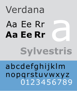
Bearing similarities to humanist sans-serif typefaces such as Frutiger, Verdana was designed to be readable at small sizes on the low-resolution computer screens of the period. [4] Like many designs of this type, Verdana has a large x-height (tall lower-case characters), with wider proportions and looser letter-spacing than on print-orientated designs like Helvetica. The counters and apertures are wide, to keep strokes clearly separate from one another, and similarly shaped letters are designed to appear clearly different to increase legibility for body text. The bold weight is thicker than would be normal with fonts for print use, suiting the limitations of onscreen display. [5] Carter has described spacing as an area he particularly worked on during the design process. [6]

Distinctive visual identifiable characteristics

A comparison of Tahoma and Verdana Tahoma vs. Verdana font comparison.png
A comparison of Tahoma and Verdana

Characteristics of the typeface are:

Lower case
Upper case

As an example of the approach of making similar characters easily distinguishable, the digit 1 (one) in Verdana was given a horizontal base and a hook in the upper left to distinguish it from lowercase l (L) and uppercase I (i). This is similar to the digit "1" found in Morris Fuller Benton's sans-serif typefaces News Gothic and Franklin Gothic.

Prevalence

Released in 1996, Verdana was bundled with subsequent versions of the Windows operating system, as well as their Office and Internet Explorer software on Windows, classic Mac OS, and Mac OS X. Since at least Mac OS X 10.4 it is even bundled with Mac OS itself. [7] In addition, up until 2002 [8] [9] it was available for download from Microsoft's web site as freeware (".exe" files for Microsoft Windows and in ".sit.hqx" archives for Mac OS) under a proprietary license imposing some restrictions on usage and distribution, allowing it to be used by end users in any system supporting installation of "exe" or ".sit.hqx" files and supporting TrueType fonts. [10] The downloadable files are still available legally from third-party web sites; see the External links section. However, these files include only old versions of Verdana, and updated versions are not available as freeware.

According to a 2013 survey, the availability of Verdana was 99.90% on Windows, 99.26% on Mac OS, and 70.02% on free operating systems like Linux. [11]

According to a study of online fonts by the Software Usability and Research Laboratory at Wichita State University, participants preferred Verdana as the best overall font choice, and it was also perceived as being among the most legible fonts. [12] However, Microsoft's font manager Bill Hill wrote that "with its large x-height and very generous spacing, it never felt comfortable as an eBook font". He noted that Microsoft had commissioned an alternative version of the pre-existing typefaces Berling and Frutiger for its Microsoft Reader e-book product. [2] Despite this, Verdana was initially used as one of the bundled book-reading fonts on the iPad before an update in 2011. [13]

Microsoft variants

Verdana Ref is a custom version of Verdana for use with Microsoft Reference. It is used in Microsoft Bookshelf 2000, Encarta Encyclopedia Deluxe 99, Encarta Virtual Globe 99, Office 2000 Premium, Publisher 2000. MS Reference Sans Serif is a derivative of Verdana Ref with bold and italic fonts. This font family is included with Microsoft Encarta.

Tahoma is similar to Verdana but with tighter letter spacing. The Windows Mobile core font Nina [14] is a more condensed version of Tahoma and Verdana. [15]

Verdana Pro

Microsoft licensed rights to Verdana to Font Bureau for a new Verdana Pro release, published in 2011. [16] Verdana Pro adds correct German closing quotation marks, light, semi-bold and black styles with italics, as well as condensed styles with italics across all weights. The expanded family was designed for organisations which had made extensive use of Verdana due to its availability but desired additional versions for greater flexibility. It is sold separately through print and web licenses, being sold by Font Bureau and Ascender, [17] [18] although Windows 10 users can acquire it free of charge from Microsoft Store [19] or by activating the Pan-European Supplemental Fonts optional resource on the Settings app. A similar Georgia Pro release was announced at the same time. [17]

Combining characters bug

In the past, Verdana (v. 2.43) had an incorrect position for combining diacritical marks, causing them to display on the following character instead of the preceding. This made it unsuitable for Unicode-encoded text such as Cyrillic or Greek. This bug did not usually reveal itself with Latin letters. This is because some font display engines substitute sequences of base character + combining character with a precomposed character glyph. [20] This bug was subsequently fixed in the version issued with Windows Vista. It is also fixed in Verdana version 5.01 font on Windows XP by installing the European Union Expansion Font Update from Microsoft. [21]

Awards

In 2006, the Verdana typeface was named in the list of British design icons in the Great British Design Quest organised by the BBC and the Design Museum. Carter's typeface appeared on a list which included Concorde, Mini, Jaguar E-Type, Aston Martin DB5, Supermarine Spitfire, World Wide Web, London tube map, AEC Routemaster bus and the K2 telephone box. [22]

Usage

In 2007, the font was used for the questions in Who Wants to Be a Millionaire? , replacing the ITC Conduit font.

In 2009, IKEA changed the typeface used in its catalog from Futura to Verdana, expressing a desire to unify its branding between print and web media. The controversy has been attributed to the perception of Verdana as a symbol of homogeneity in popular typography. [23] Time magazine and the Associated Press ran articles on the controversy including a brief interview with an IKEA representative, focusing on the opinions of typographers and designers. [24] Design and advertising industry-focused publications such as Business Week joined the fray of online posts. The branding critic blog Brand New was one of those using the Verdanagate name. [23] The Australian online daily news site Crikey also published an article on the controversy. [25] The Guardian ran an article asking "Ikea is changing its font to Verdana—causing outrage among typomaniacs. Should the rest of us care? Absolutely." [26] The New York Times said the change to Verdana "is so offensive to many because it seems like a slap at the principles of design by a company that has been hailed for its adherence to them." [27]

Carter addressed this controversy during an interview in 2013:

Ever since there was that big ruckus about the IKEA catalog changing from Futura to Verdana, which I had nothing to do with and didn’t even know about, people ask me about that everywhere I go. I give a talk about something historical and then at the end someone will get up and say: "I started a petition to go back to Futura. You’re a villain!" You get blamed for something you had nothing to do with.

There's a strange misunderstanding. A friendly guy came up to me at a conference recently and said: I signed that petition to go back to Futura. So I asked: what caused you to do that? And he said, well, Verdana is a screen font. You mustn’t use it in print. So I said: OK, well, so you open the IKEA catalog, it’s set in Verdana, with the big prices and everything… how do you tell it’s a screen font? What is it about Verdana that says: this is a screen font? He had no idea. He just knew it because he’d been told. There are many people who make judgments without really understanding what the typographic issues are. Students are interesting—they’ll say things to me like: my professor told me I cannot use Verdana and Georgia in print because they’re screen fonts, but I tried it and it looks perfectly all right. And I can only say: Thank you! Go ahead! [5]

In 2019, with its logo refresh, IKEA again changed their corporate typeface, from Verdana to a customized version of Noto Sans under the name Noto IKEA.

Monotype also created a custom version for Opel, Opel Next. [28]

See also

Notes

  1. Re, Margaret, ed. (2003). Typographically Speaking: The Art of Matthew Carter (2. ed.). New York: Princeton Architectural. pp. 41–2. ISBN   9781568984278 . Retrieved 26 March 2016.
  2. 1 2 Hill, Bill (9 December 2011). "Apple updates iBooks with new book fonts". Bill Hill 49 (blog). Retrieved 26 March 2016.
  3. "Interview with Virginia Howlett, mother of Verdana". Dmxzone.com. 2004-06-24. Retrieved 2013-09-21.
  4. Will-Harris, Daniel (2003). "Georgia & Verdana - Typefaces designed for the screen (finally)". Archived from the original on 28 August 2013. Retrieved 9 August 2013.
  5. 1 2 Middendorp, Jan; Carter, Matthew (October 2013). "Matthew Carter". Creative Characters. MyFonts by Monotype. Retrieved September 29, 2018.
  6. Drucker, Johanna (2003). "Typographic Intelligence". In Re, Margaret (ed.). Typographically Speaking: The Art of Matthew Carter (2. ed.). New York: Princeton Architectural. p. 12. ISBN   9781568984278 . Retrieved 26 March 2016.
  7. "Apple.com - Mac OS X 10.4: Fonts list". Support.apple.com. 2011-11-06. Archived from the original on 2013-09-25. Retrieved 2013-09-21.
  8. Mark Hachman (2002-08-14). "Microsoft Withdraws Free Web Fonts". ExtremeTech. Retrieved 2010-04-13.
  9. Microsoft (2002-07-25). "TrueType core fonts for the Web FAQ". Microsoft . Archived from the original on 2002-01-24. Retrieved 2010-04-13.
  10. Microsoft (2001-12-28). "TrueType core fonts for the Web EULA". Microsoft . Archived from the original on 2009-12-08. Retrieved 2010-04-13.
  11. Code Style: Most common fonts for Windows, Mac and Linux, full font survey results. Archived April 26, 2013, at the Wayback Machine .
  12. "A Comparison of Popular Online Fonts: Which Size and Type is Best?". Archived from the original on 2015-04-14. Retrieved 2015-04-04.
  13. Peters, Yyves. "Version 1.5 Improves Typography in iBooks on iPad and iPhone". FontFeed. Archived from the original on 16 March 2016. Retrieved 26 March 2016.
  14. "E-books: an InfoDesign-Café discussion about their usability potentials and problems". 2008-02-24. Archived from the original on February 24, 2008. Retrieved 2013-09-21.
  15. "When in doubt, use Verdana". Microsoft.com. Retrieved 2013-09-21.
  16. "Introducing Georgia Pro and Verdana Pro". Font Bureau. Archived from the original on 11 November 2011. Retrieved 11 November 2011.
  17. 1 2 Coles, Stephen. "Verdana Pro". Font Bureau. Archived from the original on 14 September 2013. Retrieved 28 July 2015.
  18. Zeldman, L. Jeffrey (2010-04-18). "Verdana Pro (and Con)". Zeldman.com. Retrieved 2013-09-21.
  19. "Verdana Pro". Microsoft Store . Microsoft. 13 December 2017. Retrieved 1 December 2018.
  20. "Underdots". Tenser.typepad.com. Retrieved 2013-09-21.
  21. "European Union Expansion Font Update". Microsoft . Retrieved 2011-02-02.
  22. "Long list unveiled for national vote on public's favourite example of Great British Design". BBC. 18 November 2016.
  23. 1 2 UnderConsideration. "Brand New: Verdanagate" . Retrieved 2024-01-16.
  24. "The Font War: Ikea Fans Fume over Switch to Verdana - TIME". 2009-08-29. Archived from the original on 2009-08-29. Retrieved 2024-01-16.
  25. Crikey (2009-09-01). "The full fonty: why type nerds went mental over IKEA". Crikey. Retrieved 2024-01-16.
  26. Garfield, Simon (2009-09-02). "Verdana: Ikea's flat-pack font". The Guardian. ISSN   0261-3077 . Retrieved 2024-01-16.
  27. Rothstein, Edward (2009-09-05). "Typography Fans Say Ikea Should Stick to Furniture". The New York Times. ISSN   0362-4331 . Retrieved 2024-01-16.
  28. "New Corporate Identity: Opel with New Image". media.opel.com. 30 November 2020. Retrieved 14 April 2021.

Related Research Articles

<span class="mw-page-title-main">Typeface</span> Set of characters that share common design features

A typeface is a design of letters, numbers and other symbols, to be used in printing or for electronic display. Most typefaces include variations in size, weight, slope, width, and so on. Each of these variations of the typeface is a font.

<span class="mw-page-title-main">Matthew Carter</span> British type designer (born 1937)

Matthew Carter is a British type designer. A 2005 New Yorker profile described him as 'the most widely read man in the world' by considering the amount of text set in his commonly used typefaces.

<span class="mw-page-title-main">Arial</span> Neo-grotesque sans-serif typeface

Arial is a sans-serif typeface and set of computer fonts in the neo-grotesque style. Fonts from the Arial family are included with all versions of Microsoft Windows after Windows 3.1, as well as in other Microsoft programs, Apple's macOS, and many PostScript 3 printers.

<span class="mw-page-title-main">Futura (typeface)</span> Geometric sans-serif typeface

Futura is a geometric sans-serif typeface designed by Paul Renner and released in 1927. It was designed as a contribution on the New Frankfurt-project. It is based on geometric shapes, especially the circle, similar in spirit to the Bauhaus design style of the period. It was developed as a typeface by the Bauer Type Foundry, in competition with Ludwig & Mayer's seminal Erbar typeface of 1926.

<span class="mw-page-title-main">Gill Sans</span> Humanist sans-serif typeface family developed by Monotype

Gill Sans is a humanist sans-serif typeface designed by Eric Gill and released by the British branch of Monotype from 1928 onwards.

<span class="mw-page-title-main">Tahoma (typeface)</span> Humanist sans-serif font

Tahoma is a humanist sans-serif typeface that Matthew Carter designed for Microsoft Corporation. Microsoft first distributed it, along with Carter's Verdana, as a font with Office 97.

In digital typography, Lucida Sans Unicode OpenType font from the design studio of Bigelow & Holmes is designed to support the most commonly used characters defined in version 1.0 of the Unicode standard. It is a sans-serif variant of the Lucida font family and supports Latin, Greek, Cyrillic and Hebrew scripts, as well as all the letters used in the International Phonetic Alphabet.

<span class="mw-page-title-main">Typography of Apple Inc.</span> Overview of typography of Apple Inc.

Apple Inc. uses a large variety of typefaces in its marketing, operating systems, and industrial design with each product cycle. These change throughout the years with Apple's change of style in their products. This is evident in the design and marketing of the company. The current logo is a white apple with a bite out of it, which was first utilized in 2013.

Core fonts for the Web was a project started by Microsoft in 1996 to create a standard pack of fonts for the World Wide Web. It included the proprietary fonts Andalé Mono, Arial, Arial Black, Comic Sans MS, Courier New, Georgia, Impact, Times New Roman, Trebuchet MS, Verdana and Webdings, all of them in TrueType font format packaged in executable files (".exe") for Microsoft Windows and in BinHexed Stuff-It archives (".sit.hqx") for Macintosh. These packages were published as freeware under a proprietary license imposing some restrictions on distribution.

<span class="mw-page-title-main">Georgia (typeface)</span> 1996 typeface by Matthew Carter

Georgia is a serif typeface designed in 1993 by Matthew Carter and hinted by Tom Rickner for Microsoft. It was intended as a serif typeface that would appear elegant but legible when printed small or on low-resolution screens. The typeface is inspired by Scotch Roman designs of the 19th century and was based on designs for a print typeface on which Carter was working when contacted by Microsoft; this would be released under the name Miller the following year. The typeface's name referred to a tabloid headline, "Alien heads found in Georgia."

<span class="mw-page-title-main">Trebuchet MS</span> Digital sans-serif typeface family

Trebuchet MS is a humanist sans-serif typeface that Vincent Connare designed for Microsoft Corporation in 1996. Trebuchet MS was the font used for the window titles in the Windows XP default theme, succeeding MS Sans Serif and Tahoma. Released free of charge by Microsoft as part of their core fonts for the Web package, it remained one of the most popular body text fonts on webpages as of 2009.

Meiryo is a Japanese sans-serif gothic typeface. Microsoft bundled Meiryo with Office Mac 2008 as part of the standard install, and it replaces MS Gothic as the default system font on Japanese systems beginning with Windows Vista.

<span class="mw-page-title-main">Microsoft Sans Serif</span> Neo-grotesque sans-serif typeface

Microsoft Sans Serif is a sans-serif typeface introduced with early Microsoft Windows versions. It is the successor of MS Sans Serif, formerly Helv, a proportional bitmap font introduced in Windows 1.0. Both typefaces are very similar in design to Arial and Helvetica. The typeface was designed to match the MS Sans bitmap included in the early releases of Microsoft Windows.

<span class="mw-page-title-main">Bitstream Charter</span> Serif typeface

Bitstream Charter is a serif typeface designed by Matthew Carter in 1987 for Bitstream Inc. Charter is based on Pierre-Simon Fournier’s characters, originating from the 18th century. Classified by Bitstream as a transitional-serif typeface, it also has features of a slab-serif typeface and is often classified as such.

Ascender Corporation was a digital typeface foundry and software development company in the Chicago suburb of Elk Grove Village, Illinois. It was founded in 2004 by a team of software developers, typographers, and people previously involved in developing fonts used widely in computers, inkjet printers, phones, and other digital technology devices. On December 8, 2010, Ascender Corp. was acquired by Monotype Imaging.

Steven R. Matteson is an American typeface designer whose work is included in several computer operating systems and embedded in game consoles, cell phones and other electronic devices. He is the designer of the Microsoft font family Segoe included since Windows XP; of the Droid font collection used in the Android mobile device platform, and designed the brand and user-interface fonts used in both the original Microsoft Xbox and the Xbox 360.

<span class="mw-page-title-main">Web typography</span> Publishing considerations for the Web

Web typography, like typography generally, is the design of pages – their layout and typeface choices. Unlike traditional print-based typography, pages intended for display on the World Wide Web have additional technical challenges and – given its ability to change the presentation dynamically – additional opportunities. Early web page designs were very simple due to technology limitations; modern designs use Cascading Style Sheets (CSS), JavaScript and other techniques to deliver the typographer's and the client's vision.

<span class="mw-page-title-main">Noto fonts</span> Multilingual font family from Google

Noto is a font family comprising over 100 individual computer fonts, which are together designed to cover all the scripts encoded in the Unicode standard. As of October 2016, Noto fonts cover all 93 scripts defined in Unicode version 6.1, although fewer than 30,000 of the nearly 75,000 CJK unified ideographs in version 6.0 are covered. In total, Noto fonts cover over 77,000 characters, which is around half of the 149,186 characters defined in Unicode 15.0.

References