
A typeface is a design of letters, numbers and other symbols, to be used in printing or for electronic display. Most typefaces include variations in size, weight, slope, width, and so on. Each of these variations of the typeface is a font.

Myriad is a humanist sans-serif typeface designed by Robert Slimbach and Carol Twombly for Adobe Systems. Myriad was intended as a neutral, general-purpose typeface that could fulfill a range of uses and have a form easily expandable by computer-aided design to a large range of weights and widths.

Franklin Gothic and its related faces are a large family of sans-serif typefaces in the industrial or grotesque style developed in the early years of the 20th century by the type foundry American Type Founders (ATF) and credited to its head designer Morris Fuller Benton. "Gothic" was a contemporary term meaning sans-serif.

In metal typesetting, a font is a particular size, weight and style of a typeface. Each font is a matched set of type, with a piece for each glyph. A typeface consists of various fonts that share an overall design.

Rotis is a typeface developed in 1988 by Otl Aicher, a German graphic designer and typographer. In Rotis, Aicher explores an attempt at maximum legibility through a highly unified yet varied typeface family that ranges from full serif, glyphic, and sans-serif. The four basic Rotis variants are:

Adobe Jenson is an old-style serif typeface drawn for Adobe Systems by its chief type designer Robert Slimbach. Its Roman styles are based on a text face cut by Nicolas Jenson in Venice around 1470, and its italics are based on those created by Ludovico Vicentino degli Arrighi fifty years later.

Multiple master fonts are an extension to Adobe Systems' Type 1 PostScript fonts, now superseded by the advent of OpenType and, in particular, the introduction of OpenType Font Variations in OpenType 1.8, also called variable fonts.

Minion is a serif typeface released in 1990 by Adobe Systems. Designed by Robert Slimbach, it is inspired by late Renaissance-era type and intended for body text and extended reading. Minion's name comes from the traditional naming system for type sizes, in which minion is between nonpareil and brevier, with the type body 7pt in height. As the historically rooted name indicates, Minion was designed for body text in a classic style, although slightly condensed and with large apertures to increase legibility. Slimbach described the design as having "a simplified structure and moderate proportions." The design is slightly condensed, although Slimbach has said that this was intended not for commercial reasons so much as to achieve a good balance of the size of letters relative to the ascenders and descenders.

News Gothic is a sans-serif typeface designed by Morris Fuller Benton, and was released in 1908 by his employer American Type Founders (ATF). The typeface is similar in proportion and structure to Franklin Gothic, also designed by Benton, but lighter.

Benton Sans is a digital typeface family begun by Tobias Frere-Jones in 1995, and expanded by Cyrus Highsmith of Font Bureau. It is based on the sans-serif typefaces designed for American Type Founders by Morris Fuller Benton around the beginning of the twentieth century in the industrial or grotesque style. It was a reworked version of Benton Gothic developed for various corporate customers, under Frere-Jones's guidance. In developing the typeface, Frere-Jones studied drawings of Morris Fuller Benton's 1908 typeface News Gothic at the Smithsonian Institution. The typeface began as a proprietary type, initially titled MSL Gothic, for Martha Stewart Living magazine and the website for Martha Stewart Living Omnimedia. As Benton Gothic, there are 7 weights from Thin to Black and only 2 widths.

Droid is a font family first released in 2007 and created by Ascender Corporation for use by the Open Handset Alliance platform Android and licensed under the Apache License. The fonts are intended for use on the small screens of mobile handsets and were designed by Steve Matteson of Ascender Corporation. The name was derived from the Open Handset Alliance platform named Android.

Trade Gothic is a sans-serif typeface designed in 1948 by Jackson Burke (1908–1975), who continued to work on further style-weight combinations, eventually 14 in all, until 1960, while he was director of type development for Linotype in the US. The family includes three weights and three widths.

Open Sans is an open source humanist sans-serif typeface that was designed by Steve Matteson under commission from Google. It was released in 2011 and is based on his earlier design called Droid Sans, which was specifically created for Android mobile devices but with slight modifications to its width.

Source Code Pro is a monospaced sans serif typeface created by Paul D. Hunt for Adobe Systems. It is the second open-source font family from Adobe, distributed under the SIL Open Font License.
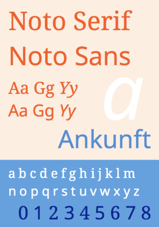
Noto is a font family comprising over 100 individual computer fonts, which are together designed to cover all the scripts encoded in the Unicode standard. As of October 2016, Noto fonts cover all 93 scripts defined in Unicode version 6.1, although fewer than 30,000 of the nearly 75,000 CJK unified ideographs in version 6.0 are covered. In total, Noto fonts cover over 77,000 characters, which is around half of the 149,186 characters defined in Unicode 15.0.

Source Han Sans is a sans-serif gothic typeface family created by Adobe and Google. It is also released by Google under the Noto fonts project as Noto Sans CJK. The family includes seven weights, and supports Traditional Chinese, Simplified Chinese, Japanese and Korean. It also includes Latin, Greek and Cyrillic characters from the Source Sans family.

Source Serif is a serif typeface created by Frank Grießhammer for Adobe Systems. It is the third open-source font family from Adobe, distributed under the SIL Open Font License.
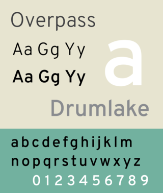
Overpass is a geometric sans-serif digital typeface, derived from Highway Gothic, but instead with a focus on usage as a webfont on digital screens for user interfaces and websites. It was designed by Delve Withrington with Dave Bailey, Thomas Jockin, Alan Dague-Greene, and Aaron Bell between 2011–2021. Overpass comprises 18 variants: 9 font weights and corrected obliques for each weight.

Source Han Serif is a serif Song/Ming typeface created by Adobe and Google.

IBM Plex is an open source typeface superfamily conceptually designed and developed by Mike Abbink at IBM in collaboration with Bold Monday to reflect the design principles of IBM and to be used for all brand material across the company internationally. Plex replaces Helvetica as the IBM corporate typeface after more than fifty years, freeing the company from extensive license payments in the process.
