The most recent revision of Junicode is 2.206, released on 9 Jan. 2024.[1]
Design
A comparison between (1) Adobe Garamond Pro, (2) Junicode, (3) Adobe Caslon Pro
The designs of the Junicode roman characters are based on a 17th-century typeface design used at the Oxford University Press, also known as Clarendon Press. Peter Baker based the Junicode roman design on those used in George Hickes' Linguarum Vett. Septentrionalium Thesaurus (1703–1705), naming the typeface Junicode ("Junius Unicode") after Franciscus Junius, who had commissioned the original typeface used for the Anglo-Saxon texts in that volume, "Pica Saxon".[2][3] The designs represent an intermediate stage between earlier 16th century typefaces (such as Garamond) and later 18th century typefaces (such as Caslon). The Junicode roman character design shares a number of features with these earlier and later typefaces.
Junicode has an individual Greek typeface, Foulis Greek. The design is a traditional revival as well. It is based on the Greek Double Pica cut by Alexander Wilson (c. 1714–1786), a Scottish doctor, astronomer, and typefounder. Wilson's typeface was used in 1756–1758 for a renowned edition of Homer's epics (the Iliad and the Odyssey),[4][5] printed by Robert Foulis and Andrew Foulis of the Foulis Publishing House and printers to the University of Glasgow. The characters previously included in Junicode font, since version 1.000, moved into a separate font.[6]
Origins and uses
The Junicode font was developed especially for medievalists, due to the need for a font to cover the large number of special characters and ligatures used in medieval manuscripts. The font has complete support for the Medieval Unicode Font Initiative version 4.0 in the regular and italic faces.
Despite the specialization of Junicode for the needs of medievalists, the font is quite complete and supports a large number of Unicode characters. In the regular style, over 3000 characters are available. This makes Junicode useful for a wide range of languages that utilize the Latin alphabet, including scholarly texts and publications that require special diacritics not traditionally found in conventional fonts. It exists in regular, italic, bold and bold italic styles, with the regular style having the largest character set. Regular and bold styles have small caps and all styles have swash alternates, although not a complete set of italic swash capitals.
Junicode has a very wide linespacing in many applications due to its numerous tall characters with stacked diacritics.
A typeface is a design of letters, numbers and other symbols, to be used in printing or for electronic display. Most typefaces include variations in size, weight, slope, width, and so on. Each of these variations of the typeface is a font.
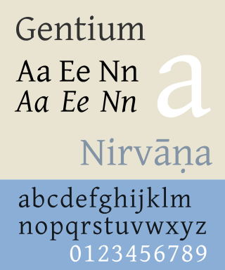
Gentium is a Unicode serif typeface designed by Victor Gaultney. Gentium fonts are free and open source software, and are released under the SIL Open Font License (OFL), which permits modification and redistribution. Gentium has wide support for languages using the Latin, Greek, and Cyrillic alphabets, and the International Phonetic Alphabet (IPA). Gentium Plus variants released since November 2010 now include over 5,500 glyphs and advanced typographic features through OpenType and formerly Graphite.
There are Unicode typefaces which are open-source and designed to contain glyphs of all Unicode characters, or at least a broad selection of Unicode scripts. There are also numerous projects aimed at providing only a certain script, such as the Arabeyes Arabic font. The advantage of targeting only some scripts with a font was that certain Unicode characters should be rendered differently depending on which language they are used in, and that a font that only includes the characters a certain user needs will be much smaller in file size compared to one with many glyphs. Unicode fonts in modern formats such as OpenType can in theory cover multiple languages by including multiple glyphs per character, though very few actually cover more than one language's forms of the unified Han characters.
Lucida Grande is a humanist sans-serif typeface. It is a member of the Lucida family of typefaces designed by Charles Bigelow and Kris Holmes. It is best known for its implementation throughout the macOS user interface from 1999 to 2014, as well as in other Apple software like Safari for Windows. As of OS X Yosemite, the system font was changed from Lucida Grande to Helvetica Neue. In OS X El Capitan the system font changed again, this time to San Francisco.
Caslon is the name given to serif typefaces designed by William Caslon I (c. 1692–1766) in London, or inspired by his work.
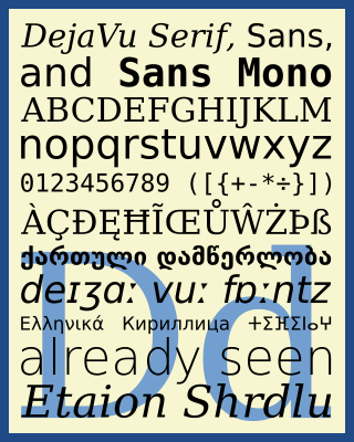
The DejaVu fonts are a superfamily of fonts designed for broad coverage of the Unicode Universal Character Set. The fonts are derived from Bitstream Vera (sans-serif) and Bitstream Charter (serif), two fonts released by Bitstream under a free license that allowed derivative works based upon them; the Vera and Charter families were limited mainly to the characters in the Basic Latin and Latin-1 Supplement portions of Unicode, roughly equivalent to ISO/IEC 8859-15, and Bitstream's licensing terms allowed the fonts to be expanded upon without explicit authorization. The DejaVu fonts project was started with the aim to "provide a wider range of characters ... while maintaining the original look and feel through the process of collaborative development". The development of the fonts is done by many contributors and is organized through a wiki and a mailing list.
Bookman, or Bookman Old Style, is a serif typeface. A wide, legible design that is slightly bolder than most body text faces, Bookman has been used for both display typography, for trade printing such as advertising, and less commonly for body text. In advertising use it is particularly associated with the graphic design of the 1960s and 1970s, when revivals of it were very popular.
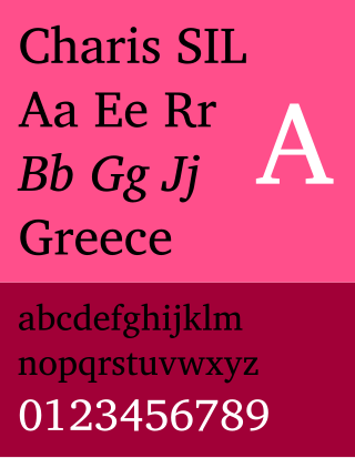
Charis SIL is a transitional serif typeface developed by SIL International based on Bitstream Charter, one of the first fonts designed for laser printers. The font offers four family members: roman, bold, italic, and bold italic.
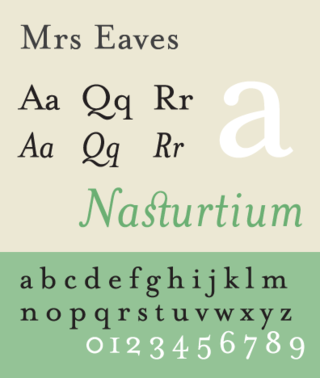
Mrs Eaves is a transitional serif typeface designed by Zuzana Licko in 1996. It is a variant of Baskerville, which was designed in Birmingham, England, in the 1750s. Mrs Eaves adapts Baskerville for use in display contexts, such as headings and book blurbs, through the use of a low x-height and a range of unusual combined characters or ligatures.
GNU FreeFont is a family of free OpenType, TrueType and WOFF vector fonts, implementing as much of the Universal Character Set (UCS) as possible, aside from the very large CJK Asian character set. The project was initiated in 2002 by Primož Peterlin and is now maintained by Steve White.
Linux Libertine is a digital typeface created by the Libertine Open Fonts Project, which aims to create free and open alternatives to proprietary typefaces such as Times New Roman. It was developed with the free font editor FontForge and is licensed under the GNU General Public License and the SIL Open Font License.
Goudy Old Style is an old-style serif typeface originally created by Frederic W. Goudy for American Type Founders (ATF) in 1915.
Minion is a serif typeface released in 1990 by Adobe Systems. Designed by Robert Slimbach, it is inspired by late Renaissance-era type and intended for body text and extended reading. Minion's name comes from the traditional naming system for type sizes, in which minion is between nonpareil and brevier, with the type body 7pt in height. As the historically rooted name indicates, Minion was designed for body text in a classic style, although slightly condensed and with large apertures to increase legibility. Slimbach described the design as having "a simplified structure and moderate proportions." The design is slightly condensed, although Slimbach has said that this was intended not for commercial reasons so much as to achieve a good balance of the size of letters relative to the ascenders and descenders.
Centaur is a serif typeface by book and typeface designer Bruce Rogers, based on the Renaissance-period printing of Nicolas Jenson around 1470. He used it for his design of the Oxford Lectern Bible. It was given widespread release by the British branch of Monotype, paired with an italic designed by calligrapher Frederic Warde and based on the slightly later work of calligrapher and printer Ludovico Vicentino degli Arrighi. The italic has sometimes been named separately as the "Arrighi" italic.
Nimbus Sans is a sans-serif typeface created by URW++, based on Helvetica.
Utopia is the name of a transitional serif typeface designed by Robert Slimbach and released by Adobe Systems in 1989.
Ubuntu is an OpenType-based font family, designed to be a modern, humanist-style typeface by London-based type foundry Dalton Maag, with funding by Canonical Ltd. The font was under development for nearly nine months, with only a limited initial release through a beta program, until September 2010. It was then that it became the new default font of the Ubuntu operating system in Ubuntu 10.10. Its designers include Vincent Connare, creator of the Comic Sans and Trebuchet MS fonts.
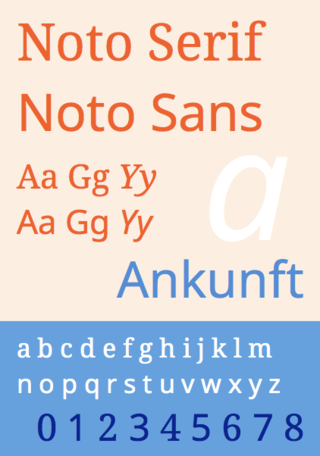
Noto is a font family comprising over 100 individual computer fonts, which are together designed to cover all the scripts encoded in the Unicode standard. As of October 2016, Noto fonts cover all 93 scripts defined in Unicode version 6.1, although fewer than 30,000 of the nearly 75,000 CJK unified ideographs in version 6.0 are covered. In total, Noto fonts cover over 77,000 characters, which is around half of the 149,186 characters defined in Unicode 15.0.
Andika is a sans-serif typeface developed by SIL International for the Latin, Greek and Cyrillic scripts. It is designed for literacy programs and beginning readers, but also has support for IPA transcription and a large number of diacritics. The font offers four family members: roman, bold, italic and bold italic.
This page is based on this Wikipedia article Text is available under the CC BY-SA 4.0 license; additional terms may apply. Images, videos and audio are available under their respective licenses.