
A typeface is a design of letters, numbers and other symbols, to be used in printing or for electronic display. Most typefaces include variations in size, weight, slope, width, and so on. Each of these variations of the typeface is a font.

Vera is a digital typeface superfamily with a liberal license. It was designed by Jim Lyles from the now-defunct Bitstream Inc. type foundry, and it is closely based on Bitstream Prima, for which Lyles was also responsible. It is a TrueType font with full hinting instructions, which improve its rendering quality on low-resolution devices such as computer monitors. The font has also been repackaged as a Type 1 PostScript font, called Bera, for LaTeX users.

Lucida Grande is a humanist sans-serif typeface. It is a member of the Lucida family of typefaces designed by Charles Bigelow and Kris Holmes. It is best known for its implementation throughout the macOS user interface from 1999 to 2014, as well as in other Apple software like Safari for Windows. As of OS X Yosemite, the system font was changed from Lucida Grande to Helvetica Neue. In OS X El Capitan the system font changed again, this time to San Francisco.

FontForge is a FOSS font editor which supports many common font formats. Developed primarily by George Williams until 2012, FontForge is free software and is distributed under a mix of the GNU General Public License Version 3 and the 3-clause BSD license. It is available for operating systems including Linux, Windows, and macOS, and is localized into 12 languages.

Roboto is a neo-grotesque sans-serif typeface family developed by Google as the system font for its mobile operating system Android, and released in 2011 for Android 4.0 "Ice Cream Sandwich".
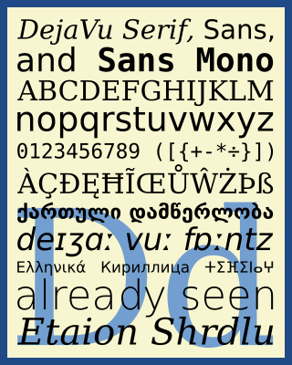
The DejaVu fonts are a superfamily of fonts designed for broad coverage of the Unicode Universal Character Set. The fonts are derived from Bitstream Vera (sans-serif) and Bitstream Charter (serif), two fonts released by Bitstream under a free license that allowed derivative works based upon them; the Vera and Charter families were limited mainly to the characters in the Basic Latin and Latin-1 Supplement portions of Unicode, roughly equivalent to ISO/IEC 8859-15, and Bitstream's licensing terms allowed the fonts to be expanded upon without explicit authorization. The DejaVu fonts project was started with the aim to "provide a wider range of characters ... while maintaining the original look and feel through the process of collaborative development". The development of the fonts is done by many contributors and is organized through a wiki and a mailing list.
Segoe is a typeface, or family of fonts, that is best known for its use by Microsoft. The company uses Segoe in its online and printed marketing materials, including recent logos for a number of products. Additionally, the Segoe UI font sub-family is used by numerous Microsoft applications, and may be installed by applications. It was adopted as Microsoft's default operating system font beginning with Windows Vista, and is also used on Outlook.com, Microsoft's web-based email service. In August 2012, Microsoft unveiled its new corporate logo typeset in Segoe, replacing the logo it had used for the previous 25 years.
A Unicode font is a computer font that maps glyphs to code points defined in the Unicode Standard. The vast majority of modern computer fonts use Unicode mappings, even those fonts which only include glyphs for a single writing system, or even only support the basic Latin alphabet. Fonts which support a wide range of Unicode scripts and Unicode symbols are sometimes referred to as "pan-Unicode fonts", although as the maximum number of glyphs that can be defined in a TrueType font is restricted to 65,535, it is not possible for a single font to provide individual glyphs for all defined Unicode characters. This article lists some widely used Unicode fonts that support a comparatively large number and broad range of Unicode characters.

GNU FreeFont is a family of free OpenType, TrueType and WOFF vector fonts, implementing as much of the Universal Character Set (UCS) as possible, aside from the very large CJK Asian character set. The project was initiated in 2002 by Primož Peterlin and is now maintained by Steve White.

Linux Libertine is a digital typeface created by the Libertine Open Fonts Project, which aims to create free and open alternatives to proprietary typefaces such as Times New Roman. It is developed with the free font editor FontForge and is licensed under the GNU General Public License and the SIL Open Font License.

Liberation is the collective name of four TrueType font families: Liberation Sans, Liberation Sans Narrow, Liberation Serif, and Liberation Mono. These fonts are metrically compatible with the most popular fonts on the Microsoft Windows operating system and the Microsoft Office software package, for which Liberation is intended as a free substitute. The fonts are default in LibreOffice.

Droid is a font family first released in 2007 and created by Ascender Corporation for use by the Open Handset Alliance platform Android and licensed under the Apache License. The fonts are intended for use on the small screens of mobile handsets and were designed by Steve Matteson of Ascender Corporation. The name was derived from the Open Handset Alliance platform named Android.

Sabily (Arabic: سبيلي, IPA:[sæˈbiːliː], My Way) is a discontinued Linux distribution based on Ubuntu, designed by and for Muslims. Originally named Ubuntu Muslim Edition (presented as UbuntuME), development for Sabily was active from 2007 to 2011.

Open Sans is an open source humanist sans-serif typeface that was designed by Steve Matteson under commission from Google. It was released in 2011 and is based on his earlier design called Droid Sans, which was specifically created for Android mobile devices but with slight modifications to its width.

Source Han Serif is a serif Song/Ming typeface created by Adobe and Google.

Foliate is a free e-book reading application for desktop Linux systems. The name refers to leaves, meaning "(getting) leafy" or "…-leaved".
The implementation of emojis on different platforms took place across a three-decade period, starting in the 1990s. Today, the exact appearance of emoji is not prescribed but can vary between fonts and platforms, much like different typefaces.

Atkinson Hyperlegible is a freely available typeface built around a grotesque sans-serif core, intended to be optimally legible for readers who are partially visually impaired, with all characters easily distinguishable from one another. It was developed by the Braille Institute of America in collaboration with Applied Design Works and is available under the SIL Open Font License. It won Fast Company's Innovation by Design Award for Graphic Design in 2019 and was shortlisted for a graphic design award by Dezeen in 2020.
Adwaita is the design language of the GNOME desktop environment. As an implementation, it exists as the default theme and icon set of the GNOME Shell and Phosh, and as widgets for applications targeting usage in GNOME. Adwaita first appeared in 2011 with the release of GNOME 3.0 as a replacement for the design principles used in Clearlooks, and with incremental modernization and refinements, continues with current version releases.
