Utopia (typeface)

Last updated
Adobe Utopia
Utopia sample image.png
Category Serif
Classification Transitional
Designer(s) Robert Slimbach
Commissioned by Adobe Systems
Date released1989
Shown hereUtopia Regular

Utopia is the name of a transitional serif typeface designed by Robert Slimbach and released by Adobe Systems in 1989. [1]

Contents

Design

Utopia qualifies as a transitional serif typeface: one based on 18th- and early-19th-century ideals of classical design. Adobe's release notes cite Baskerville and Walbaum as influences, and Adobe's Sumner Stone has also compared it to Hermann Zapf's Melior. [2] [3] It was one of the first typefaces to be part of Adobe's Originals programme, designed to feature a large range of styles for professional use. With a reasonably solid design, Utopia was sometimes used by newspapers.

Current versions of the typeface are released in the OpenType format and include features such as ligatures and small capitals. It is released in four optical variants, for display, headline, regular and caption text sizes, each in regular, semibold and bold weights. A black (extra-bold) weight is available in the headline size. Slimbach made some changes to the font when revisiting it for the OpenType release, and Adobe does not guarantee identical character metrics. [4] This means documents developed using one font file should not be switched to using another, at risk of lines breaking in different places.

Free software release

Uniquely for Adobe's professional typefaces, a basic set of Utopia's styles has been open-sourced by Adobe, allowing it to be used for free. This comprises regular, italic, bold and bold italic styles of the regular size, with 229 glyphs for each, including ligatures but not small capitals. Adobe donated the Utopia typeface (in the form of PostScript Type 1 files) to the X Consortium, for use in the X Window System, a popular graphical environment for Unix workstations. [5] Conversions of the Type 1 files to ttf and otf files have also been made. This release is designed for use at small text sizes, with a large x-height and quite thick stroke widths. Adobe retains rights to the Utopia name, and prohibits modified fonts from being redistributed without the name being changed. [6]

The OpenType version that Adobe now distributes commercially was modified from the open-sourced PostScript fonts, and Adobe does not guarantee that the font metrics are the same.

Initial donation to the X Consortium

There was controversy around the license regarding the status of the font files as free software. Many distributors (with one of the prominent being the Debian project), to prevent being sued, opted to state clearly that the fonts had a non-clear license which prevented it from being freely redistributable with modifications. [7] After considerable debate, Adobe formally donated the Type 1 version of the font, on October 11, 2006, to the TeX Users Group (TUG), with clarified concerns regarding its use licensing, so that it could be used with, for instance, Donald Knuth's program TeX, a digital typesetting system for computers. The version donated consisted of the Roman (Regular), Italic, Bold, and Bold Italic versions of the typeface, differently from the commercial version offered as part of the Adobe Originals Pack. [8] On November 17, 2006, Karl Berry, the TeX Users Group President, gave irrevocable permissions of the font to any third party and it constitutes free software.

Derived typefaces

The original Utopia typeface has, since being released as free software, been modified to support glyphs in scripts other than the basic Latin script: at least three projects have emerged from the sources that Adobe has donated, one being an adaptation to Vietnamese, called Vntopia, by Hàn Thế Thành. [9]

Another further development of the original was made by Andrey V. Panov, in an OpenType derivative called Heuristica (also: "Эвристика"), with the primary intent of adding Cyrillic symbols. Andrey has also incorporated Hàn Thế Thành's Vietnamese glyphs in Heuristica and the development of the project is open. [10]

From the Heuristica font family, Andreas Nolda [11] created Utopia Nova font family in 2015, changing this reserved name to Lingua Franca [12] OpenType and Web Open Font Format fonts in 2016. Andreas Nolda added proportional figures and a stylistic set with longer slashes, matching the parentheses in height and depth to Lingua Franca OpenType and Web Open Font Format fonts.

In 2016 Stefan Peev [13] created Linguistics Pro font family [14] as a fork of Nolda's Utopia Nova. Linguistics Pro contains two models of Cyrillic glyphs. The base range of the Cyrillic glyphs (uni0410:uni044F) represents the modern Bulgarian letterform model. [15] The traditional Cyrillic letterform model is included as a local feature for Russian language and as a Stylistic Set 01. Stylistic Set 02 is for Serbian and Macedonian texts (in Regular and Bold variants) and for Serbian texts in Italic and Bold Italic variants. Stylistic Set 03 is for Macedonian texts (in Italic and Bold variants). Linguistics Pro also contains polytonic Greek.

Lawsuit

From 1995 to 1997, Adobe filed several complaints against Southern Software, Inc. regarding the latter company's use of the Utopia font, under the name "Veracity", in its products. In 1998, the United States District Court for the Northern District of California ruled in favor of Adobe, finding that Southern Software, Inc.'s font software infringed Adobe's copyright. Although typefaces are held to be unprotectable by copyright under United States copyright law, the court found that the control points used by the font software to generate the typeface were protectable.

Related Research Articles

<span class="mw-page-title-main">Typeface</span> Set of characters that share common design features

A typeface is the design of lettering that can include variations in size, weight, slope, width, and so on. Each of these variations of the typeface is a font.

<span class="mw-page-title-main">Arial</span> Neo-grotesque sans-serif typeface

Arial is a sans-serif typeface and set of computer fonts in the neo-grotesque style. Fonts from the Arial family are included with all versions of Microsoft Windows from Windows 3.1 on, some other Microsoft software applications, Apple's macOS and many PostScript 3 computer printers. The typeface was designed in 1982, by Robin Nicholas and Patricia Saunders, for Monotype Typography. Each of its characters has the same width as that character in the popular typeface Helvetica; the purpose of this design is to allow a document designed in Helvetica to be displayed and printed with the intended line-breaks and page-breaks without a Helvetica license. Because of their almost identical appearances, both Arial and Helvetica have commonly been mistaken for each other.

<span class="mw-page-title-main">Courier (typeface)</span> Monospaced slab serif font of IBM

Courier is a monospaced slab serif typeface. The typeface was designed by Howard "Bud" Kettler (1919–1999). Initially created for IBM's typewriters, it has been adapted for use as a computer font, and versions of it are installed on most desktop computers.

<span class="mw-page-title-main">Computer Modern</span> Family of typefaces

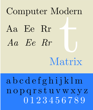
Computer Modern is the original family of typefaces used by the typesetting program TeX. It was created by Donald Knuth with his Metafont program, and was most recently updated in 1992. Computer Modern, or variants of it, remains very widely used in scientific publishing, especially in disciplines that make frequent use of mathematical notation.

<span class="mw-page-title-main">Gentium</span> Typeface

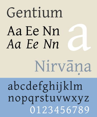
Gentium is a Unicode serif typeface designed by Victor Gaultney. Gentium fonts are free and open source software, and are released under the SIL Open Font License (OFL), which permits modification and redistribution. Gentium has wide support for languages using the Latin, Greek, and Cyrillic alphabets, and the International Phonetic Alphabet (IPA). Gentium Plus variants released in November 2010 now include over 5,500 glyphs and advanced typographic features through OpenType and Graphite.

<span class="mw-page-title-main">Myriad (typeface)</span> Sans-serif typeface family

Myriad is a humanist sans-serif typeface designed by Robert Slimbach and Carol Twombly for Adobe Systems. Myriad was intended as a neutral, general-purpose typeface that could fulfill a range of uses and have a form easily expandable by computer-aided design to a large range of weights and widths.

<span class="mw-page-title-main">Font</span> Particular size, weight and style of a typeface

In metal typesetting, a font is a particular size, weight and style of a typeface. Each font is a matched set of type, with a piece for each glyph. A typeface consists various fonts that share an overall design.

<span class="mw-page-title-main">Parisine</span> Typographic character

Parisine is a typeface created by Jean-François Porchez. Distributed by Typofonderie.

<span class="mw-page-title-main">Adobe Jenson</span> Typeface

Adobe Jenson is an old-style serif typeface drawn for Adobe Systems by its chief type designer Robert Slimbach. Its Roman styles are based on a text face cut by Nicolas Jenson in Venice around 1470, and its italics are based on those created by Ludovico Vicentino degli Arrighi fifty years later.

<span class="mw-page-title-main">Multiple master fonts</span> Extension to Adobe Systems Type 1 PostScript fonts

Multiple master fonts are an extension to Adobe Systems' Type 1 PostScript fonts, now superseded by the advent of OpenType and, in particular, the introduction of OpenType Font Variations in OpenType 1.8, also called variable fonts.

Apple's Macintosh computer supports a wide variety of fonts. This support was one of the features that initially distinguished it from other systems.

<span class="mw-page-title-main">Minion (typeface)</span> Serif typeface

Minion is a serif typeface released in 1990 by Adobe Systems. Designed by Robert Slimbach, it is inspired by late Renaissance-era type and intended for body text and extended reading. Minion's name comes from the traditional naming system for type sizes, in which minion is between nonpareil and brevier, with the type body 7pt in height. As the historically rooted name indicates, Minion was designed for body text in a classic style, although slightly condensed and with large apertures to increase legibility. Slimbach described the design as having "a simplified structure and moderate proportions." The design is slightly condensed, although Slimbach has said that this was intended not for commercial reasons so much as to achieve a good balance of the size of letters relative to the ascenders and descenders.

<span class="mw-page-title-main">News Gothic</span> Grotesque sans-serif typeface

News Gothic is a sans-serif typeface designed by Morris Fuller Benton, and was released in 1908 by his employer American Type Founders (ATF). The typeface is similar in proportion and structure to Franklin Gothic, also designed by Benton, but lighter.

PostScript fonts are font files encoded in outline font specifications developed by Adobe Systems for professional digital typesetting. This system uses PostScript file format to encode font information.

<span class="mw-page-title-main">Droid (typeface)</span> Typeface family

Droid is a font family first released in 2007 and created by Ascender Corporation for use by the Open Handset Alliance platform Android and licensed under the Apache License. The fonts are intended for use on the small screens of mobile handsets and were designed by Steve Matteson of Ascender Corporation. The name was derived from the Open Handset Alliance platform named Android.

<span class="mw-page-title-main">Adobe Originals</span>

The Adobe Originals program is a series of digital typefaces created by Adobe Systems from 1989 for professional use, intended to be of extremely high design quality while offering a large feature set across many languages. Many are strongly influenced by research into classic designs from the past and calligraphy. Adobe Originals fonts are sold separately or with Adobe products such as InDesign.

<span class="mw-page-title-main">Open Sans</span> Sans-serif typeface

Open Sans is an open source humanist sans-serif typeface designed by Steve Matteson, commissioned by Google and released in 2011. It is based on his previous Droid Sans design, designed for Android mobile devices, but slightly wider.

<span class="mw-page-title-main">EB Garamond</span> Typeface family

EB Garamond is a free and open source implementation of Claude Garamond’s typeface, Garamond, and the matching Italic, Greek and Cyrillic characters designed by Robert Granjon. Its name is shortening of Egenolff–Berner Garamond which refers to the fact that the letter forms are taken from the Egenolff–Berner specimen printed in 1592.

<span class="mw-page-title-main">IBM Plex</span> Open source typeface family

IBM Plex is an open source typeface superfamily conceptually designed and developed by Mike Abbink at IBM in collaboration with Bold Monday to reflect the design principles of IBM and to be used for all brand material across the company internationally. Plex replaces Helvetica as the IBM corporate typeface after more than fifty years, freeing the company from extensive license payments in the process.

<span class="mw-page-title-main">Andika (typeface)</span> Typeface

Andika, from the verb root for 'to write' in Swahili, is a sans-serif typeface developed by SIL International for the Latin, Greek and Cyrillic scripts. It is designed for literacy programs and beginning readers, but also has support for IPA transcription and a large number of diacritics. The font offers four family members: roman, bold, italic and bold italic.

References

  1. "Read Me". Adobe.com. Retrieved 2011-08-04.
  2. Shaw, Paul (10 February 2011). "Overlooked Typefaces". Print magazine. Retrieved 2 July 2015.
  3. Riggs, Tamye. "The Adobe Originals Silver Anniversary Story: Stone, Slimbach, and Twombly launch the first Originals". Adobe Typekit. Adobe Systems. Retrieved 8 January 2016.
  4. "SOTA Typography Award Honors Robert Slimbach". SOTA. Retrieved 8 January 2016.
  5. Paul Asente, from Adobe, stating the availability of Utopia for use with the X Window System
  6. Karl Berry, Announcement of sublicensing of Utopia, without restrictions
  7. "[texhax] Re: question re. the license of Adobe Utopia". tug.org. 2005-09-21. Retrieved 2011-08-04.
  8. As a side effect of the fact that Adobe distributed the fonts as free software, improvements and extra features can be incorporated to the font—and have already been done so with software like FontForge.
  9. "Các tin đáng chú ý". vntex.sourceforge.net. Retrieved 2011-08-04.
  10. "evristika - Heuristica is extended version of Adobe Utopia font" . Retrieved 2011-08-04.
  11. Nolda, Andreas. "Andreas Nolda [Software]".
  12. "Lingua Franca". FontLibrary.org.
  13. Devroye, Luc. "Context Ltd [Stefan Peev]".
  14. "Linguistics Pro". FontLibrary.org.
  15. "What shall be done for Bulgarian Cyrillic .loclBGR". Lettersoup.de. 8 July 2016.