Benton Sans

Last updated
Benton Sans
FBBentonSans.svg
Category Sans-serif
Designer(s) Tobias Frere-Jones
Cyrus Highsmith
Commissioned by Martha Stewart Living , Worth
Foundry Font Bureau

Webtype (2015–2016) [1]

Type Network (2016–) [2]
Design based on News Gothic

Benton Sans is a digital typeface family begun by Tobias Frere-Jones in 1995, and expanded by Cyrus Highsmith of Font Bureau. It is based on the sans-serif typefaces designed for American Type Founders by Morris Fuller Benton around the beginning of the twentieth century in the industrial or grotesque style. It was a reworked version of Benton Gothic developed for various corporate customers, under Frere-Jones's guidance. In developing the typeface, Frere-Jones studied drawings of Morris Fuller Benton's 1908 typeface News Gothic at the Smithsonian Institution. The typeface began as a proprietary type, initially titled MSL Gothic, for Martha Stewart Living magazine and the website for Martha Stewart Living Omnimedia. As Benton Gothic, there are 7 weights from Thin to Black and only 2 widths.

Contents

When working for retail version of the font, the family was harmonized and given the new name called Benton Sans. In 2002-2003, Cyrus Highsmith added additional widths, weights, and italics to the typeface family, and the face was released for public use under the name Benton Sans. The extra weight and widths also served as optically-corrected replacements for Franklin Gothic, Alternate Gothic, Lightline Gothic.

Like News Gothic, Benton Sans follows the grotesque model. Distinct characters are the two-story lowercase a, the two-story lowercase g, and a blunt terminus at the apex of the lowercase t. The tail of the uppercase Q is distinct for being located completely outside the bowl. The character set is compact, and descenders are shallow. The typeface differs from other grotesque sans-serifs in its organic shapes and subtle transitions of stroke width, all contributing to a less severe, humanist tone of voice. Benton Sans has a wider, less compact character set than News Gothic. The typeface includes text figures (old style figures) providing a refinement not available in News Gothic.

Benton Sans font family originally consists of 26 fonts in 8 weights, and 4 widths for all but Extra Light and Thin families, which only include the widest width. On December 18, 2008, The Font Bureau Inc. announced the expansion of the font family. The expanded family has 128 fonts in 8 weights, and 4 widths for all weights, with complementary italic and small caps. [3]

Benton Sans RE (2010)

It is a version of Benton Sans font designed by David Berlow for screen use between 9 and 18 pixels. Changes include exaggerate the glyph features, larger clearances between letter features, reduced stroke contrasts, wider and more open letterforms with increased letter spacing, larger x-heights, shortened ascenders and descenders. [4] Other changes include 1-storey small g, addition of lower right tail in small a, truncation of vertical stem in cedilla, stretched top hook in small f, linked f bar to dotless i in fi ligature (), semicircular O in capital OE ligature (Œ), small numeral 1 without bottom bar, 2-storey a in @, diagonal stem and leaned hooks in integral sign (∫), addition of lower left ball serif in small Greek mu and micro signs (μ), addition of lower right tail in small Greek pi (π), downward left hook in square root sign (√), wedged acute and grave diacritical marks, circular dots in commas, quotation marks, exclamation marks, question marks, decimal point, division sign; stretched upper tail in partial differential sign (∂), wedged quotation marks in primes and back quote marks, smaller angle brackets in angle bracket marks, sharper lower tip in single dagger mark, sharper tips in asterisk, elimination of loop in pound currency sign (£), vertical stem in cent currency sign (¢), separation of plus and minus signs in plus-minus sign (±).

The font family includes 4 fonts in 2 weights (regular, bold) and 1 width (between normal and extended width), with complementary italic.

Benton Sans Wide (2013)

On August 7, 2013, The Font Bureau Inc. announced the expansion of the Benton Sans font family, which included the addition of Wide width fonts to Benton Sans font family. In addition, small caps and figure styles, extended Latin character set, language support are included in all Benton Sans fonts.

The updated Benton Sans font family includes 80 fonts in 5 widths and 8 weights, with complementary italic. [5] [6]

Usage examples

Corporate branding

Miscellaneous

Related Research Articles

<span class="mw-page-title-main">Sans-serif</span> Typeface classification for letterforms without serifs

In typography and lettering, a sans-serif, sans serif, gothic, or simply sans letterform is one that does not have extending features called "serifs" at the end of strokes. Sans-serif typefaces tend to have less stroke width variation than serif typefaces. They are often used to convey simplicity and modernity or minimalism. For the purposes of type classification, sans-serif designs are usually divided into these major groups: § Grotesque and § Neo-grotesque, § Geometric, § Humanist and § Other or mixed.

<span class="mw-page-title-main">Typeface</span> Set of characters that share common design features

A typeface is a design of letters, numbers and other symbols, to be used in printing or for electronic display. Most typefaces include variations in size, weight, slope, width, and so on. Each of these variations of the typeface is a font.

<span class="mw-page-title-main">Frutiger (typeface)</span> Typeface designed by Adrian Frutiger

Frutiger is a series of typefaces named after its Swiss designer, Adrian Frutiger. Frutiger is a humanist sans-serif typeface, intended to be clear and highly legible at a distance or at small text sizes. A popular design worldwide, type designer Steve Matteson described its structure as "the best choice for legibility in pretty much any situation" at small text sizes, while Erik Spiekermann named it as "the best general typeface ever".

<span class="mw-page-title-main">Futura (typeface)</span> Geometric sans-serif typeface

Futura is a geometric sans-serif typeface designed by Paul Renner and released in 1927. It was designed as a contribution on the New Frankfurt-project. It is based on geometric shapes, especially the circle, similar in spirit to the Bauhaus design style of the period. It was developed as a typeface by the Bauer Type Foundry, in competition with Ludwig & Mayer's seminal Erbar typeface of 1926.

<span class="mw-page-title-main">Univers</span> Sans-serif typeface family

Univers is a large sans-serif typeface family designed by Adrian Frutiger and released by his employer Deberny & Peignot in 1957. Classified as a neo-grotesque sans-serif, one based on the model of nineteenth-century German typefaces such as Akzidenz-Grotesk, it was notable for its availability from the moment of its launch in a comprehensive range of weights and widths. The original marketing for Univers deliberately referenced the periodic table to emphasise its scope.

<span class="mw-page-title-main">Johnston (typeface)</span> Sans-serif typeface

Johnston is a sans-serif typeface designed by and named after Edward Johnston. The typeface was commissioned in 1913 by Frank Pick, commercial manager of the Underground Electric Railways Company of London, as part of his plan to strengthen the company's corporate identity. Johnston was originally created for printing, but it rapidly became used for the enamel station signs of the Underground system as well.

<span class="mw-page-title-main">Lucida</span> Typeface family designed by Charles Bigelow and Kris Holmes in 1984

Lucida is an extended family of related typefaces designed by Charles Bigelow and Kris Holmes and released from 1984 onwards. The family is intended to be extremely legible when printed at small size or displayed on a low-resolution display – hence the name, from 'lucid'.

<span class="mw-page-title-main">Myriad (typeface)</span> Sans-serif typeface family

Myriad is a humanist sans-serif typeface designed by Robert Slimbach and Carol Twombly for Adobe Systems. Myriad was intended as a neutral, general-purpose typeface that could fulfill a range of uses and have a form easily expandable by computer-aided design to a large range of weights and widths.

<span class="mw-page-title-main">Franklin Gothic</span> Family of sans-serif fonts

Franklin Gothic and its related faces are a large family of sans-serif typefaces in the industrial or grotesque style developed in the early years of the 20th century by the type foundry American Type Founders (ATF) and credited to its head designer Morris Fuller Benton. “Gothic” was a contemporary term meaning sans-serif.

Oblique type is a form of type that slants slightly to the right, used for the same purposes as italic type. Unlike italic type, however, it does not use different glyph shapes; it uses the same glyphs as roman type, except slanted. Oblique and italic type are technical terms to distinguish between the two ways of creating slanted font styles; oblique designs may be labelled italic by companies selling fonts or by computer programs. Oblique designs may also be called slanted or sloped roman styles. Oblique fonts, as supplied by a font designer, may be simply slanted, but this is often not the case: many have slight corrections made to them to give curves more consistent widths, so they retain the proportions of counters and the thick-and-thin quality of strokes from the regular design.

<span class="mw-page-title-main">Font</span> Particular size, weight and style of a typeface

In metal typesetting, a font is a particular size, weight and style of a typeface. Each font is a matched set of type, with a piece for each glyph. A typeface consists of various fonts that share an overall design.

<span class="mw-page-title-main">Rotis</span> Typeface

Rotis is a typeface developed in 1988 by Otl Aicher, a German graphic designer and typographer. In Rotis, Aicher explores an attempt at maximum legibility through a highly unified yet varied typeface family that ranges from full serif, glyphic, and sans-serif. The four basic Rotis variants are:

<span class="mw-page-title-main">Syntax (typeface)</span> Typeface

Syntax comprises a family of fonts designed by Swiss typeface designer Hans Eduard Meier. Originally just a sans-serif font, it was extended with additional serif designs.

<span class="mw-page-title-main">News Gothic</span> Grotesque sans-serif typeface

News Gothic is a sans-serif typeface designed by Morris Fuller Benton, and was released in 1908 by his employer American Type Founders (ATF). The typeface is similar in proportion and structure to Franklin Gothic, also designed by Benton, but lighter.

<span class="mw-page-title-main">Bank Gothic</span> Typeface

Bank Gothic is a rectilinear geometric sans-serif typeface designed by Morris Fuller Benton for American Type Founders and released in 1930. The design has become popular from the late twentieth century to suggest a science-fiction, military, corporate, or sports aesthetic.

In typography, the Vox-ATypI classification makes it possible to classify typefaces into general classes. Devised by Maximilien Vox in 1954, it was adopted in 1962 by the Association Typographique Internationale (ATypI) and in 1967 as a British Standard, as British Standards Classification of Typefaces, which is a very basic interpretation and adaptation/modification of the earlier Vox-ATypI classification. On April 27, 2021, ATypI announced that they had de-adopted the system and that they were establishing a working group building towards a new, larger system incorporating the different scripts of the world.

<span class="mw-page-title-main">Source Sans</span> Sans-serif typeface family

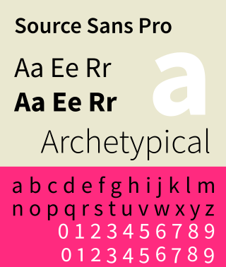
Source Sans is a sans-serif typeface created by Paul D. Hunt, released by Adobe in 2012. It is the first open-source font family from Adobe, distributed under the SIL Open Font License.

<span class="mw-page-title-main">Metro (typeface)</span> Typeface

Metro is a sans-serif typeface family created by William Addison Dwiggins and released by the American Mergenthaler Linotype Company from 1929 onwards.

<span class="mw-page-title-main">Grotesque (Stephenson Blake typefaces)</span> Family of sans-serif typefaces

The Stephenson Blake Grotesque fonts are a series of sans-serif typefaces created by the type foundry Stephenson Blake of Sheffield, England, mostly around the beginning of the twentieth century.

References

  1. "Complete Benton Sans, Now on Webtype". Archived from the original on 2017-05-09. Retrieved 2016-07-26.
  2. Font Bureau library now available exclusively on Type Network
  3. "New Fonts: Zocalo, Whitman Display, and Benton Sans". Archived from the original on 2009-01-17. Retrieved 2009-01-21.
  4. The Reading Edge (RE) fonts - Ten font families, each with four basic styles, designed to function reliably at 9px–18px
  5. New Fonts: Benton Sans Wide
  6. Benton Sans Wide - Benton Sans, Font Bureau's largest type family, goes wide, to give full coverage in eight wide-ranging weights.
  7. "BostonGlobe.com One of the first major newspapers to use webfonts in its digital edition, the Globe always feels like the Globe, on paper or screen". Fonts In Use.
  8. "Fonts: Applying the Brand". Indiana University. Retrieved 2014-12-16.
  9. "Western University Graphic Standards Manual" (PDF). Western University.
  10. "Ivey Standards Manual" (PDF). Ivey Business School. Retrieved 2017-07-25.
  11. "UT Brand Guidelines: Fonts". The University of Texas at Austin. Retrieved 2014-09-10.
  12. "Designing destinations at Lonely Planet". Medium. Retrieved 2017-02-27.
  13. "Look & Feel | Axon". Axon.