Berthold Block

Last updated
Block
Block specimen.png
Category Sans-serif
Designer(s) Hermann Hoffmann
Foundry H. Berthold
Date created1908

Berthold Block is a sans-serif typeface released by the H. Berthold foundry in the early twentieth century and intended for display use. [1] Block has a chunky design suitable for headings, with short descenders allowing tight linespacing and rounded corners. [2] [3] It is sometimes simply called "Block". Font design expert Stephen Coles describes it as "a soft but substantial display face with compact dimensions and an organic appearance…[it] isn’t meant for body copy." [4] The Klingspor Museum credits it to Hermann Hoffmann, who managed type design for Berthold. [5] [6]

Contents

The original metal type release of Block was intentionally "distressed" in style, matching the effect of worn type; some re-releases have a cleaner design. Ferdinand Ulrich suggests that this was to match the organic feel of advertising lettering of the time, including the work of Lucian Bernhard. [7] Block was one of Berthold's most popular typefaces, and was released in a wide range of versions, including lighter weights and type in wood (for large sizes). [8] Metal type versions had stylistic alternate characters such as a more compact 'S' to allow fine-tuning of appearance of type and fit the desired number of characters into a line. [9]

History

The cover of a 1921 specimen of Berthold Block. Note alternate 'S' on SW. Die Block Serie in der Akzidenz.jpg
The cover of a 1921 specimen of Berthold Block. Note alternate 'S' on SW.

Berthold Block was released in 1908; Berthold later added additional weights and styles, also releasing phototypesetting versions. [10] [11] Berthold also used the name "Block" for a number of other typefaces not particularly closely related to it as a brand extension marketing strategy. These included the script font "Block-Signal" and the blackletter Block-Fraktur. [1]

Block continued to be popular in the phototypesetting period; Jens Gehlhaar comments that "with roughened outlines and in bold weights, it was never a candidate for timelessness, but its big x-height and tight fit made it quite popular in 1970s Germany and England." [12] It was often used by Praktiker and by the Whitechapel Art Gallery for branding in the 1970s and 80s. [13] [14] In the late 1970s, Berthold re-released three lighter-weight fonts derived from the Block design as a mini-family named "Berliner Grotesk" for phototypesetting, with the font redraw carried out by Erik Spiekermann. [7] [15] [lower-alpha 1]

Digitisations

Berthold Block in a 1928 Swiss political flyer Votation Kursaals 1928.jpg
Berthold Block in a 1928 Swiss political flyer

A variety of digitisations of Block exist, including by Berthold and successor companies and by Bitstream (the condensed weight only). [16] [17] [18] Paratype of Moscow released an expansion with Cyrillic characters in 1997. [2] Matthew Butterick's Hermes, first released by Font Bureau and later self-released, is a loose adaptation also inspired by other German grotesque typefaces of the period, adding lighter weights and unicase features. [19] [20]

Related Research Articles

<span class="mw-page-title-main">Palatino</span> Serif typeface

Palatino is the name of an old-style serif typeface designed by Hermann Zapf, initially released in 1949 by the Stempel foundry and later by other companies, most notably the Mergenthaler Linotype Company.

<span class="mw-page-title-main">Helvetica</span> Neo-grotesque sans-serif typeface

Helvetica, also known by its original name Neue Haas Grotesk, is a widely used sans-serif typeface developed in 1957 by Swiss typeface designer Max Miedinger and Eduard Hoffmann.

<span class="mw-page-title-main">Futura (typeface)</span> Geometric sans-serif typeface

Futura is a geometric sans-serif typeface designed by Paul Renner and released in 1927. It was designed as a contribution on the New Frankfurt-project. It is based on geometric shapes, especially the circle, similar in spirit to the Bauhaus design style of the period. It was developed as a typeface by the Bauer Type Foundry, in competition with Ludwig & Mayer's seminal Erbar typeface of 1926.

<span class="mw-page-title-main">Univers</span> Sans-serif typeface family

Univers is a large sans-serif typeface family designed by Adrian Frutiger and released by his employer Deberny & Peignot in 1957. Classified as a neo-grotesque sans-serif, one based on the model of nineteenth-century German typefaces such as Akzidenz-Grotesk, it was notable for its availability from the moment of its launch in a comprehensive range of weights and widths. The original marketing for Univers deliberately referenced the periodic table to emphasise its scope.

<span class="mw-page-title-main">Bembo</span> Serif typeface in 1495 Venetian style

Bembo is a serif typeface created by the British branch of the Monotype Corporation in 1928–1929 and most commonly used for body text. It is a member of the "old-style" of serif fonts, with its regular or roman style based on a design cut around 1495 by Francesco Griffo for Venetian printer Aldus Manutius, sometimes generically called the "Aldine roman". Bembo is named for Manutius's first publication with it, a small 1496 book by the poet and cleric Pietro Bembo. The italic is based on work by Giovanni Antonio Tagliente, a calligrapher who worked as a printer in the 1520s, after the time of Manutius and Griffo.

<span class="mw-page-title-main">Font</span> Particular size, weight and style of a typeface

In metal typesetting, a font is a particular size, weight and style of a typeface. Each font is a matched set of type, with a piece for each glyph. A typeface consists of various fonts that share an overall design.

<span class="mw-page-title-main">Impact (typeface)</span> Sans-serif typeface

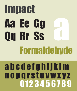
Impact is a sans-serif typeface in the industrial or grotesk style designed by Geoffrey Lee in 1965 and released by the Stephenson Blake foundry of Sheffield. It is well known for having been included in the core fonts for the Web package and distributed with Microsoft Windows since Windows 98. In the 2010s, it gained popularity for its use in image macros and other internet memes.

<span class="mw-page-title-main">Akzidenz-Grotesk</span> Sans-serif typeface family by the Berthold Type Foundry of Berlin

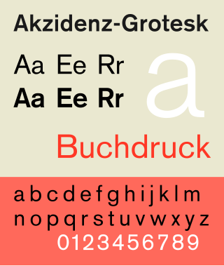
Akzidenz-Grotesk is a sans-serif typeface family originally released by the Berthold Type Foundry of Berlin. "Akzidenz" indicates its intended use as a typeface for commercial print runs such as publicity, tickets and forms, as opposed to fine printing, and "grotesque" was a standard name for sans-serif typefaces at the time.

<span class="mw-page-title-main">Janson</span> Typeface

Janson is the name given to a set of old-style serif typefaces from the Dutch Baroque period, and modern revivals from the twentieth century. Janson is a crisp, relatively high-contrast serif design, most popular for body text.

<span class="mw-page-title-main">Albertus (typeface)</span> Typeface

Albertus is a glyphic serif display typeface designed by Berthold Wolpe in the period 1932 to 1940 for the British branch of the printing company Monotype. Wolpe named the font after Albertus Magnus, the thirteenth-century German philosopher and theologian.

<span class="mw-page-title-main">Kabel (typeface)</span> Geometric sans-serif typeface

Kabel is a geometric sans-serif typeface that was designed by the German designer Rudolf Koch and released by the Klingspor foundry from 1927 onwards.

Berthold Type Foundry foundry could refer to:

<span class="mw-page-title-main">Haettenschweiler</span> Sans-serif typeface

Haettenschweiler is a sans-serif typeface in the grotesque style that is very bold and condensed. It is intended for headlines and display text.

<span class="mw-page-title-main">Erbar</span> Sans-serif typeface

In typography, Erbar or Erbar-Grotesk is a sans-serif typeface in the geometric style, one of the first designs of this kind released as type. Designer Jakob Erbar's aim was to design a printing type which would be free of all individual characteristics, possess thoroughly legible letter forms, and be a purely typographic creation. His conclusion was that this could only work if the type form was developed from a fundamental element, the circle. Erbar-Grotesk was developed in stages; Erbar wrote that he had originally sketched out the design in 1914 but had been prevented from working on it due to the war. The original version of Erbar was released in 1926, following Erbar's "Phosphor" titling capitals of 1922 which are very similar in design.

<span class="mw-page-title-main">Britannic (typeface)</span> Typeface

Britannic is a sans-serif typeface family that was sold in metal type by Stephenson Blake. It is a "modulated" or stressed sans-serif design, in which the vertical lines are clearly thicker than the horizontals. The Klingspor Museum reports that it was originally created by the Wagner & Schmidt foundry of Leipzig, Germany. In design it is intended for headings, advertisements and signs rather than continuous body text. Stephenson Blake advertised it as "just the right note for an advertising or display panel".

<span class="mw-page-title-main">Venus (typeface)</span> Grotesque sans-serif typeface

Venus or Venus-Grotesk is a sans-serif typeface family released by the Bauer Type Foundry of Frankfurt am Main, Germany from 1907 onwards. Released in a large range of styles, including condensed and extended weights, it was very popular in the early-to-mid twentieth century. It was exported to other countries, notably the United States, where it was distributed by Bauer Alphabets Inc, the U.S. branch of the firm.

<span class="mw-page-title-main">URW Grotesk</span> Sans-serif typeface

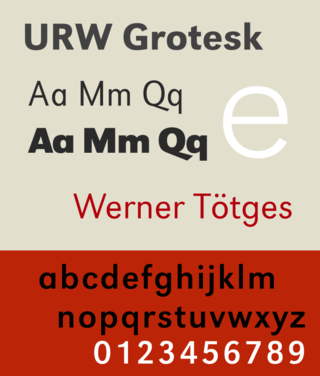
URW Grotesk is a large sans-serif typeface family designed by Hermann Zapf for URW in the mid-1980s.

<span class="mw-page-title-main">Permanent Headline</span> Display sans serif typeface

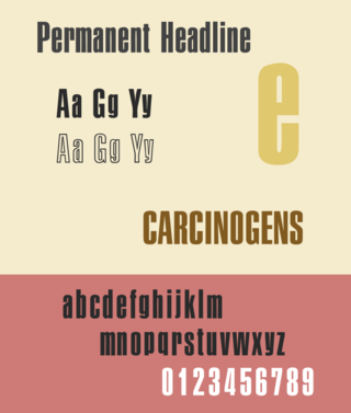
Permanent Headline is a bold, highly compressed sans-serif typeface in the neo-grotesque style. It was designed by Karlgeorg Hoefer for the type foundry Ludwig & Mayer in Frankfurt am Main. It was released from 1964 and later issued by a range of companies in phototypesetting and digital versions.

<span class="mw-page-title-main">Normal-Grotesk</span> Sans-serif typeface

Normal-Grotesk is a sans-serif typeface that was sold by the Haas Type Foundry of Basel and Münchenstein, Switzerland, and popular in Swiss graphic design towards the end of the metal type period in the mid-twentieth century.

<span class="mw-page-title-main">Unica (typeface)</span> Typeface

Unica or Haas Unica is a neo-grotesque sans-serif typeface developed at Haas Type Foundry in the late 1970s and originally released in 1980. Initiated as a project that sought to combine the strengths of both Helvetica and Univers, it had the misfortune of being released for phototypesetting just as the technology was being made obsolete by desktop publishing, and subsequent corporate mergers and a copyright dispute kept a digital version off the market. In 2015, two digital revivals were released: one by the rights holders, and the other with the blessing of the team that originally developed it.

References

  1. 1 2 "Block - Fonts in Use". Fonts In Use. Retrieved 12 June 2016.
  2. 1 2 Safayev, Tagir. "Paratype Bloc". Paratype. Retrieved 12 June 2016.
  3. "Block Berthold". Typewolf. Retrieved 12 June 2016.
  4. Coles, Stephen (4 June 2015). "In Pieces website". Fonts In Use. Retrieved 12 June 2016.
  5. "H. Berthold AG" (PDF). Klingspor Museum . Retrieved 12 June 2016.
  6. Devroye, Luc. "Hermann Hoffmann". Type Design Information. Retrieved 12 June 2016.
  7. 1 2 3 Ulrich, Ferdinand. "From Condensed Light to Extended Ultra". FontShop. Retrieved 19 August 2017.
  8. "Block in Stahl-Typen". Flickr. 21 February 2012. Retrieved 17 December 2016.
  9. Coles, Stephen; Hardwig, Florian (21 August 2008). "Berthold Block & Berliner Grotesk, 1921 Specimen". Flickr. Retrieved 17 December 2016.
  10. "Schriftdesigner Hermann Hoffmann" (PDF). Klingspor Museum . Retrieved 12 June 2016.
  11. "Berthold BQ". Berthold Types. Retrieved 12 June 2016.
  12. Gehlhaar, Jens. "Neuwelt: An optimistic transatlantic sans serif type family — Jens Gehlhaar". Jens Gehlhaar. Retrieved 15 December 2021.
  13. Hardwig, Florian (11 July 2013). "Praktiker". Fonts In Use. Retrieved 12 June 2016.
  14. 1 2 "Berliner Grotesk BQ". MyFonts . Retrieved 21 August 2017.
  15. "Block Berthold BE". MyFonts. H. Berthold. Retrieved 12 June 2016.
  16. Ruecha, Stawix. "Amsi Pro (Block digitisation)". MyFonts. Stawix. Retrieved 12 June 2016.
  17. "Condensed Gothic 821". MyFonts. Bitstream. Retrieved 12 June 2016.
  18. Butterick, Matthew. "Hermes Maia ‹ MB Type". MB Type. Retrieved 15 December 2021.
  19. Butterick, Matthew. "Hermes FB". Font Bureau . Retrieved 12 June 2016.
  1. Sources vary on release date giving 1978 and 1979. [7] [15]