Graphic design is a profession, academic discipline and applied art whose activity consists in projecting visual communications intended to transmit specific messages to social groups, with specific objectives. Graphic design is an interdisciplinary branch of design and of the fine arts. Its practice involves creativity, innovation and lateral thinking using manual or digital tools, where it is usual to use text and graphics to communicate visually.

Typography is the art and technique of arranging type to make written language legible, readable and appealing when displayed. The arrangement of type involves selecting typefaces, point sizes, line lengths, line-spacing (leading), and letter-spacing (tracking), as well as adjusting the space between pairs of letters (kerning). The term typography is also applied to the style, arrangement, and appearance of the letters, numbers, and symbols created by the process. Type design is a closely related craft, sometimes considered part of typography; most typographers do not design typefaces, and some type designers do not consider themselves typographers. Typography also may be used as an ornamental and decorative device, unrelated to the communication of information.
Web design encompasses many different skills and disciplines in the production and maintenance of websites. The different areas of web design include web graphic design; user interface design ; authoring, including standardised code and proprietary software; user experience design ; and search engine optimization. Often many individuals will work in teams covering different aspects of the design process, although some designers will cover them all. The term "web design" is normally used to describe the design process relating to the front-end design of a website including writing markup. Web design partially overlaps web engineering in the broader scope of web development. Web designers are expected to have an awareness of usability and be up to date with web accessibility guidelines.
Desktop publishing (DTP) is the creation of documents using page layout software on a personal ("desktop") computer. It was first used almost exclusively for print publications, but now it also assists in the creation of various forms of online content. Desktop publishing software can generate layouts and produce typographic-quality text and images comparable to traditional typography and printing. Desktop publishing is also the main reference for digital typography. This technology allows individuals, businesses, and other organizations to self-publish a wide variety of content, from menus to magazines to books, without the expense of commercial printing.

Jan Tschichold was a German calligrapher, typographer and book designer. He played a significant role in the development of graphic design in the 20th century – first, by developing and promoting principles of typographic modernism, and subsequently idealizing conservative typographic structures. His direction of the visual identity of Penguin Books in the decade following World War II served as a model for the burgeoning design practice of planning corporate identity programs. He also designed the typeface Sabon.

Kinetic typography—the technical name for "moving text"—is an animation technique mixing motion and text to express ideas using video animation. This text is presented over time in a manner intended to convey or evoke a particular idea or emotion.

Josef Müller-Brockmann was a Swiss graphic designer, author, and educator, he was a Principal at Muller-Brockmann & Co. design firm. He was a pioneer of the International Typographic Style. One of the main masters of Swiss design. Müller-Brockmann is recognized for his simple designs and his clean use of typography, shapes and colors which inspire many graphic designers in the 21st century.

Ladislav Sutnar was a Czech graphic designer. He was a pioneer of information design and information architecture. Although he is uncredited, his contributions to business organization benefited society, which included creating a user-friendly telephone directory by implementing parenthetical area codes. He received design commissions from a variety of employers, including McGraw-Hill, IBM, and the United Nations. He also worked as art director for Sweet's Catalog Service for almost twenty years. Sutnar held many one-man exhibitions, and his work is on permanent display in MoMA. He is best known for his books, including Controlled Visual Flow: Shape, Line and Color, Package Design: The Force of Visual Selling, and Visual Design in Action: Principles, Purposes. Sutnar was a master of exhibition design, typography, advertising, posters, magazine and book design.

In graphic design, page layout is the arrangement of visual elements on a page. It generally involves organizational principles of composition to achieve specific communication objectives.

The International Typographic Style is a systemic approach to graphic design that emerged during the 1930s - 1950s but continued to develop internationally. It is considered the basis of the Swiss style. It expanded on and formalized the modernist typographic innovations of the 1920s that emerged in part out of art movements such as Constructivism (Russia), De Stijl and at the Bauhaus (Germany). The International Typographic Style has had profound influence on graphic design as a part of the modernist movement, impacting many design-related fields including architecture and art. It emphasizes simplicity, clarity, readability, and objectivity. Hallmarks of the style are asymmetric layouts, use of a grid, sans-serif typefaces like Akzidenz Grotesk and Helvetica, and flush left, ragged right text. The style is also associated with a preference for photography in place of illustrations or drawings. Many of the early International Typographic Style works featured typography as a primary design element in addition to its use in text, and it is for this that the style is named. The influences of this graphic movement can still be seen in design strategy and theory to this day.
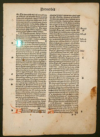
The canons of page construction are historical reconstructions, based on careful measurement of extant books and what is known of the mathematics and engineering methods of the time, of manuscript-framework methods that may have been used in Medieval- or Renaissance-era book design to divide a page into pleasing proportions. Since their popularization in the 20th century, these canons have influenced modern-day book design in the ways that page proportions, margins and type areas of books are constructed.
Emil Ruder was a Swiss typographer and graphic designer, who with Armin Hofmann joined the faculty of the Schule für Gestaltung Basel. One of the main masters of Swiss design.

In typography, a column is one or more vertical blocks of content positioned on a page, separated by gutters or rules. Columns are most commonly used to break up large bodies of text that cannot fit in a single block of text on a page. Additionally, columns are used to improve page composition and readability. Newspapers very frequently use complex multi-column layouts to break up different stories and longer bodies of texts within a story. Column can also more generally refer to the vertical delineations created by a typographic grid system which type and image may be positioned. In page layout, the whitespace on the outside of the page are known as margins; the gap between two facing pages is also considered a gutter, since there are columns on both sides.
Reginald Clifton Firth was a New Zealand graphic designer and photographer. Influenced by writings of the Bauhaus and contemporaries, especially the Swiss typographer Jan Tschichold, Firth's design work of the late 1920s and early 30s was some of the earliest modernist graphic design in New Zealand. Firth later went on to be a successful portrait photographer in Auckland during and after the Second World War.

Modern typography was a reaction against the perceived decadence of typography and design of the late 19th century. It is mostly associated with the works of Jan Tschichold and Bauhaus typographers Herbert Bayer, László Moholy-Nagy, El Lissitzky and others.

Responsive web design (RWD) or responsive design is an approach to web design that aims to make web pages render well on a variety of devices and window or screen sizes from minimum to maximum display size to ensure usability and satisfaction.
Foundation is a free responsive front-end framework, providing a responsive grid and HTML and CSS UI components, templates, and code snippets, including typography, forms, buttons, navigation and other interface elements, as well as optional functionality provided by JavaScript extensions. Foundation is an open source project, and was formerly maintained by ZURB. Since 2019, Foundation has been maintained by volunteers.

Karl Gerstner was a Swiss designer, typographer, author, and artist.
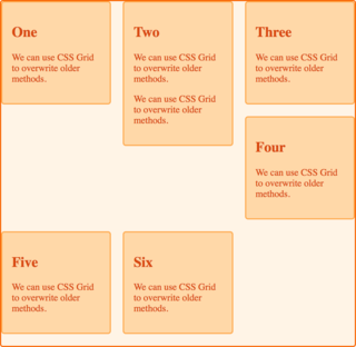
In Cascading Style Sheets, CSS grid layout or CSS grid creates complex responsive web design grid layouts more easily and consistently across browsers. Historically, there have been other methods for controlling web page layout methods, such as tables, floats, and more recently, CSS Flexible Box Layout (flexbox). CSS grid is currently not an official standard although it has been adopted by the recent versions of all current major browsers.

Swiss style is a trend in graphic design, formed in the 1950s - 1960s under the influence of such phenomena as the International Typographic Style, Russian Constructivism, the tradition of the Bauhaus school, the International Style and classical modernism. The Swiss style is associated with the activities of Swiss graphic artists. However, the principles of the Swiss style have spread in different countries, so the “Swiss style” uses wide international program.

