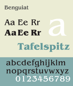
ITC Benguiat

Last updated
ITC Benguiat
Benguiat.png
Category Serif
Classification Display
Designer(s) Ed Benguiat
Foundry International Typeface Corporation
Date created1977 [1] [2]

ITC Benguiat is a decorative serif typeface designed by Ed Benguiat and released by the International Typeface Corporation (ITC) in 1977. The face is loosely based upon typefaces of the Art Nouveau period but is not considered an academic revival. The face follows ITC's design formulary of an extremely high x-height, combined with multiple widths and weights.

Contents

The original version of 1977 contained numerous nonstandard ligatures (such as AB, AE, AH, AK, AR, LA, SS, TT) and alternate shapes for some letters which were not carried into the digital version. [3]

The font family consists of 3 weights at 2 widths each, with complementary italic.

It is also sold as 'Formal 832' by Bitstream.

ITC Benguiat Pro

It is a version released in September 2008. It includes support for Central European and many Eastern European characters.

ITC Benguiat Gothic

ITC Benguiat Gothic
Benguiat Gothic Specimen.svg
Category Sans-serif
Classification Humanist
Designer(s) Ed Benguiat
Foundry International Typeface Corporation (ITC)
Date created1979 [4]

ITC Benguiat Gothic is a sans-serif variant for the original serif font family. Both faces are loosely based upon typefaces of the Art Nouveau period but are not considered academic revivals. The face follows ITC's design formulary of an extremely high x-height, combined with multiple widths and weights.

The font family consists of 4 weights at 1 width each, with complementary italic.

It is also sold as 'Informal 851' by Bitstream.[ citation needed ]

In the 1980s, it was the house font for album cover text at RCA Records.[ citation needed ]

The font is used on the cover of 1980s Stephen King novels, The Smiths album Strangeways, Here We Come , for the book covers of the Choose Your Own Adventure series, The Bitmap Brothers game The Chaos Engine , as well as in the logos of both the National Assembly of Quebec and the Melbourne Knights. [5] The typeface is featured in the main titles of the Star Trek films, Star Trek Generations and Star Trek: First Contact , as well as video game Nier: Automata. Paramount's FBI warning, from 1995–present, also uses ITC Benguiat. [6] The font is also used in the logo of the American rock band Greta Van Fleet, in the logo for Netflix show Stranger Things , and in the album art for rapper Logic's album Supermarket . The font is used for the logo written and directed by Quentin Tarantino in the beginning of his films.[ citation needed ]

ITC Benguiat Gothic is featured as the user interface font in The Sims 2 PC video game [ citation needed ] and in Boom Blox Bash Party for the Wii.

See also

Related Research Articles

<span class="mw-page-title-main">Typeface</span> Set of characters that share common design features

A typeface is a design of letters, numbers and other symbols, to be used in printing or for electronic display. Most typefaces include variations in size, weight, slope, width, and so on. Each of these variations of the typeface is a font.

<span class="mw-page-title-main">Futura (typeface)</span> Geometric sans-serif typeface

Futura is a geometric sans-serif typeface designed by Paul Renner and released in 1927. It was designed as a contribution on the New Frankfurt-project. It is based on geometric shapes, especially the circle, similar in spirit to the Bauhaus design style of the period. It was developed as a typeface by the Bauer Type Foundry, in competition with Ludwig & Mayer's seminal Erbar typeface of 1926.

<span class="mw-page-title-main">Korinna</span> 1904 typeface by H. Berthold AG

Korinna is a serif typeface, first released by the H. Berthold AG type foundry in 1904. A revival of the typeface was designed in 1974 by Ed Benguiat and Vic Caruso for the International Typeface Corporation (ITC). Their version follows the formulary ITC approach of increased x-height, and multiple weights from light to ultra. The face is named for the ancient Greek poet.

<span class="mw-page-title-main">Eras (typeface)</span> Humanist sans-serif typeface

Eras is a humanist sans-serif typeface designed by Albert Boton and Albert Hollenstein and was released by the International Typeface Corporation (ITC) in 1976. Eras is licensed by the Linotype type foundry.

<span class="mw-page-title-main">Myriad (typeface)</span> Sans-serif typeface family

Myriad is a humanist sans-serif typeface designed by Robert Slimbach and Carol Twombly for Adobe Systems. Myriad was intended as a neutral, general-purpose typeface that could fulfill a range of uses and have a form easily expandable by computer-aided design to a large range of weights and widths.

<span class="mw-page-title-main">Ed Benguiat</span> American type designer (1927–2020)

Ephram Edward Benguiat was an American type designer and lettering artist. He designed over 600 typefaces, including Tiffany, Bookman, Panache, Souvenir, Edwardian Script, and the eponymous Benguiat and Benguiat Gothic.

<span class="mw-page-title-main">Franklin Gothic</span> Family of sans-serif fonts

Franklin Gothic and its related faces are a large family of sans-serif typefaces in the industrial or grotesque style developed in the early years of the 20th century by the type foundry American Type Founders (ATF) and credited to its head designer Morris Fuller Benton. "Gothic" was a contemporary term meaning sans-serif.

<span class="mw-page-title-main">Bookman (typeface)</span> 1869 serif typeface

Bookman, or Bookman Old Style, is a serif typeface. A wide, legible design that is slightly bolder than most body text faces, Bookman has been used for both display typography, for trade printing such as advertising, and less commonly for body text. In advertising use it is particularly associated with the graphic design of the 1960s and 1970s, when revivals of it were very popular. It is also used as the official font of Indonesian laws since 2011.

<span class="mw-page-title-main">Kabel (typeface)</span> Geometric sans-serif typeface

Kabel is a geometric sans-serif typeface that was designed by the German designer Rudolf Koch and released by the Klingspor foundry from 1927 onward.

<span class="mw-page-title-main">Rotis</span> Font superfamily; humanist sans-serif typeface

Rotis is a typeface developed in 1988 by Otl Aicher, a German graphic designer and typographer. In Rotis, Aicher explores an attempt at maximum legibility through a highly unified yet varied typeface family that ranges from full serif, glyphic, and sans-serif. The four basic Rotis variants are:

<span class="mw-page-title-main">Cheltenham (typeface)</span> 1896 display typeface

Cheltenham is a typeface for display use designed in 1896 by architect Bertram Goodhue and Ingalls Kimball, director of the Cheltenham Press. The original drawings were known as Boston Old Style and were made about 14" high. These drawings were then turned over to Morris Fuller Benton at American Type Founders (ATF) who developed it into a final design. Trial cuttings were made as early as 1899 but the face was not complete until 1902. The face was patented by Kimball in 1904. Later the basic face was spun out into an extensive type family by Morris Fuller Benton.

<span class="mw-page-title-main">Syntax (typeface)</span> Sans-serif typeface

Syntax comprises a family of fonts designed by Swiss typeface designer Hans Eduard Meier. Originally just a sans-serif font, it was extended with additional serif designs.

The International Typeface Corporation (ITC) was a type manufacturer founded in New York in 1970 by Aaron Burns, Herb Lubalin and Edward Rondthaler. The company was one of the world's first type foundries to have no history in the production of metal type. It is now a wholly owned brand or subsidiary of Monotype Imaging.

<span class="mw-page-title-main">News Gothic</span> Grotesque sans-serif typeface

News Gothic is a sans-serif typeface designed by Morris Fuller Benton, and was released in 1908 by his employer American Type Founders (ATF). The typeface is similar in proportion and structure to Franklin Gothic, also designed by Benton, but lighter.

<span class="mw-page-title-main">Benton Sans</span> Sans-serif typeface

Benton Sans is a digital typeface family begun by Tobias Frere-Jones in 1995, and expanded by Cyrus Highsmith of Font Bureau. It is based on the sans-serif typefaces designed for American Type Founders by Morris Fuller Benton around the beginning of the twentieth century in the industrial or grotesque style. It was a reworked version of Benton Gothic developed for various corporate customers, under Frere-Jones's guidance. In developing the typeface, Frere-Jones studied drawings of Morris Fuller Benton's 1908 typeface News Gothic at the Smithsonian Institution. The typeface began as a proprietary type, initially titled MSL Gothic, for Martha Stewart Living magazine and the website for Martha Stewart Living Omnimedia. As Benton Gothic, there are 7 weights from Thin to Black and only 2 widths.

<span class="mw-page-title-main">ITC Avant Garde</span> Sans-serif typeface

ITC Avant Garde Gothic is a geometric sans serif font family based on the logo font used in the Avant Garde magazine. Herb Lubalin devised the logo concept and its companion headline typeface, and then he and Tom Carnase, a partner in Lubalin's design firm, worked together to transform the idea into a full-fledged typeface.

<span class="mw-page-title-main">Handel Gothic</span> Geometric sans-serif typeface

Handel Gothic is a geometric sans-serif typeface designed in 1965 by Donald J. Handel (1936–2002), who worked for the graphic designer Saul Bass.

<span class="mw-page-title-main">Bauhaus (typeface)</span> Sans-serif geometric typeface

The Bauhaus typeface design is based on Herbert Bayer's 1925 experimental Universal typeface and the Bauhaus aesthetic overall.

<span class="mw-page-title-main">Souvenir (typeface)</span> Typeface

Souvenir is a serif typeface designed in 1914 by Morris Fuller Benton for American Type Founders. It was loosely based on Schelter-Antiqua and Schelter-Kursiv, a 1905 Art Nouveau type issued by the J.G. Schelter & Giesecke foundry in Leipzig. It has a much softer appearance than other old style faces, with a generally light look, rounded serifs, and very little contrast between thick and thin strokes. Like Cheltenham, it shows the influence of the Arts and Crafts Movement without belonging to a specific historical style. A 1970s redesign by Ed Benguiat, adding extra styles and an italic, became far more popular than the initial release, and is the source of most versions sold today.

<span class="mw-page-title-main">Galliard (typeface)</span> Serif typeface

ITC Galliard is the name of a serif typeface designed by Matthew Carter and issued in 1978 by the Mergenthaler Linotype Company.

References

  1. "ITC Benguiat Gothic Medium". Identifont. Retrieved 22 November 2009.
  2. "ITC Benguiat". MyFonts. 3 December 2007. Retrieved 22 November 2009.
  3. Coles, Stephen (27 July 2016). "Photo-Lettering ITC Benguiat ad". Fonts in use. Retrieved 27 July 2016.
  4. "ITC Benguiat Gothic". MyFonts. 3 December 2007. Retrieved 22 November 2009. Following up on his earlier serif design, Ed Benguiat created ITC Benguiat Gothic in 1979.
  5. "Choose Your Own Adventure book series". 27 July 2016. Retrieved 29 July 2016.
  6. "A History of Star Trek Movie Titles". TrekMovie.com. 15 March 2009. Retrieved 16 February 2014.