Related Research Articles
Multivariate statistics is a subdivision of statistics encompassing the simultaneous observation and analysis of more than one outcome variable, i.e., multivariate random variables. Multivariate statistics concerns understanding the different aims and background of each of the different forms of multivariate analysis, and how they relate to each other. The practical application of multivariate statistics to a particular problem may involve several types of univariate and multivariate analyses in order to understand the relationships between variables and their relevance to the problem being studied.

A chart is a graphical representation for data visualization, in which "the data is represented by symbols, such as bars in a bar chart, lines in a line chart, or slices in a pie chart". A chart can represent tabular numeric data, functions or some kinds of quality structure and provides different info.

A bar chart or bar graph is a chart or graph that presents categorical data with rectangular bars with heights or lengths proportional to the values that they represent. The bars can be plotted vertically or horizontally. A vertical bar chart is sometimes called a column chart and has been identified as the prototype of charts.

A scatter plot, also called a scatterplot, scatter graph, scatter chart, scattergram, or scatter diagram, is a type of plot or mathematical diagram using Cartesian coordinates to display values for typically two variables for a set of data. If the points are coded (color/shape/size), one additional variable can be displayed. The data are displayed as a collection of points, each having the value of one variable determining the position on the horizontal axis and the value of the other variable determining the position on the vertical axis.
In statistics, exploratory data analysis (EDA) is an approach of analyzing data sets to summarize their main characteristics, often using statistical graphics and other data visualization methods. A statistical model can be used or not, but primarily EDA is for seeing what the data can tell beyond the formal modeling and thereby contrasts with traditional hypothesis testing, in which a model is supposed to be selected before the data is seen. Exploratory data analysis has been promoted by John Tukey since 1970 to encourage statisticians to explore the data, and possibly formulate hypotheses that could lead to new data collection and experiments. EDA is different from initial data analysis (IDA), which focuses more narrowly on checking assumptions required for model fitting and hypothesis testing, and handling missing values and making transformations of variables as needed. EDA encompasses IDA.
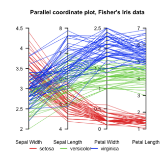
Parallel Coordinates plots are a common method of visualizing high-dimensional datasets to analyze multivariate data having multiple variables, or attributes.
Data and information visualization is the practice of designing and creating easy-to-communicate and easy-to-understand graphic or visual representations of a large amount of complex quantitative and qualitative data and information with the help of static, dynamic or interactive visual items. Typically based on data and information collected from a certain domain of expertise, these visualizations are intended for a broader audience to help them visually explore and discover, quickly understand, interpret and gain important insights into otherwise difficult-to-identify structures, relationships, correlations, local and global patterns, trends, variations, constancy, clusters, outliers and unusual groupings within data. When intended for the general public to convey a concise version of known, specific information in a clear and engaging manner, it is typically called information graphics.

UCSF Chimera is an extensible program for interactive visualization and analysis of molecular structures and related data, including density maps, supramolecular assemblies, sequence alignments, docking results, trajectories, and conformational ensembles. High-quality images and movies can be created. Chimera includes complete documentation and can be downloaded free of charge for noncommercial use.
GeoDa is a free software package that conducts spatial data analysis, geovisualization, spatial autocorrelation and spatial modeling.
GGobi is a free statistical software tool for interactive data visualization. GGobi allows extensive exploration of the data with Interactive dynamic graphics. It is also a tool for looking at multivariate data. R can be used in sync with GGobi. The GGobi software can be embedded as a library in other programs and program packages using an application programming interface (API) or as an add-on to existing languages and scripting environments, e.g., with the R command line or from a Perl or Python scripts. GGobi prides itself on its ability to link multiple graphs together.
Statistical graphics, also known as statistical graphical techniques, are graphics used in the field of statistics for data visualization.
Dap is a statistics and graphics program based on the C programming language that performs data management, analysis, and C-style graphical visualization tasks without requiring complex syntax. Its name is an acronym for Data Analysis and Presentation.

Michael Louis Friendly is an American-Canadian psychologist, Professor of Psychology at York University in Ontario, Canada, and director of its Statistical Consulting Service, especially known for his contributions to graphical methods for categorical and multivariate data, and on the history of data and information visualisation.

A plot is a graphical technique for representing a data set, usually as a graph showing the relationship between two or more variables. The plot can be drawn by hand or by a computer. In the past, sometimes mechanical or electronic plotters were used. Graphs are a visual representation of the relationship between variables, which are very useful for humans who can then quickly derive an understanding which may not have come from lists of values. Given a scale or ruler, graphs can also be used to read off the value of an unknown variable plotted as a function of a known one, but this can also be done with data presented in tabular form. Graphs of functions are used in mathematics, sciences, engineering, technology, finance, and other areas.
Interactive Visual Analysis (IVA) is a set of techniques for combining the computational power of computers with the perceptive and cognitive capabilities of humans, in order to extract knowledge from large and complex datasets. The techniques rely heavily on user interaction and the human visual system, and exist in the intersection between visual analytics and big data. It is a branch of data visualization. IVA is a suitable technique for analyzing high-dimensional data that has a large number of data points, where simple graphing and non-interactive techniques give an insufficient understanding of the information.
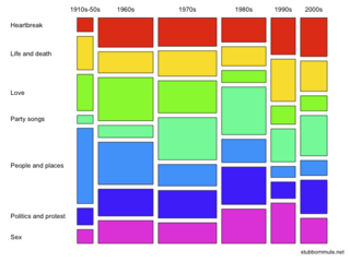
A mosaic plot, Marimekko chart, Mekko chart, or sometimes percent stacked bar plot, is a graphical visualization of data from two or more qualitative variables. It is the multidimensional extension of spineplots, which graphically display the same information for only one variable. It gives an overview of the data and makes it possible to recognize relationships between different variables. For example, independence is shown when the boxes across categories all have the same areas. Mosaic plots were introduced by Hartigan and Kleiner in 1981 and expanded on by Friendly in 1994. Mosaic plots are also called Marimekko or Mekko charts because they resemble some Marimekko prints. However, in statistical applications, mosaic plots can be colored and shaded according to deviations from independence, whereas Marimekko charts are colored according to the category levels, as in the image.
Heike Hofmann is a statistician and Professor in the Department of Statistics at University of Nebraska–Lincoln and was previously at Iowa State University.

UpSet plots are a data visualization method for showing set data with more than three intersecting sets. UpSet shows intersections in a matrix, with the rows of the matrix corresponding to the sets, and the columns to the intersections between these sets. The size of the sets and of the intersections are shown as bar charts.
References
- ↑ Theus, Martin (August 29, 2013). "Mondrian - Interactive Statistical Data Visualization in JAVA". Martin Theus. Retrieved January 3, 2015.