Related Research Articles

Typography is the art and technique of arranging type to make written language legible, readable, and appealing when displayed. The arrangement of type involves selecting typefaces, point sizes, line lengths, line-spacing (leading), and letter-spacing (tracking), and adjusting the space between pairs of letters (kerning). The term typography is also applied to the style, arrangement, and appearance of the letters, numbers, and symbols created by the process. Type design is a closely related craft, sometimes considered part of typography; most typographers do not design typefaces, and some type designers do not consider themselves typographers. Typography also may be used as a decorative device, unrelated to communication of information.
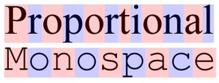
A monospaced font, also called a fixed-pitch, fixed-width, or non-proportional font, is a font whose letters and characters each occupy the same amount of horizontal space. This contrasts with variable-width fonts, where the letters and spacings have different widths.

Times New Roman is a serif typeface. It was commissioned by the British newspaper The Times in 1931 and conceived by Stanley Morison, the artistic adviser to the British branch of the printing equipment company Monotype, in collaboration with Victor Lardent, a lettering artist in The Times's advertising department. It has become one of the most popular typefaces of all time and is installed on most desktop computers.

A typeface is the design of lettering that can include variations, such as extra bold, bold, regular, light, italic, condensed, extended, etc. Each of these variations of the typeface is a font.

Helvetica or Neue Haas Grotesk is a widely used sans-serif typeface developed in 1957 by Swiss typeface designer Max Miedinger with input from Eduard Hoffmann.

Matthew Carter is a British type designer. A 2005 New Yorker profile described him as 'the most widely read man in the world' by considering the amount of text set in his commonly used fonts.

William Addison Dwiggins, was an American type designer, calligrapher, and book designer. He attained prominence as an illustrator and commercial artist, and he brought to the designing of type and books some of the boldness that he displayed in his advertising work. His work can be described as ornamented and geometric, similar to the Art Moderne and Art Deco styles of the period, using Oriental influences and breaking from the more antiquarian styles of his colleagues and mentors Updike, Cleland and Goudy.
Neville Brody is an English graphic designer, typographer and art director.
A swash is a typographical flourish, such as an exaggerated serif, terminal, tail, entry stroke, etc., on a glyph. The use of swash characters dates back to at least the 16th century, as they can be seen in Ludovico Vicentino degli Arrighi's La Operina, which is dated 1522. As with italic type in general, they were inspired by the conventions of period handwriting. Arrighi's designs influenced designers in Italy and particularly in France.

Gudrun Zapf-von Hesse was a German book-binder, calligrapher and typographer.
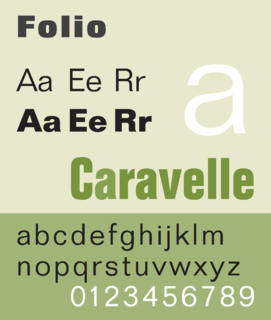
Folio is a sans-serif typeface in the neo-grotesque style designed by Konrad Bauer and Walter Baum in 1957 for the Bauer Type Foundry. Bauer licensed the design to Fonderie Typographique Française for sale in France under the name Caravelle.

Martin Majoor is a Dutch type designer and graphic designer. As of 2006, he had worked since 1997 in both Arnhem, Netherlands and Warsaw, Poland.

Fred Smeijers is a Dutch type designer, researcher and writer, educated at the ArtEZ Hogeschool voor de Kunsten in Arnhem in the early 1980s.

The MAK – Museum of Applied Arts is an arts and crafts museum located at Stubenring 5 in Vienna's 1st district Innere Stadt. Besides its traditional orientation towards arts and crafts and design, the museum especially focuses on architecture and contemporary art.
Professor R K Joshi was an academic type designer and calligrapher. He designed the core Indian fonts used in Microsoft Windows.
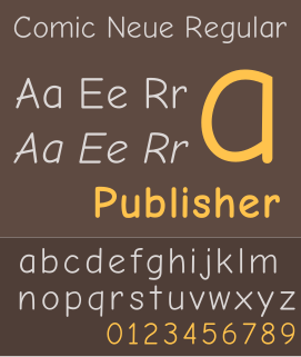
Comic Neue is a casual script typeface released in 2014. It was designed by Craig Rozynski with Hrant Papazian as a more modern, refined version of the ubiquitous, but often criticized, typeface, Comic Sans.
Cyrus Highsmith is an American typeface designer, illustrator, and author.
Anna Carolina Laudon is a typographic designer and graphic designer. Educated in Fine Art at Gerlesborgsskolan in Stockholm, Laudon earned a master's degree in graphic design at HDK School of Design and Crafts at the University of Gothenburg in Sweden, where she made her first font.
Colin Brignall is an English type designer and photographer. In addition to designing typefaces himself, he has worked as a type director and typographic consultant to Letraset and the International Typeface Corporation (ITC), selecting and overseeing other designers' typefaces.

Joshua Darden is the first African American credited as a typeface designer. He published his first typeface at the age of 15.
References
- ↑ "About — Process — Studio for Art and Design". process.studio/about/. Retrieved 8 June 2020.
- ↑ "Yes, AI Has a Carbon Footprint – So How Do We Deal With It?". xd.adobe.com. Retrieved 8 June 2020.
- ↑ "Digital Animated Visual Installation in Vienna". www.fubiz.net. Retrieved 8 June 2020.
- ↑ 2050 Une brève Histoire de l'avenir: Catalogue d'exposition des Musées ... By Musées royaux des Beaux-Arts de Belgique. 2050 Une brève Histoire de l'avenir: Catalogue d'exposition des Musées ... By Musées royaux des Beaux-Arts de Belgique. 9 October 2015. ISBN 9789461612731 . Retrieved 8 June 2020.
- ↑ "Vienna Biennale". UNCANNY VALUES: Artificial Intelligence & You - Vienna Biennale for Change 2019. Retrieved 8 June 2020.
- ↑ "Vienna Biennale". Austria CIRCULAR FLOWS – The Toilet Revolution! Triennale Milano. Retrieved 8 June 2020.
- ↑ "The Prodigy announce single Wild Frontier on their Facebook page". The Prodigy. Retrieved 8 June 2020.
- ↑ "The Prodigy - Wild Frontier (2015, Cardoard Sleeve, CD) - Discogs". www.discogs.com/The-Prodigy-Wild-Frontier/release/6715966. Retrieved 8 June 2020.
- ↑ "The Art Direction Show / Process Studio". art-direction.upstatement.com/interviews/process-studio. Retrieved 8 June 2020.
- ↑ "Massachusetts Institute of Technology – Process – Studio for Art and Design". process.studio/works/mit-school-of-science/. Retrieved 8 June 2020.
- ↑ "Traffic to Nowhere - Sagmeister Inc". sagmeister.com/work/traffic-to-nowhere/ - Project Info. Retrieved 8 June 2020.
- ↑ "What Does The World's Most Average Typeface Look Like? [Video]". www.fastcompany.com/1665171/what-does-the-worlds-most-average-typeface-look-like-video. Retrieved 8 June 2020.
- ↑ "The Average Font combines hundreds of characters into one typeface". www.dezeen.com/2014/08/29/the-average-font-moritz-resl-typography/. Retrieved 8 June 2020.
- ↑ "900+ Fonts Mashed Together Create Beautiful Typographical Art". gizmodo.com/900-fonts-mashed-together-create-beautiful-typographic-5842295. Retrieved 11 June 2020.
- ↑ "swissmiss - Average Font". www.swiss-miss.com/2011/09/average-font.html. Retrieved 11 June 2020.
- ↑ "Moritz Resl - Speaker - MCBW 2019". 2019.mcbw.de/en/speakers/details/speaker/moritz-resl.html. Retrieved 8 June 2020.
- ↑ "Process / Forward Festival 2020". forward-festival.com/vienna/speaker/process. Retrieved 8 June 2020.
- ↑ "Martin Grödl & Moritz Resl - FYI: Konferenz für Informationsdesign Wien". fyi-conference.com/process-studio. Retrieved 8 June 2020.
- ↑ "AI Symposium: UNCANNY VALUES - MAK Museum Vienna". mak.at/en/ai_symposium_uncanny_values__2019-09-24. Retrieved 8 June 2020.
- ↑ "Codici visivi. Nuove Tendenze nella Grafica Algoritmica - Graphic Days Torino". www.graphicdays.it/2019/inthecity/codici-visivi-nuove-tendenze-nella-grafica-algoritmica-2/. Retrieved 8 June 2020.
- ↑ "PROCESS STUDIO - Swiss Interactive Media Design". www.imdsg.ch/speaker/process-studio. Retrieved 8 June 2020.
- ↑ "Moritz RESL - European Forum Alpbach". www.alpbach.org/en/person/moritz-resl/. Retrieved 8 June 2020.